
Short-Term Pullback Or Medium-Term Pullback?
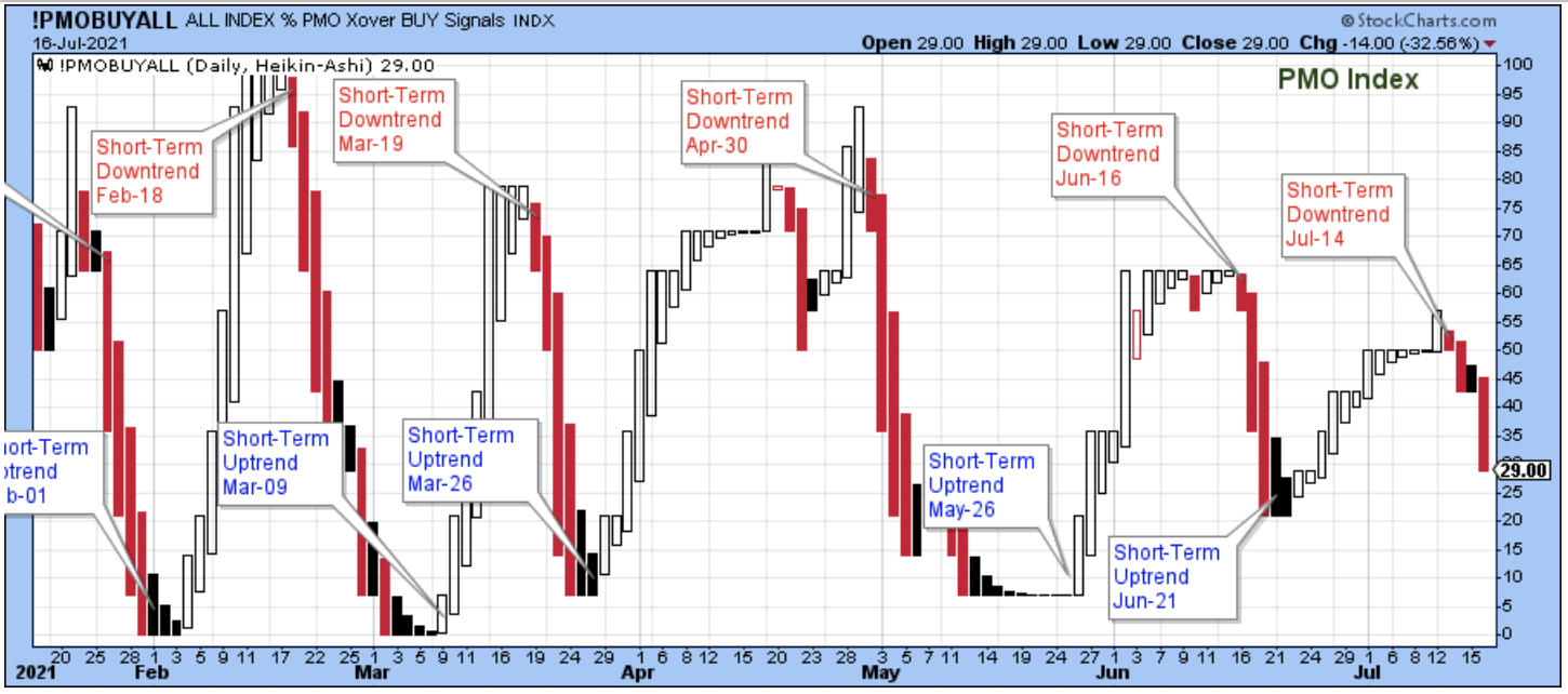
A short-term downtrend started on Tuesday, July 14. The downtrend began with the PMO index near the 50-level, which is unusual because a downtrend will usually begin with the index near the top of its range.
And now, just a few days after the downtrend began, the PMO is at the 29-level which is about where I usually state that it is too late to be selling stocks because the market is closer to a short-term bottom than it is to a short-term top. So, in other words, the PMO isn't the best market timing tool at the moment, but with the annotations it is still a good way to illustrate the short-term cycle tops and bottoms.
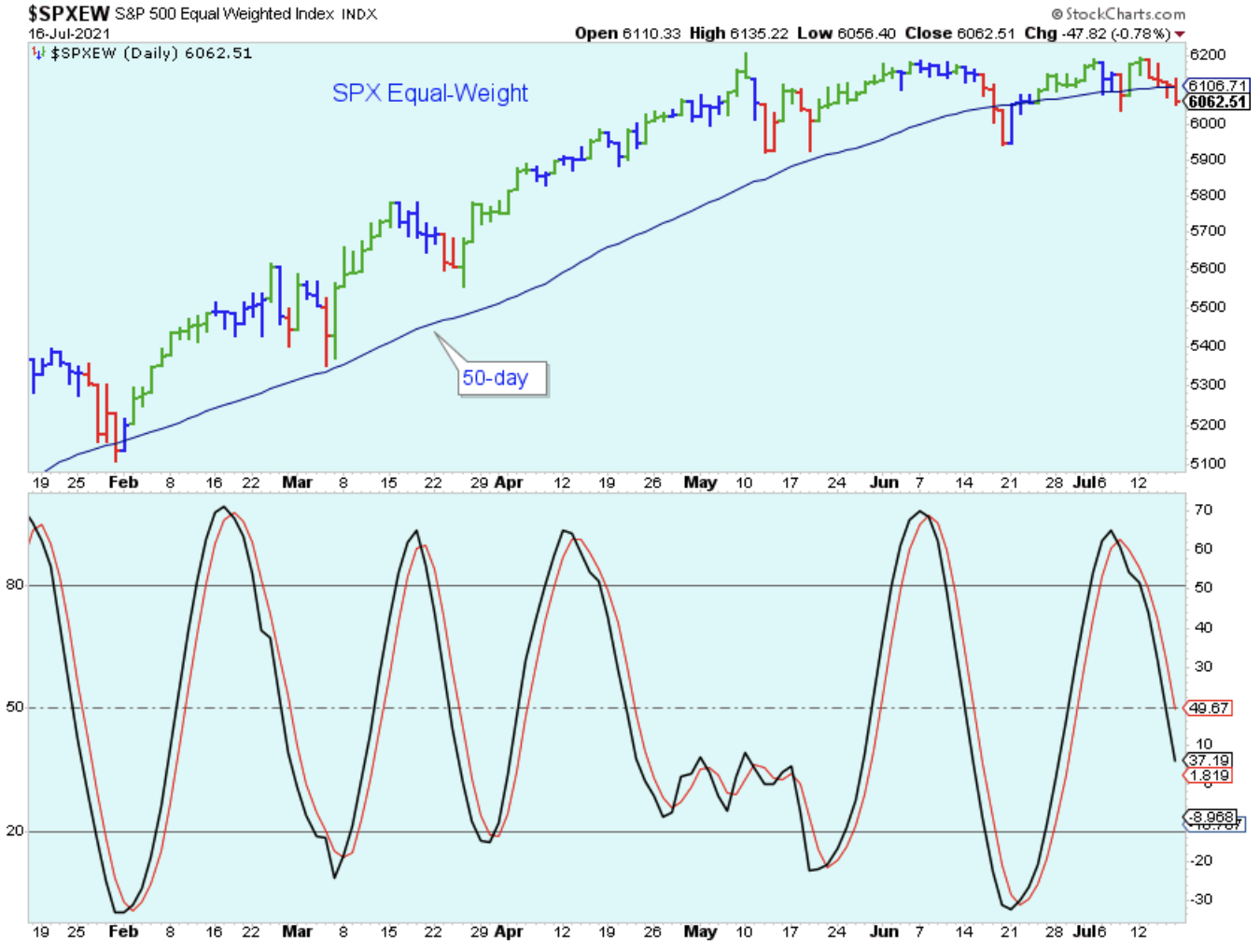
The daily chart shown below of the SPX equal-weight was my favorite from last week, but it is now my least favorite because it is making me look bad. Last week I showed it as a very bullish setup, but now it shows a bearish breakdown below the trendline.
If this were a paid subscription, then readers would be entitled to money back. But there is hope for this index because it is still possible that the index is forming a flat base with some room available to the downside before the larger trend shifts downward.

Here is another look at the SPX equal-weight. The general market selling seems strong enough that we should probably assume that this index will continue moving lower, at least until the stochastic reaches oversold. So, it looks like a week or two of short-term market weakness.
Below is a look at the 10-day call/put ratio. This used to be one of my favorite indicators, but like the PMO, it seems out-of-sync with the market lately. Or, better stated, stocks within the general market are so out-of-sync with each other that it is making some of the best indicators much less useful.
This indicator peaked mid-June and has been mostly pointed lower since then, which is a negative divergence with the major indexes that have been moving higher. This indicator shows no sign of bottoming, so assume more selling of stocks for now.

The number of new 52-week lows in the chart below has been the better indicator to use lately. For the last few weeks, the periodic spikes in the Nasdaq new lows have been a warning of trouble brewing beneath the surface of the market that hasn't been shown by the SPX and NDX. Any time I see the number of new lows over the 50-level on either index, I take notice and get cautious.

Using the charts above, we've established that a new short-term downtrend has started, but we also need (or at least would like) some idea of whether the downtrend is just beginning or getting nearer to a bottom.
As mentioned earlier, usually I'd use the PMO but since that indicator isn't working well at the moment, I am choosing instead to use the number of stocks above the 50-day average, which is shown below for the major indexes.
This chart indicates that the majority of stocks have been correcting for at least a month and are now much closer to an oversold low than they are to an overbought high. This is telling me that it is too late to sell aggressively and that I shouldn't get too bearish because the selling could be close to being finished in the short-term.
Of course, there is more to it than just this chart. Some stocks still have the potential to plummet because they are extended. Also, most of the time, and this is important, the most intense market selling occurs just before the short-term bottom is established, so the next week or two could be bad. Note to self; sometimes the most intense selling is a signal that the market is near a short-term bottom.

Another important question is whether the current downtrend is just another short-term pullback, or whether it is the beginning of a larger, medium-term pullback. In my opinion, even if the market bottoms and rallies in the next few weeks, a larger correction is likely.
First, the time of year is not good for stocks. The market often rallies early in the summer and then struggles late-summer, early-fall. Second, this might sound lame because it is so obvious, but we are overdue. The last medium-term correction was September through November 2020, and stock prices have advanced a lot since then.
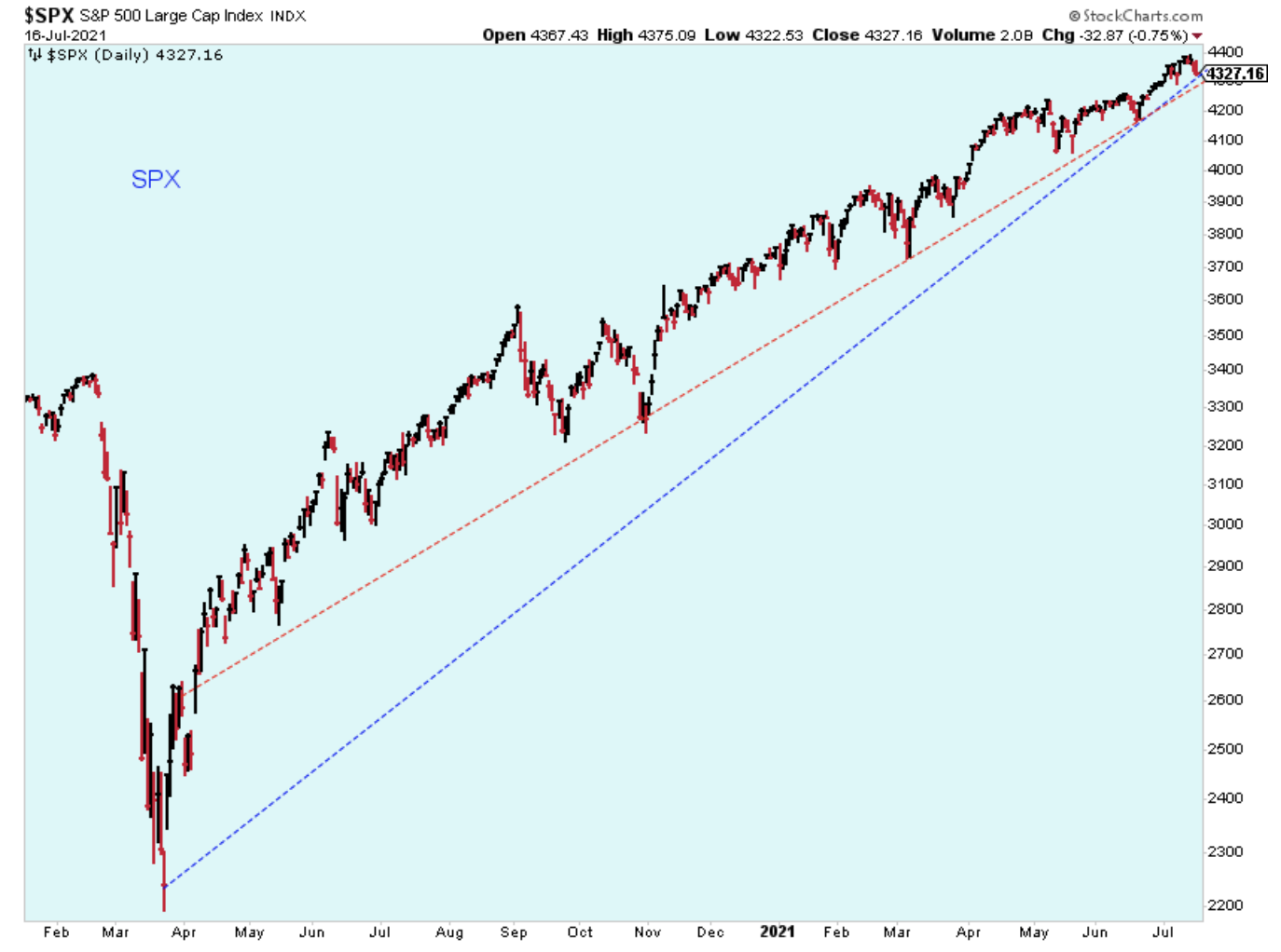
Third, some of the charts are hinting at a larger correction. The chart below shows the uptrend line for the SPX since the COVID-19 collapse in early 2020. I'm not sure exactly how to draw the trend, but in either case even a short-term pull back could break the trendline, which would be a set up for a bounce up to resistance below the trend.
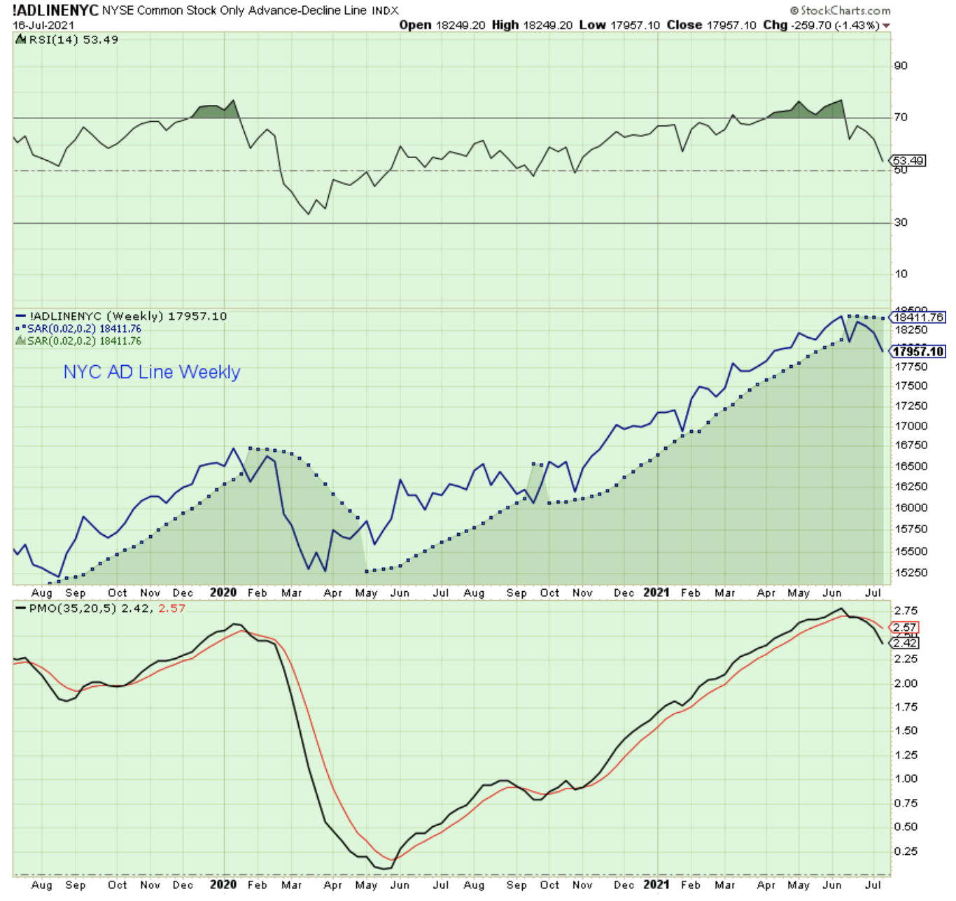
Another indication that a medium-term correction may occur is this chart of the NYC summation which just turned negative this past week. The dips into negative have been signs of a larger pullback.

The weekly chart below is more of the same weak breadth which we've been looking at for several weeks. Its a clear negative divergence with the indexes at new highs and breadth headed in the wrong direction, but on a larger, more important weekly scale rather than the smaller daily scale.
More to come later.
Outlook Summary
- The short-term trend is down for stock prices as of July 14.
- Contrarian sentiment is unfavorable for stock prices as of Nov. 14.
- The economy is in expansion as of Sept. 19.
- The medium-term trend is up for treasury bond prices as of June 11 (prices higher, rates lower).
Disclaimer: I am not a registered investment adviser. My comments reflect my view of the market, and what I am doing with my accounts. The analysis is not a recommendation to buy, sell, ...
more


I wouldn't be surprised if a crash greater than 1920 is coming...