

Image source: Pixabay
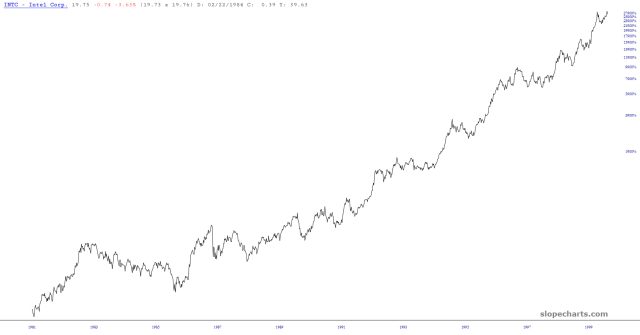
Below is the percentage chart of a truly amazing stock. All through the 1980s and 1990s, it did little but go up. That’s two decades, folks. It went up tens of thousands of percentages. This is a generational type of wealth going on here.
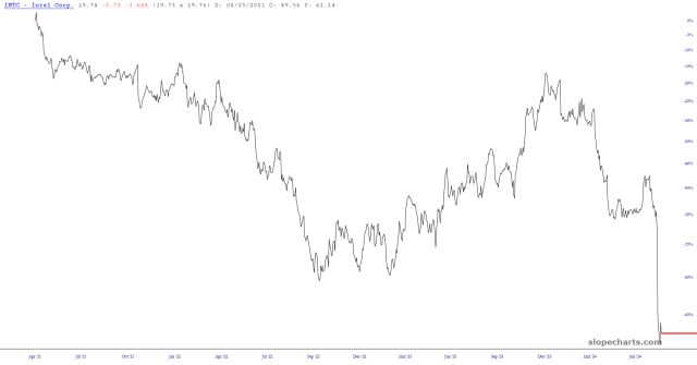
Here’s the same stock over the past few years. Same company, same industry. Most of the market cap was obliterated over the span of a few dozen months.
Most interestingly of all, this is the past quarter century of the stock. That’s 300 months, and over 9,000 days.
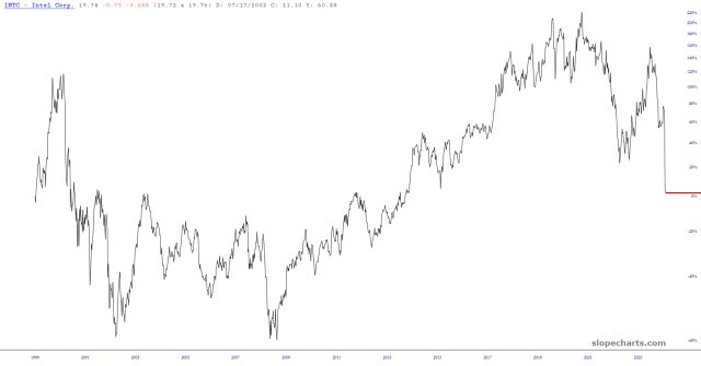
You want to know what the return was for the summer of 1999 through the summer of 2024 timeframe? Zero.
You probably have this figured out already. How a high-tech company can squander a quarter-century of the biggest bull market in history is beyond me.
More By This Author:
Ethereum Ready To ReverseKeep An Eye On USD/JPY
Rates Ready To Plunge?


Comments
Log in or sign up to join the conversation.