

Exactly a year ago I shared a chart here that represented “An Epic Set Of Alligator Jaws.” It plotted the weighting of the energy sector within the S&P 500 Index versus the combined weightings of the tech and communications services sectors (which were a single sector until recently). “For my money, those alligator jaws look more likely to snap shut than to open even wider,” I wrote at the time. Indeed, the energy sector has risen more than 60% over the past twelve months, outperforming the index, while the combined tech and communications services sectors have fallen, underperforming the index, resulting in those alligator jaws closing to some degree.
(Click on image to enlarge)
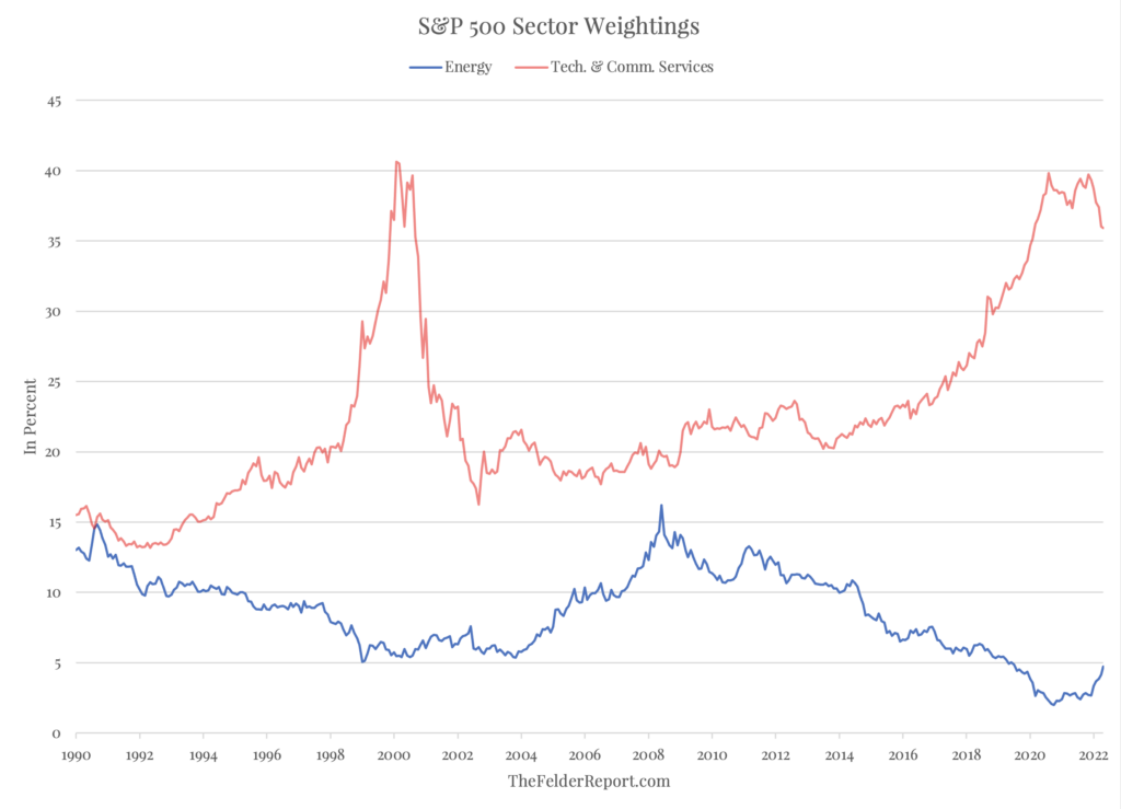
But it’s astounding to note how little these jaws have actually closed in light of the dramatic performance gap between the two groups of stocks. In fact, what I wrote a year ago is just as relevant today as it was then: “Many may be asking themselves whether this trend is sustainable. But when you look at the historical weighting within the S&P 500 Index, energy still comprises a smaller portion than it did 20 years ago, at the dawn of its last major bull market, and tech and communications services are just below their all-time highs set back then at the peak of the DotCom Mania. So I would just ask in return, looking at the chart above, does it appear that energy has become overextended? Or is it more likely popular sectors like tech still have some give back ahead of them?”


Comments
Log in or sign up to join the conversation.