A Tenuous Uptrend
The short-term uptrend continues, although I would describe the trend as tenuous. There was some real weakness in the price action during the week, particularly on Tuesday, and IBD described the market as showing fatigue.
Last Saturday I labeled the short-term trend as "uncertain" because, even though the PMO was rising, some of the other indicators were not confirming the uptrend, such as the number of new lows on the Nasdaq. And I tend to think that an elevated number of new lows trumps all other indicators.
However, the chart below of the PMO index shows six clean-looking white candles in a row, which means that the majority of stocks have been rising fairly consistently, so I'm labeling it as an uptrend.
This chart of the major indexes shows that all three closed out the week under their five-day averages, which doesn't inspire confidence in the week ahead. However, with the PMO rising in such a clean fashion, it may just be that the troops are still advancing while the generals rest a bit.
This chart is also a reminder to me that although the PMO index is fairly timely in its short-term trend signals, it can be improved by monitoring the price action and the five-day averages of the major indexes.
Doing some purchasing near the close of the session on July 20 seems reasonable considering the classic short-term reversal chart pattern of the three sessions from July 16 through July 20. Also, although not shown in the chart, there is a convincing bounce off the 50-day average, and the July 20 reversal was followed by four strong closes, which were good money-making days missed by the PMO buy signal.
On Thursday, it looked like we were getting a nice break out of the SPX equal-weight from a solid-looking three-month consolidation base, so Friday's poor follow-through was a bit disappointing. Although it isn't a failed breakout yet, with the stochastic nearing the top of the range, price momentum in this index will probably be weak and failure is likely.
On Thursday, while the SPX equal-weight was breaking out to new highs, the small-caps rallied nicely past the 20-day, and at mid-day, the ETF looked very strong and provided a little bit of hope that the market was ready for a strong move.
But by the close, the small-caps had reversed and ended the day at the lows, providing a hint of Friday's weak session that put the small-caps back in their downtrend. As a result, this chart below now has the look of a short-term bearish wedge.
Here is a broader look at the same ETF, and it shows the small-caps to be trapped under the 50-day. This could be another base forming, but in a bullish base, you like to see strength emerging up the right side. At the moment, this chart looks much more like the ETF is breaking down, and rather than seeing a base forming, it looks more like a topping pattern.
The chart below shows the new 52-week lows for both major exchanges. The level of new lows for the NYSE isn't too bad, but it is definitely elevated above the harmless level of late May and June. On the other hand, the number of new lows on the Nasdaq is quite elevated, and in my opinion, it is ringing alarm bells about the health of the market. There is no way I could be bullish towards stocks in the short-term with this many new 52-week lows.
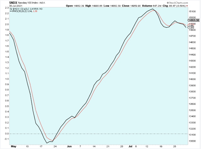
I'm sure you don't need another weak-looking chart to be convinced that I'm bearish, but we might as well take a quick look at all the charts I had planned for today. This chart below displays the Nasdaq 100 but only showing the PMO momentum indicator, and to me, this is pretty bearish-looking short-term.
I like to use the indicator-only chart sometimes because it puts the focus squarely on the highs and lows of the short-term cycle. This case shows an index near the high of the short-term cycle, and it is rolling over.
To be fair, I need to also look at the indicators that don't support my bearish view, such as the 10-day call/put shown below which is just now, as of Friday, looking like it wants to head higher. Just when I convinced myself that the market is heading lower short-term, the call buyers are stepping in. I guess this means that I need to be flexible and open to the possibility that I am wrong about the market.
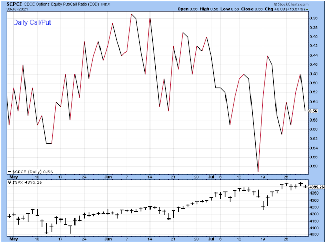
Below is the daily call/put (inverted put/call), and this chart makes more sense to me than the 10-day call/put shown above. I probably should be looking at this daily indicator more often instead of relying only on the 10-day average of the indicator. The 10-day has probably been thrown off by this year's market choppiness.
This chart shows an extremely low level of calls existing just before the price bottomed out on July 19, and that makes sense because it represents excessive short-term pessimism that hinted at a very good short-term buying opportunity.
In this chart, I see a downtrend starting in mid-June that is confirmed most recently by the lower high this past Thursday. This chart is a much better fit with the negative price action that we have seen in the market. (They say a bear can always find a chart to fit his pessimistic point of view.)
There are lots of other stock-related charts, but there isn't time to look at them all. I'm ready to wrap up the discussion with a quick review of the US dollar and US treasuries.
The past five days were very weak for the US dollar. If the market has a price correction, then I would expect a shift to risk-aversion, which means the dollar will probably start to rise. In general, in the short-term, I think a weak dollar will favor stock prices and a strong dollar will work against stock prices because of the risk on-off characteristic.
I never have had much luck forecasting what the US dollar will do, so rather than predict, maybe it is better just to observe what it is doing now and to understand what movement in the dollar means for stocks.
This chart shows that the larger trend for the dollar remains downward with a series of lower highs, and in general, I think this favors stocks. In the short-term, the dollar has cycled sideways but in big swings, and I think that this chart pattern aligns with what we are seeing in the stock market, with several weeks of dollar weakness favoring value stocks and then several weeks of dollar strength favoring growth stocks.
Bond prices are rising (yields lower) as shown by this chart. Higher bond prices could mean that economic growth is below what had been expected, which helps explain our choppy stock market. But if bond prices continue to rise, it could mean a risk-off attitude and stock prices would suffer.
Bottom Line
I am quite cautious towards stocks in the short-term and so my trading account is now in cash once again. I would welcome a correction in stock prices. This market really seems to need a healthy pullback to provide a refresh that could springboard the market into another powerful rally later in the year.
Outlook Summary
- The short-term trend is up for stock prices as of July 23.
- The economy is in expansion as of Sept. 19.
- The medium-term trend is up for treasury bond prices as of June 11 (prices higher, rates lower).
Disclaimer: I am not a registered investment adviser. My comments reflect my view of the market, and what I am doing with my accounts. The analysis is not a recommendation to buy, sell, ...
more


