
Some Thoughts On US Wealth Patterns
When I first started paying attention to national-level economic statistics in the late 1970s and early 1980s, it was commonly taught that the ratio of national wealth to GDP was more-or-less a constant over time. This made some intuitive sense. After all, the value of real estate wealth will be worth what people are willing to pay for it, and it makes some sense that this should grow over time with people's incomes. The value of stock market wealth in US companies will reflect future expected profits in the corporate sector, and again, will be growing over time with the economy. But this longstanding pattern fractured in the 1990s.
Here's a figure showing the wealth-to-GDP ratio for the US economy (generated using the ever-helpful FRED website maintained by the Federal Reserve Bank of St. Louis).
(Click on image to enlarge)
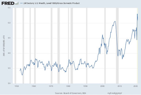
As you can see, the ratio was relatively close to being constant at about 3.6 for the period from the 1950s into the early 1990. The patterns of the figure in recent decades are fairly obvious. The run-up in wealth in the 1990s represents the stock market taking off. The run-up in the early 2000s is the real estate market taking off. After a big fall in both during the Great Recession of 2007-2009, both have rebounded. By mid-2020, the ratio was up to about 5, near an all-time high.
What has changed this ratio? Why are the US real estate and the stock market worth so much more, relative to GDP, than they had been for decades? One plausible reason has to do with the generally lower levels of interest rates since the 1990s (for discussions, see here or here). At an intuitive level, lower interest rates mean that people can afford to spend more on houses--so housing wealth goes up. A similar logic applies to the stock market, when interest rates are very low, the potential future returns from companies look that much better, and investors are willing to pay more for them.
This explanation also implies that those who have seen big increases in their wealth over the last few decades--for me, that would be higher housing equity and a rising balance from the stock market investments in my retirement account--are growing wealthier only in part from a willingness to make those monthly mortgage payments and contributions to the retirement account. A substantial portion of the gain in wealth is from those shifts in interest rates.
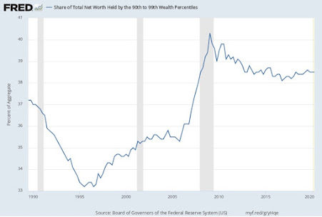
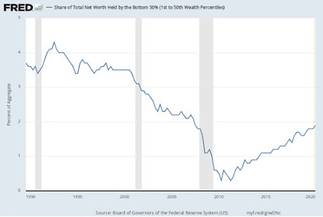
How is the distribution of wealth evolving? Here, the underlying data come from the Distributional Financial Accounts calculated by researchers at the Federal Reserve, which is only available since 1989--the tail end of the period when the wealth/GDP ratio was fairly stable. The top figure shows the share of wealth going to the top 1%; the second figure shows the share of wealth from the 90th-99th percentile; the third figure shows the share of wealth for the 50th-90th percentile, and the bottom figure shows the share of wealth for the bottom 50%.
(Click on image to enlarge)


What patterns emerge here?
Even as the wealth-to-GDP ratio has been rising, not all groups of the wealth distribution have benefited in the same way. Lest I be accused of burying the lede here, the big story with US wealth is the growth in wealth/GDP ratio and the growing share of that wealth held by the top 1%. The share of wealth going to the top 1% shows occasional setbacks, like when the stock market fell in 2001 or in the aftermath of the Great Recession, but overall, the share of wealth going to this group has risen from about 24% of the total back in 1990 to above 30% of the total more recently. One thinks here of some of fortunes that have been made by Microsoft, Google, Facebook, Apple, along with Berkshire Hathaway--all benefiting from the overall run-up in the stock market prices of these companies.
The pattern for to the 90th-99th percentile looks rather different. It was a little over 37% of the total in 1990 and is a little over 38% of the total now. What seems to be happening here is that the wealth of this group benefitted less from the 1990s run-up of the stock market than did the top 1%--so the share of total wealth for this group declined during that time. However, the wealth of this group also suffered less from the stock market decline of 2001, and from the aftereffects of the Great Recession. So after three decades of down and up and down, it's overall share hasn't changed by much.
The pattern for the 50th-90th percentile is where the big shift happens. This group had about of total wealth in 1990 and still had about that same share in the early 2000s. But since then, its share has dropped down to about 29% of total wealth. In ownership of real estate or financial assets, this group is benefitting considerably less from the run-up in wealth/GDP than the top 1%. This group is often what is called the "middle class" in a US context.
The bottom 50% has relatively little wealth, which isn't a surprise. After all, lots of fairly middle-class people under the age of 35-40 don't have much total wealth, in part because what they are in debt to buy a house, and there hasn't been enough time for their housing equity and retirement accounts to build up. The poor don't have much wealth, either. Thus, it's not a big surprise that back in the 1990s the total share of the wealth distribution for this group was around 3.5-4.0% of the total. But since the 2000s, the wealth gains of this group didn't keep up--indeed, one suspects that this group includes a number of people who borrowed heavily to buy a house in the early 2000s and then, after real estate prices fell, ended up having borrowed more than the property was worth.


