
Image Source: Pexels
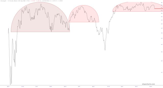
It seems that, in spite of the lifetime highs, the raw strength of the market is starting to wane, as this chart of the percentage of stocks above their 200-day moving averages illustrates.
More By This Author:
Unity Software's Impeccable Head And Shoulders Pattern Signals Further DeclineMy Best Day Of 2024: Eight Bearish Wins And A Stellar QQQ Trade
Quarterly Report Highlights DJT's $6.6 Billion Valuation Despite Lack Of Profit


Comments
Log in or sign up to join the conversation.