Mapped: The World’s Countries Compared By 20 Key Metrics
Which countries have the largest populations? What about the rural versus urban population divide? And which countries have the highest Gross Domestic Product (GDP), military expenditures, or tech exports?
Instead of comparing countries by one metric, this animation and series of graphics by Anders Sundell uses 20 different categories of World Bank data to compare countries. The data was sourced in July 2022 and contains the latest available data for each country.
Below, we provide some context on eight of the 20 categories and share some facts on the top-ranking countries for each category.
Top 10 Countries Worldwide by GDP
(Click on image to enlarge)
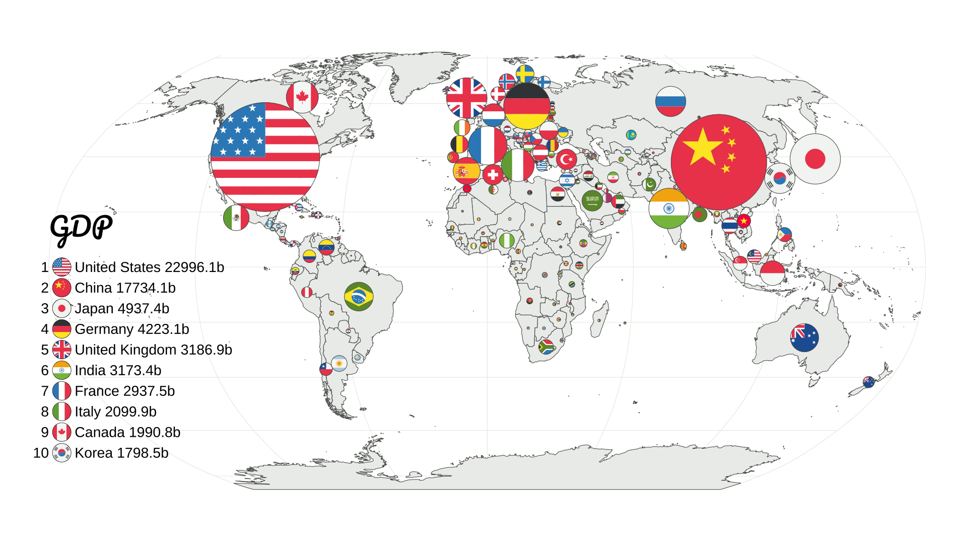
With a GDP of nearly $23 trillion in 2021, the United States has the largest economic output of any country in the world. While China is currently second on the list, some projections have China’s nominal GDP surpassing America’s as early as 2030.
And even more evident on this map is the weight of economic power to Western countries and just a few Asian countries. Africa, South America, and the rest of Asia are tiny in contrast.
Top 10 Countries Worldwide by Population
(Click on image to enlarge)
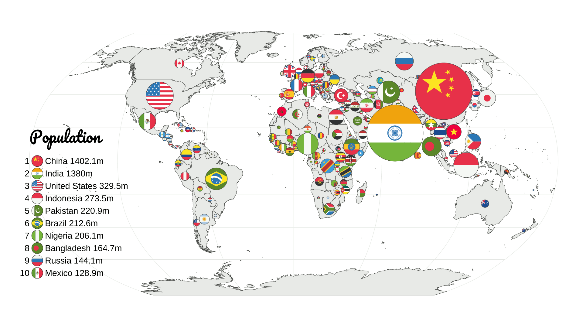
China ranks first as the world’s most populated country, with a population of 1.4 billion. China has been the world’s most populated country for more than 300 years, but this could change in the near future.
According to the UN’s latest population prospects, India’s population is expected to surpass China’s as early as 2023. However, it’s still unclear what the consequences of this shift will be.
Top 10 Countries Worldwide by Population 65+
(Click on image to enlarge)
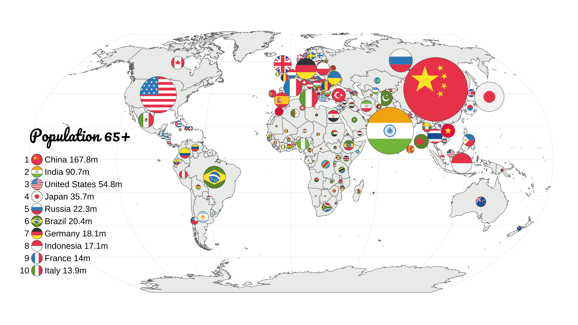
While China also takes the top spot when it comes to total elderly population, it’s worth noting that Japan has a larger per capita population of people aged 65 and over.
According to the Population Reference Bureau, nearly 12% of China’s population is 65 or older, while in Japan, more than 28.2% of people are 65+.
Top 10 Countries Worldwide by Urban Population
(Click on image to enlarge)
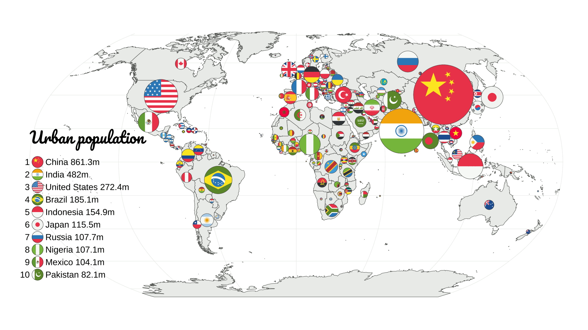
Until the Industrial Revolution, most of the world’s population lived in rural areas. But by the early 1900s, urbanization started to skyrocket, and now more than half of the world’s population lives in cities.
China’s urbanization really took off as soon as the country’s economic reforms began in the late 1970s. As of 2021, China’s urban population of roughly 861 million people made up 63% of its overall population.
Top 10 Countries Worldwide by Rural Population
(Click on image to enlarge)
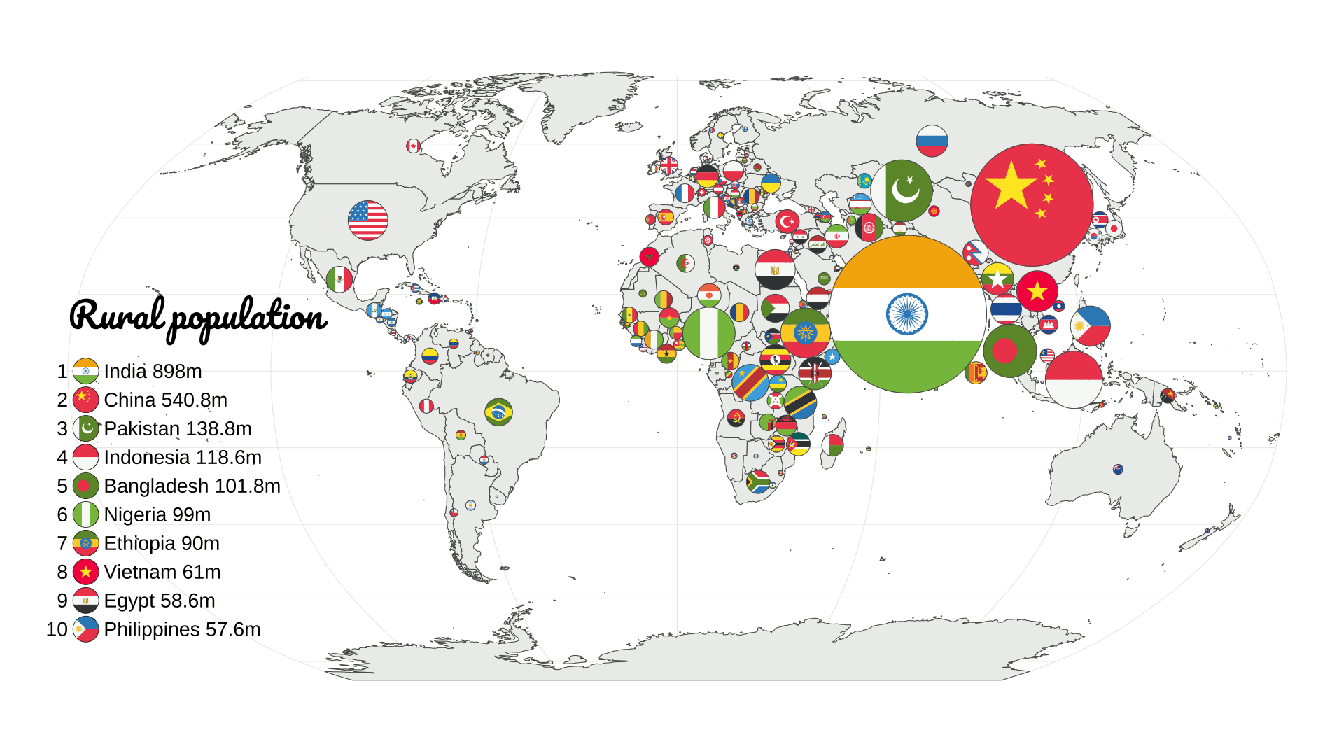
Many Asian and East African countries rise to the front when it comes to rural population comparisons, but India easily has the world’s largest share with around 898 million people.
As of 2021 figures, about 65% of India’s population is rural. This is actually a significant drop compared to the 1960s, when the country’s rural population made up a whopping 82% of its overall population.
Still, that’s still significantly higher than Western countries. For instance, only 17% of the U.S. population lives in rural areas.
Top 10 Countries Worldwide by Land Area
(Click on image to enlarge)
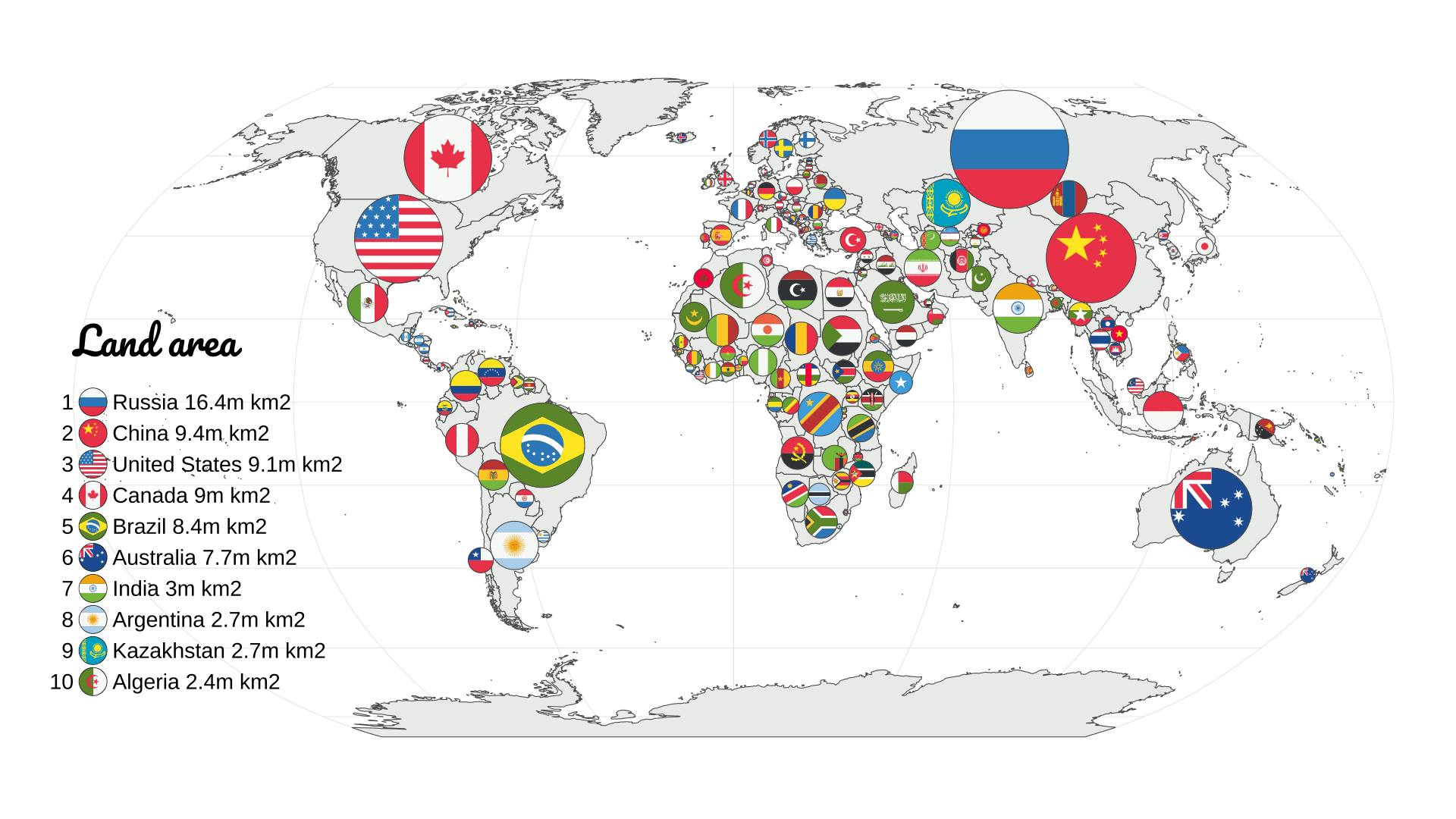
When it comes to comparing countries by sheer size, Russia comes first with a land area of 16.4 million square kilometers—that’s nearly 2x bigger than China, which comes second on the list.
According to National Geographic, Russia is so big, it accounts for one-tenth of all land on Earth. The country has 11 different time zones, as well as coasts on three separate oceans.
Why isn’t Canada ranked second? Though it is generally accepted as the world’s second-largest country, around 8.9% of its total area is made up of water. In pure landmass, China and the U.S. have an edge.
Top 10 Countries Worldwide by Fuel Exports
(Click on image to enlarge)
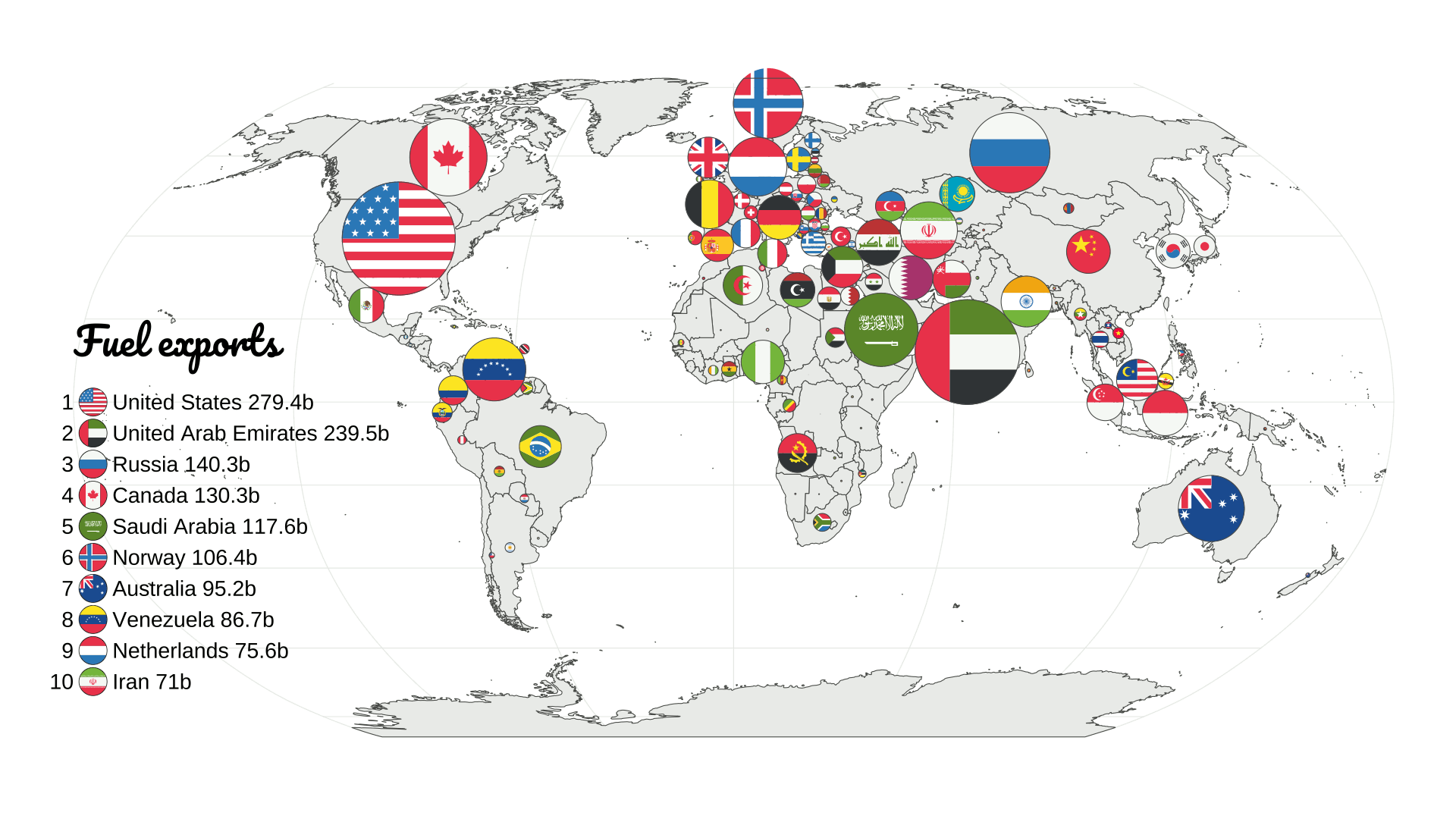
The U.S. ranks as the world’s top fuel exporter, with the United Arab Emirates in close second.
According to the American Petroleum Institute, the oil and gas sector is responsible for about 8% of America’s total economic output, measured by GDP.
And this map also highlights the many other countries dependent on energy for GDP. This includes OPEC members like Saudi Arabia, Venezuela, and Iran, as well as well-known energy exporters like Norway and Russia.
Top 10 Countries Worldwide by CO2 Emissions
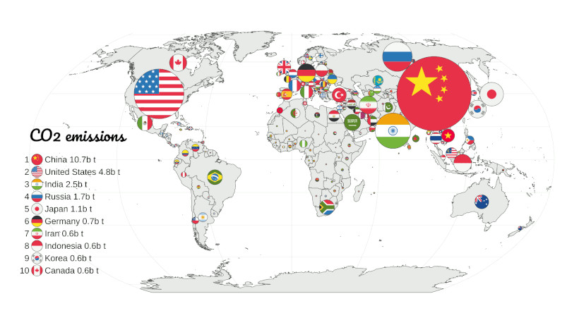
While China ranks first as the world’s biggest carbon emitter, it’s worth mentioning that the country is not even in the top 10 when looking at per capita carbon emissions.
That being said, China’s annual emissions of 10.7 billion tons CO₂ make up a massive share of global emissions. They are more than double the second largest emitter, the United States.
Comparing Countries by Other Metrics
This series of graphics shows 20 distinct measures of comparing countries, but they are just a few of the hundreds of possible examples.
From different economic measures like remittances, employment, and GDP to the multitude of factors that one can find in a demographic census, each comparison can yield different results and shed new lights on how countries relate to each other.
More By This Author:
Visualizing Currencies’ Decline Against The U.S. DollarVisualizing (And Understanding) An Inverted Yield Curve
Mapping Out The Richest Billionaires In Each Country
Disclosure: None.


