
Webull 4 You: A Review Of Webull's New Desktop 4.0 Trading Application

Webull 4.0 logo, courtesy of Webull
Webull 4.0 is a new desktop trading application which gives you quick access to your portfolio and up to the minute information on what is happening in the stock market. Webull Desktop 4.0 (an upgrade from previous versions) is intended to make trading easier for you with improved CPU/memory usage, new features, and a highly customizable layout. I originally learned about Webull after reading a review of the company's trading application last year, right here on TalkMarkets (Webull: A Great New Investment App Or "Cr"app?). At that time the reviewer gave an overview of the app and account opening instructions. In this article, I will take you through the Webull app menu and highlight some of the app's features. You can check the app out on your own by going to the Webull homepage.
The left side of the Webull Desktop 4.0 screen has an icon menu that looks like this:
(Click on image to enlarge)
![]()
The eleven icons symbolize actions/and or functions.

1) This is the layout choice icon. You go here to decide what you want to do. The drop down menu lets you a) create a new window, b) close an existing window, c) reset the current layout, d) save as a customized layout, e) all layouts, f) About (shows you what version of Webull you are using and g) Quit

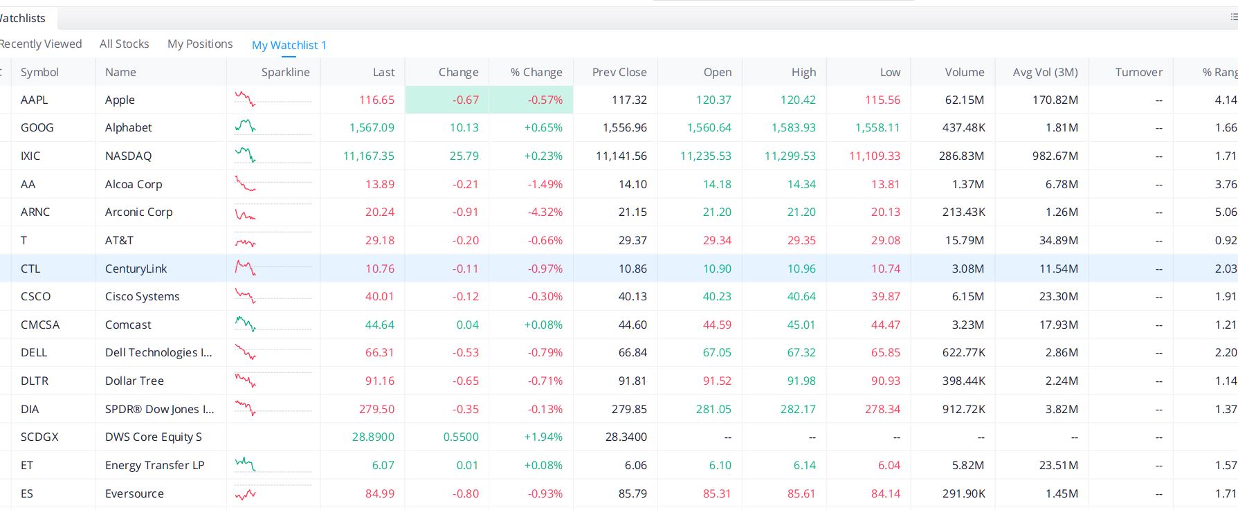
2) This is the Watchlist icon. It lets you create lists of stock that you want to track. You can edit the items you want to track. It looks like this:
(Click on image to enlarge)

3) The third icon is "Stocks". This is probably the window/page you will use the most. Below you can see what the default window for Alphabet (GOOG) looks like.
(Click on image to enlarge
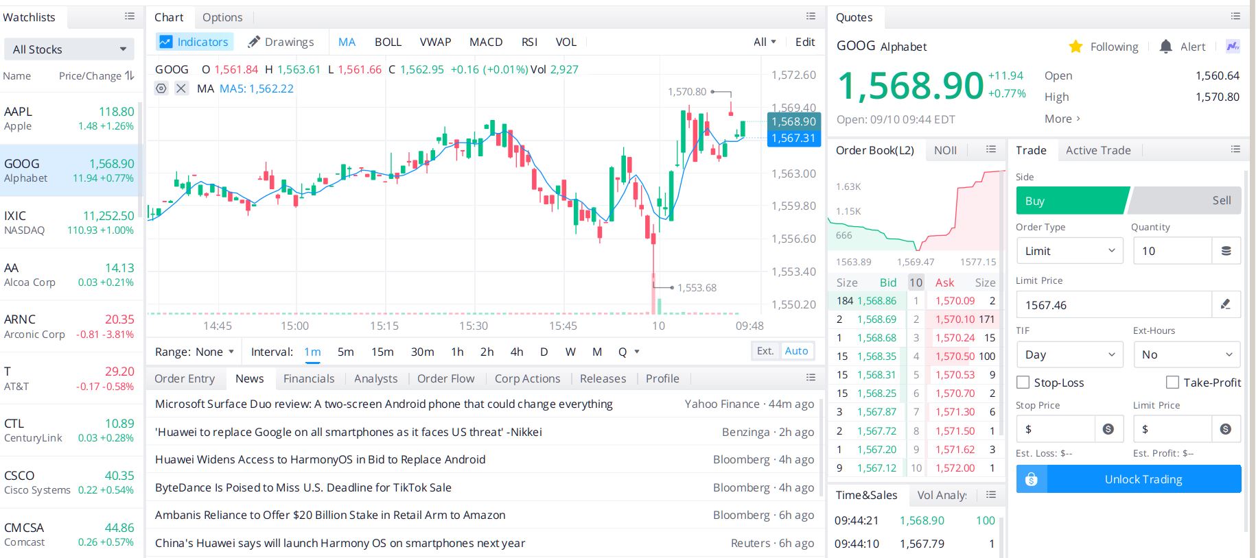
All the information to date is live. You can place trades for a particular stock from this page as well.

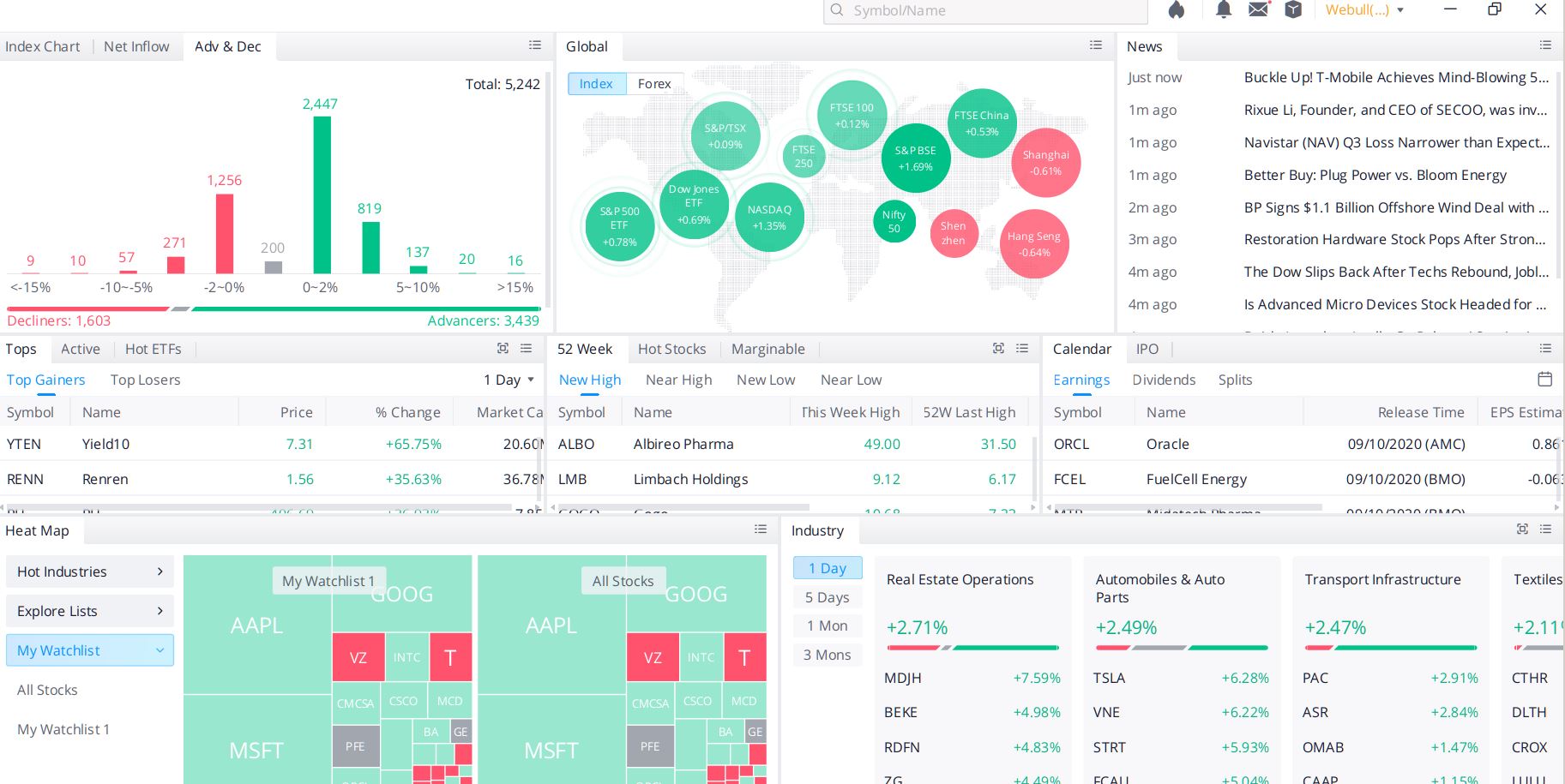
4) The fourth icon is the "Markets" icon. You can see information for companies by sector, industry, etc. One of the neat features is the "heat map" which allows you to see where one stock is in relation to another. Below is a view of the Markets default window/page. You can see that it is sectioned by feature.
(Click on image to enlarge)
![]()
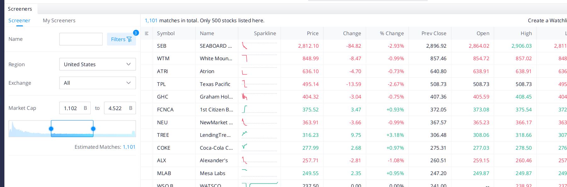
5) The fifth icon is the "Screeners" window. This feature lets you look for companies based on criteria you define. In the screenshot below we searched for companies in the United States, traded on all markets with market caps between 1.1 and 4.5 billion dollars.
(Click on image to enlarge)

6) The sixth icon in the list is the "Custom Layout" icon, fittingly symbolized by a paint roller. The layout choices you have are as below.
(Click on image to enlarge)
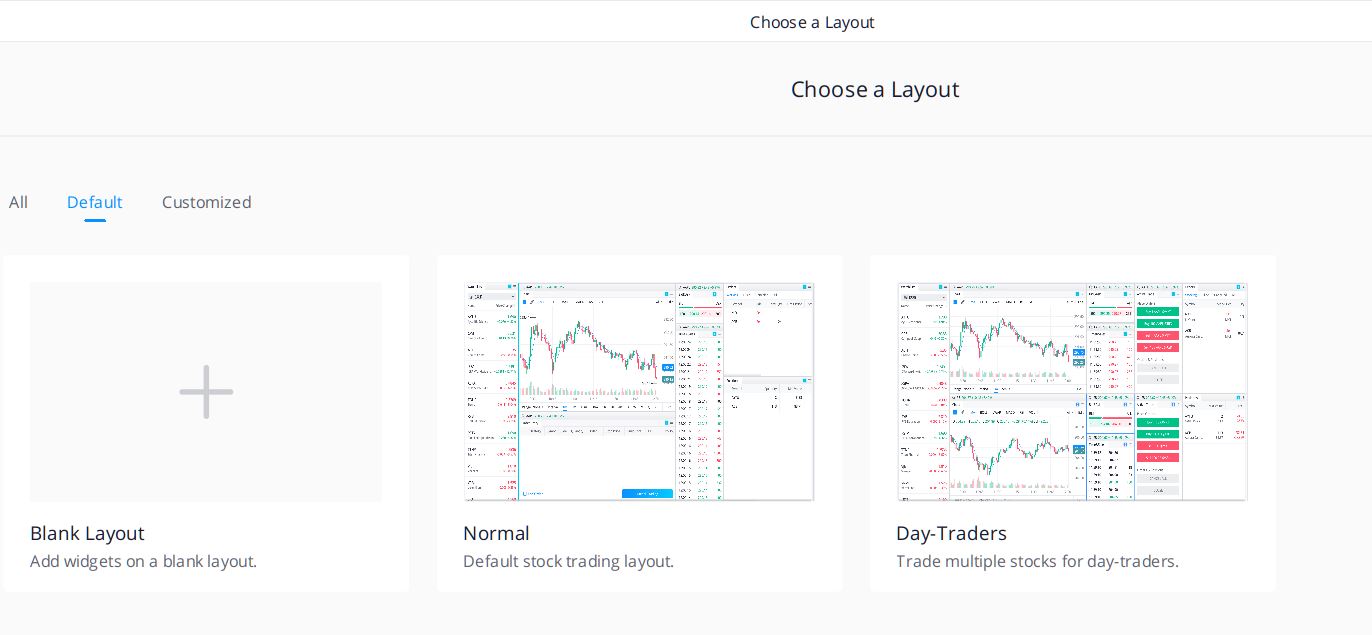
For Day-Traders the ability to set-up custom views with real-time information is a fantastic tool.

7) The seventh icon is the "Account" icon. Here you can find and access all your account information once you open your personal Webull trading account.

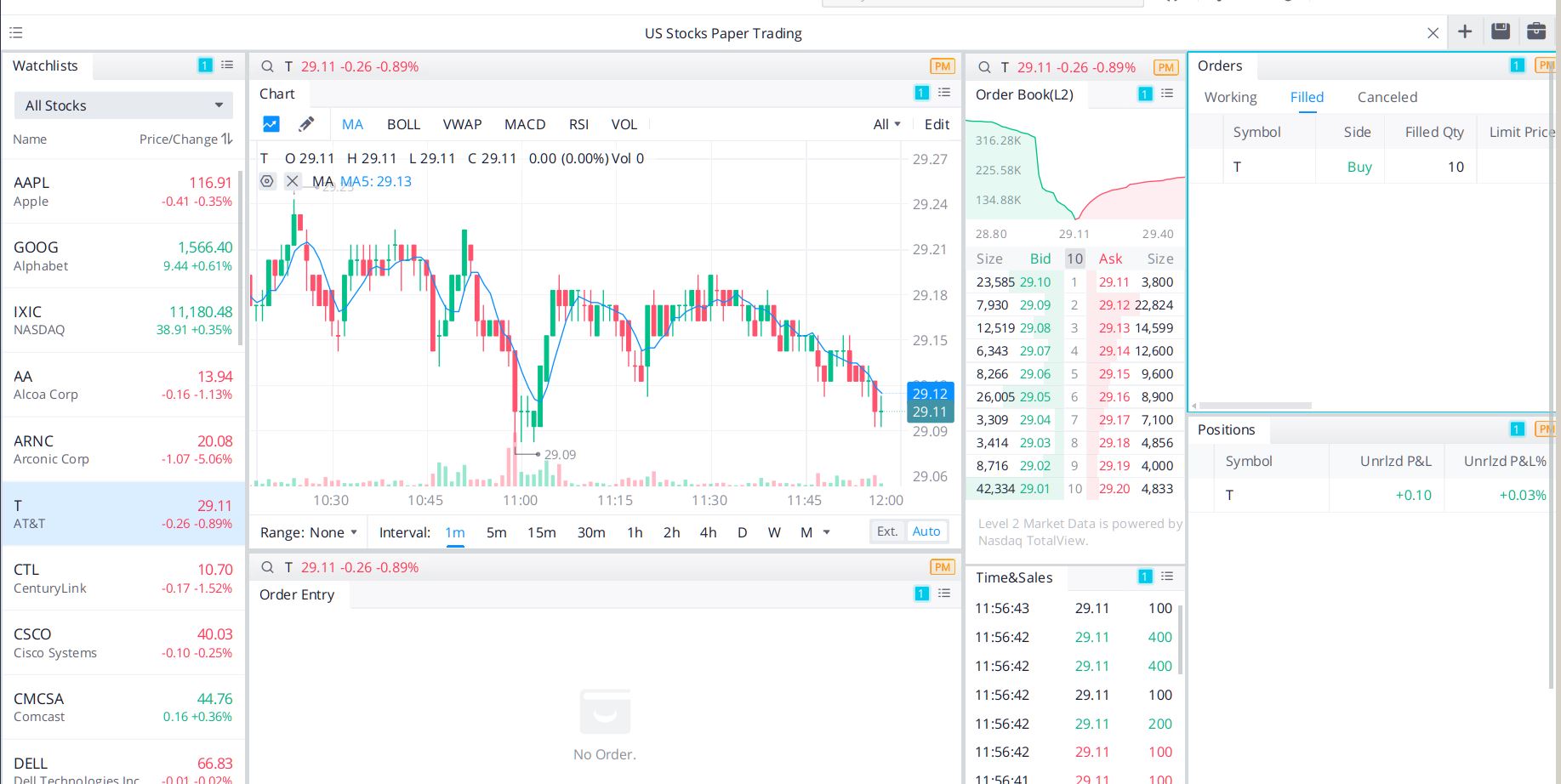
8) "Paper Trading" symbolized by the $ sign is the eighth icon in the list. This is one of Webull 4.0's fun features. It let's you play trade. You can get a hang for the trading tool, here. It will help you find your way around the trading app, which is ultimately what Webull wants you to use the app for primarily. Here is a view of the "Paper Trading" window/page using AT&T (T) stock as the example.
(Click on image to enlarge)

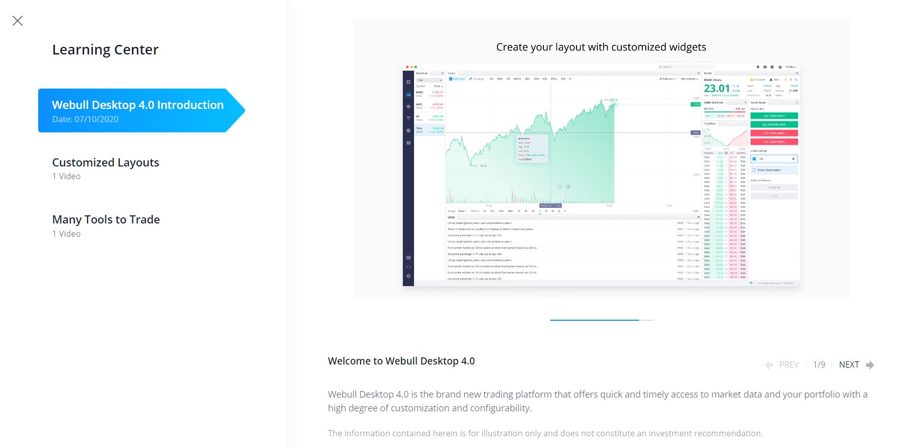
9) The ninth icon is the "Learning Center" icon which is a book, though the learning is done by slide presentations and videos. Here I would like to call Webull out a bit, as I find the educational materials a little thin. So far there is only a nine slide presentation and two short videos, one two minutes long, and the second 1 minute long. Believe me, the Webull 4.0 application is more complex than what can be explained in such short formats.

10) The tenth and penultimate icon is the "Contact Us" icon symbolized by a headset, but ironically the feature is a "create a note" and "submit" feature.
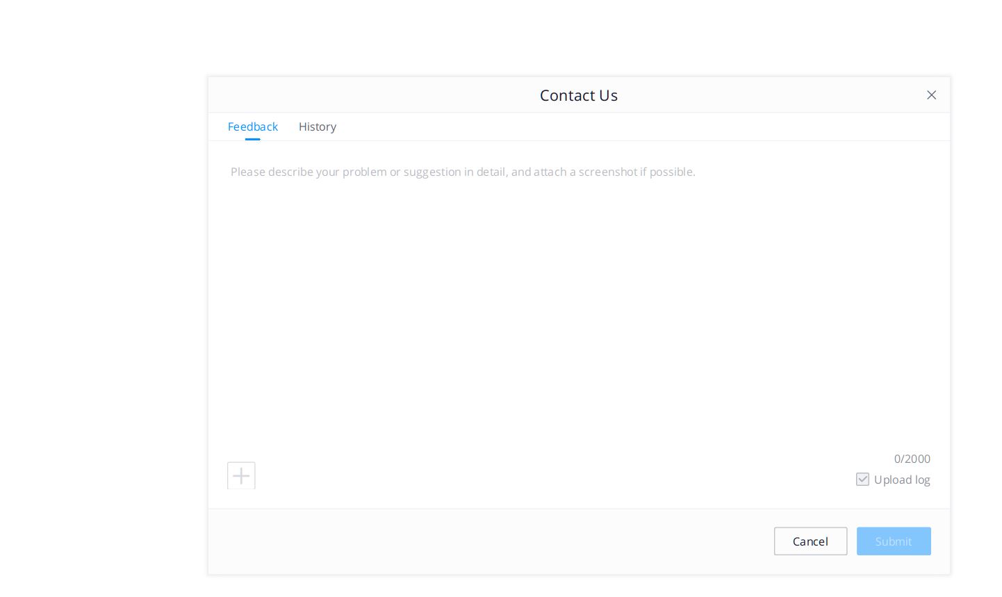
![]()
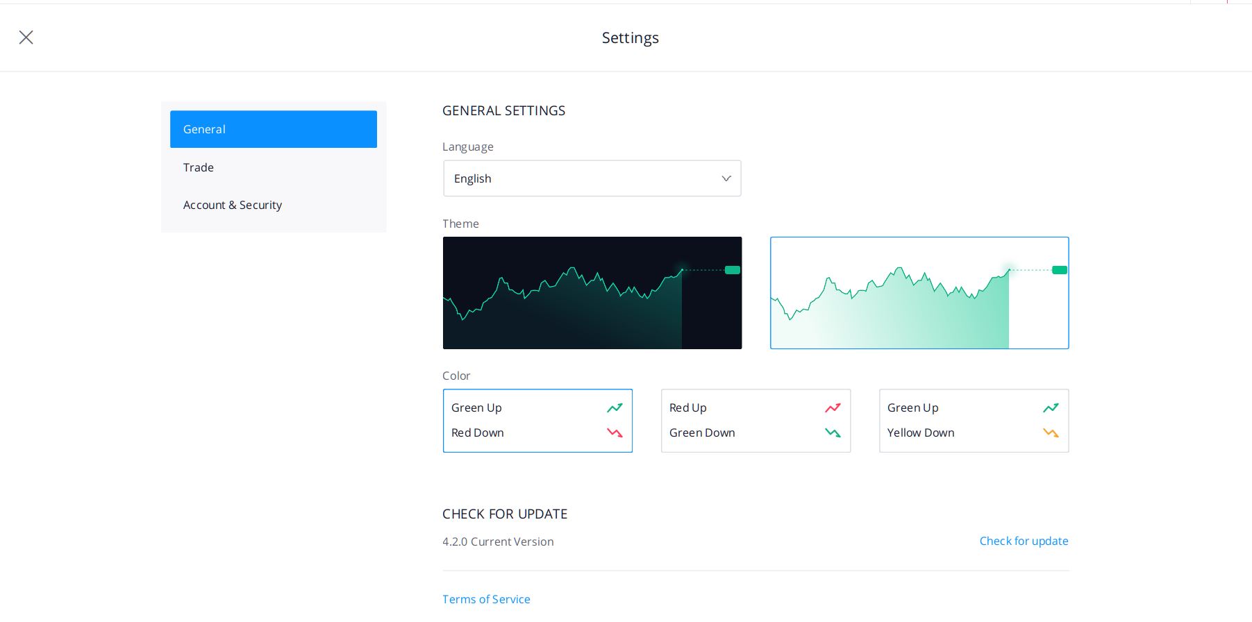
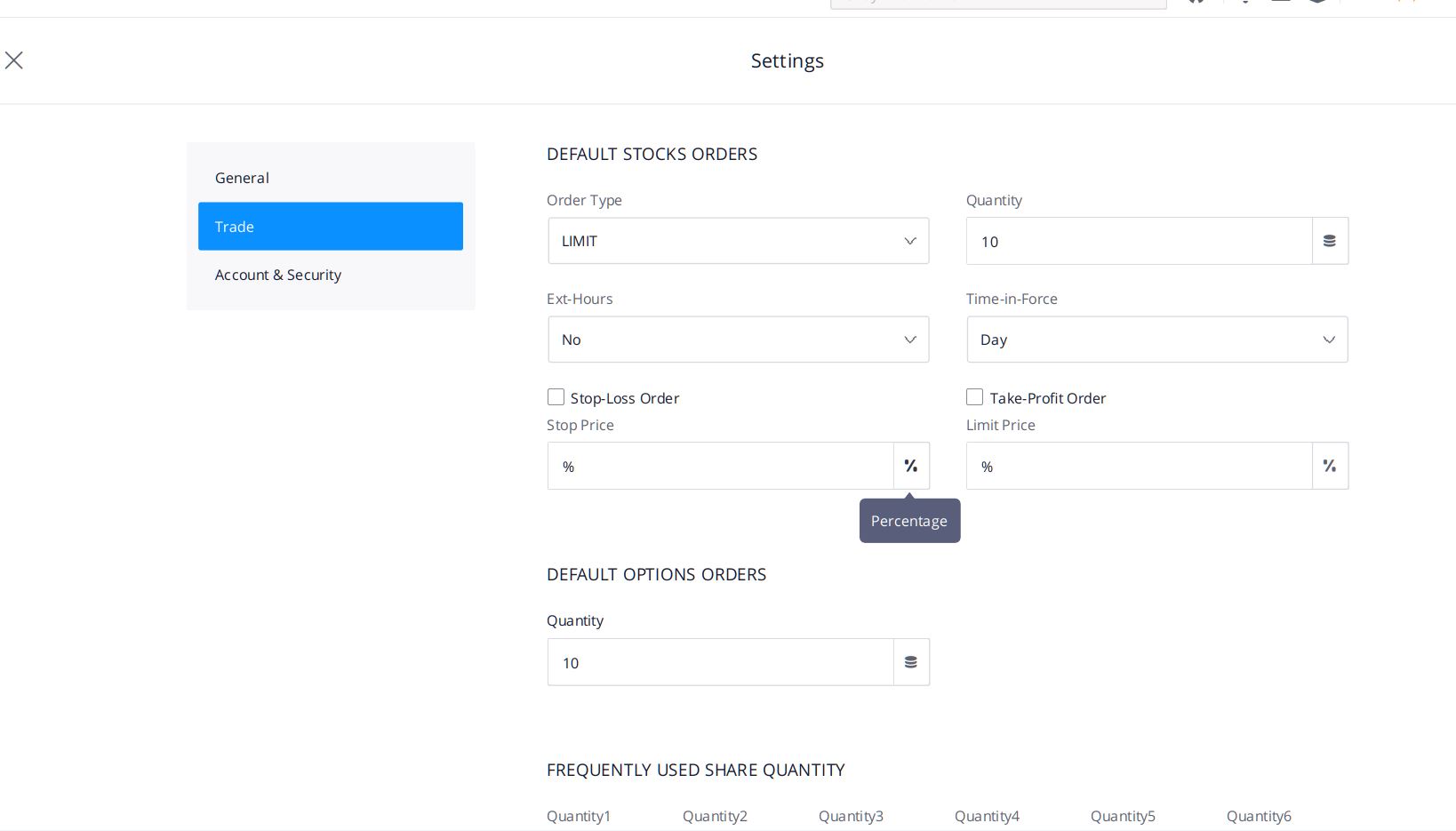
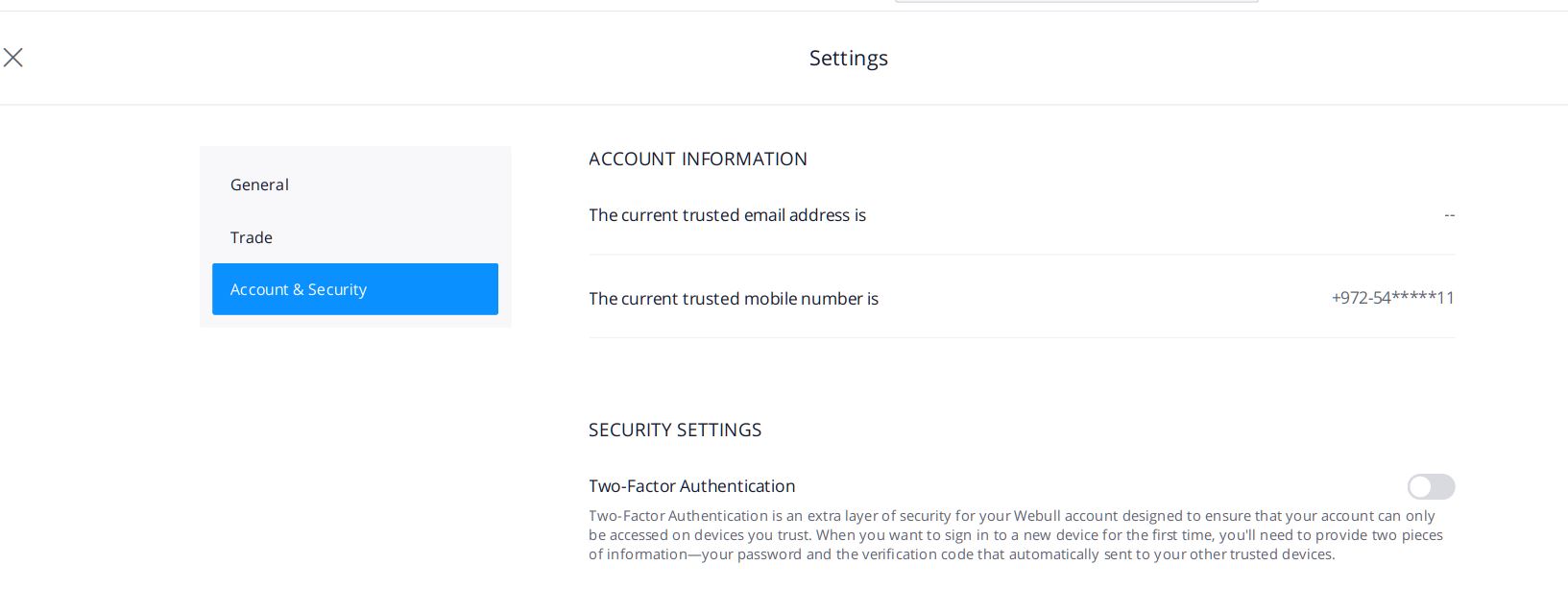
11) The eleventh and last icon is the "Settings" icon which is symbolized by a gear wheel, a symbol most of us have become accustomed to from many other programs and applications. Here the choices are brief, as shown below.
(Click on image to enlarge)
Well folks, this ends our nickel tour of the Webull Desktop 4.0 application. Between this article and the initial Webull review I referenced at the top of this piece, you should be equipped with enough information and interest to take a test drive of Webull 4.0 yourself.
I am sure that a lot of effort has gone into getting this version out, which now includes an "Options" capability which was missing in earlier versions. At the end of my time spent with the application I can say that it is very rich in features but more for application geeks than Jane and Joe investors like myself. It's just not intuitive enough for ol’ folks like myself, though it was impressively fast and responsive. The graphics, while detailed, are neither vivid or
exciting to my taste, and in my opinion, the tools have an "old-fashioned" feel. These days, with so many different programs and apps vying for our attention, I want to spend my time in a Tesla (or a Nikola) and not in an Oldsmobile. But for those looking for a feature rich, fast application, this is worth a closer look.
For those who do want to try out Webull, now is a good time as they currently have a promotion: Get a free stock valued up to $1600 when you open an account. To take advantage of this limited time offer, open an account here.


Will check it out, thanks.
Looks like some great new features.
Will check this out.
Sounds like a big improvement!