The CPI Effect On Stocks
Image Source: Unsplash
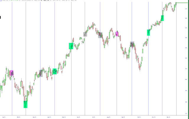
Here is a chart I put together of the SPY with a vertical line denoting each monthly CPI report. This is all thanks to our spiffy Event Markers feature! The green tint indicates reports that led to a generally bullish month, the magenta for bearish, and grey for neither. As you can see, the last two reports simply egged on the bulls. Let’s see what Thursday morning holds, with the market presently at lifetime highs.
More By This Author:
Tesla’s EnnuiThe New Bond
Lifetime Chart of Nvidia
I tilt to the bearish side. Slope of Hope is not, and has never been, a provider of investment advice. So I take absolutely no responsibility for the losses – – or any credit ...
moreComments
Please wait...
Comment posted successfully
No Thumbs up yet!


