Oil Stocks Overvalued

Photo by Timothy Newman on Unsplash
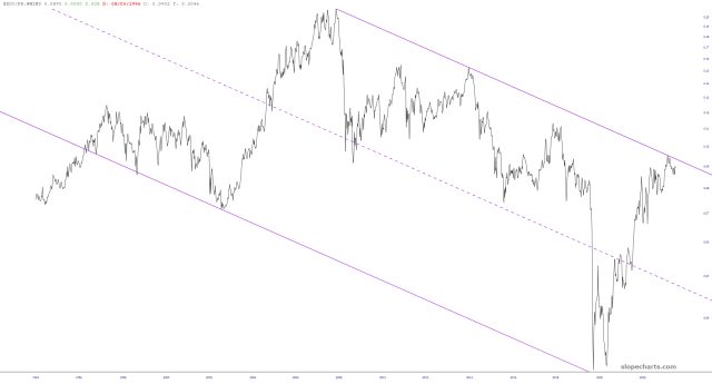
Here’s an interesting chart of the XOI oil index divided by the money supply, illustrating the very consistent pattern of this market over a period of decades. As you can see, we rammed against resistance.
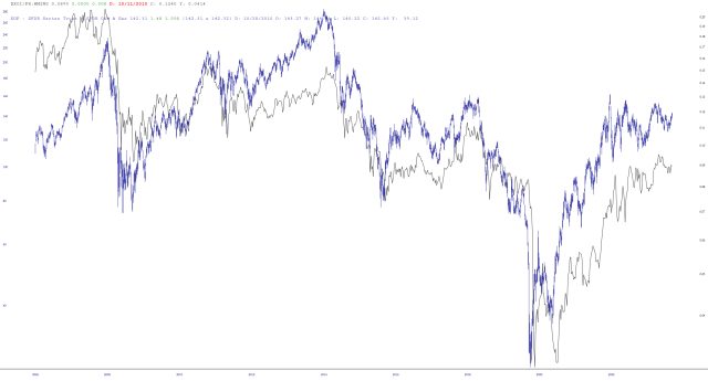
Using the Layered Mode feature, I placed the ETF symbol XOP on top of it, and I’d say the odds of energy stocks being much lower a year from now than they are right now is pretty strong.
More By This Author:
Gold Miner Charts: Mixed Outlook Despite Sector PotentialSunday ETF Review
Crushing Inequalities Of Wealth
I tilt to the bearish side. Slope of Hope is not, and has never been, a provider of investment advice. So I take absolutely no responsibility for the losses – – or any credit ...
moreComments
Please wait...
Comment posted successfully
No Thumbs up yet!


