
Fearsome Breakouts

Image Source: Pexels
For a long time now, I’ve been able to shrug off the bull market based on the fact that the very long-term charts, including ratio charts, were topping out. I’m afraid even these long-term charts are breaking out to the upside. I’m not sure what this means. Maybe 100,000 is on the way for the Dow Industrials, after all.
All World Index Divided by Gold
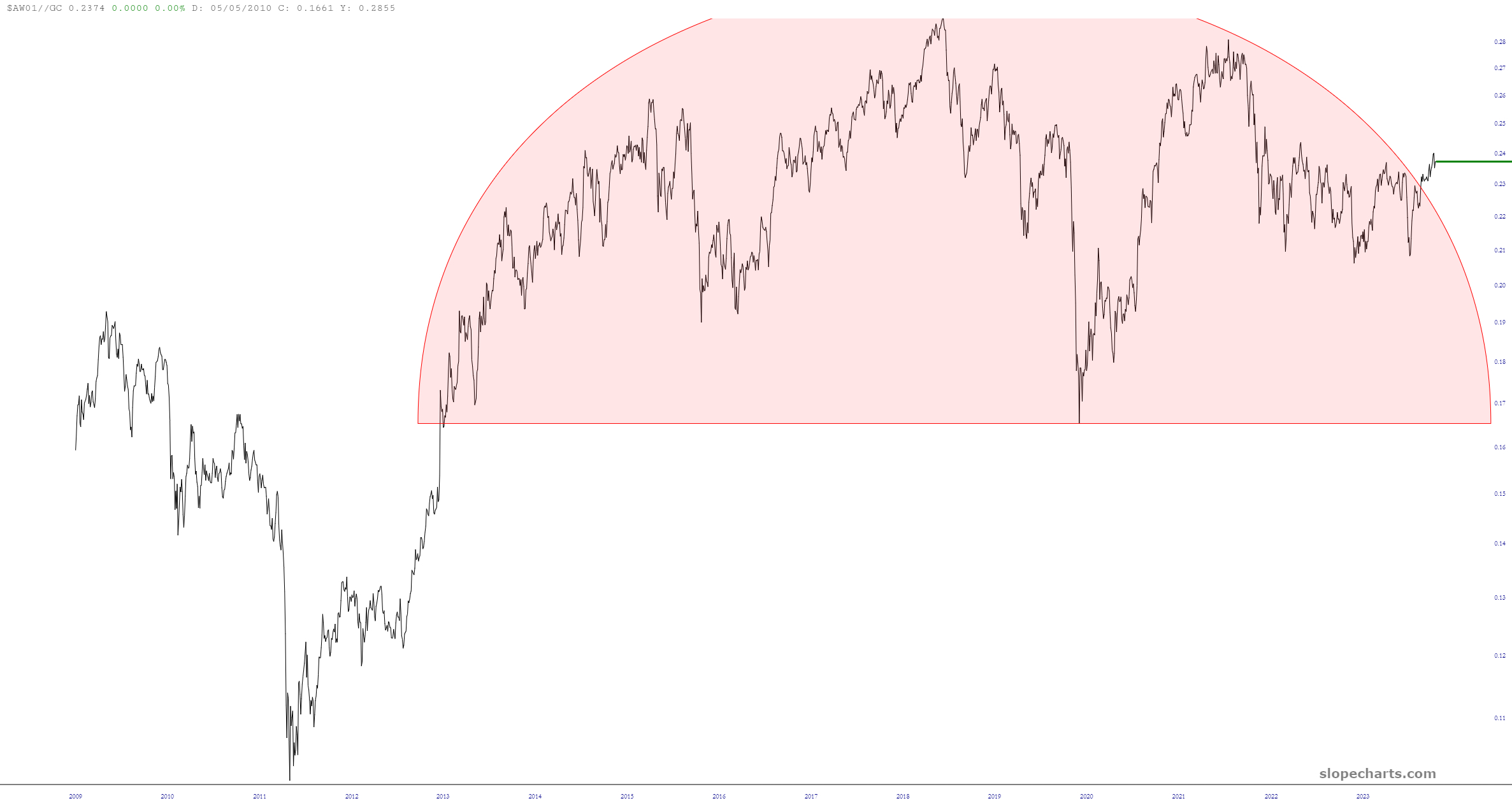
(Click on image to enlarge)
Dow Composite Divided by Money Supply
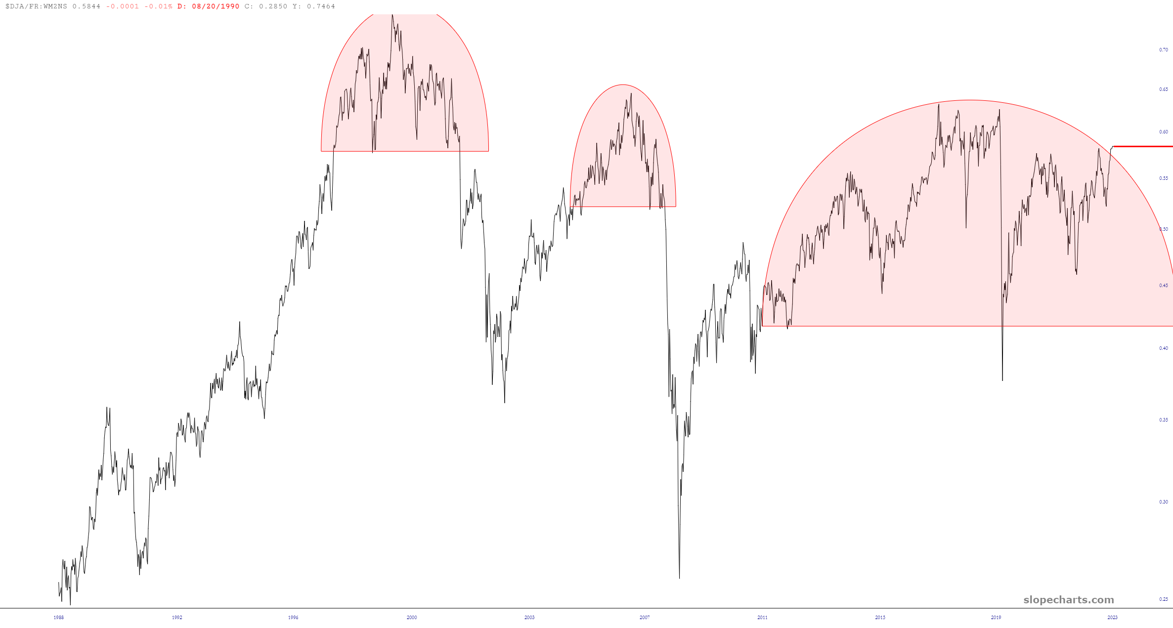
(Click on image to enlarge)
France CAC-40 Futures
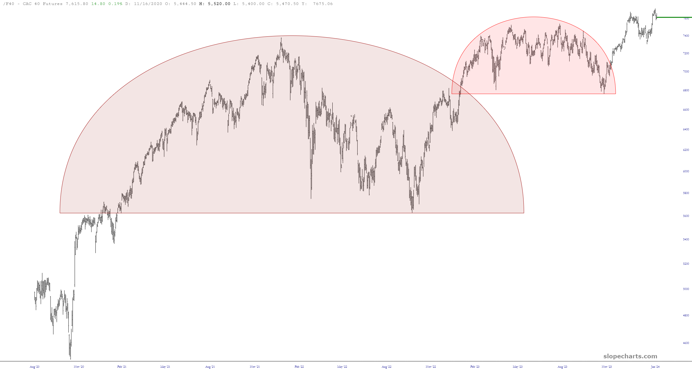
(Click on image to enlarge)
German DAX Futures
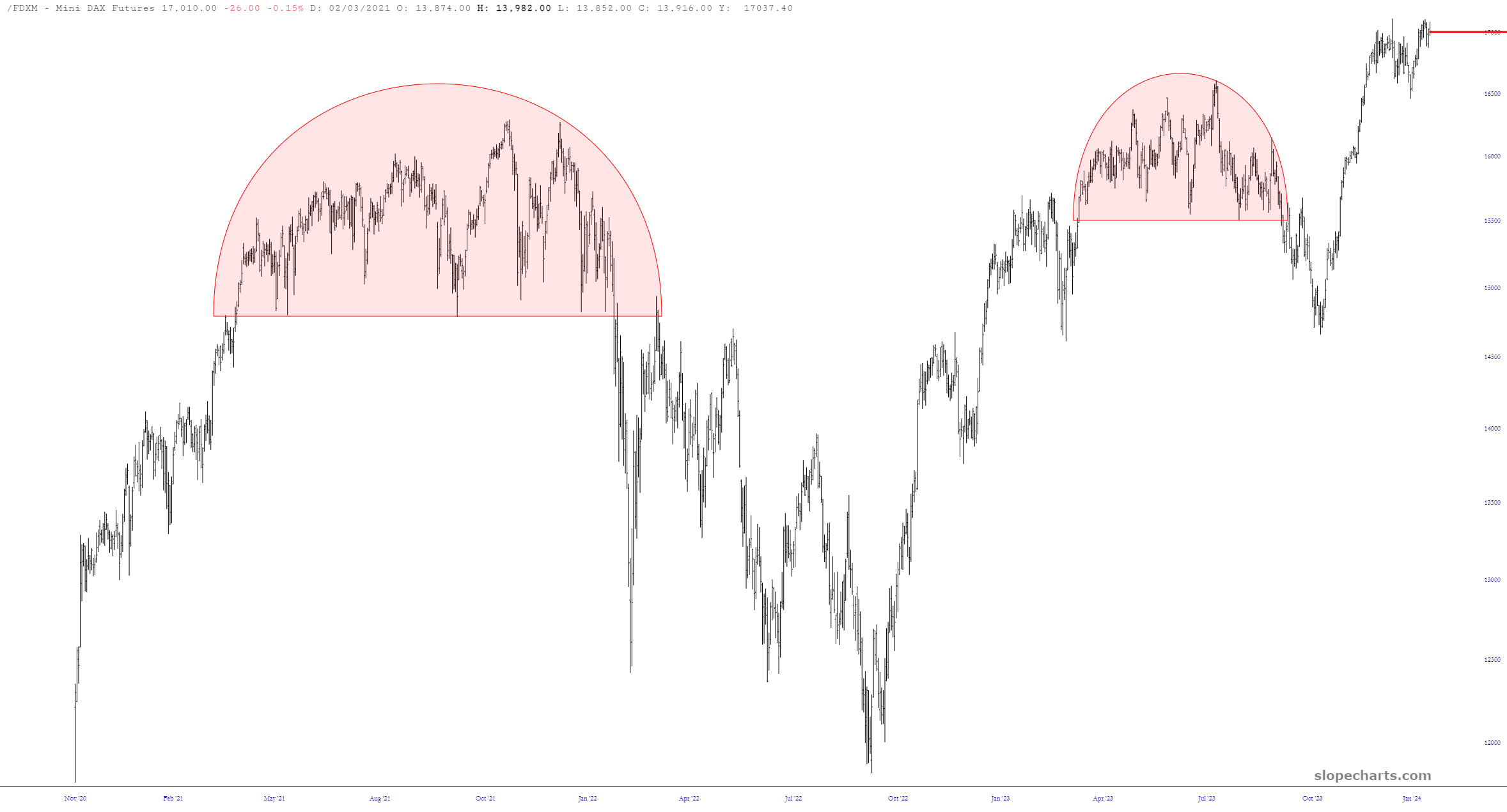
(Click on image to enlarge)
MSCI EAFE Index Futures
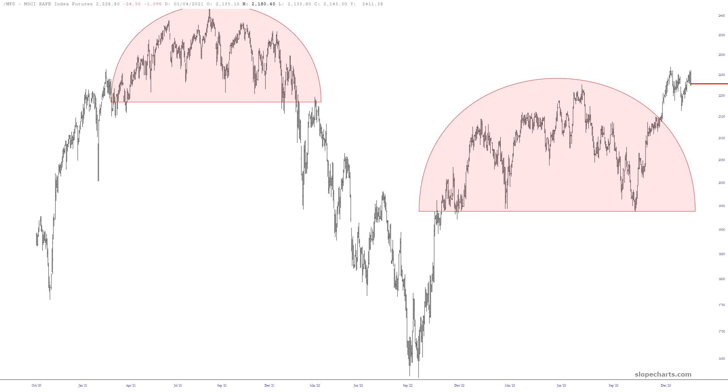
(Click on image to enlarge)
More By This Author:
Sunday ETF Review, Feb. 4, 2024
Elon Musk's Pay Package Struck Down
More Thoughts On Full Self Driving
I tilt to the bearish side. Slope of Hope is not, and has never been, a provider of investment advice. So I take absolutely no responsibility for the losses – – or any credit ...
more

