
A Market Love Story: Heading For A Fall
Image Source: Pexels
The economy moves in cycles, whether they're short, intermediate, or long-term. It’s a form of original thinking to assume that these cycles can be suspended or eliminated. The Federal Reserve and fiscal policy have hypothesized that they can eliminate the business cycle, and we know how that has worked from an inflation and debt perspective. Their policies have led to gold outperforming the S&P 500 over the past thirty years.
Just like economics, there are those that think the market can move higher forever with little to no risk. The fact is, the price also moves in cycles -- and the later in the cycle the market gets, the more risk you’re taking for every $1 of return.
For those that know me, I’m always looking for the next move. In a rally, I’ll be looking for signs of a reversal. Into a sell-off, I’m looking for signs of market strength. My process is to sell into strength and buy into weakness. It’s a difficult road to navigate; always selling into weakness and buying into strength, especially late in cycles.
So, where are we today? Are we late into a cycle or early?
Do you have a systematic approach for gauging when risk is elevated and profits should be taken? Do you have a perspective for when the selling phase is close to being over and it’s time to look for bullish opportunities?
Let me share an approach that has served me very well over the 20 years that I’ve used it, wrote about it, and taught it.
The 90-Day Rubber Band
Let’s start off by taking a look at the S&P 500.
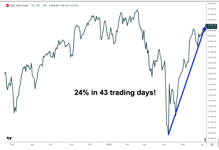
(Click on image to enlarge)
A 24% advance in 43 trading days is nothing to scoff at. However, what are we to imply about the next +20% move?
Find Balance
The issue is that so many traders just extrapolate to upside, put on their rally hats, and block out anything that may indicate any sort of bearish sentiment. You see this a lot on social media.
As I mentioned, I’m always looking for the next move -- and after a rally like this, I’m trying to balance out the downside risks and looking at key indicators of a reversal to take profits and hedge. The idea is to stay long but look for areas to take profits and add hedges for equity allocation. Hedges, like the 'Atomic Hedge,' are an easy way to reduce downside risk in your portfolio. They can also allow you to pick up a lot if the market declines.
3 Keys to Management
These are three key areas of portfolio management:
- Trade management
- Asset allocation
- Market sentiment
Do you only close positions when your trading system tells you to? If so, you may have significant exposure when turning points happen, which they always do.
Does your allocation remain constant in all market conditions? What type of signal would cause you to change your allocation or hedge your risk?
How do you determine sentiment on the market? There are internal and external trends. Always focusing on the external trend to take profits, increase cash levels, and hedge can be a very discouraging approach to investing. You’re going to underperform at some point, so would you rather underperform by being less bullish or realizing significant losses?
The Indicator: Heading for a Fall
Frequently, people will accuse others of being too bearish, or they may say they “missed the move.” What is better? Staying bullish when the market is poised to sell, or trying to adapt and being willing to miss the last gasps of a bullish or bearish move?
Enter the 90-day 'Rubber Band.' This helps identify major reversals in the market. Right now, it’s close to signaling a 5%-10% correction in the S&P 500.
This indicator has been triggered bearishly three times in the past six months: Nov. 29, 2024; Dec. 24, 2024, and Feb. 14, 2025. All of those signals provided great timing for taking profits and applying hedges.
The idea is targeting institutional hedging activities that provides a signal when volatility expectations are peaked. This is where the rubber band comes in. I try to identify when the volatility difference between 30-day volatility (VIX) and 90-day volatility (VIX3M) is stretched. This is accomplished by taking a ratio of VIX3M and the VIX.
In this chart, you’ll see those dates when the ration of the two indices crossed above 1.2. This is a point where VIX3M is 20% higher than the spot 30-day VIX.
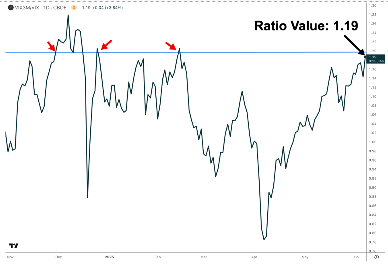
(Click on image to enlarge)
Today, the value is at 1.19. This level is signaling expectations for a significant rise in volatility over the next 30 days. While it’s not above 1.20, it’s close enough to set the stage for taking profits, raising cash, and considering hedging.
Conclusion
Trading isn’t easy, and it’s even harder to trade when you’ve lost confidence. I’m sure that many were questioning themselves during the most recent correction, and it may have taken the past month to regain some of that confidence.
The intent isn’t to take that away, but to add something that may help gain perspective at extremes. This perspective is only designed to reduce your bullish exposure rather than eliminating it. In the future, it may help you look around the corner a little to identify moves before they happen, which is a major premise of my approach to trading the market.
More By This Author:
Speculation Isn’t A Strategy - Unless You Know The RulesBig Bad Bonds Are Back
The Great Tech Reset Continues…


