
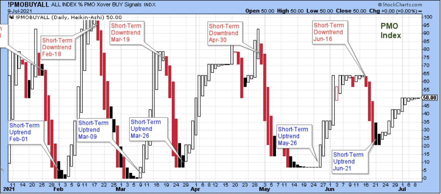
A Different Sort Of Uptrend
The short-term uptrend that started on June 21 continues. The uptrend isn't the sort that we are accustomed to seeing, but it's still an uptrend. What we are used to seeing is all or most stocks move up or down in price together within a broad market trend.
In order to time buys and sells in sync with the broad market trend, we are used to looking for the PMO index to reach all the way up to the top of the range, or all the way down to the bottom of the range, and then raise or deploy cash accordingly.
Starting in mid-March, stock prices have been controlled by the trend in the 10-year yield so that those that benefit from higher yields go up, and those that are hurt by higher yields go down, and vice versa. As a result, stocks are split into two camps and the PMO isn't able to reach the top or bottom of its range, and we don't get the clear market timing signals that we want.
For now, I am going to continue to show my usual charts and formats, but obviously my timing tools need to be adjusted to match the changing market dynamics.
The major indices dipped under their five-day averages on Thursday, but the strong close of the session suggested that on Friday they would pop back above to continue the trend higher. On Friday, they did trade above their five-day averages, and with very strong closes, as well.
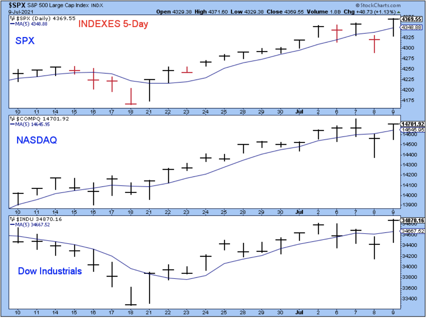
The major indices are on a consistent, relentless march higher despite the endless discussion that you hear and read about. People who simply own a passive mutual fund have done quite well in this market while also spending their time doing more productive things than worrying about every tick up or down (like I have).
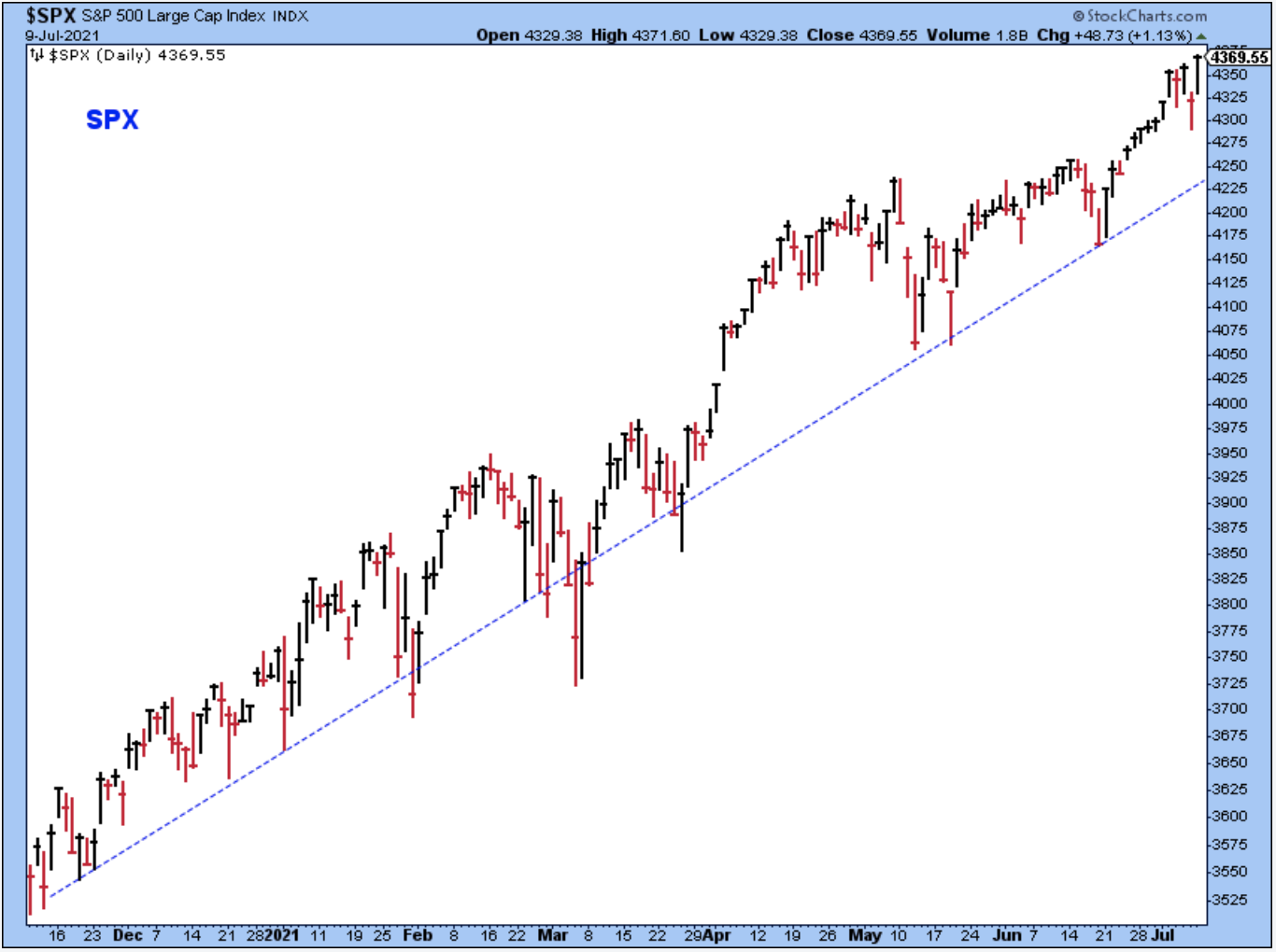
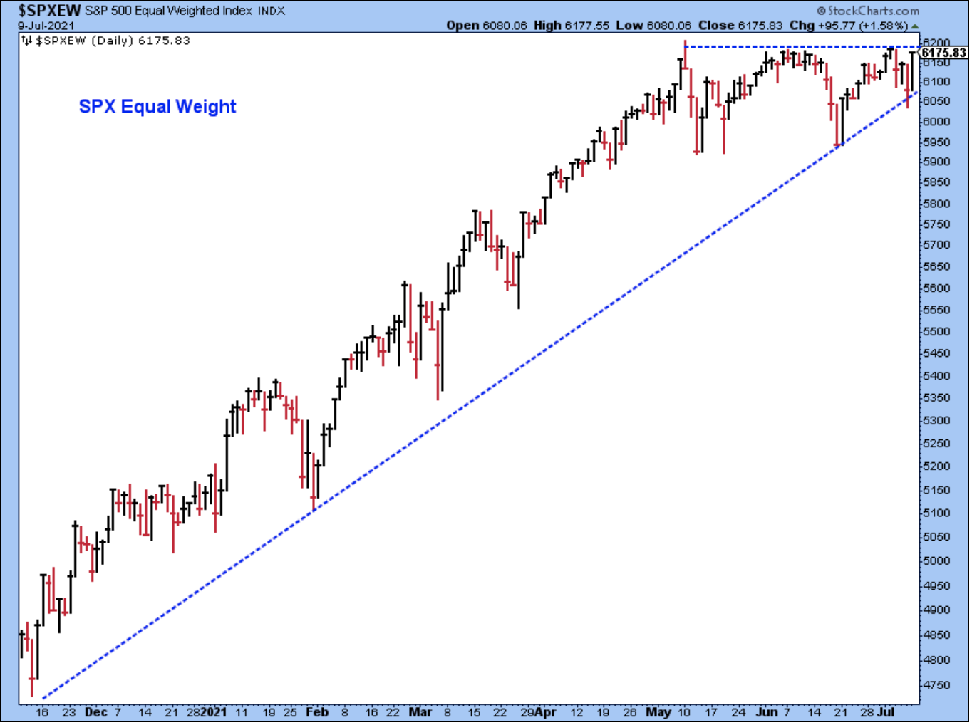
The chart above shows us that the most influential stocks have pushed the cap-weighted market index higher, but the chart below shows that the rest of the stocks are now poised to push the equal-weighted index higher as well. This chart looks very bullish to me.
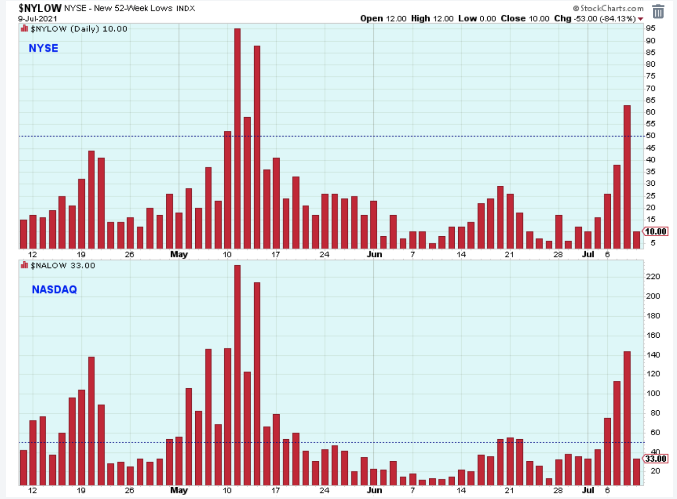
The excessive number of Nasdaq new 52-week lows was the big story for me early in the week. If we were to look, most of the new lows probably came from smaller stocks like regional banks that were being pushed lower by the sharp decline in the 10-year yield.
This chart showed me that something negative was brewing in the market under the surface. These new lows led up to the selling on Thursday, but it looks now as though the selling is done because of the strong market snap back and the decline of new lows to harmless levels. In addition, the 10-year yield looks as though it put in at least a short-term low.
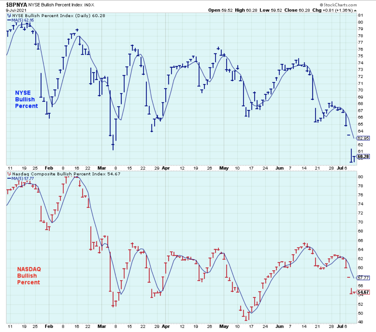
Below is a six-month look at the bullish percents of the major exchanges. Both indicators have the droopy look of lower lows and lower highs that shows less and less participation in the bull market that was at its peak in January. It's hard to reconcile this chart of the bullish percents with the strength in the chart of the SPX, but we have all seen this so many times before -- where the SPX pushes higher while broad-market participation declines.
In the past, I have shown this as a warning for the market, but in many of those cases, the indices didn't turn lower, and instead, participation began to improve and the SPX continued to climb. So, I think you have to take other factors into the analysis before turning too negative.
At the moment, this chart doesn't discourage my shorter-term trading, but it does tell me that longer-term purchases need to be managed more carefully, particularly if the stock is in an early cycle industry. I think that is the key; the focus in a longer-term account should be on stocks in mid- and late-cycle industries.
What is certain is that each of the short-cycle declines in the bullish percents shown in this six-month chart have been good short-term buying opportunities. So, even though the indices are at all-time new highs, the current low in the indicators presents another short-term buying opportunity.
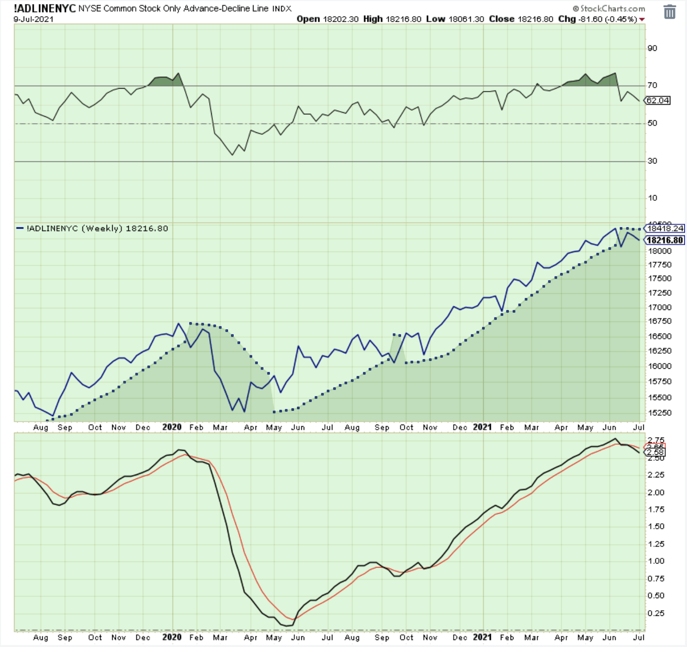
Below is another look at stock market participation. The weekly chart of the cumulative advance/declines looks like it peaked out on the NYSE. Nothing says that the trend in this chart can't reverse higher, as I mentioned above when looking at the chart of the bullish percents.
However, it does indicate that the bull market has matured and that different industries will probably start to lead. Also, as the bull market matures, there is also a greater risk of cyclical pullbacks in price, so we may start to see the classic 10% corrections.
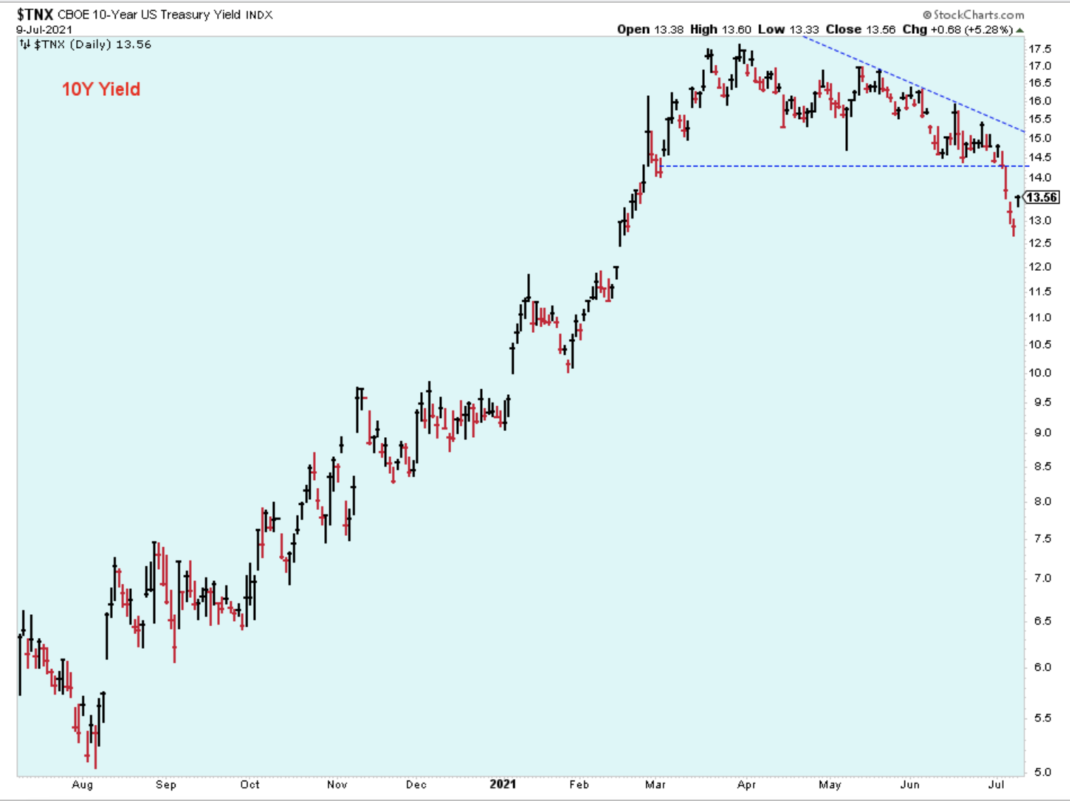
Switching the focus to yields, this chart shows the 10-year yield breakdown that caused the big swing in stock prices late in the week. The downtrend is intact but a low has been established in the short-term. A lot of people are speculating that this is a major low and now the 10-year yield will climb higher longer-term.
I won't argue with that except to say that as a technician, instead of speculating, I will wait for yields to tell me that their trend has changed. I'll also be watching the industries that benefit from higher yields. If they start to outperform, then we'll have a better understanding of where the 10-year yield is headed.
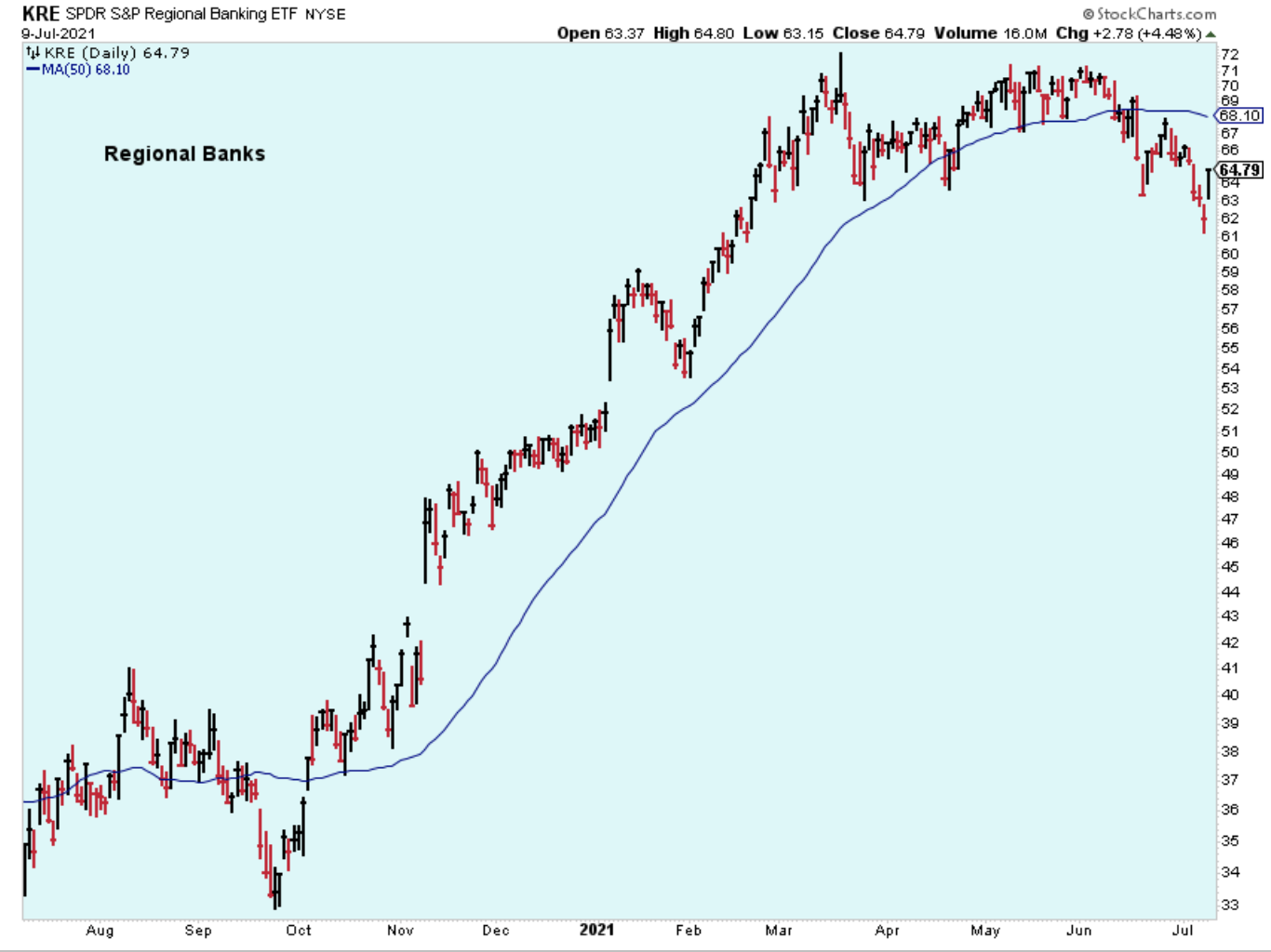
Here is a look at the regional banks, which is an industry that benefits from higher longer-term yields. Currently, it is trapped under the 50-day, and prices are pointed lower, but the decline isn't too bad yet, and this could be a base that is forming in which last week's low was a final shake-out. This is a good chart to watch.
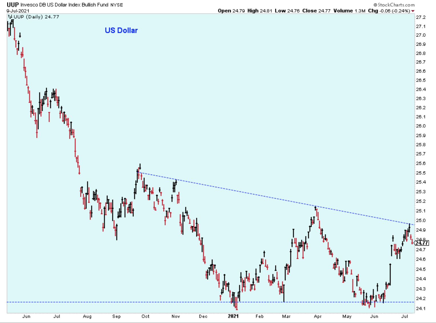
In my experience, oil prices are the key to understanding where we are in a bull market cycle. In the past, it is usually an unacceptable rise in oil prices that forces the Federal Reverse to raise short-term rates, and rising rates are what eventually kills the bull market. And oil prices are heavily influenced by the direction of the US dollar.
This chart tells me that the longer-term trend is lower but that there is currently substantial multi-month sideways consolidation. I'm going to assume that the trend will eventually continue lower unless there is a signal that the trend is changing, such as a break above this downtrend line.
So, if the dollar heads lower, then we assume oil prices will head higher and we know then that there is added pressure on the Fed to raise rates -- despite any public comments that they make.
Bottom Line
In the short-term, I'm optimistic about higher prices, but my market timing toolbox is missing the important signals from the PMO indicator. In the medium-term, I'm also optimistic because the major indices just keep marching higher. However, the signals of weakening market participation say to be prepared for the possibility of a 10% correction, so I'm ready to play defense if needed.
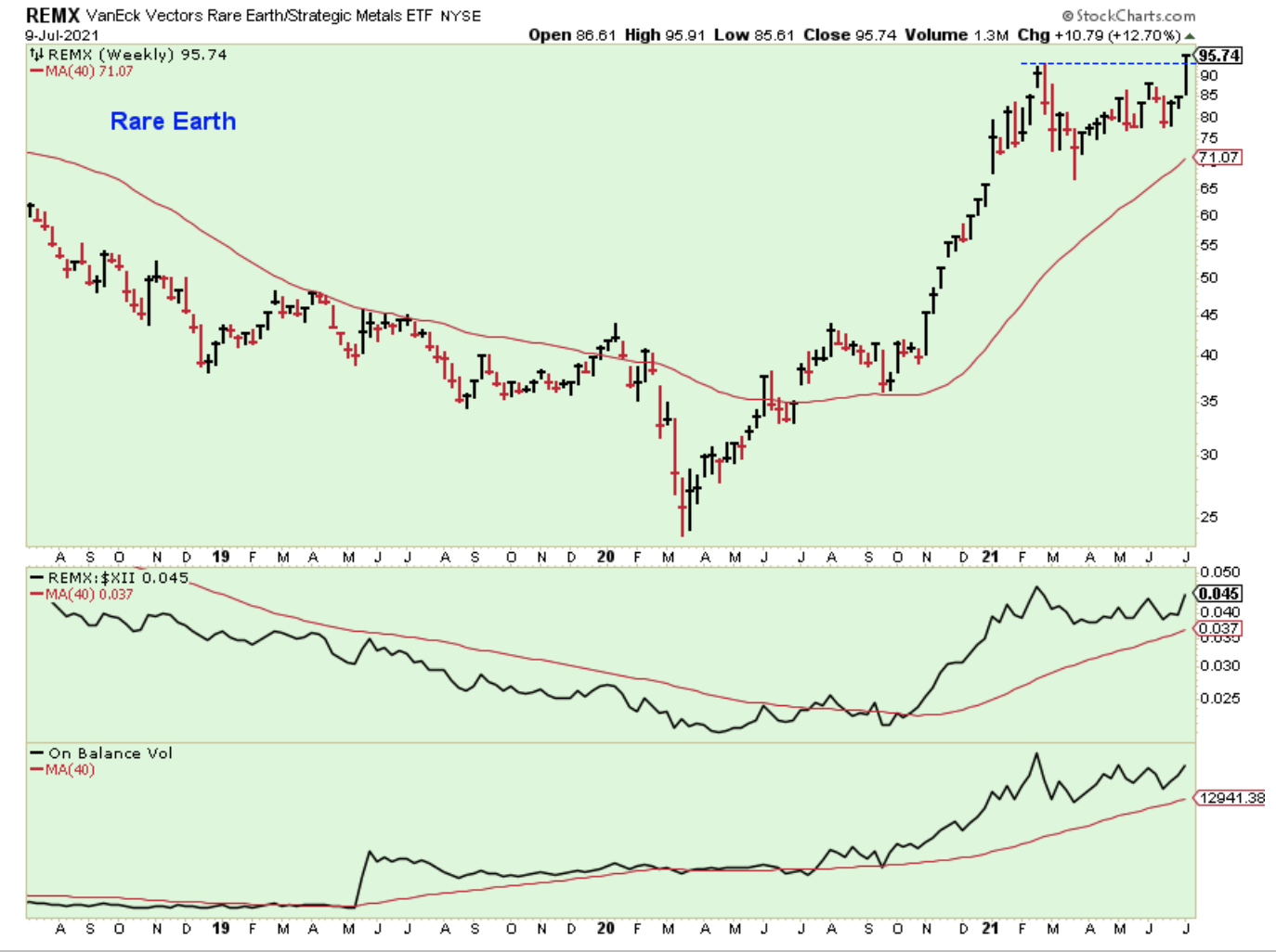
Here is a nice chart of a mid-cycle industry. You have to like the looks of this ETF.
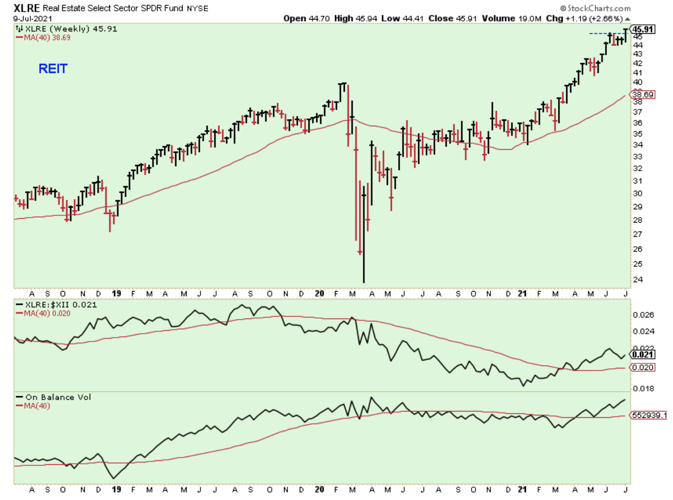
Here is another good-looking ETF hitting new highs. The relative strength isn't as good, but this looks like an ETF that plans to embark on a steady climb higher for a while.
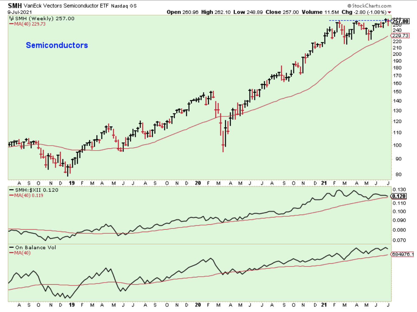
Semiconductors have been basing for most of this year. The chart looks promising.
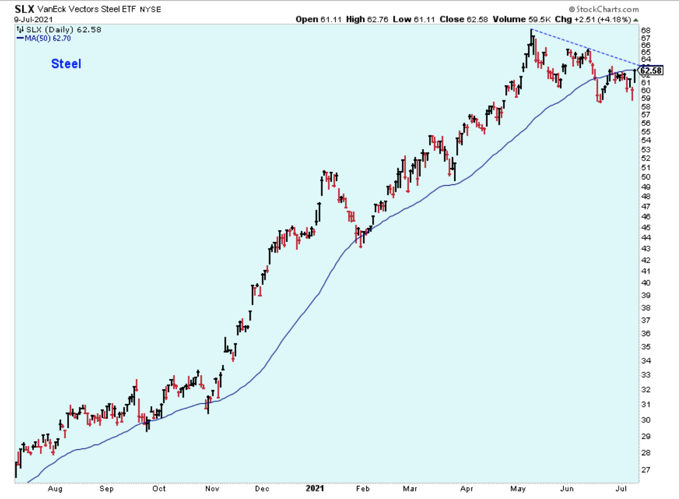
Steel stocks might be ready to make a comeback after consolidating. I'm waiting for the breakout. The recent price action looks like a double bottom where the second leg is a retest of the earlier low with a very strong spring back to the upside. Looking bullish to me.
Outlook Summary
- The short-term trend is up for stock prices as of June 21.
- Contrarian sentiment is unfavorable for stock prices as of Nov. 14.
- The economy is in expansion as of Sept. 19.
- The medium-term trend is up for treasury bond prices as of June 11 (prices higher, rates lower).
Disclaimer: I am not a registered investment adviser. My comments reflect my view of the market, and what I am doing with my accounts. The analysis is not a recommendation to buy, sell, ...
more

