Visualizing GDP, With And Without Government
Not long ago, we received an interesting request from one of our longtime readers:
Could you do an article and specifically a graphic that would show what the US economy would look like in GDP terms without the Federal, State and Local governments? Say from 1970 to present? It would be informative to see the GDP growth less government spending.
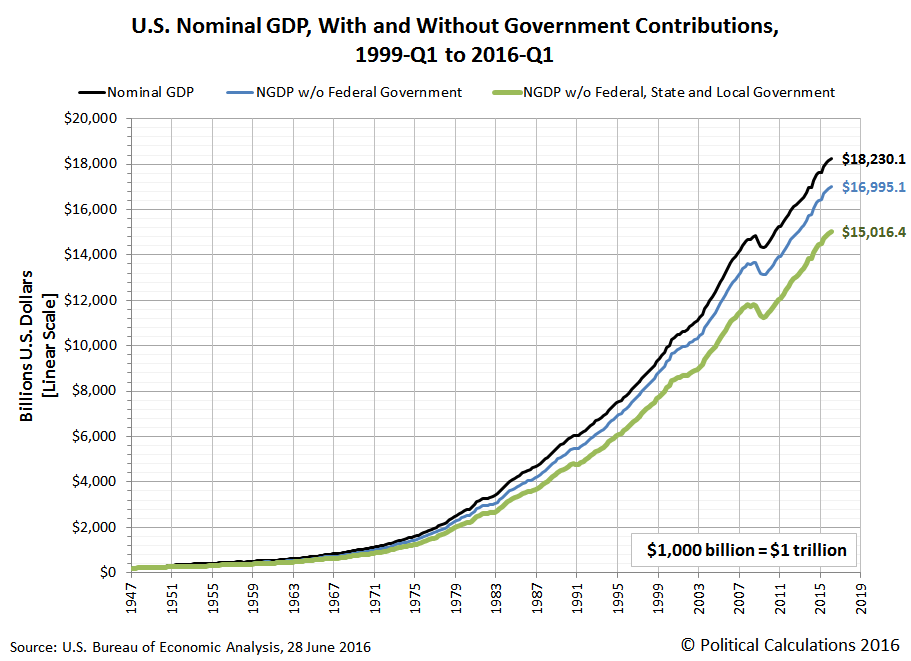
We'll go a step further, because the U.S. Bureau of Economic Analysis makes most of this data available on a quarterly basis going back to 1947. In our first chart below, we'll track the evolution of nominal GDP from 1947-Q1 through 2016-Q1, in which we can extract both the contributions of the federal government and also of state and local governments.

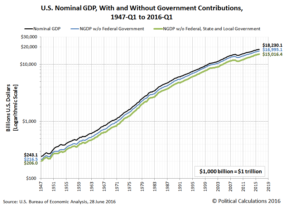
Because the U.S.' Gross Domestic Product has typically grown at exponential rates over time, we'll also visually present this same nominal data on a logarithmic scale, which indicates equal amounts of percentage change, as opposed to the more common linear scale, which indicates equal units of numerical change.

The two charts above represent the nominal GDP for the U.S., which is to say the Gross Domestic Product that was measured in the terms of the actual prices in U.S. dollars that people and businesses actually paid for goods and services in the periods where the data was recorded.
But whenever we present nominal data like this, we also invariably get requests to adjust the values to account for the effects of inflation over time.
That can be problematic because there is more than one kind of inflation measure. Should we use the GDP deflator?
And once we do select the type of inflation to adjust for, we still need to select which year's U.S. dollars to reference all the calculations to. Should we use 2016? How about 2000? Or perhaps the bicentennial year of 1976? Maybe we should go back to the beginning of the quarterly GDP data series and use 1947? It seems that no matter which time period we might select, it will invariably be out of date, or soon will be, especially for people who are always most familiar with buying and selling things priced in terms of current day nominal U.S. dollars!
If these considerations sound somewhat complicated, it is because selecting an appropriate measure of inflation for which to adjust nominal price data can be challenging, where you can get quite different results from using different measures. As economic historians, these considerations are why we strongly recommend that regardless of which inflation measure you might choose to adjust nominal data, it is essential to *always* reference nominal data sources because they are not subject to what may be arbitrary choices on the part of the analyst doing the calculations.
Nominal price data has the singular benefit of never changing while also representing the documented costs that real people participating in the economy at the time in a given period of interest would have paid, and as such, will be the only form of such price data that can be confirmed or validated using contemporary accounts and other historic references, which is essential for appreciating the true context in which their participation in the economy occurred. Believe it or not, there are economics professors at major universities who don't themselves have a firm grasp of these kinds of considerations, but whose students have never-the-less benefited from their having incorporated our comments on this specific topic into their presentations.
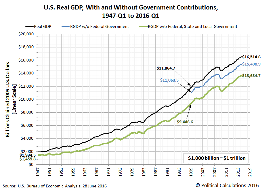
In this case, we'll default our presentation to match the choice of the data jocks at the U.S. Bureau of Economic Analysis, who are using the GDP implicit price deflator as expressed in terms of chained 2009 U.S. dollars. If you'd like to see this data presented to be adjusted to be in terms of some other inflation measure, we've linked to the source of the nominal data below, and you should find the math of doing the inflation adjustment yourself to be super easy, even if the choice of which inflation measure to use may not be quite so simple. Our chart showing the Real GDP of the U.S. economy, with and without the contribution of the U.S. government as well as state and local governments, on a linear scale is below.

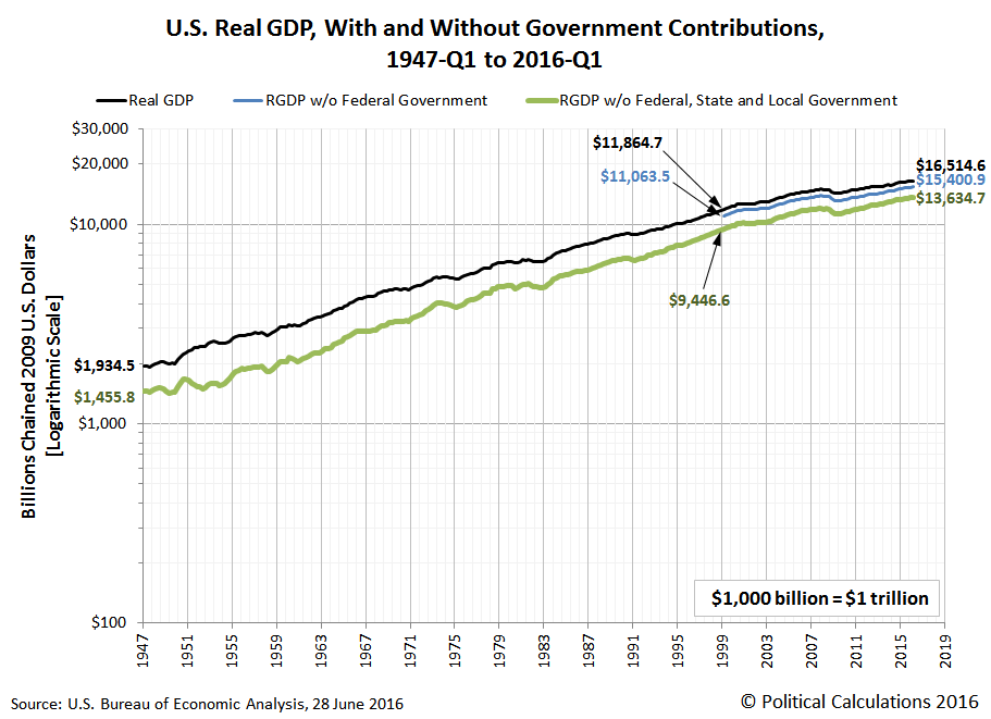
In the chart above, since the BEA only provides detailed Real GDP data on the contributions of the U.S. Federal Government and State & Local Governments back to 1999-Q1, we only show their individual contributions back to that quarter. The BEA does however provide data on the combined contribution of all governments in the U.S. back to 1947-Q1, so we can get a good idea of the private sector's GDP output back to that time.
We'll wrap up this post with the same inflation-adjusted data presented on a logarithmic scale.

In the course of putting these charts together, we did find something else interesting in the data, which we'll follow up with in the very near future!
Disclosure: None.


Nice article, this really puts in perspective the amount of taxes we pay and the benefit of those taxes for society as a whole.
Agreed Mo, gives me one more reason why I don't want to pay taxes!