
It’s not often I hear a claim the BLS is overstating inflation, but it comes from two people I respect, so let’s investigate.
(Click on image to enlarge)

Cleveland Fed New Tenant Rent Index NTR with upper and lower bound 95% confidence intervals, CPI rent of primary residence, and OER. Chart by Mish
I created the above chart from a Cleveland Fed data download of quarterly data and compared it to end of quarter data from the CPI (March, June, September, and December).
Rent is the CPI rent of primary residence and OER is Owners’ Equivalent Rent discussed below.
Cleveland Fed Synopsis
Rent measurement determines 32 percent of the CPI. Accurate rent measurement is therefore essential for accurate inflation measurement, but the CPI rent index often differs from alternative measures of rent inflation. Using repeat-rent inflation measures created from CPI microdata, we show that this discrepancy is largely explained by differences in rent growth for new tenants relative to all tenants. New-tenant rent inflation provides information about future all-tenant rent inflation, but the use of new-tenant rents is contraindicated in a cost-of-living index such as the CPI. Nevertheless, policymakers should integrate new-tenant inflation into inflation forecasts and monetary policy decisions.
Owners’ Equivalent Rent
OER stands for Owners’ Equivalent Rent. It is the price one would pay to rent one’s own house from oneself, unfurnished without utilities.
It is the single largest component of the CPI with a current weight 25.7 percent. Rent of primary residence has a weight of 7.6 percent.
Rent and OER track together in my lead chart as they should. They are both measures of rent.
Contrary to popular belief, OER is based on measured prices not by the question “If someone were to rent your home today, how much do you think it would rent for monthly, unfurnished and without utilities?”
Rather, that ridiculous question is used to help set weights, not set measured rent (see previous link).
Whether or not OER should be in the CPI is subject to debate.
I think actual home prices should be in the CPI. But home prices are not in the CPI because they are considered a capital expense.
My counter point is “So what? Inflation matters, not just consumer inflation.” The Fed has messed up multiple time with a myopic spotlight on “consumer inflation” instead of inflation and home prices are definitely part of the inflation picture.
With that background out of the way, let’s investigate the claim the Fed is overstating rent.
Professor Plum
Danielle DiMartino Booth
It is a bit premature to declare inflation is transitory, especially without a definition, but let’s postpone that idea for a bit and focus on rent.
The “New Tenant Repeat Index” name inaccurately mergers two ideas, a repeat index and a New Tenant Rent Index (NTR). The above chart shows the NTR, not repeats.
Let’s strip out OER to simply the discussion. OER closely tracks rent anyway, as it should, and as shown in the lead chart.
New Tenant Rent Index vs Rent of Primary Residence
(Click on image to enlarge)

Notice the enormous confidence interval for NTR, currently -0.73 to +6.20. The Cleveland Fed does not have much confidence in its own assessment this quarter and neither do I (reason explained below).
But the key point is that it is a huge mistake to think that new leases represent a better measure than rent of primary residence.
We need to compare CPI rent to existing leases because renewals make up the bulk of rentals.
Cleveland Fed All Tenant Repeat Rent Index
(Click on image to enlarge)

Unfortunately, ATRR data is only through the first quarter, that I can find.
Nonetheless, the chart pretty much smashes the idea that the BLS is wildly off and that 2.74 is the actual year-over-year market price.
Secondly, please note that CPI rent tracks above ATRR from 2017 through 2020. And CPI rent should track higher because CPI measure consists of new and existing leases.
If new leases are hotter than renewals, it would be logical for the CPI to be above ATRR.
I cannot explain why ATRR is ahead of Rent in 2021 and part of 2022, but one possibility is the BLS understated rent, not overstated it, for about a year.
What About Lags?
(Click on image to enlarge)
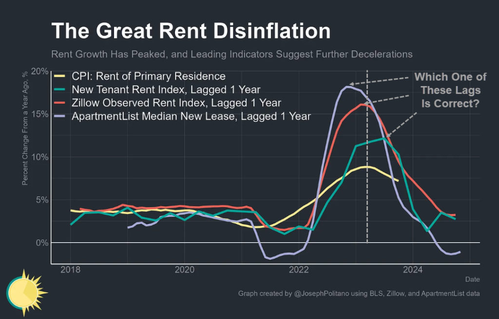
Chart by Joseph Politano, dashed lines and question in grey added by Mish.
Most analysts tend to think there is a lag of about a year on rent prices. This makes a bit of sense since in month 1 of a new lease the CPI only picks up 1/12 of it as leases roll over.
However, leases are not evenly distributed. Most leases are in the months of May through September as High School graduates leave for jobs of school.
For multiple reasons, conventional wisdom on lag times is suspect. The above annotated chart shows huge differences in estimated lags. And to top it off, ATRR disagrees with all of them. It’s about 6 months as shown by my chart.
The median new lease is not a great measure because it does not even consider the number of rooms. They have alternate measures which are based on a Case-Shiller type methodology that will yield yet another measure of lags. And Apartment List does not seasonally-adjust its data making a mockery of the whole thing.
If you have a favorite lag period, you can find supporting evidence no matter what it is.
What About Methodology and “Actual” Prices?
Please consider this snip by Politano, the source of the above chart, from his report The Most Important Inflation Indicator Shows More Cooling Ahead
The Bureau of Labor Statistics’ (BLS) measures of shelter inflation are based on contract rents (that is, what existing renters are paying today) which gives them the most accurate possible picture of households’ real expenses.
Getting an accurate picture of the current drivers of rental inflation requires a different way of analyzing the data. That is where one of the most important new inflation indicators comes in—the New Tenant Rent Index (NTR, formerly the New Tenant Repeat Rent Index) created by BLS & Cleveland Fed.
Plus, it’s worth remembering that the most recent NTR data comes with significantly higher uncertainty bands due to the index’s methodological limitations. The two most recent quarters of data have much smaller sample sizes since the CPI’s housing survey measures the rental prices for units only once every six months, meaning a unit could get a new tenant in January but would not be surveyed and added to the sample until May. This makes readings for the most recent quarter subject to significant possible change—the initial NTR print for Q1 2023 suggested zero year-on-year price growth, but was revised upward as new data came in over the subsequent two quarters.
Inflation revised higher? Gee, who couldda thunk?
Actual Prices vs Actual Prices
I’ve written about the measure twice before, but to recap, they use the same underlying microdata as the official CPI shelter measures to look only at price developments among the subset of housing units where new tenants have signed leases, giving a much better read on where the housing market is now and where official CPI housing inflation is headed
Questions of the Day
Booth: “On market-based metrics (you know, ACTUAL PRICES) we’ve averaged 2% for all of 23. Note that even the Fed’s ‘market-based’ metrics are corrupted as they include Owner’s Equivalent Rent for shelter”.
Which one is actual, the BLS methodology or the Cleveland Fed methodology based on the same BLS methodology but more subject to wild sampling errors and revisions?
And which lag time is real?
Summation
New leases are a poor measure by which to judge overall trends in the price of rent.
The repeat lease index closely tracks BLS rent of primary residence and OER, which it should, because the methodologies are the same.
The difference between BLS rent and the Cleveland Fed repeat index likely reflects nothing more than new leases being in the BLS measure but not the repeat index. The implication is BLS imputations have at most a tiny impact on measures of rent. And even if they do, the Cleveland Fed and the BLS methodology is reportedly the same.
Assuming new leases have been running hot, a case can be made the BLS and/or Cleveland Fed understated rents for a period of time.
Regarding the sudden drop of the ATRR in the first quarter of 2023: The repeat rent data is six months stale and the sudden drop could be an outlier or sampling error.
As noted by Politano, “The two most recent quarters of data have much smaller sample sizes.”
CPI Rent
Rent of primary residence, the cost that best equates to the rent people pay, jumped 0.5 another percent in October.
(Click on image to enlarge)
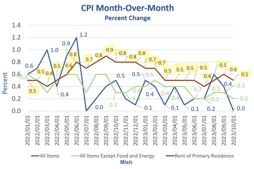
CPI month-over-month data from the BLS, chart by Mish
People keep telling me rent is falling, I keep saying it isn’t (and the data proves it).
Rent of primary residence has gone up at least 0.4 percent for 27 consecutive months although the widely believed lag is 12 months!
For discussion, please see Falling Rent is Extremely Rare, Yet Economists Keep Expecting That
Booth and Professor Plum may be accurate about what’s ahead.
I am not knocking their viewpoints specifically because they could easily be right. Rather, I question the reasons they use to support their views.
They may be correct, but not because the BLS methodology is inaccurate vs the Cleveland Fed, not because of new tenant lease lags, and not because of theories about units under construction as widely believed and discussed below.
What About Housing Units Under Construction?
(Click on image to enlarge)

Housing units from Census Department, Rent CPI from BLS, chart By Mish
A widely-believed theory is that rents will come crashing down as soon as that massive block of housing units is completed.
I saw that theory so many times that I almost started believing it myself.
However, the data shows no discernable correlation no matter how you shift the lead or lag times.
The chart looks totally random. So, perhaps rents abate. Perhaps not. The data itself provides no reason to believe anything.
Meanwhile, please note year-over-year rent has a floor of about 2 percent except in the Great Recession housing crash. The average appears to be above 3 percent.
But if rent does drop, expect to hear “See, I told you so.”
Inflation Supporting Points
- The tail winds of global wage arbitrage and just-in-time manufacturing have reversed to head winds of onshoring and just-in-case manufacturing.
- Neither party will fix deficits and out of control spending.
- Trump’s tariffs and sanctions were hugely inflationary but Biden is much worse.
- Biden’s energy policy and regulatory madness is hugely inflationary.
- Retiring boomers need more medical care services. Their jobs are replaced by unskilled zoomers with a totally different work ethic.
- Massive wage increases in union contracts over a many year period and ongoing minimum wage hikes in many states.
Please bear in mind that for years I was one of the biggest deflationistas around. But many factors supporting lower interest rates and lower inflation have changed 180 degrees from tailwinds to headwinds.
And we had 50 years of disinflationary conditions culminating in an absurdly low 1.0 percent 30-year long bond yield.
Is it too much to think inflationary conditions and higher rates will last more than 18 months?
How Do Inflation Expectations Impact Wages?
As long as we are questioning conventional wisdom, now is a good time to review the idea that inflation expectations matter.
Please see my post How Do Inflation Expectations Impact Wages and Future Consumer Inflation?
Many will be shocked to learn that inflation expectations are irrelevant to future inflation. I can show this with data and explain why it is logically so.
What about the Inverted Double-Humped Yield Curve?
The yield curve went from steeply inverted to nearly flat and is now becoming more steeply inverted.
Double-Humped Inverted Yield Curve
(Click on image to enlarge)
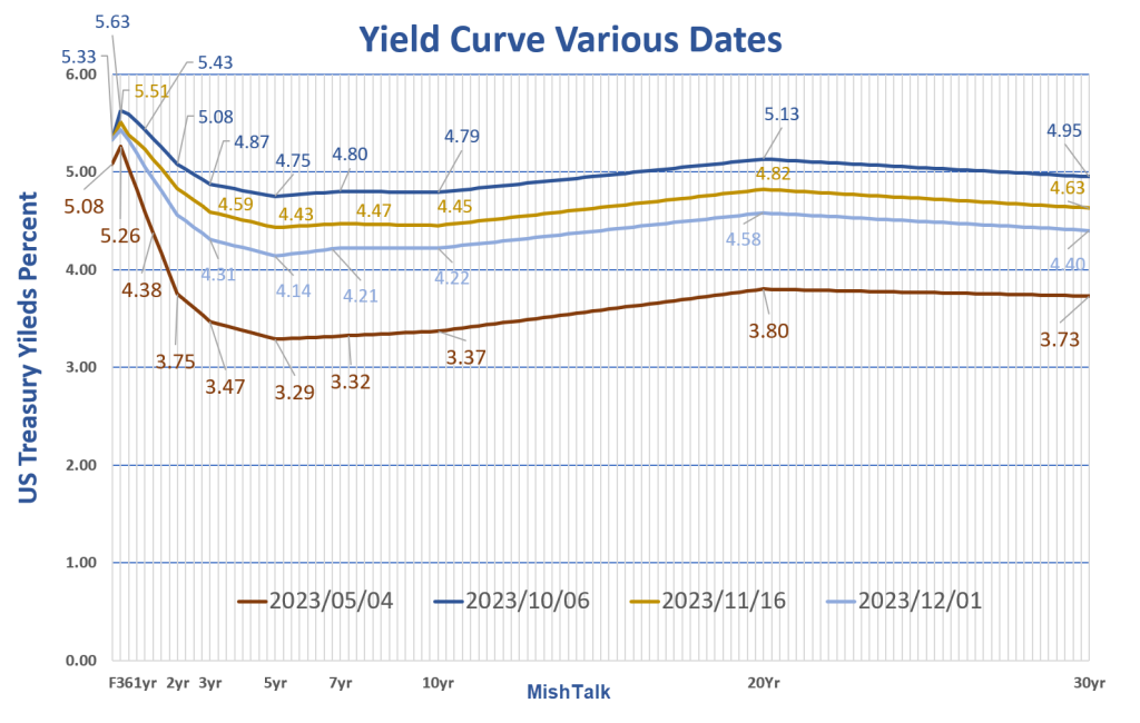
Yield curve at various dates. Data from the New York Fed, chart by Mish.
I discuss the above chart in Huge Moves in the Yield Curve This Year, What’s Going On?
Regarding the huge inversion between 1 month and five years then strongly steepening: Could it be the bond market smells a short quick recession followed by a big inflation problem coming down the pike?
See above link for discussion.
Inflation may very well be “transitory” but for how long and to what?
I think we need a definition of “transitory”.
More By This Author:
The Jobs Boom Is Clearly Behind Us, So What’s Ahead?A Big Decline In Quits Suggests The Labor Market Is Back To Normal
Germany’s Commitment To End Coal By 2030 Is A Never Ending Shell Game


Comments
Log in or sign up to join the conversation.