
Why The Gold Bull Market Has Legs, In Six Charts

Image Source: Unsplash
There are a lot of “xx priced in gold” charts floating around, most of which show that stocks, houses, and pretty much everything else aren’t actually going up in real (i.e., gold-adjusted) terms. They only appear to be in bull markets because we’re measuring them with declining fiat currencies.
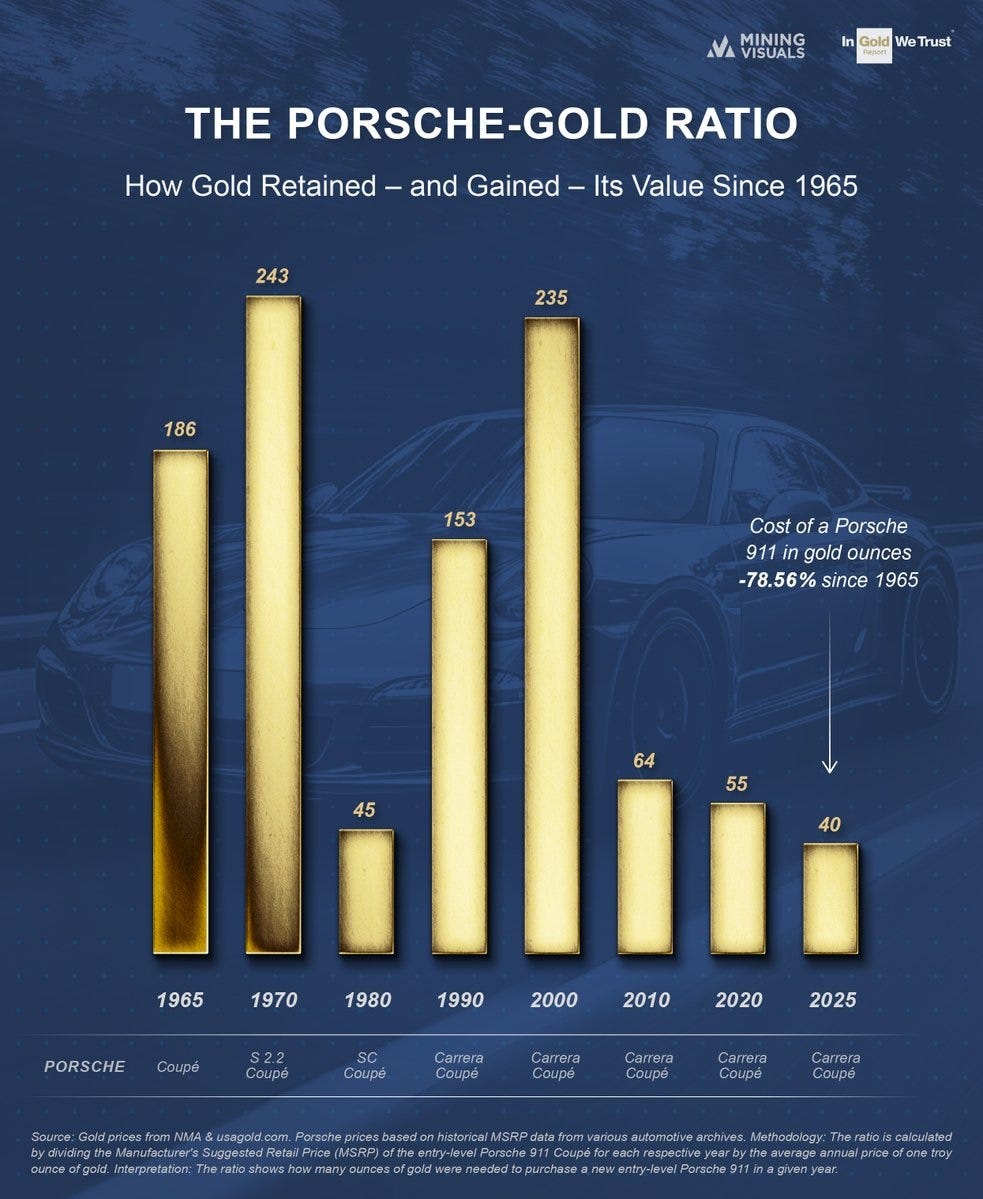
Here’s an unusual example: The Porsche 911 sports car has seen massive deflation so far in this century when priced in gold, as the metal has risen faster than the car’s sticker price.
Central banks understand this. They’re accumulating gold aggressively, which accounts for a big part of gold’s rising US$ price.
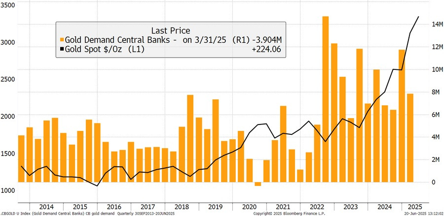
And they plan to keep buying, which gives gold a nice tailwind.
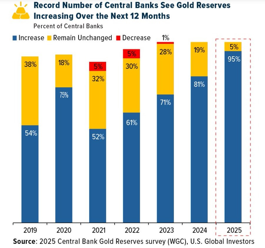
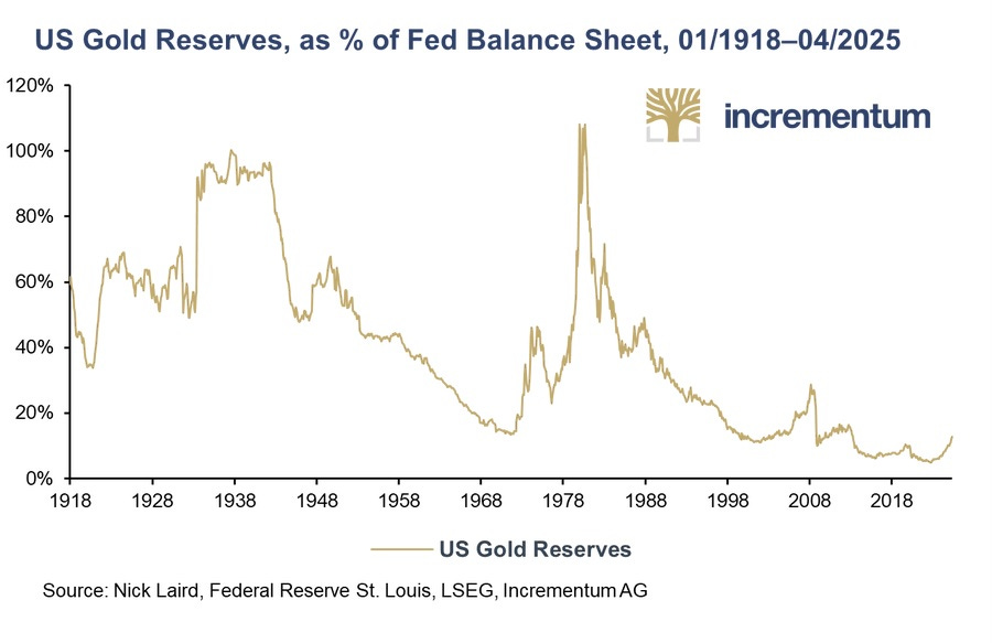
This makes sense in light of the tiny share of central bank reserves that gold now comprises:
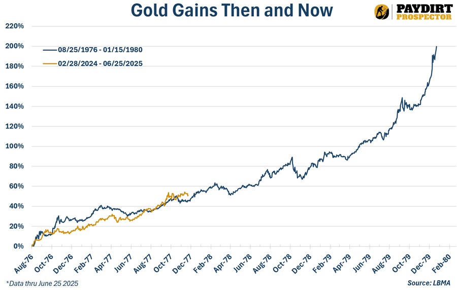
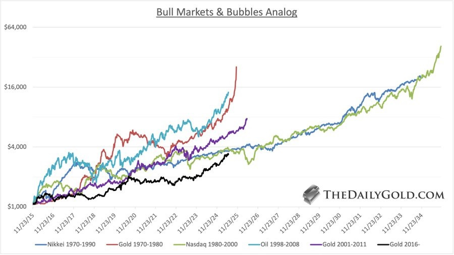
If gold’s recent rally (up $1,000/oz in the past year) feels a bit overdone, compare it to previous bull markets and relax:
Silver, of course, is another beneficiary of the shift back to real money. So keep stacking.
More By This Author:
The Coming Silver Bull In 3 Charts
Copper Squeeze: A Great Story Playing Out As Expected
The Japan Shock: How The World’s Biggest Creditor Could Cripple U.S. Markets


