
The Gold/Silver Bull Market, In Seven Charts
.webp)
Photo by Zlaťáky.cz on Unsplash
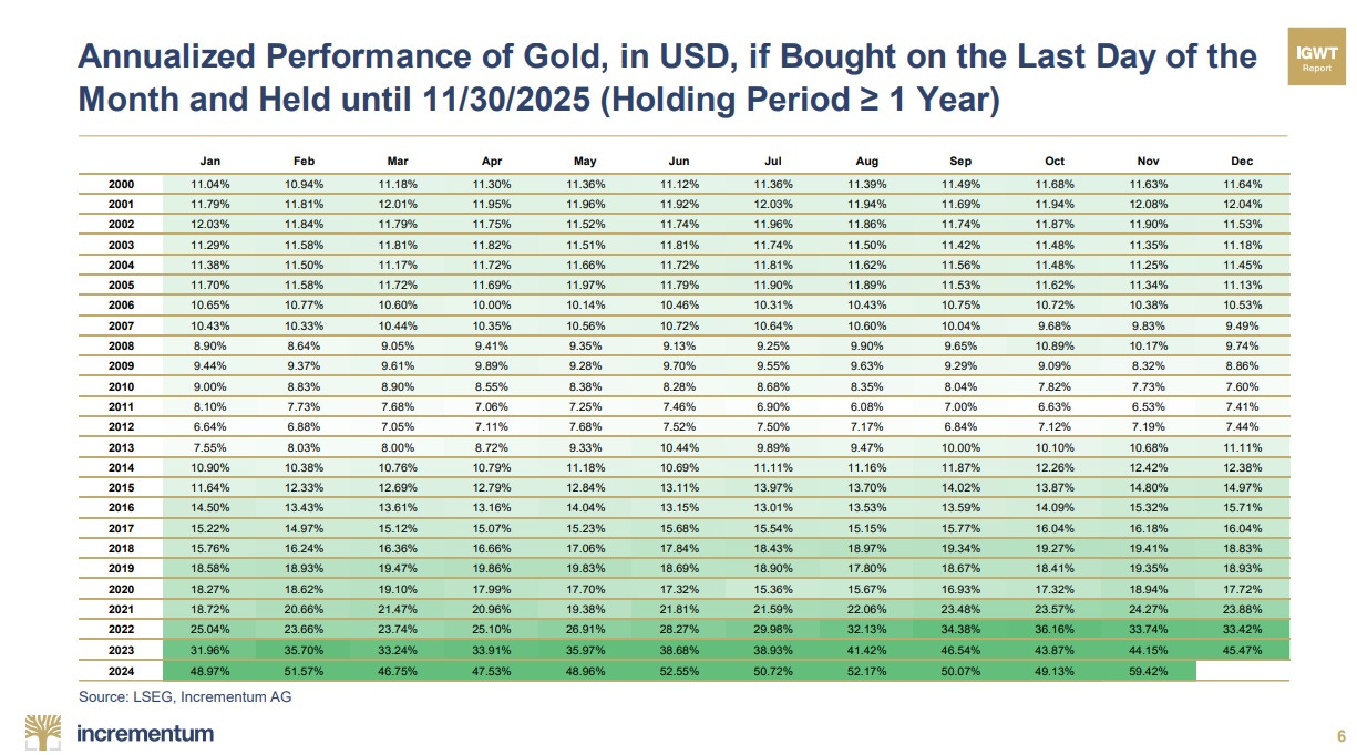
Gold in This Century
The following chart shows what would have happened if we had bought gold at nearly any time in this century. The numbers are a little hard to read, but the color (green) is what matters: No matter when someone bought gold since 2000, they’re up, and the rate of gain is accelerating.
(Click on image to enlarge)
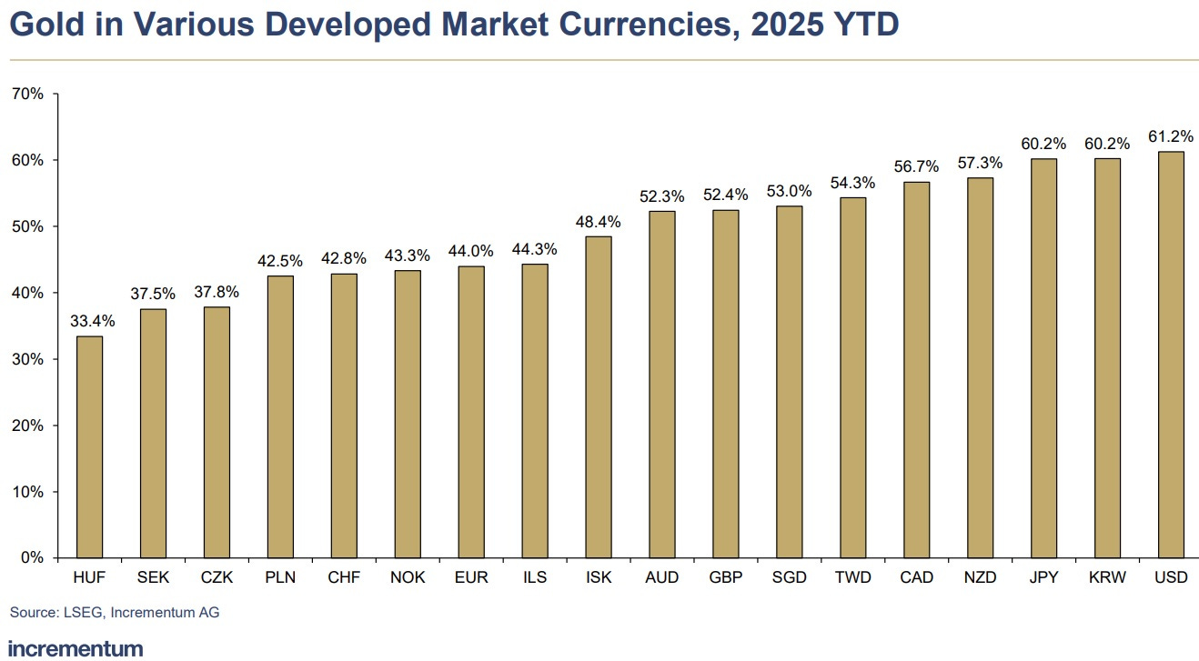
In Any Currency…
It also didn’t matter what currency we used to buy our gold. It’s up against them all:
(Click on image to enlarge)
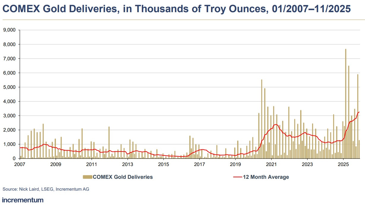
Demanding Physical Gold
On major metals exchanges, the demand for physical gold has spiked:
(Click on image to enlarge)
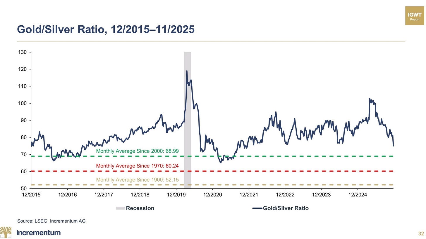
Silver Doing Even Better
Remember when the gold/silver ratio broke 100 (meaning it took more than 100 ounces of silver to buy an ounce of gold) and gold bugs called it a screaming buy signal for silver?
They were right. Silver has been outperforming gold, and the gold/silver ratio is falling hard. BUT it remains above past averages, which means it’s still undervalued, both on its own and relative to gold:
(Click on image to enlarge)
Not surprisingly, this translates into 25 years of silver purchases being way up, no matter when it was bought or at what price:
(Click on image to enlarge)

Demanding Physical Silver
Like gold, physical silver is leaving the exchanges at record rates, as the amount of available metal dwindles:
(Click on image to enlarge)

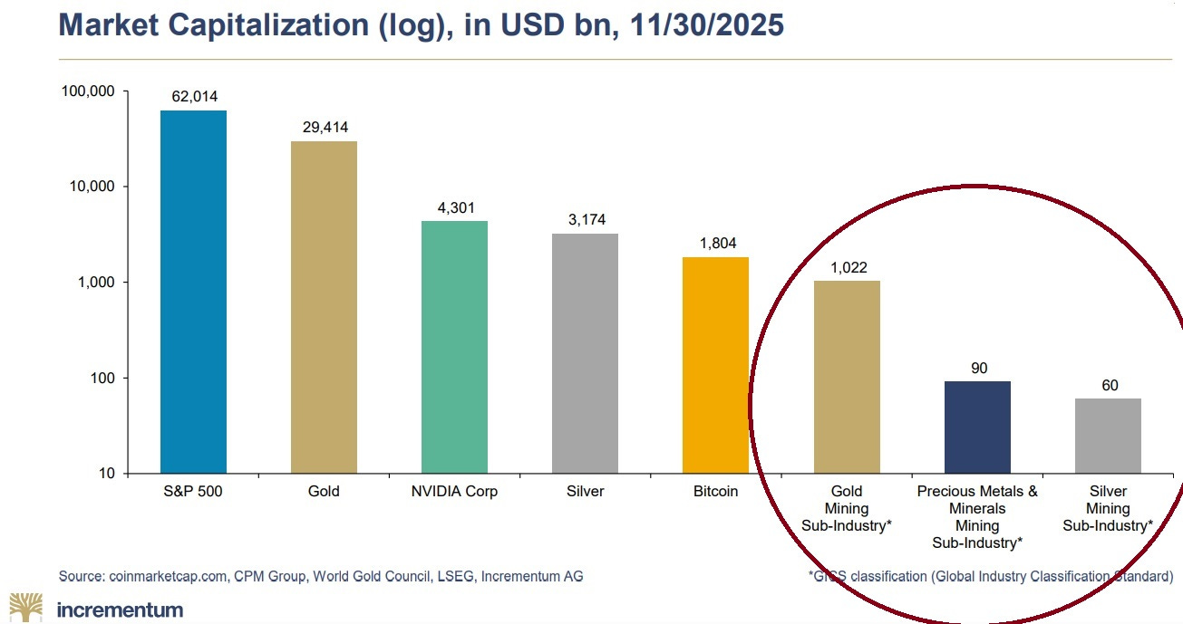
What About the Miners?
If the metals are disappearing from exchanges, are the miners’ gold/silver reserves becoming more valuable? Yes, especially given how small their market caps are relative to the broader markets. So keep buying the high-quality miners.
(Click on image to enlarge)
Incrementum — source of great gold/silver charts — just posted some new ones that illustrate the epic nature of this bull market. Here are seven, and the stories they tell:
More By This Author:
Next Year's Wild Card: The Yen Carry TradeGold Bugs Win
A Global Currency Crisis In 2026?


