

Image Source: Pexels
As I try to shake off the nothing-is-happening-in-the-market blues, here are a couple of ratio charts, each of which use the Russell 2000 ($RUT) index.
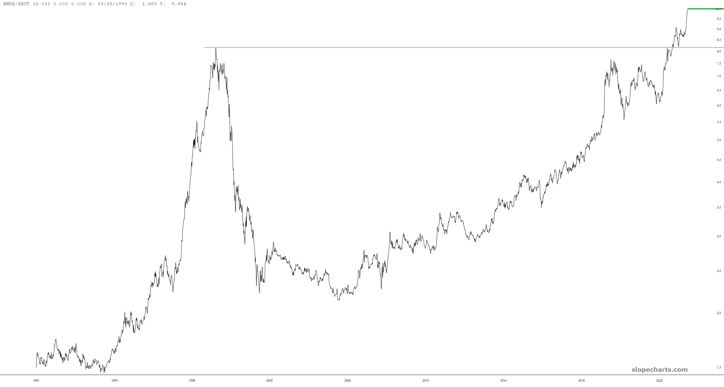
This first one is the entire history I’ve got of the Nasdaq 100 divided by the Russell 2000. As you can see, the ratio chart is at levels never witnessed before, because every human in the entire world has dropped 50mg of LSD and is running around screaming their heads off.
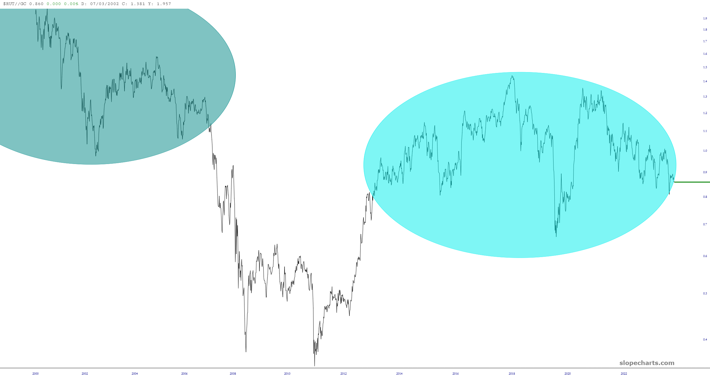
The other, which makes $RUT the numerator instead of the denominator, is small caps divided by gold, which as you can see is about to plunge into a free fall. This suggests that small caps are going to get smaller, gold is going to get more expensive or……….and this is my guess………….BOTH.
More By This Author:
Three Indexes In Trouble
Navigating The Market's Relentless Climb
Summer Index Review


Comments
Log in or sign up to join the conversation.