July CPI Pauses – Is Peak Inflation Over?
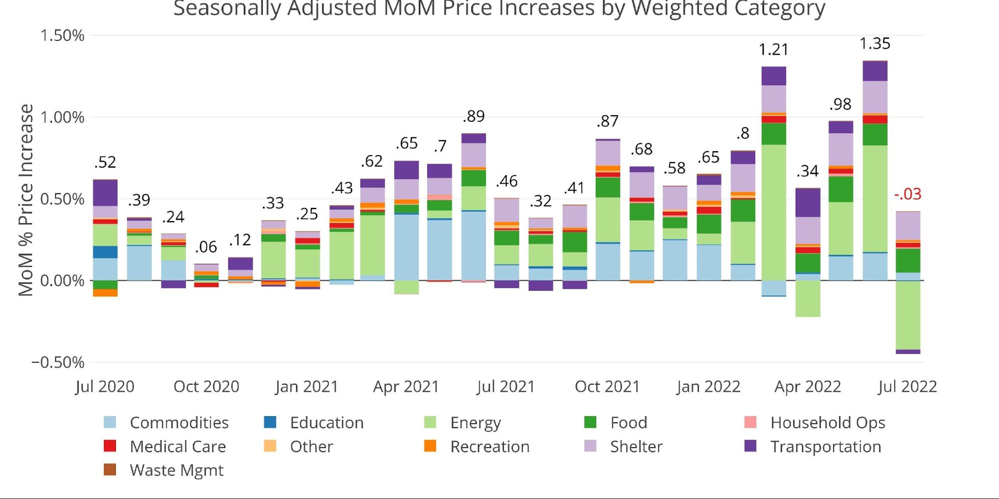
The latest seasonally adjusted inflation rate for July came in nearly flat at -0.03%. This was on the heels of a blisteringly hot June number of 1.35%.
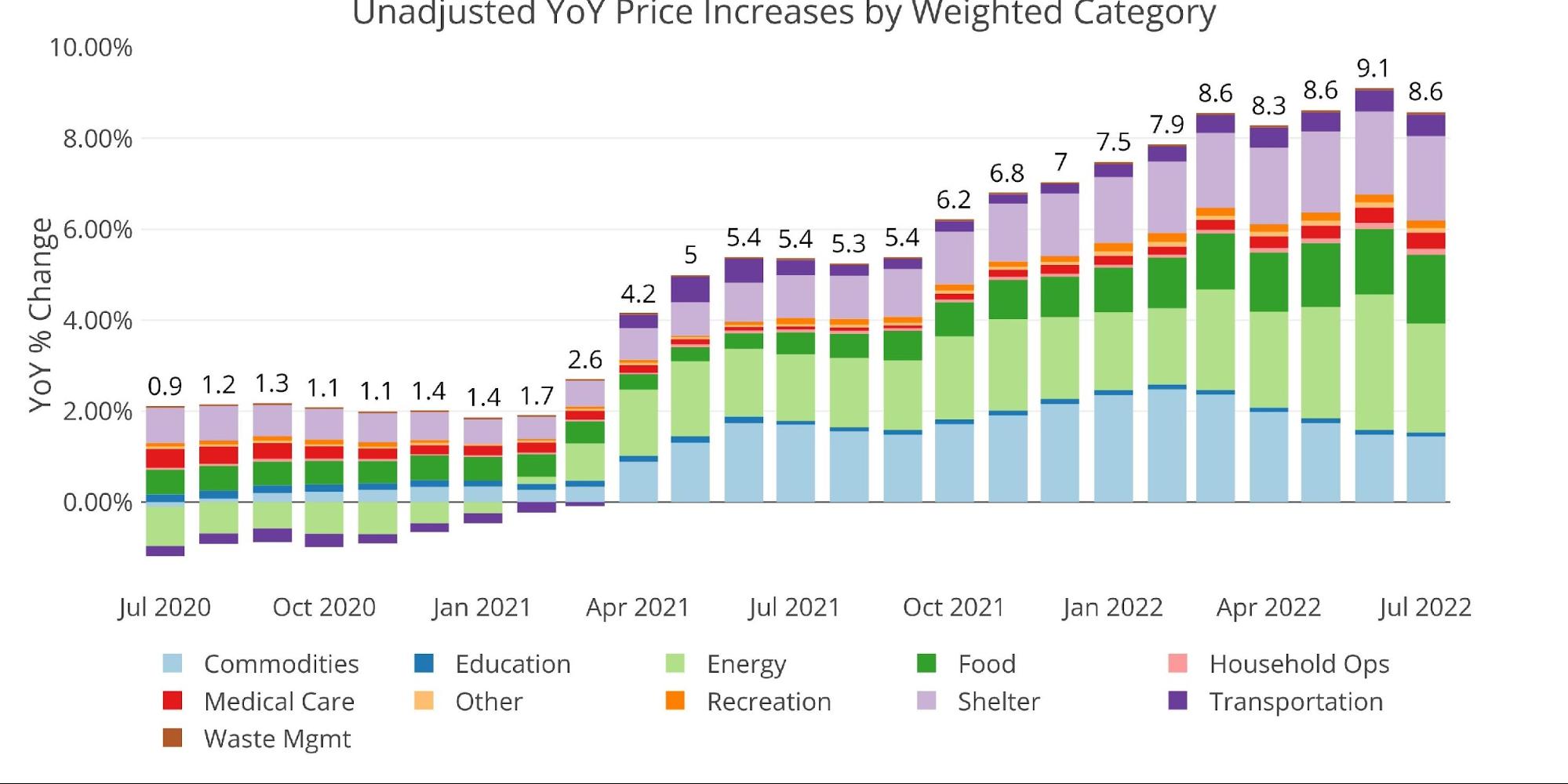
While inflation did surprise to the downside, it had been expected to be much lower due to the fall in oil and drop in gasoline prices. The YoY number also fell as the reading from last July of 0.46% fell off the calendar.
It should be noted that except for the big collapse in Energy, which brought the CPI down by -0.42%, the YoY number would have stayed close to the 9.1% reported last month. Considering that Energy contributed 0.12% of the 0.46% increase last July, it can be concluded that this July is actually stronger than a year ago excluding Energy.
Figure: 1 Month Over Month Inflation
While the flat move in CPI is a slight reprieve, it has not done anything to alleviate the pain felt by consumers over the last 15 months. Furthermore, as the chart below shows, it’s hard to imagine this is a substantial trend change that can fully undo the trend in place. Even if inflation slows more in the months ahead, the trend makes it hard to believe inflation will return to sub 2 % anytime soon.
Figure: 2 Year Over Year Inflation
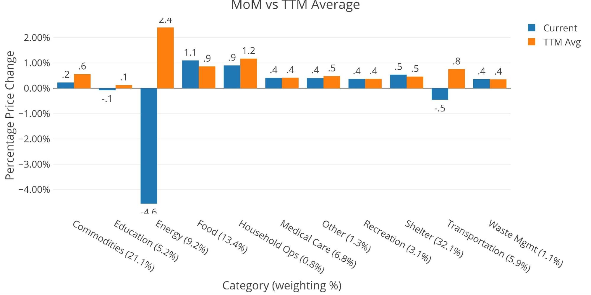
The chart below compares the current month to the 12-month average. Many of the categories were at or below the 12-month average
- The collapse in Energy is very visible compared to the 12-month trend
- Unfortunately, Shelter and Food were the two categories above the 12-month average. This is where consumers will feel the biggest pinch
- Transportation and Education also saw a slight reduction in prices MoM
The shelter is of particular importance. While the CPI continues to understate the true cost of living, specifically shelter, market reports are still showing growth above 9%. In fact, after a brief pause in June, rent prices accelerated in July!
Figure: 3 MoM vs TTM
The table below gives a more detailed breakdown of the numbers. It shows the actual figures reported by the BLS side by side with the recalculated and unrounded numbers. The weighted column shows the contribution each value makes to the aggregated number. Details can be found on the BLS Website.
Some key takeaways:
- According to the BLS, Shelter is up 5.72% YoY, but as stated above, this grossly understates the true increase in Shelter costs!
- Some cities like Nashville saw increases of 26.6% YoY!
- Rents in New York increased 5% MoM and 41% YoY
- Food continues to climb, up 1.1% MoM and 10.92% YoY
- Food at Home increased even faster at 1.7% MoM driven by Dairy (1.7%) and Beverage (2.3%)
- While Energy did fall 4.6% MoM, it is still up 32.92% YoY!
Figure: 4 Inflation Detail
Looking at the Fed Numbers
While the Fed does have different categories, its aggregate numbers match the BLS.
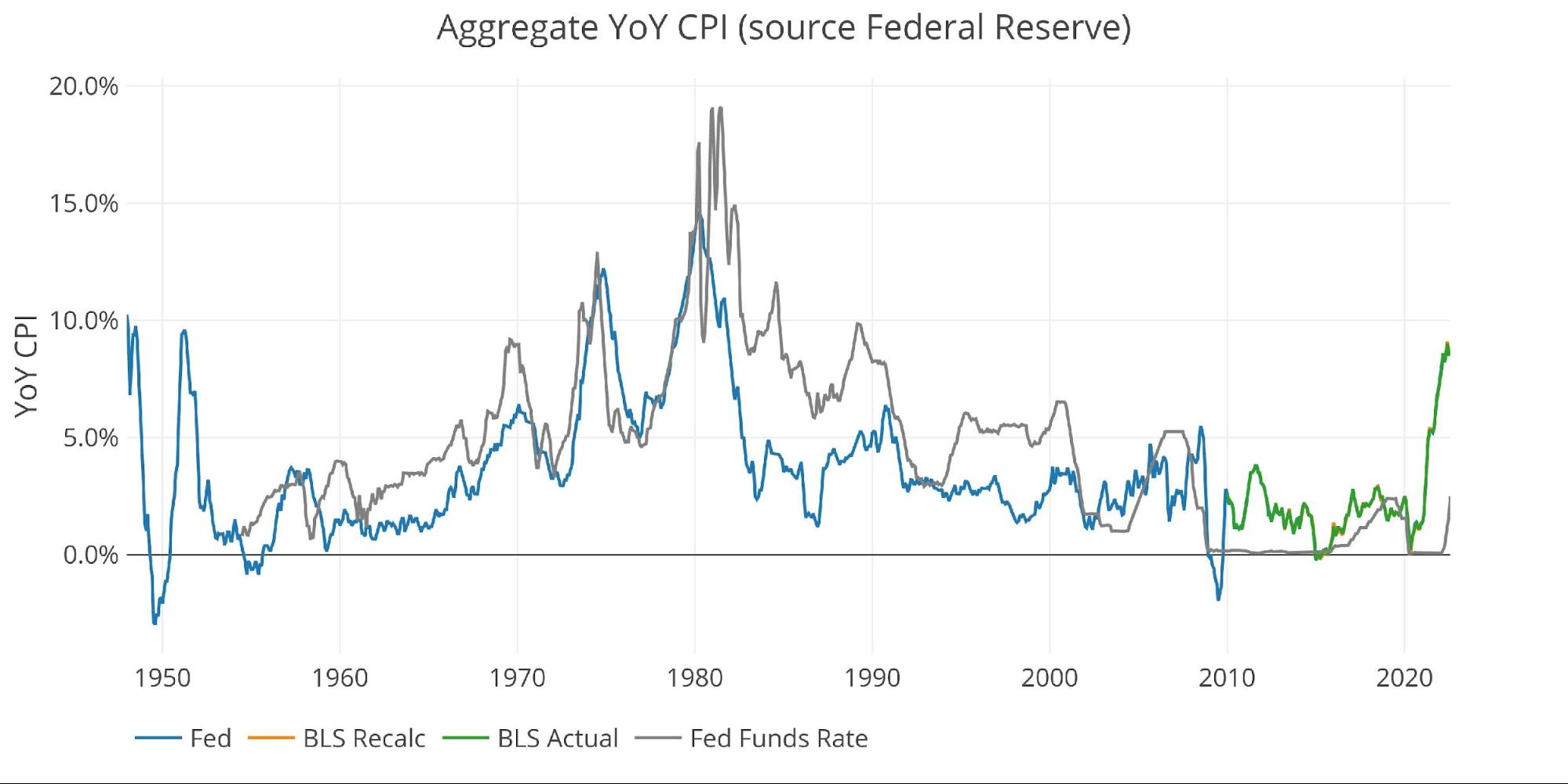
Their data goes back to the 1950s. Unfortunately, they do not publish the weightings of each category so it would be impossible to do a similar analysis showing the impact of each category on the overall number.
Looking at history back to 1950 puts the current spike into perspective. Remember that if the methodology was the same, inflation would likely be above 15% already!
While the Fed has been perceived as very aggressive by the market, the chart below shows this to be far from true. The Fed continues to be well behind the inflation curve, even with the latest hike up to 2.25%-2.5%. Historically, the Fed has been far more aggressive in previous battles against inflation.
Unfortunately for the Fed, things are different this time. Even the minor rate hikes so far have started to significantly impact the interest on the Federal debt with costs rising by $65B annually in only 7 months. It should be noted that most of this was before the recent 1.5% Fed Funds increase.
The reason why the Fed is so far behind the curve is that they have no other viable choice. They are still praying inflation comes down all on its own. One month of flat inflation does not equate to success, but expect Fed members to start talking like victory is within sight. They need to pause rate hikes as soon as possible!
Figure: 5 Fed CPI
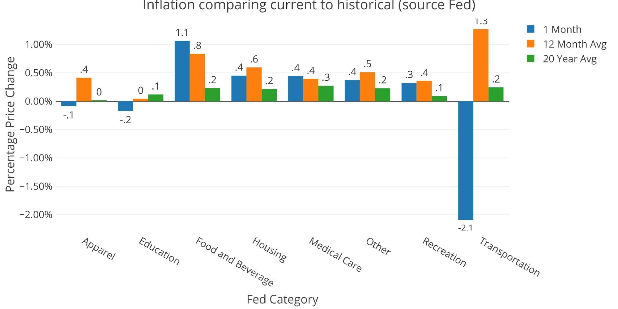
Using the Fed categorical data, which is different than the BLS, actually shows that Housing is below the 12-month average. On its own, this should call into question the accuracy of the CPI report given the reports coming from market sources.
Figure: 6 Current vs History
Historical Perspective
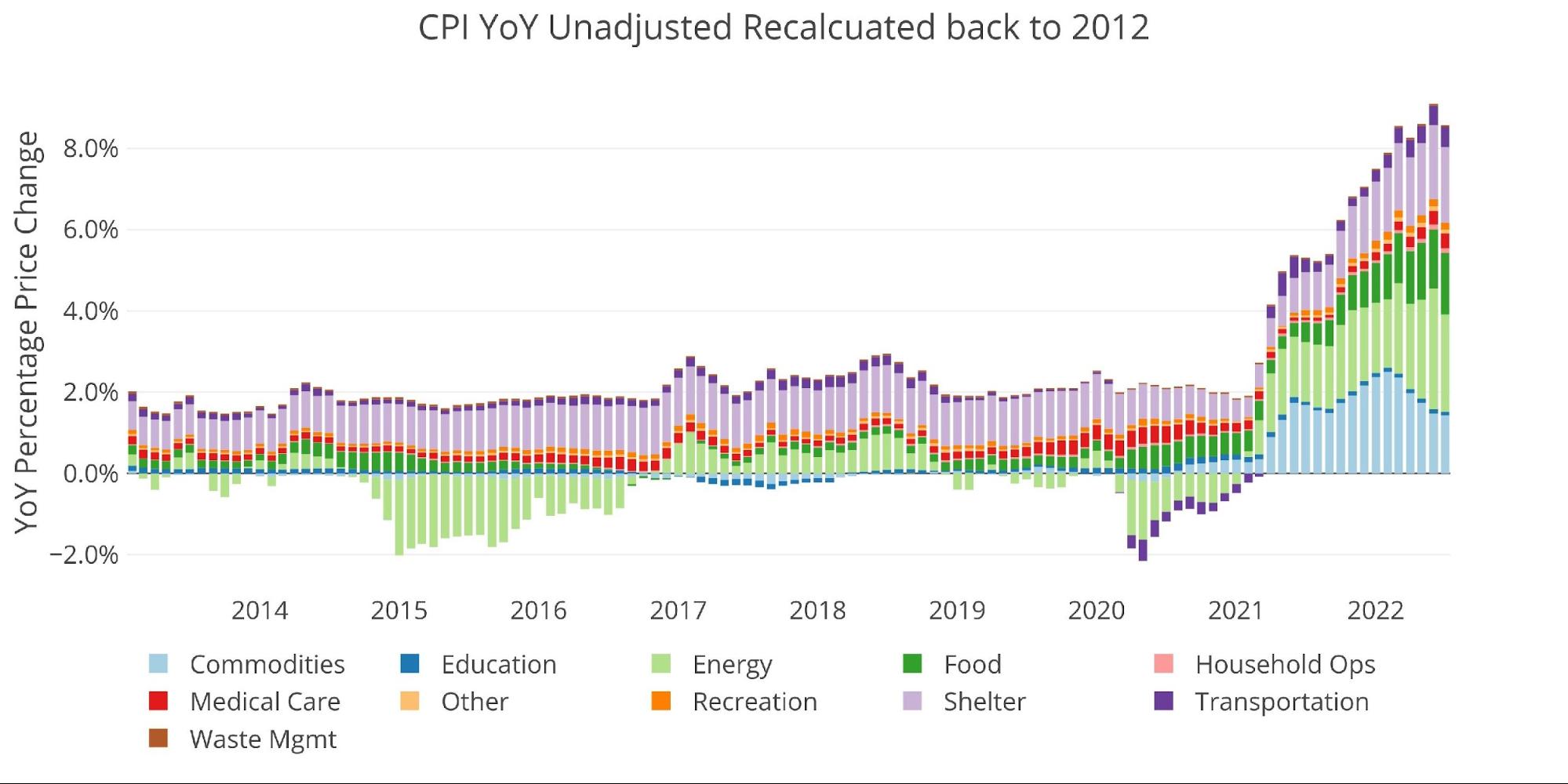
The BLS weightings have only been scraped back to 2012, thus the chart below shows the past 10 years of annual inflation data, reported monthly. The volatility in Energy can be seen clearly over this time period.
The YoY CPI first went over 4% in April of 2021. For the CPI to come back down to below 4%, the monthly numbers would likely have to turn negative.
Figure: 7 Historical CPI
What it means for Gold and Silver
The flat CPI number has mildly pushed up precious metal prices as of publishing. In the last meeting, Powell explicitly stated the stance of being data-dependent and emphasized the need for inflation to come down before pausing. Consequently, the CME Fed Funds tracker is now showing only a 37.5% chance of a 75bps hike in September versus a 68% chance yesterday which had surged on the heels of a hot jobs report.
Gold and silver are caught between several cross winds right now. The COT’s report shows that Managed Money had gone aggressively short. With all players on one side of the market, there was a setup for a short squeeze. The hot employment report put a pause on the recent price advance but both metals showed surprising resilience.
The market is now caught on some technical levels with gold futures struggling at $1820 and silver at $21. Both markets have seen a strong bounce off the recent lows and the price rebound needs time to consolidate at elevated levels before it can move higher. The hot employment report and cool inflation report have negated each other. With no major catalysts in the next few weeks beyond smaller data points (e.g., Michigan Consumer Sentiment on Friday), the metals may be entering a consolidation phase after a very volatile few weeks.
Over the longer term, the fundamental picture is still strong as ever. The Fed is handcuffed in its ability to raise rates but is clearly doing enough to drive the economy further into recession. With new legislation being passed by Congress, and the rest of the world no longer adding to their holdings of US Treasuries, it’s only a matter of time before the Fed has to lower rates and start buying debt. This will occur long before inflation returns to 2% which means peak inflation is likely still ahead. Gold and silver will protect purchasing power in such a scenario.
Data Source: https://www.bls.gov/cpi/ and https://fred.stlouisfed.org/series/CPIAUCSL
Data Updated: Monthly within the first 10 business days
Last Updated: Jul 2022
Interactive charts and graphs can always be found on the Exploring Finance dashboard: https://exploringfinance.shinyapps.io/USDebt/
More By This Author:
CPI Cools Modestly; How Will The Fed Play This?
Fed Balance Sheet Reduction Not Delivering As Promised
Record Consumer Debt Levels Continue To Climb


