
Big Picture Silver Charts Point To Triple-Digit Prices

Image Source: Pixabay
This week, we will look at two silver charts unlike any you've ever seen to get a better sense of where we are in the current bull market and just how much upside remains.
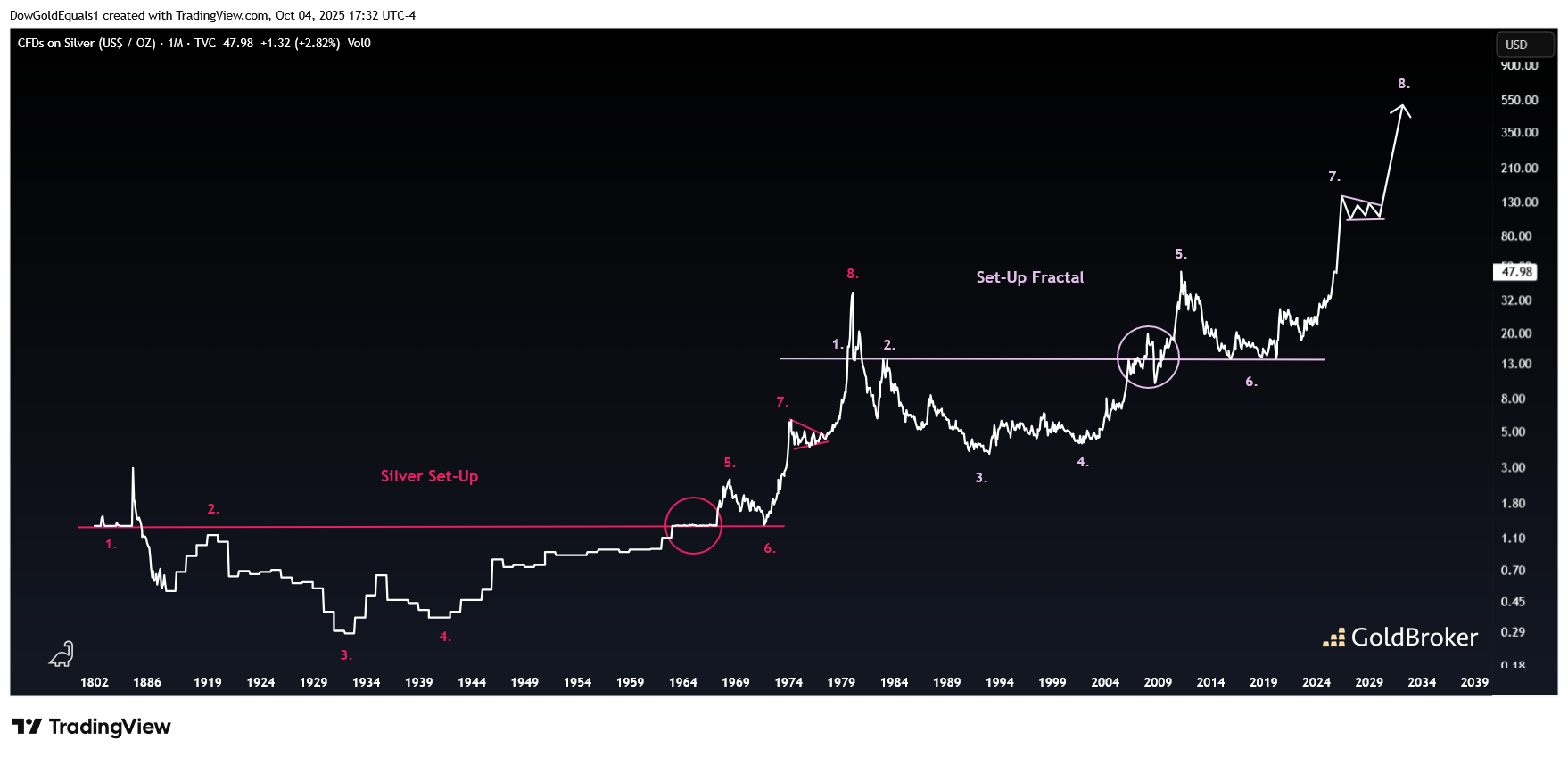
Let's start with a 225-year monthly line chart that I have defined as a pair of fractals. The first one (pink) played out over more than 100 years, while the current one (purple) appears to be playing out in half that time. If you look at Points 1-6 on the purple fractal, you'll see they match up quite well to the pink one. There are even similarities to how price straddled each neckline prior to Points 5 on each. If Point 7 is to play out on the current fractal, the price of silver would more than double from here without a significant pullback. If we ultimately see Point 8 as well, the price would launch into the multiple hundreds of dollars.
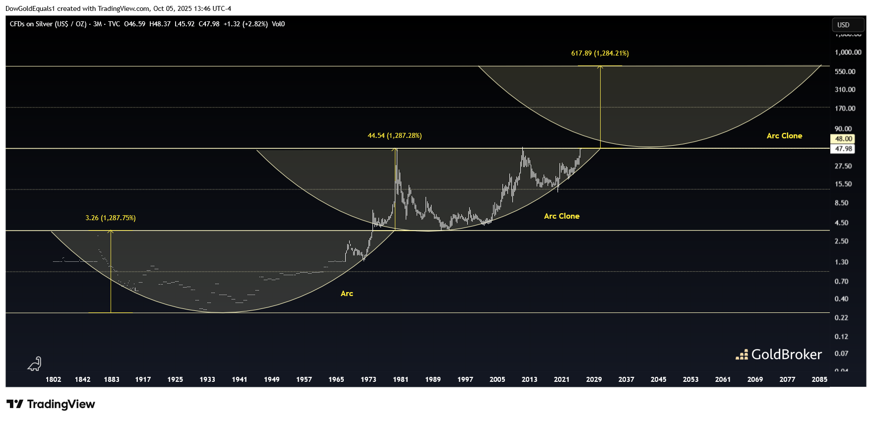
The second is an incredible 225-year quarterly candle chart. Note that the channel and arc that played out from the mid-1800s to the early 1970s were both replicated identically from the early 1970s to the present. The only difference is that silver has spent less time in the current arc and channel, and now appears set to break out into the next channel and arc. Also of note is that silver has formed a 45-year Cup & Handle while in the current arc, with a measured move to the top rail of the next channel and arc at around $650.
$50 silver was expensive in 1980 and 2011. This time, it may well be the last time you'll ever see it this cheap!
More By This Author:
From Monetary Metals To Strategic Metals: The End Of A World Based On TrustLuke Gromen: “The United States Is Heading Toward An Inflationary Crisis”
Tether: Why The No. 1 Stablecoin Invests In Physical Gold
Disclosure: GoldBroker.com, all rights reserved.


