
Bullish Percents Pointing Lower
A short-term downtrend probably started Wednesday or Thursday.
(Click on image to enlarge)
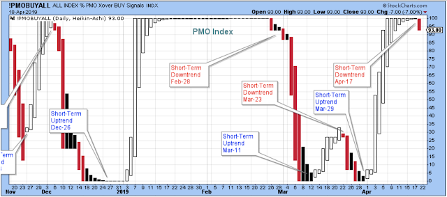
The bullish percents are pointing lower.
(Click on image to enlarge)

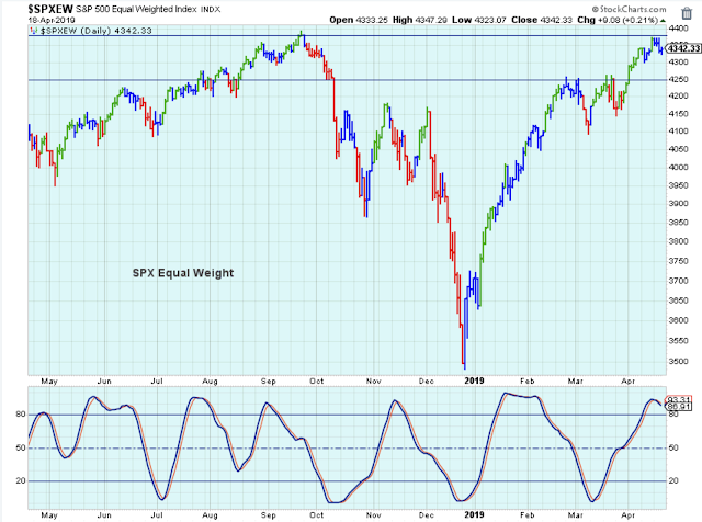
The SPX equal-weight is up against resistance, so some struggling and choppy behavior is likely and expected.
(Click on image to enlarge)
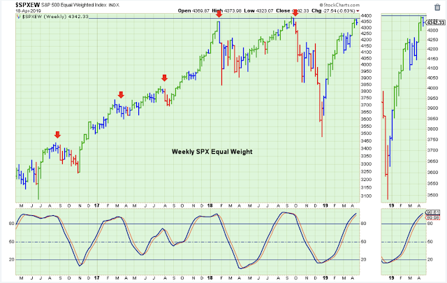
The same index is also at a point on the weekly chart where some struggles are likely. In addition, the weekly stochastic works fairly well at providing a general time frame where the market starts to struggle on a medium-term basis.
(Click on image to enlarge)
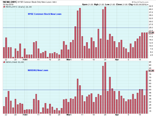
The new 52-week lows on the Nasdaq are elevated. There is definitely some selling pressure in the general market.
(Click on image to enlarge)
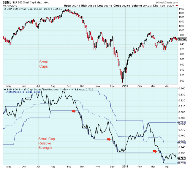
Last week I thought the small caps would start to rally, but so far there is no sign of strength in this group. A general market rally is always more convincing when there is leadership from small caps.
(Click on image to enlarge)
The Longer-Term Outlook
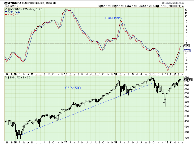
The ECRI Index is now giving the bulls the green light to buy the dips and the breakouts.
(Click on image to enlarge)
Sector Strength
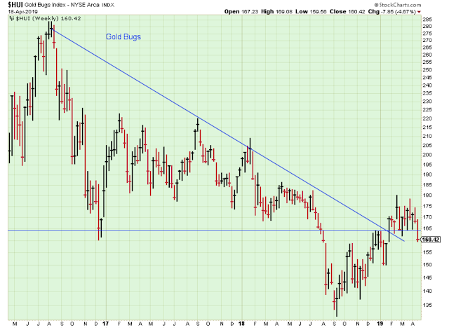
More disappointment for gold bugs.
(Click on image to enlarge)
Large-caps are clearly the leaders, and small-caps are getting weaker. Also, bonds are retaining some of their strength despite the market rally. It seems like late-stage bull market behavior to me.
Sector strength is curious with Technology leading along with the dividend-paying defensive groups. Investors are clearly favoring safety and income, but are also still looking for growth.
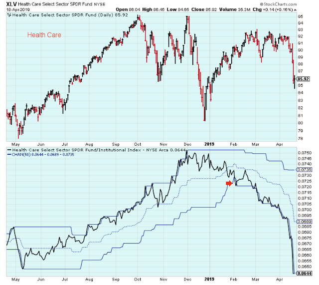
I'm sticking with the leaders in my portfolio, although I do own health care and have yet to reduce those positions.
I haven't sold health care because it is my favorite group and somehow got sucked into being stubborn.
Here is what I told myself... I don't like to sell positions based on headlines which often turn out to just be dips that I should be buying. Also, I am thinking that before this bull market is over, health care will be a leader again because it is defensive.
However, the truth is that my trading performance is always much better when I just follow market leadership. Or stated differently, I always do better when I follow my own rules and advice.
When I step back and look at this spreadsheet, I see the influence of the inverted yield curve (or nearly inverted).
(Click on image to enlarge)

Here is a look at the health care ETF. The relative strength line gave a decent sell signal early in the year. Apparently, I wasn't paying attention.
(Click on image to enlarge)
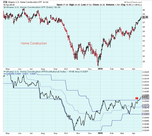
This group hasn't been on my radar. It has given a nice little signal of strength probably due to low rates. I am going to pass, though. It isn't for me. I am not sure why but maybe because it feels so late in the game to be buying home builders.
(Click on image to enlarge)
Outlook Summary
Bottom line: The economy has picked up and the market has responded favorably. The indicators that I follow are doing their job nicely. However, I am a pessimist and the sector alignment in the spreadsheet alarms me.
- The long-term outlook is positive as of Apr-12.
- The medium-term trend is up as of Jan-4. Watching for some weakness in this trend.
- The short-term trend is down as of Apr-18.
- The medium-term trend for bond prices is up as of Nov-16 (prices higher yields lower).
Disclaimer: I am not a registered investment advisor. My comments above reflect my view of the market, and what I am doing with my accounts. The analysis is not a recommendation to buy, ...
more

