
USDX, S&P GSCI: Flip It Upside Down And See How Gold Falls
It’s a dance of death between the USDX and S&P GSCI. When the former goes up, the latter does the exact opposite - and gold may follow.
Gold, silver, and mining stocks did next to nothing yesterday, and practically everything that I wrote previously remains up-to-date. Consequently, today’s technical part will be limited to just one chart – with one implication being both important and subtle – but today’s more fundamental part will be longer.
Let’s jump right into the chart featuring… The USD Index, as that’s the market that contains the important change.
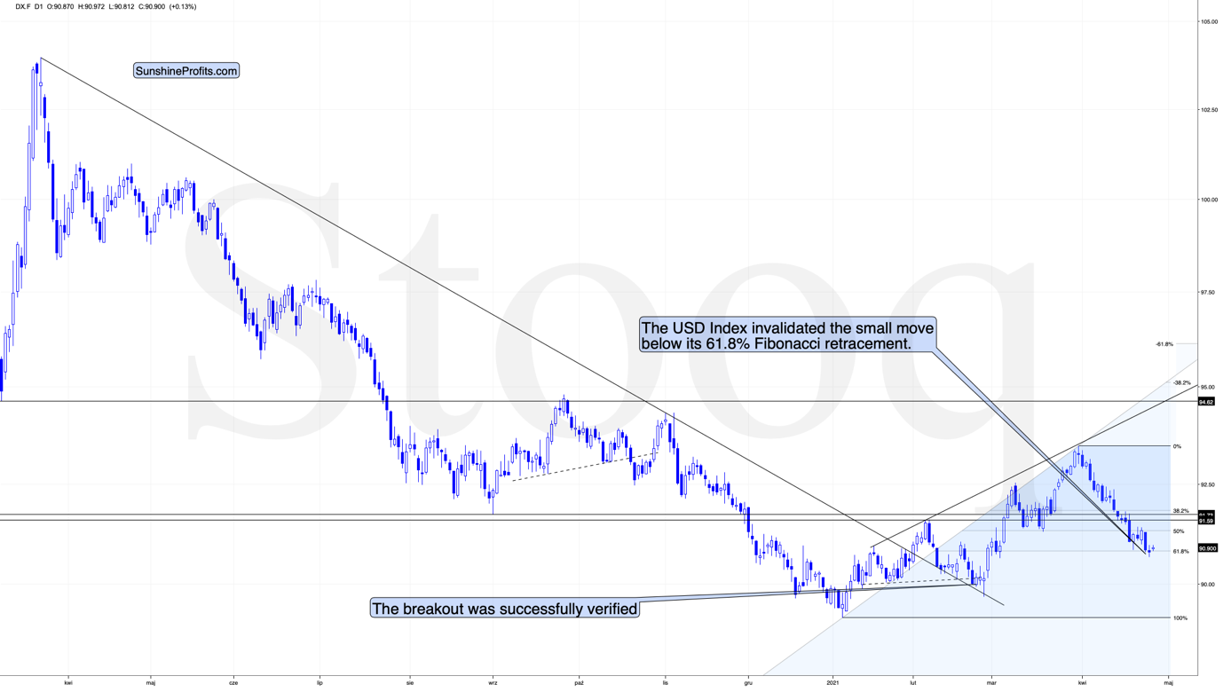
The important change is that the situation relates to the USD’s 61.8% Fibonacci retracement.
Last week, I wrote the following:
I wouldn’t be surprised to see this weekend without any major reversal, but we could see one on Monday. Some traders won’t be able to adjust their stop-loss levels at that time, so if anyone “big” wants to squeeze the profits out of individual traders shorting the USDX before the latter rallies, it would be a perfect time. The idea could be to trigger a small sell-off early on Monday, which would then trigger stop-loss selling, and it would allow the “big” market participant to re-enter the long positions at lower prices.
The fact that the USD Index moved slightly below its very important short-term support (the 61.8% Fibonacci retracement) on Monday and that it invalidated this breakdown earlier today perfectly fits the above quote.
The invalidation of the breakdown is a bullish phenomenon, and even though the price moves are still small, they already suggest that a bigger rally is likely just around the corner. Naturally, the bullish situation in case of the USD Index has bearish implications for the precious metals market.
Having said that, let’s take a look at the markets from a more fundamental angle.
The Paradox of Inflation
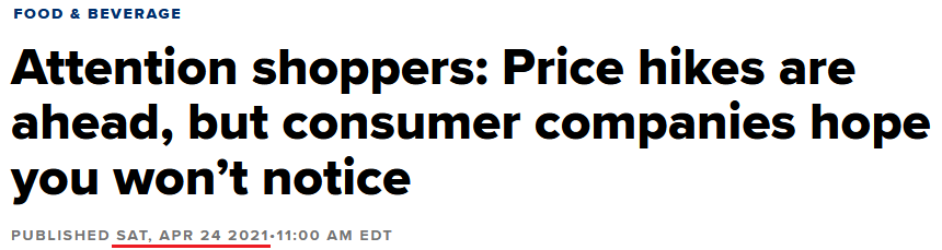
Hiding in plain sight for the last several months, warnings of rising inflation have officially gone mainstream. Case in point: please see the headline from CNBC on Apr. 24:
Source: CNBC
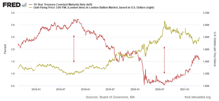
And while I’ve been warning about the prospect for some time now, when CNBC initiates coverage, you know that the cat is out of the bag. But why is rising inflation such an important variable when analyzing the PMs? Well, because higher inflation is a precursor to higher interest rates. And with the domino effect of rising input costs, leading to rising output prices, leading to a rising U.S. 10-Year Treasury yield … well, gold has nightmares just thinking about it.
Please see below:
However, it’s important to remember that two different paths can lead to the same destination. On one side of the road, you have demand-pull inflation: this occurs when unemployment is low, prosperity is high, wages are rising, and corporate profits follow suit. On the other side of the road, cost-push inflation occurs when demand is dormant, but rising input costs lead to price hikes by corporate executives. Think about it: when faced with a dilemma of accepting lower profit margins or raising output prices, which path do you think they’ll choose?
Moreover, it’s no secret that the U.S. Federal Reserve (FED) has unleashed a tsunami of liquidity. In turn, the spending has also unleashed a tsunami of financial-market speculation. And when meme stocks like GameStop move from $4 to $400, it has no effect on the real economy. However, when excessive speculation cascades from the stock market to the commodities market, it has a profound effect on the real economy.
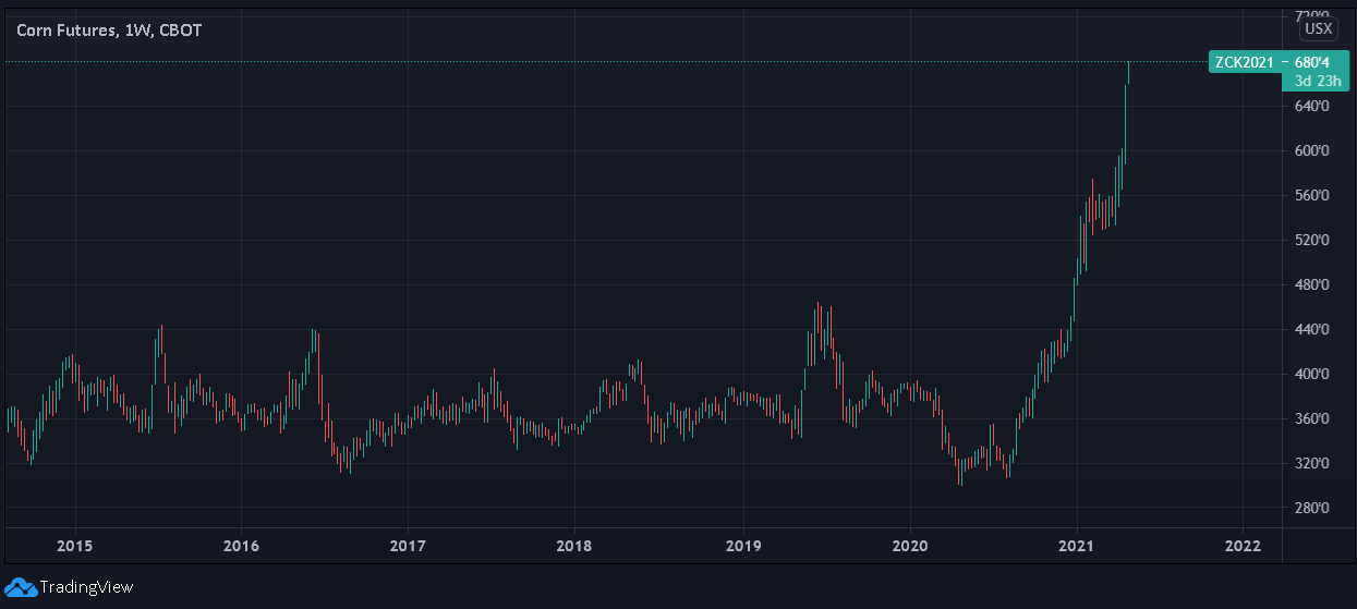
Case in point: lumber prices have risen by more than 356% over the last year (and are up by more than 200% from their pre-COVID 19 highs), while gasoline prices have risen by more than 205% (and are up by more than 18% from their pre-COVID 19 highs). If that wasn’t enough, corn prices have recently gone vertical, hitting ‘limit up’ on Apr. 26. For context, ‘limit up’ means that the contract rose so rapidly that regulators were forced to suspend trading for the day.
Please see below:
As a result, when destabilizing moves occur in the commodities market, manufacturers incur higher input costs, while consumers are also forced to pay more for finished goods.
The bottom line?
Unlike demand-pull inflation, where consumer spending leads to increased business investment and is followed by healthy inflation, the current environment is the exact opposite. With excessive speculation leading to explosions in the commodities market, rising inflation is occurring alongside extremely high unemployment.
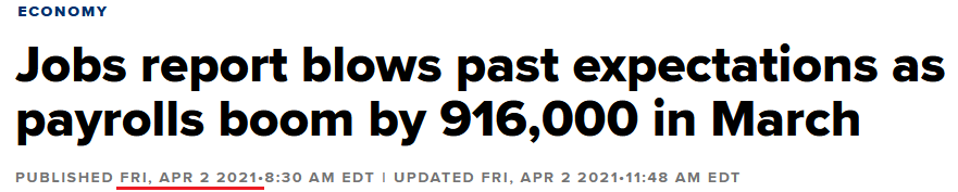
Case in point: after investors celebrated April’s ‘blowout’ jobs report – with the unemployment rate falling to 6% – the zeitgeist proclaimed that the economic renaissance finally began. And with the economy ‘booming,’ what’s wrong with rising inflation expectations and a rising U.S. 10-Year Treasury yield?
Source: CNBC
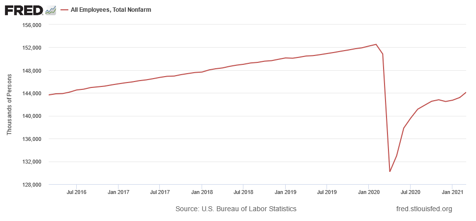
Well, like most fairy tales, they often require a lot of imagination. To explain, the FED believes that reverse-engineering a recovery – by letting prices lead economic activity – will give off the appearance of a demand-pull recovery. However, the reality on the ground is much different. If you analyze the chart below, you can see that the U.S. economy has only recovered 62% of the jobs lost during the pandemic.
Even more accurate, the U.S. Bureau of Labor Statistics (BLS) revealed that the civilian labor force consists of more than 160 million people (as of March 2021).
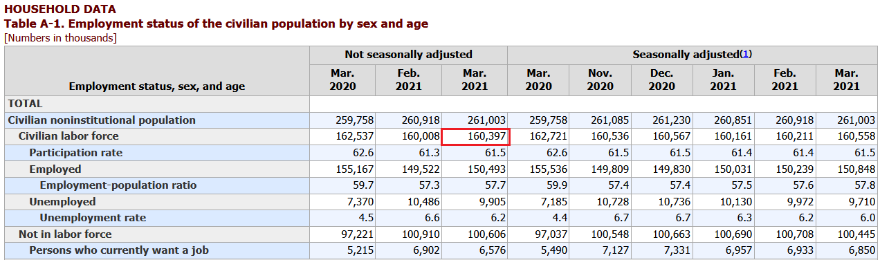
Source: BLS
Likewise, the U.S. Department of Labor (DOL) revealed on Apr. 22 that more than 17 million people are still collecting some form of unemployment.
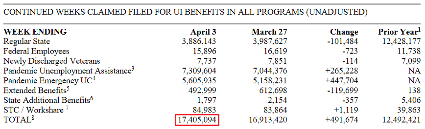
Source: DOL
Thus, doing a little math (17.405/160.397) the real unemployment rate is 10.9% (rounded). Think about it: if the U.S. government eliminates the Pandemic Unemployment Assistance and Pandemic Emergency UC programs, do you think that nearly 14 million people will be boasting about a ‘booming’ economy?
Therefore, while I spend a lot of time discussing the prevalence and importance of inflation, it’s not because the U.S. is an economic utopia. Quite the contrary, the U.S. – like the Eurozone – is actually headed toward stagflation. For context, stagflation is a period of both high inflation and high unemployment. More importantly, though, once the illusion of demand-pull inflation is finally seen as its destructive twin, cost-push inflation, investors’ vision of a commodity supercycle could eventually fade to black. Gold would be likely to slide, at least initially, and then rally in the long run – just like it had done in the 1970s during the stagflationary environment.
To that point, gold may have already signaled its demise.
Please see below:
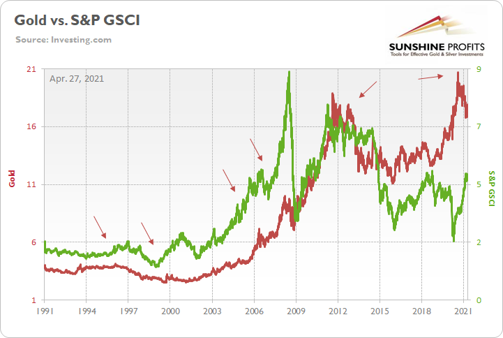
The Importance of the S&P GSCI
To explain, the red line above tracks the gold price, while the green line above tracks the S&P Goldman Sachs Commodity Index (S&P GSCI). For context, the S&P GSCI contains 24 commodities from all sectors: six energy products, five industrial metals, eight agricultural products, three livestock products and two precious metals. More importantly, though, gold has already sent an ominous signal. If you analyze the arrows above, you can see that gold nearly always peaks in advance of the S&P GSCI (except for in 2011).
In addition, the pair’s current behavior is mirroring their historical scripts. Back in 2020, gold bottomed on Mar. 18, while the S&P GSCI bottomed on Apr. 21. However, like their five historical analogues, the S&P GSCI has continued to make new highs, while gold peaked on Aug. 7. As a result, the yellow metal has already sounded the alarm.
Please see below:
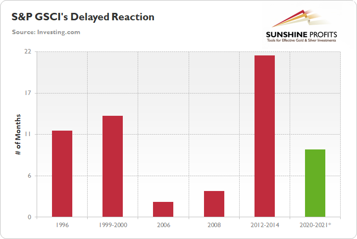
To explain, the red bars above depict the number of months between gold’s peak and the eventual peak in the S&P GSCI. As you can see, the data ranges from a follow-through of two months to a delay of 21 ½ months. However, with the S&P GSCI rolling over 11 ½ and 13 ½ months after gold in 1996 and 1999-2000, the current timeline – the S&P GSCI’s rally has gone on for roughly nine months (the green bar) – signals that a severe shock could occur over the medium term.
But why is the behavior of the S&P GSCI so important?
Well, if you analyze the chart below, you can see that the S&P GSCI’s pain is often the USD Index’s gain.
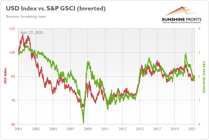
To explain, the red line above tracks the USD Index, while the green line above tracks the inverted S&P GSCI. For context, “inverted” means that the S&P GSCI’s scale is flipped upside down and that a rising green line represents a falling S&P GSCI, while a falling green line represents a rising S&P GSCI. More importantly, though, the two have a history of following in each other’s footsteps, and since 2010 it’s been almost a spitting image. As a result, if the S&P GSCI is about to meet its maker, a surging USD Index could eventually drop the guillotine on the PMs.
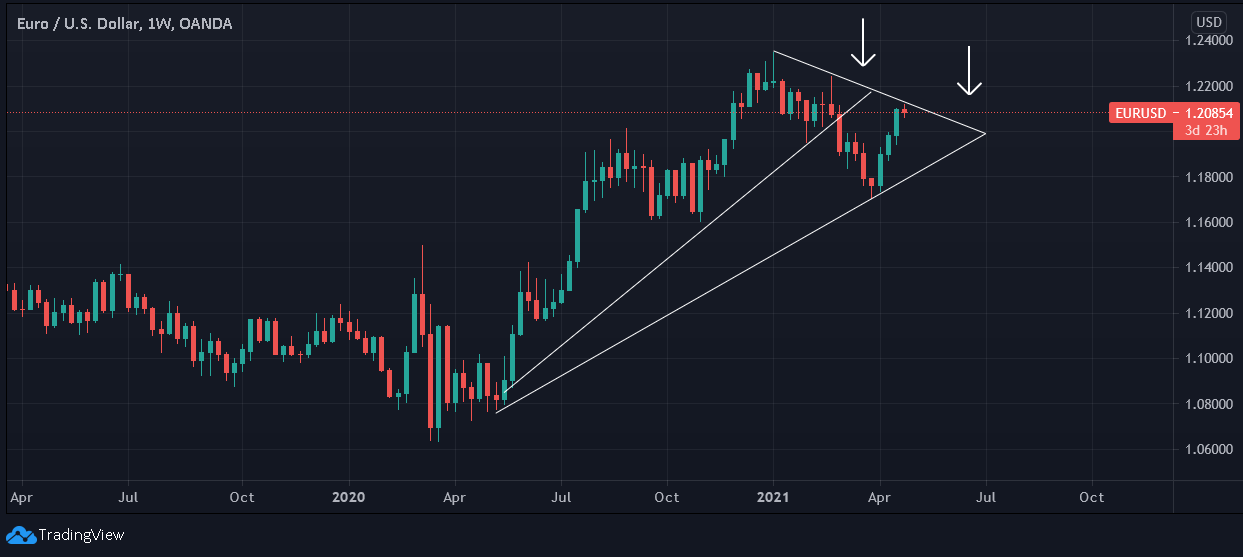
In addition, while the EUR/USD’s recent ascension has dollar bulls doubting their eyesight, the currency pair’s latest rerating is still fraught with peril. For one, it was less than four months ago that the EUR/USD was trading at 1.235. And despite the recent rise in optimism, the currency pair – which accounts for nearly 58% of the movement of the USD Index – is at a point where it needs to certify its status.
Please see below:
The European Connection
To explain, after attempting to break above its declining resistance line in February, the EUR/USD eventually rolled over and broke below its rising support line. Similarly, after approaching its declining resistance line again on Apr. 26, investors rejected the attempted breakthrough. As a result, the EUR/USD’s pathway higher has already become more difficult.
Furthermore, I’ve discussed at length the connection between the USD Index’s current price action and its 2017-2018 analog. But not to be outdone, the EUR/USD is also following the same historical script.
Please see below:
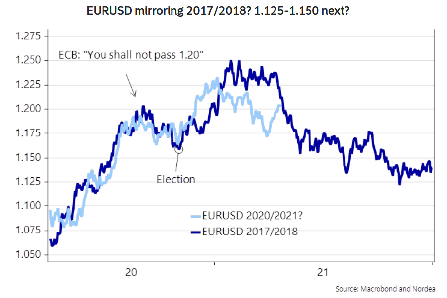
To explain, the light blue line above tracks the EUR/USD’s current price action, while the dark blue line above tracks the currency pair’s movement in 2017-2018. As you can see, up until recently, the EUR/USD was following the historical analogue to a tee. Moreover, while the light blue line has moved sharply higher in recent weeks, notice how fits and starts were also a part of the story in 2017-2018? If you analyze the middle of the chart, you can see that the dark blue line moved below 1.225 and above 1.250 before rolling over eventually. As a result, the current bounce from below 1.175 to above 1.200 is nothing to write home about.
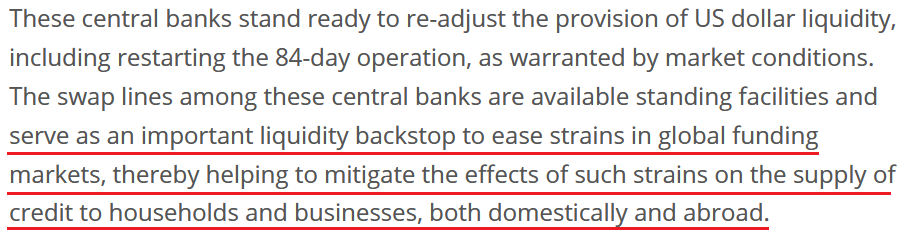
Furthermore, there seems to be some confusion about the European Central Bank’s (ECB) – and other major central banks’ – suspension of their 84-day U.S. dollar liquidity operations. For context, the swap facility was created to ensure that U.S. dollars remained abundant during the coronavirus crisis.
Please see below:
Source: ECB
However, keep in mind that “an important liquidity backstop to ease strains in global funding markets,” is code for avoiding a large spike in the U.S. dollar. Essentially, if the swap lines didn’t exist in March 2020, global central banks would have been forced to purchase U.S. dollars on the open market. In turn, this would have increased the value of the USD Index. The bottom line? The suspension of the facility is not bearish for the greenback, if anything, it’s bullish because it reduces the available supply of U.S. dollars.
If that wasn’t enough, recent whispers of the ECB tapering its bond-buying program are extremely premature. With the European economy still drastically underperforming the U.S., it’s actually more likely that the ECB increases the pace of its bond-buying program. Case in point: while the EUR/USD ignores the reality, last week’s PEPP purchases (€22.2 billion) by the ECB were the highest since June 2020. Moreover, since its March meeting, the ECB has increased its average daily PEPP purchases per week from €2.90 billion to €3.60 billion.
Please see below:

Source: ECB/Frederik Ducrozet
Likewise, with the ECB stuck between a rock and a hard place, the central bank is likely to elicit stronger forward guidance. For context, the ECB could pledge to keep interest rates low until a certain date or refuse to scale back its bond-buying program until other criteria have been met. And with the former making the euro an even more attractive funding currency for the carry trade, the prospect is fundamentally bearish for the EUR/USD.
Please see below:
For context, the carry trade is an arbitrage strategy where an investor borrows money in one currency and invests the proceeds in the bonds (usually) of another currency. In addition, because the carry trade incurs interest charges, lower Eurozone interest rates (relative to the U.S.) means that it’s cheaper to use the euro as the funding currency.
Regarding the Eurozone economy, future ‘expectations’ were the primary driver of the EUR/USD’s recent rally. With hope overpowering reality, the daily deluge of weak economic data was overruled by investors’ ‘optimism’ for the future. However, with the ifo Business Expectations Index – a monthly indicator of economic sentiment in Germany (Europe’s largest economy) – falling to 99.5 (from 100.3 and missing the consensus estimate of 101.2), even hope is beginning to fade.
Please see below:
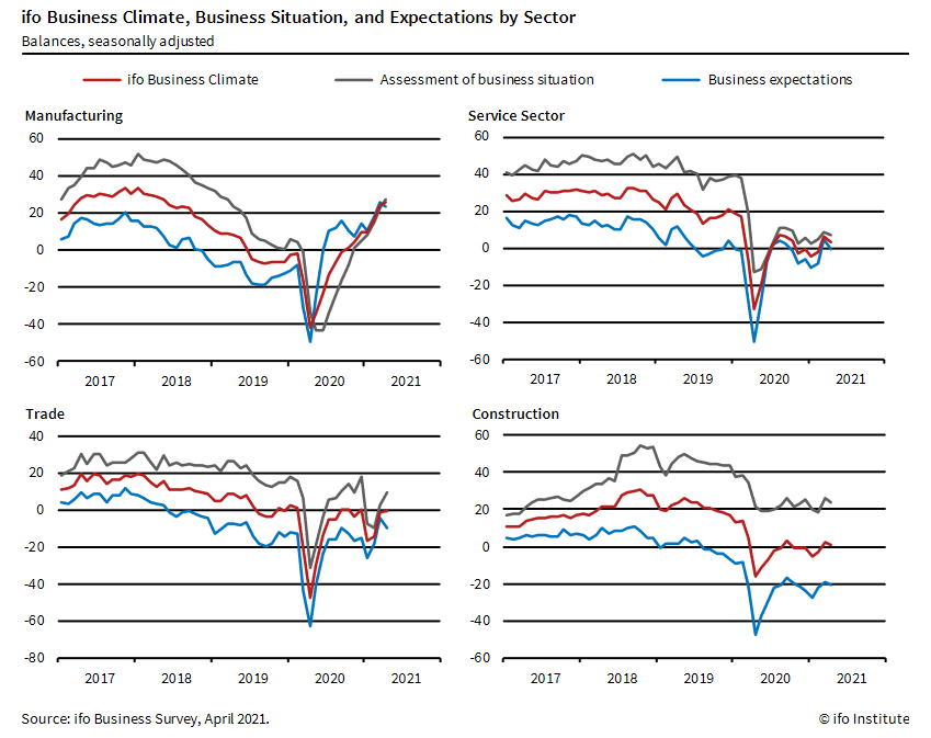
To explain, if you analyze the light blue lines on all four charts, notice how manufacturing, services, trade, and construction expectations have all moved lower? Even more revealing, according to ifo, German businesses are “no longer quite so optimistic about the coming six months.”
Last but not least, not only is Bank of America short the EUR/USD and long the USD/JPY, but its Global Research team expects the USD Index to move “moderately higher” in the not-so-distant future.
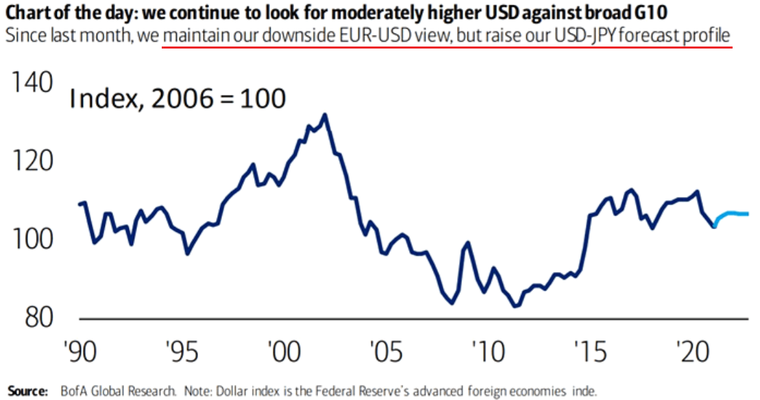
Please note that the price of gold is quite closely correlated with the performance of the USD/JPY pair (inversely), so – while they didn’t say it – in my opinion, the above could be translated into “Bank of America is now even more bearish on gold’s price than it was previously.”
In conclusion, while it may look like the USD Index is staring into the dead of night, as Gotham’s White Knight once said, “The night is darkest just before the dawn. And I promise you, the dawn is coming.” And while the sun currently shines on nearly every asset except for the greenback, the negative consequences of cost-push inflation signals that a material reversal could be on the horizon (in fact, it has already happened when looking at things from the medium-term point of view).
Moreover, with the PMs’ exhibiting a strong negative correlation with the U.S. dollar, the prospect is unlikely to elicit a positive response. The bottom line? With the PMs’ dodging bullets from the U.S. 10-Year Treasury yield and the USD Index liable to add further ammunition, their medium-term outlook remains bearish. However, once the financial markets resemble the realistic state of economic affairs, the PMs will be ready to shine once again.
Disclaimer: All essays, research and information found on the Website represent the analyses and opinions of Mr. Radomski and Sunshine Profits' associates only. As such, it may prove wrong ...
more


wow - always a great and thorough analysis Przemyslaw!
Thank you!