
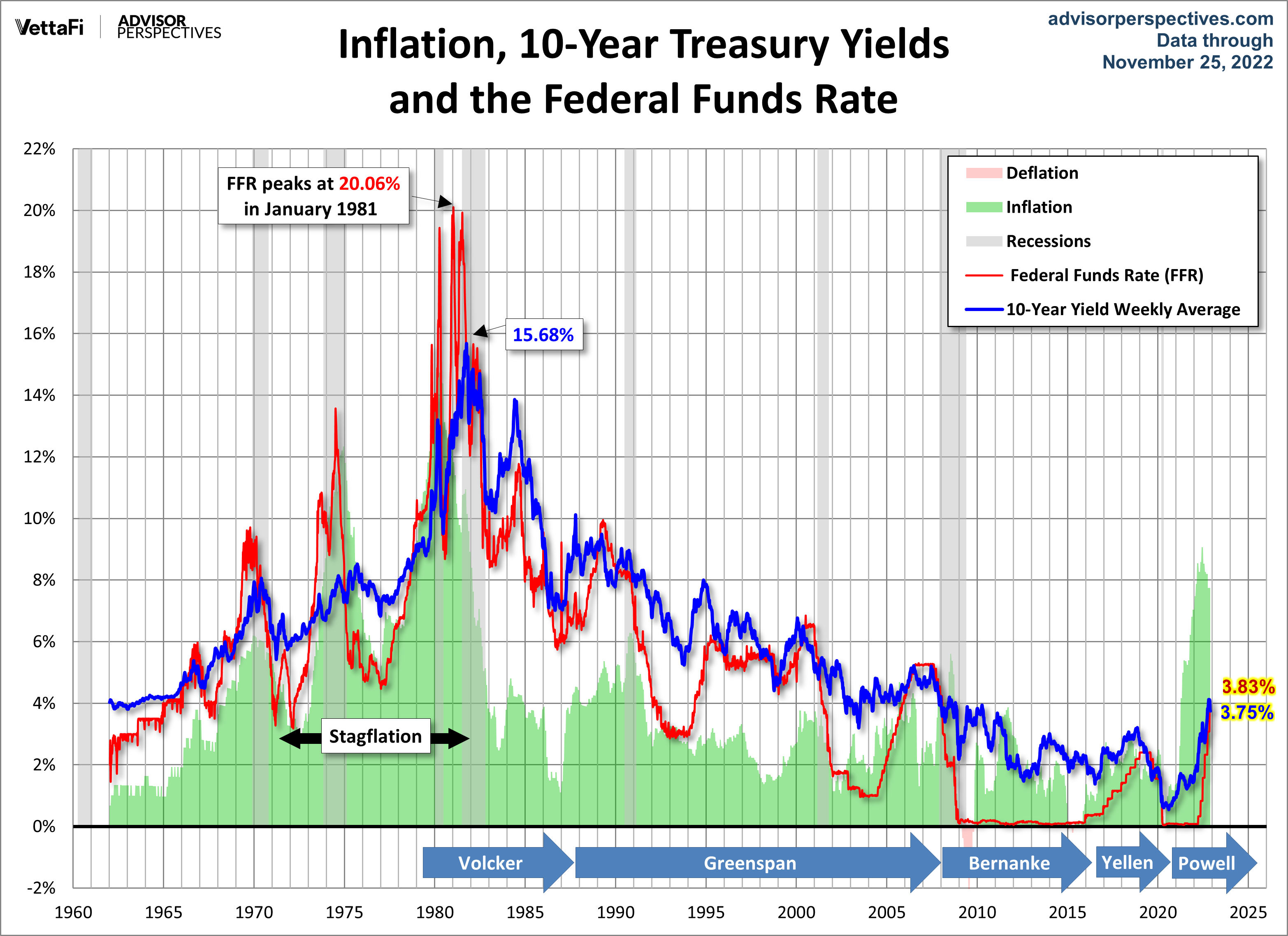
Let's have a look at a long-term perspective on Treasury yields as of the November 25, 2022 close. The chart below shows the 10-Year Constant Maturity yield since 1962 along with the Federal Funds Rate (FFR) and inflation. The range has been astonishing. The stagflation that set in after the 1973 Oil Embargo was finally ended after Paul Volcker raised the FFR to 20.06%.
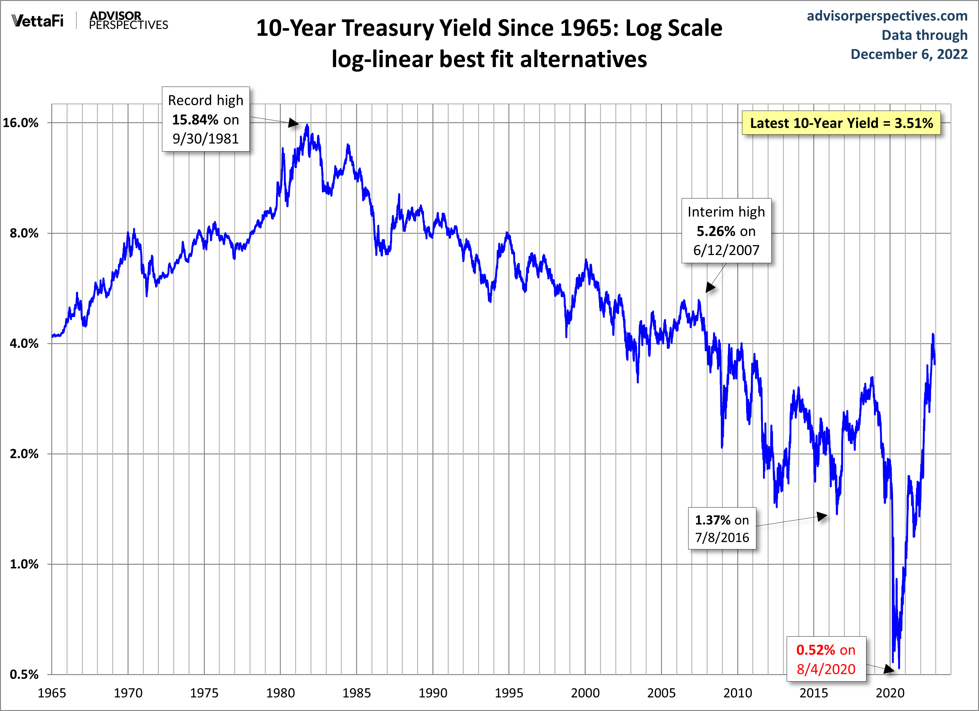
As of November 25, 2022, the 10-year note was 316 basis points above its historic closing low of 0.52%, reached on August 4, 2020
Now let's overlay the S&P 500 to see the historical pattern of equities versus treasuries. This is a nominal chart, which significantly distorted the real value of both yields and equity prices.

Here's the same chart with the S&P 500 and 10-year yields adjusted for inflation using the Consumer Price Index. The impact of stagflation becomes much clearer. We can better understand the severity of the decline in equities from the mid-1960s to the bottom in 1982. And we can also see why high yields can be deceptive in periods of double-digit inflation.
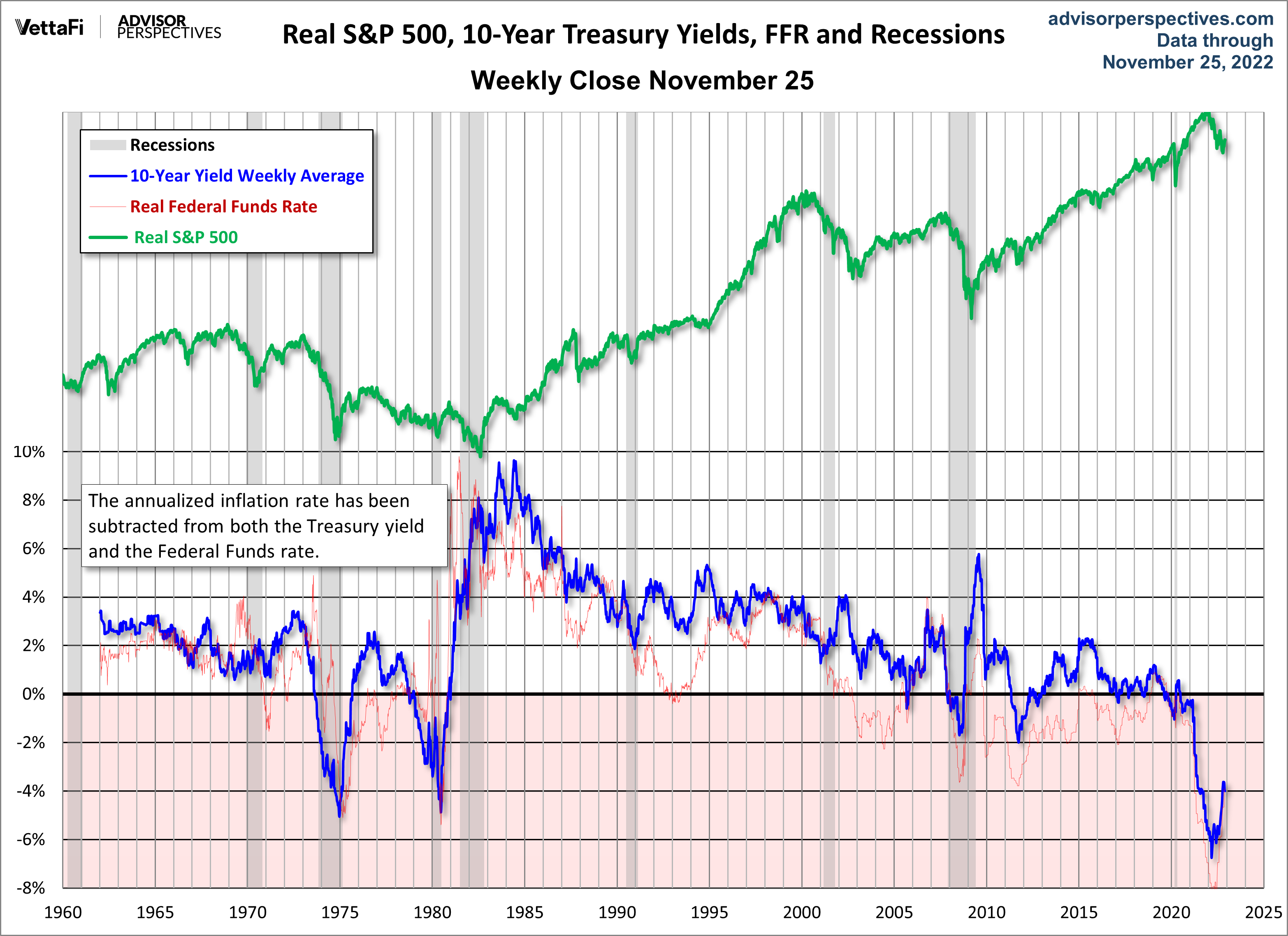
The most interesting series in the charts is the FFR red line. We can see how the Fed has used rates to control inflation, accelerate growth and, when needed, apply the brakes. The FFR was virtually zero from 2008 through 2016 and again starting in 2020. It's not obvious that it has done a great job to stimulate the economy - the S&P has risen to record levels over the last decade. Additionally, even when rates were at record highs in the late 80s, the S&P did not plummet. We've annotated the top chart with the tenures of the last three Fed chairmen so we can see who was managing the various FFR cycles since the summer of 1979.
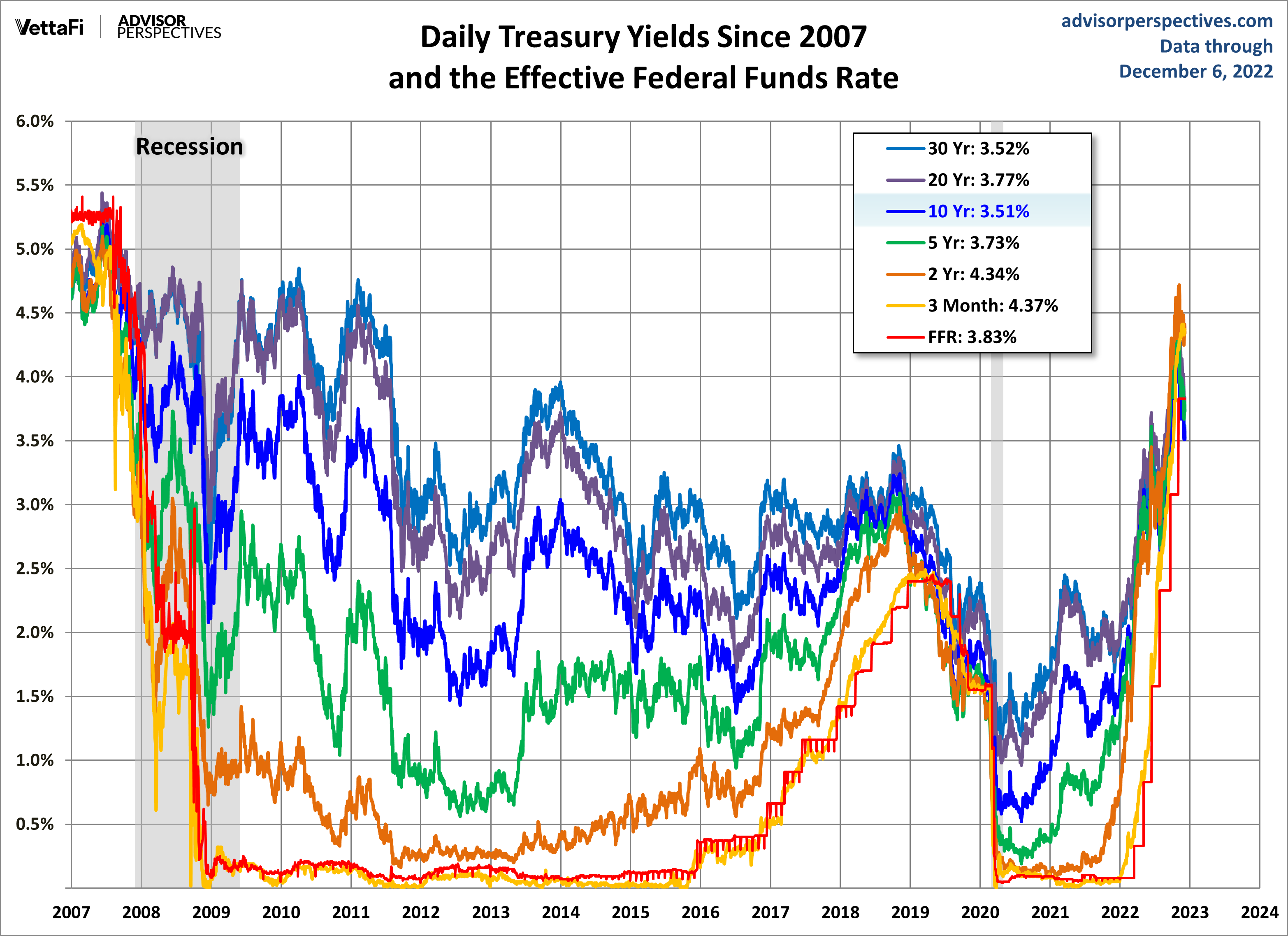
The next chart is based on daily data and adds some additional Treasuries for a close look at yields since 2007.
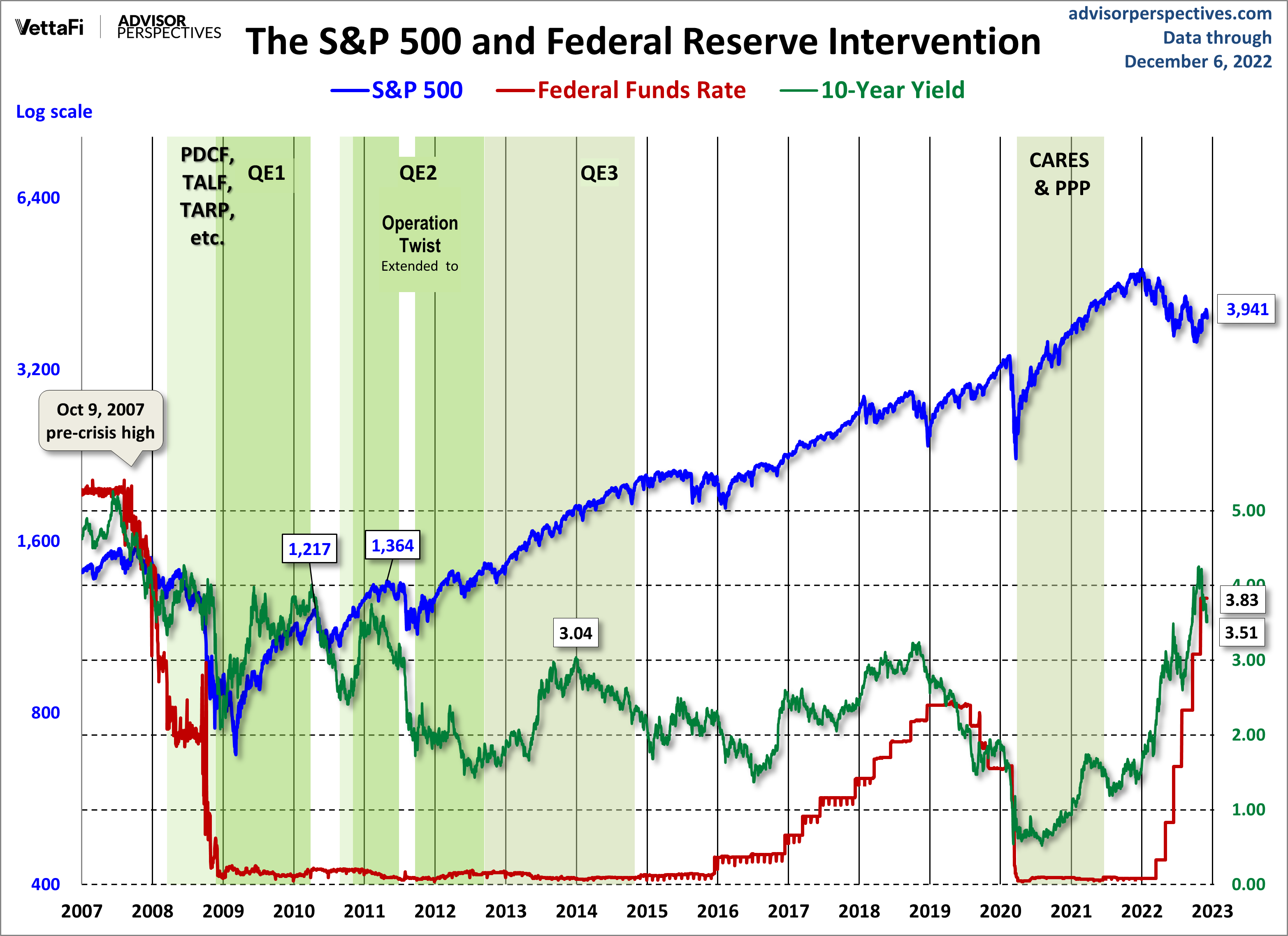
Now let's see the 10-year against the S&P 500 with some notes on Fed intervention.
We update the long-term charts periodically and the last chart more frequently, depending on yield volatility.
More By This Author:
Weekly Gasoline Prices: Regular And Premium Drop Again
November Employment: Services Vs. Goods Producing Jobs
October Trade Deficit At $78.2B

Comments
Log in or sign up to join the conversation.