
The gutters of Wall Street are strewn with the bodies of people who looked good for five years. ~ Marty Whitman
In this week’s Dirty Dozen [CHART PACK] we go through the latest monthly charts and cover the strongest macro asset (USD to the moon), the leading country ETF, and the top-performing sectors, along with some trade picks, plus more…
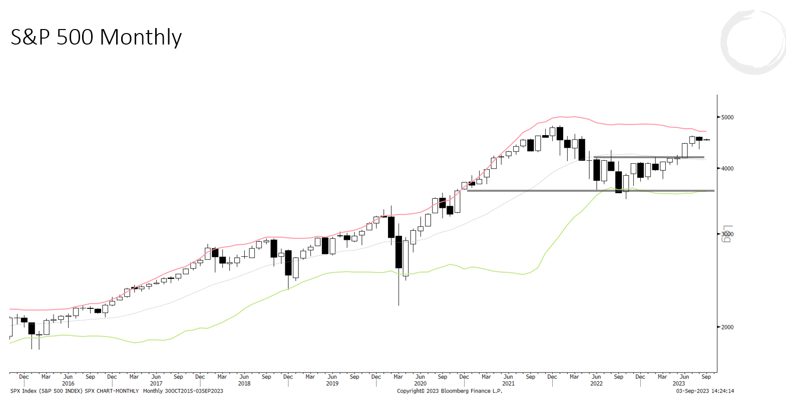
1. The SPX dipped in the month of August and that dip was bought as can be seen on the monthly candle chart below showing a large lower wick. This means that the bulls are still in control and the path of least resistance remains up.
(Click on image to enlarge)
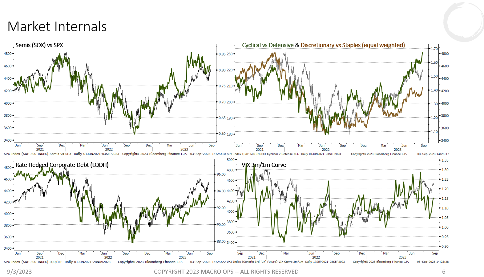
2. Internals have been keeping us long since the Oct 22’ low and they continue to confirm — even lead in the case of cyc vs. def — the trend is higher.
(Click on image to enlarge)
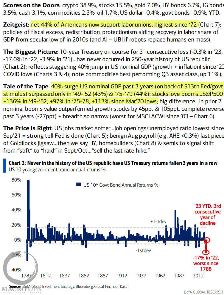
3. BofA Flow Show summary with highlights from me… Chart points out that never in the history of the US republic have US Treasuries seen negative returns for three consecutive years in a row. I think bonds will be a great long towards the end of the year but the setup isn’t quite there yet so we need to be patient.
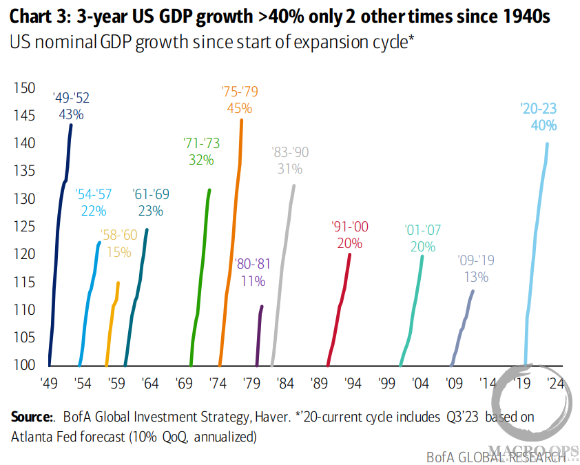
4. We’ve been in a regime of fiscal dominance for the past three years. The next three will look quite different.
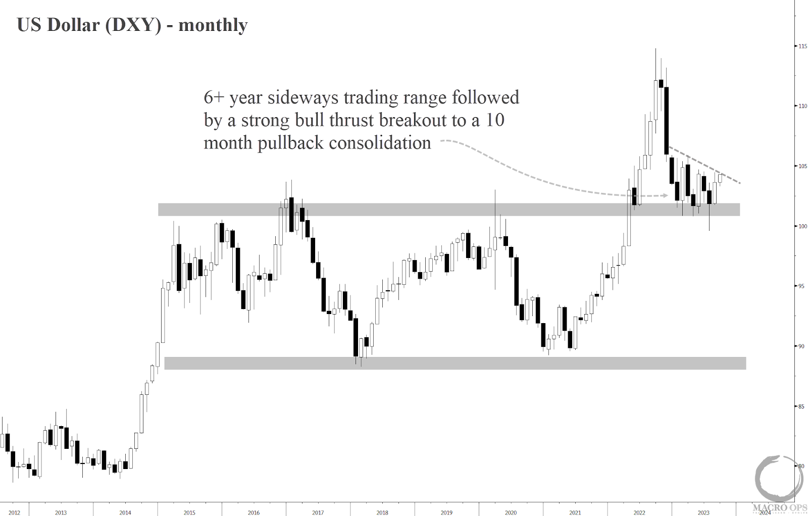
5. The US dollar has one of the most bullish monthly charts out of all the macro assets at the moment. DXY is going to trade significantly higher by year’s end.
Here’s why (1) Technically it’s a great setup. DXY saw an incredibly strong bull thrust out from a 6+ year sideways congestion zone. This type of thrust from this long of a sideways range does not just die after a single leg. It leads to follow-through and new highs (2) A Fed pause doesn’t mean a Fed pivot. The current popular narrative on this is about as lame as the one from the recessionistas over the past 18 months (3) positioning is offsides. The market is very long euros and pounds. There are a lot of repositioning flows to drive DXY once it gets going again.
(Click on image to enlarge)
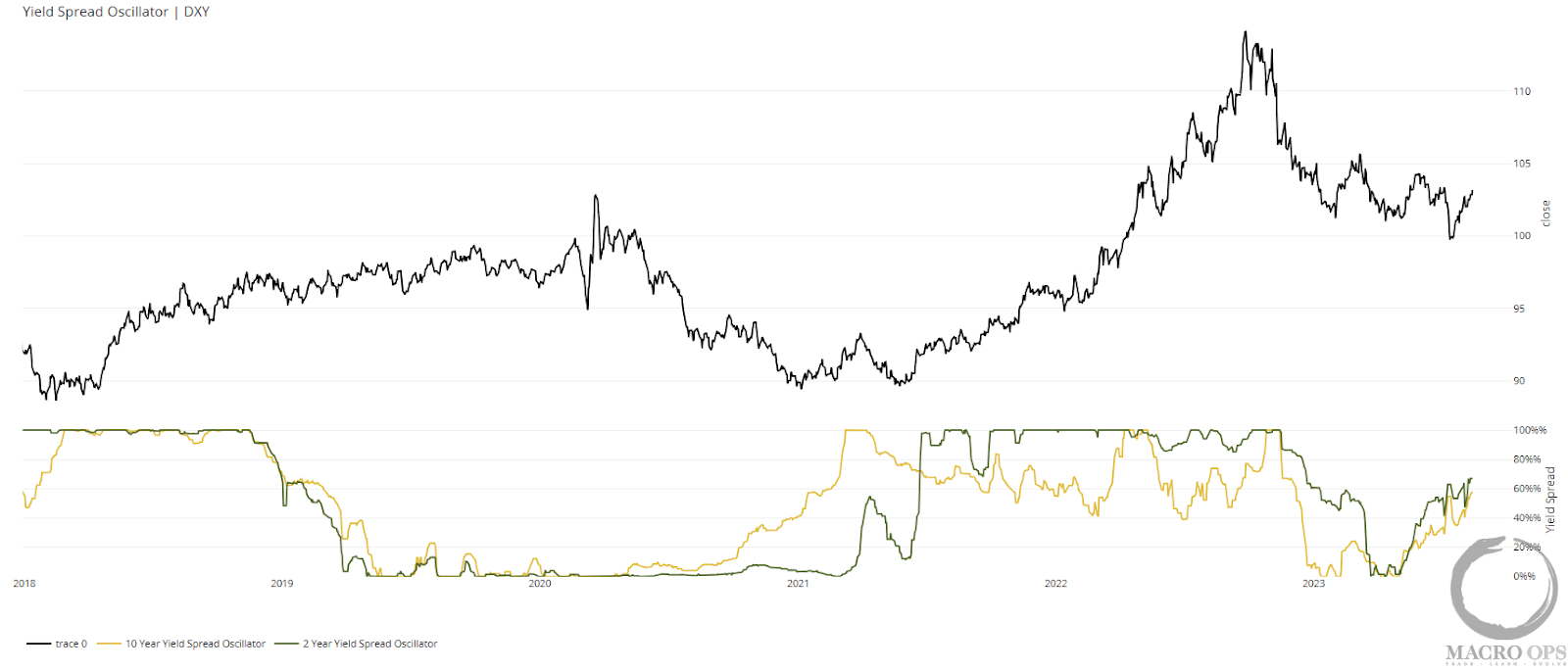
6. Our 2s and 10s DXY aggregate yield spread oscillator is back to trending up and is now north of 60%. We saw similar action in 21’ that led to a bottom and a large subsequent rally. I think we’re seeing something similar happen now.
(Click on image to enlarge)
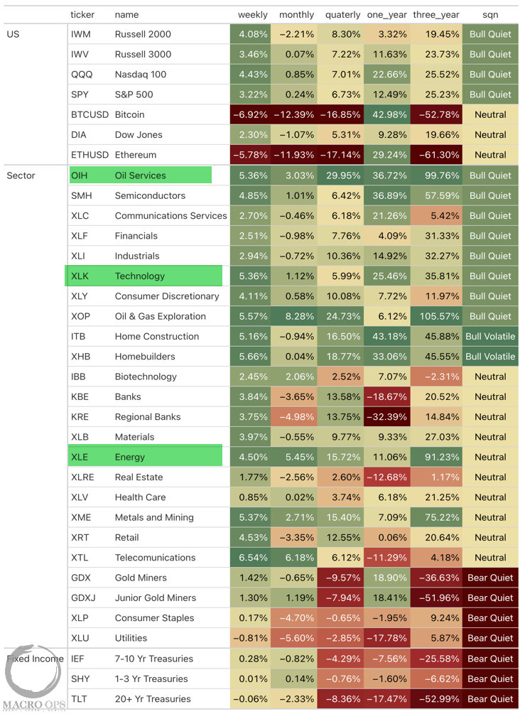
7. Our latest Returns Heatmap shows the market regimes and returns for all the major markets/assets. It’s hard to go wrong if you just stick to the Bull Quiet and Neutral regimes with the most consistently positive returns (green) across timeframes.
I’ve highlighted the strongest standouts below (energy, oil services, and tech).
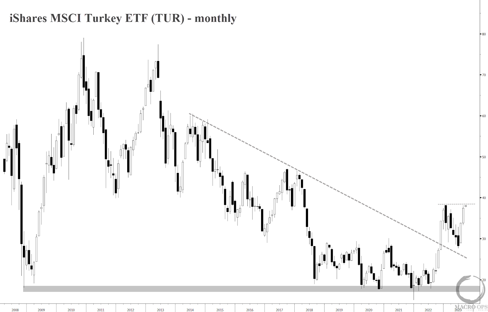
8. Turkey, a market I noted for its strength here back in Dec 22’ continues to be a relative leader.
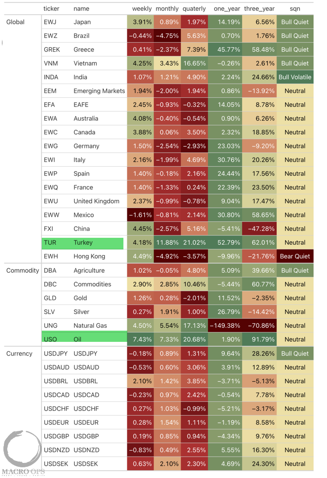
9. iShares MSCI Turkey (TUR) is about to break out to new multi-year highs soon. The country has been a big winner from the geopol shakeup that’s going on as it leverages its geographical position and its Nato membership to play all sides for its gain.
(Click on image to enlarge)
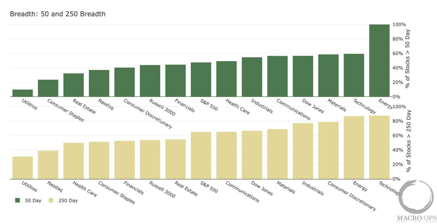
10. No surprise here… The strongest returning sectors also have the strongest breadth. At some point, this will become a contrarian input and Utes will be a buy and Energy + Tech will be a sell. But the trend is your friend until it bends…
(Click on image to enlarge)
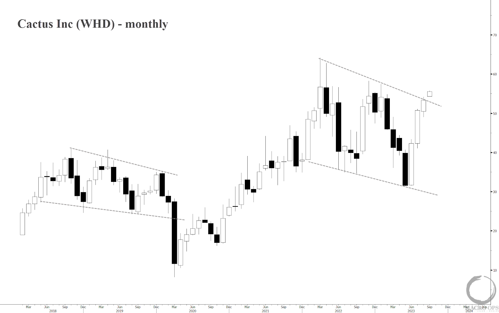
11. Within the Oil Services ETF (OIH), WHD has one of the stronger momentum profiles as well as long-term charts. At least outside of TDW which we’ve been in for a while now.
I pointed out the likely bottom in crude last week which has played out nicely since. However, while I believe crude will head higher in the interim. At some point the stronger dollar, fading fiscal impulse, and tightening liquidity will start to work against it. So while I continue to like energy names here the time to back up the truck on them has passed and we should be mindful of where the exit is in the coming weeks.
(Click on image to enlarge)
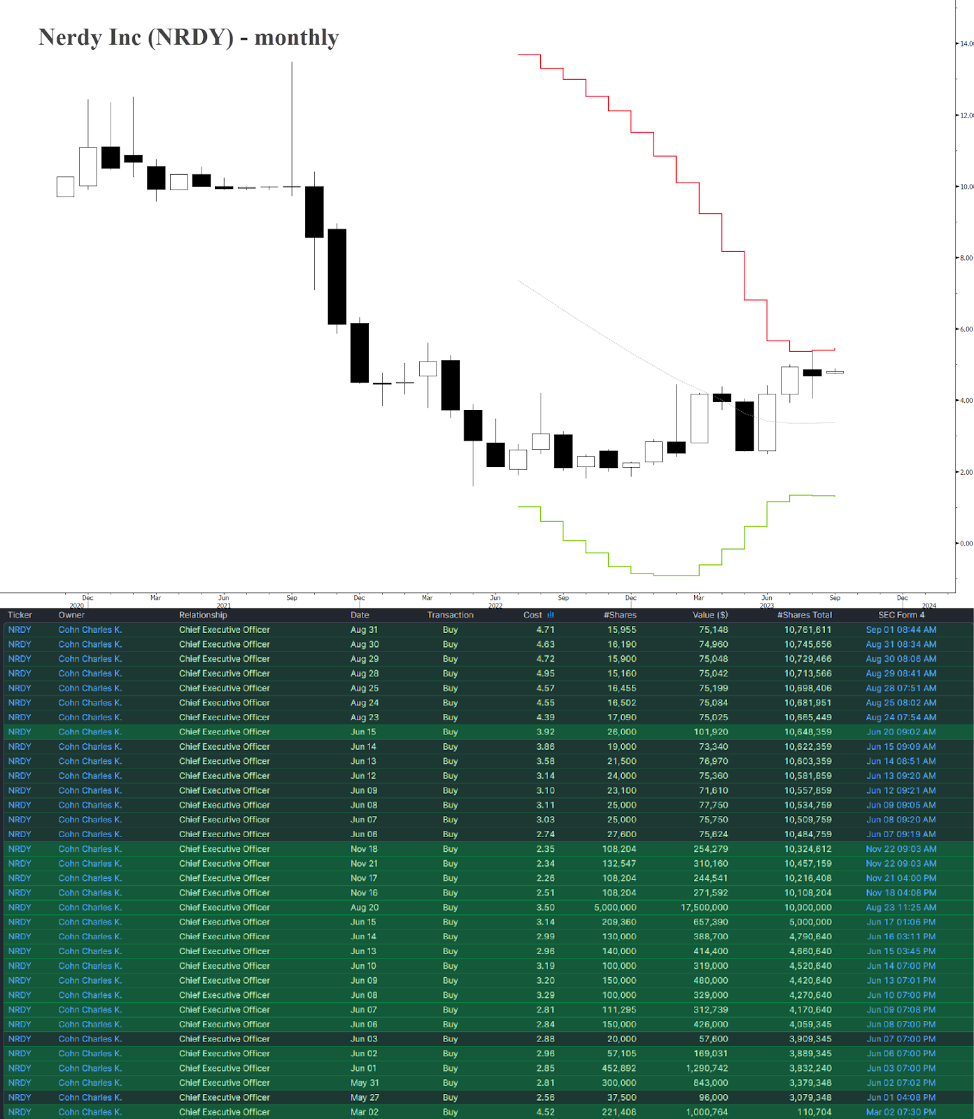
12. If you’re looking for tech value then NRDY should be on your radar. The company is founder-led, said founder has been gobbling up stock (see table below), and they recently completed a major business transition from single-use product sales to subscriptions. This has gone better than expected and management has been raising guidance the last few quarters.
The long-term chart is solid with a completed 18-month Cup-N-Handle pattern.
(Click on image to enlarge)
More By This Author:
Fade The Fame & Short Nvidia…The Whales Bail On Nvidia
A Bear Trap In Bonds…

Comments
Log in or sign up to join the conversation.