
How Bond Yields Are Affecting Gold
As U.S. Treasury yields rise, gold, which is seen as an inflation hedge, is hurting. Despite the obvious warning signs, investors remain bullish.
After Monday’s (Feb. 22) supposedly “groundbreaking” rally, the situation in gold developed in tune with what I wrote yesterday. The rally stopped, and miners’ decline indicated that it was a counter-trend move.
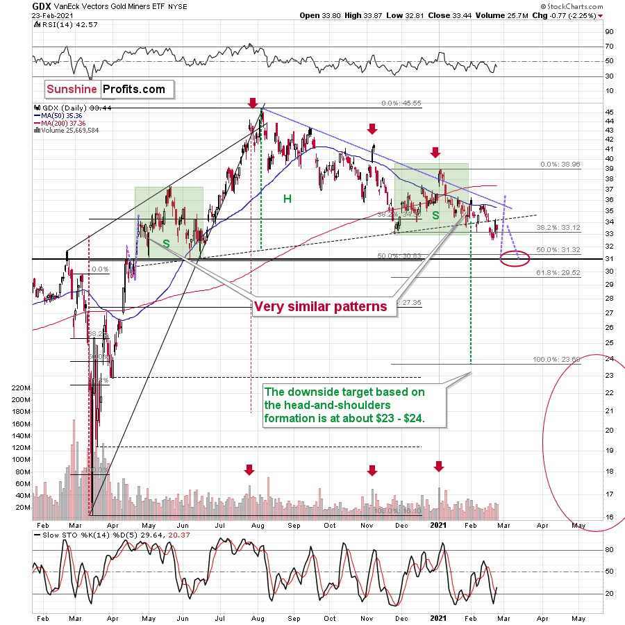
Figure 1
Despite Monday’s (quite sharp for a daily move) upswing, the breakdown below the neck level of the broad head-and-shoulders remains intact. It wasn’t invalidated. In fact, based on Monday’s rally and yesterday’s (Feb. 23) decline, it was verified. One of the trading guidelines is to wait for the verification of the breakdown below the H&S pattern before entering a position.
What about gold stocks ratio with other stocks?
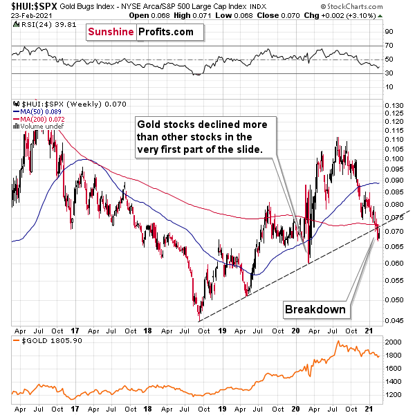
Figure 2
It’s exactly the same thing. The breakdown below the rising long-term support line remains intact. The recent upswing was just a quick comeback to the broken line that didn’t take it above it. Conversely, the HUI to S&P 500 ratio declined once again.
Consequently, bearish implications of the breakdowns remain up-to-date. Having said that, let’s consider the more fundamental side of things.
Swimming Against the Current
After trading lower for six consecutive days, gold managed to muster a three-day winning streak. However, with the waves chopping and the ripple gaining steam, every swim higher requires more energy and yield’s decelerating results.
For weeks, I’ve been warning that a declining copper/U.S. 10-Year Treasury yield ratio signaled a further downside for gold. And with the ratio declining by 2.88% last week, gold suffered a 2.51% drawdown.
Please see below:
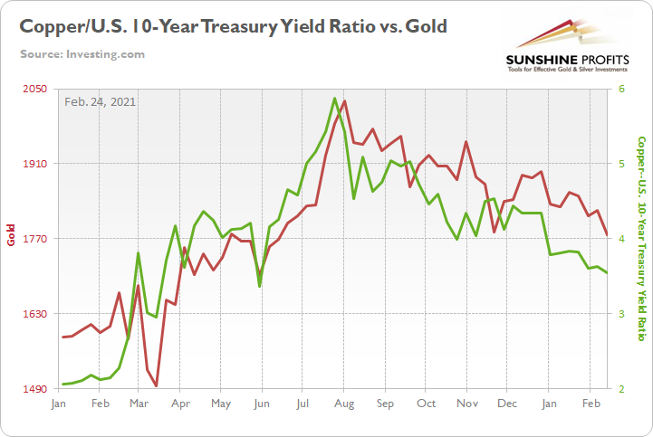
Figure 3
Over the long-term, the ratio is a reliable predictor of the yellow metal’s future direction. And even though the weekly reading (3.04) hit its lowest level since May 2020, it still has plenty of room to move lower.
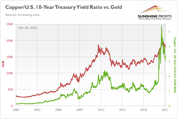
Figure 4
For context, I wrote previously:
To explain the chart above, the red line depicts the price of gold over the last ~21 years, while the green line depicts the copper/U.S. 10-Year Treasury yield ratio. As you can see, the two have a tight relationship: when the copper/U.S. 10-Year Treasury yield ratio is rising (meaning that copper prices are rising at a faster pace than the U.S. 10-Year Treasury yield), it usually results in higher gold prices. Conversely, when the copper/U.S. 10-Year Treasury yield ratio is falling (meaning that the U.S. 10-Year Treasury yield is rising at a faster pace than copper prices), it usually results in lower gold prices.
As the star of the ratio’s show, the U.S. 10-Year Treasury yield has risen by more than 47% year-to-date (YTD) and the benchmark has surged by more than 163% since its August trough.
Please see below:
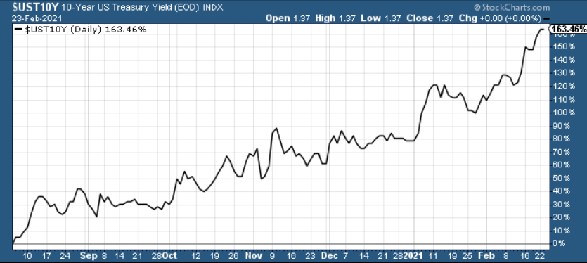
Figure 5
On Jan. 15, I warned that the U.S. Federal Reserve (FED) had painted itself into a corner. With inflation running hot and Chairman Jerome Powell ignoring the obvious, I wrote that Powell’s own polices (and their impact on real and financial assets) actually eliminate his ability to determine when interest rates rise.
As a result, the central bank had two options:
- If they let yields rise, the cost of borrowing rises, the cost of equity rises and the U.S. dollar is supported (all leading to shifts in the bond and stock markets and destroying the halcyon environment they worked so hard to create).
- To stop yields from rising, the U.S. Federal Reserve (FED) has to increase its asset purchases (and buy more bonds in the open market). However, the added liquidity should have the same net-effect because it increases inflation expectations (which I mentioned yesterday, is a precursor to higher interest rates).
Opening door #2, Powell’s deny-and-suppress strategy is now playing out in real-time. On Feb. 23 – testifying before the U.S. Senate Banking Committee – the FED Chairman told lawmakers that inflation isn’t an issue.
“We’ve been living in a world for a quarter of a century where the pressures were disinflationary,” he said... “The economy is a long way from our employment and inflation goals.”
And whether he’s unaware or simply ill-informed, commodity prices are surging. Since the New Year, oil and lumber prices have risen by more than 24%, while corn and copper prices are up by more than 14%.
Please see below:
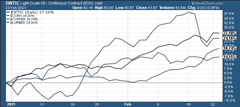
Figure 6
In addition, relative to finished goods, the entire basket of inputs is sounding the alarm.
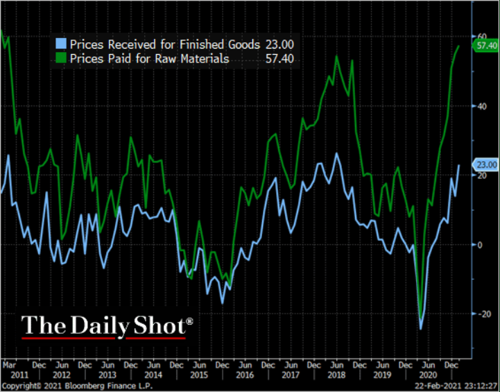
Figure 7
To explain the chart above, the blue line is an index of the price businesses receive for their finished goods. Similarly, the green line is an index of the price businesses pay for raw materials. As you can see, the cost of doing business is rising at a torrent pace.
More importantly, though, Powell’s assertion that inflation is an urban legend has been met with eye rolls from the bond market. To repeat what I wrote above: Powell’s own policies (and their impact on real and financial assets) actually eliminate his ability to determine when interest rates rise.
Case in point: the U.S. 10-year to 2-year government bond spread is now at its highest level since January 2017.
Please see below:
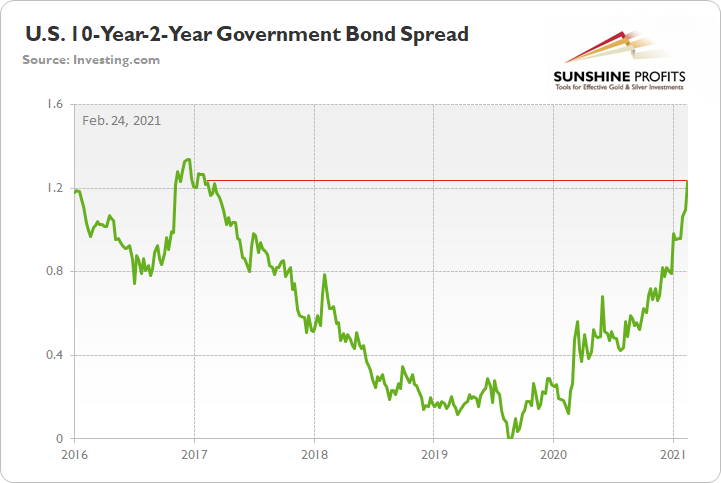
Figure 8
To explain the significance, the figure is calculated by subtracting the U.S. 2-Year Treasury yield from the U.S. 10-Year Treasury yield. When the green line is rising, it means that the U.S. 10-Year Treasury yield is increasing at a faster pace than the U.S. 2-Year Treasury yield. Conversely, when the green line is falling, it means that the U.S. 2-Year Treasury yield is increasing at a faster pace than the U.S. 10-Year Treasury yield.
And why does all of this matter?
Because the above visual is evidence that Powell has lost control of the bond market.
At the front-end of the curve, Powell can control the 2-year yield by decreasing the FED’s overnight lending rate (which was cut to zero at the outset of the coronavirus crisis). However, far from being monolithic, the 5-, 10-, and 30-year yields have the ability to chart their own paths.
And their current message to the Chairman? “We aren’t buying what you’re selling.” As such, the yield curve is likely to continue its steepening stampede.
Circling back to gold, all of the above supports a continued decline of the copper/U.S. 10-Year Treasury yield ratio. With yields essentially released from captivity, even copper’s 8.02% weekly surge wasn’t enough to buck the trend.
As a result, gold’s recent strength is likely a mirage. The yellow metal continues to bounce in fits and starts, thus, it’s only a matter of time before the downtrend continues. Furthermore, with the USD Index still sitting on the sidelines, a resurgent greenback would add even more concrete to gold’s wall of worry.
And speaking of gold’s wall of worry, the sentiment surrounding it is far from being negative.
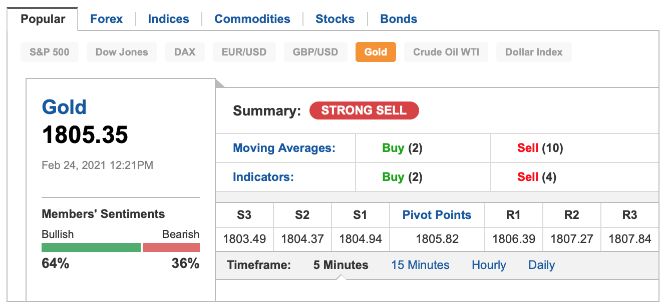
Figure 9 - Source: Investing.com
The above chart shows the sentiment of Investing.com’s members. 64% of them are bullish on gold. As you can see above, there are also other popular markets listed: the S&P 500, Dow Jones, DAX, EUR/USD, GBP/USD, USD Index, and Crude oil. The sentiment for gold is the most bullish of all of them. Yes, the general stock market is climbing to new all-time highs every day now, and yet, people are even more bullish on gold than they are on stocks.
When gold slides, the sentiment is likely to get more bearish, and particularly high “bearish” readings – say, over 80% would likely indicate a good buying opportunity. Naturally, this is not the only factor that one should be paying attention to.
The bottom line? As it stands today, being long the precious metals offers a poor risk-reward proposition. However, in time (perhaps over the next several months), the dynamic will reverse, and the precious metals market will shine once again.
Disclaimer: All essays, research, and information found on the Website represent the analyses and opinions of Mr. Radomski and Sunshine Profits' associates only. As such, it may prove wrong ...
more


What do you think of $NMGRF - Noveau Monde Graphite. I think they will be the largest producer of graphite in the Western Hemisphere. Uplisting to NASDAQ.
Unfortunately, I have no opinion on that stock. I specialize in the precious metals market...