
10 Charts To Watch In 2019 (Q1 Update)
The year is quickly getting away. Personally, I've had so much going on that I can't decide whether this year feels like it's gone really fast or whether it feels like a year in one quarter! One thing I can decide on though is that it's worth taking a quick progress check on the "10 Charts to Watch in 2019".
In the original article, I shared what I thought would be the 10 most important charts to watch for multi-asset investors in the year ahead (and beyond).
In this article, I have updated those 10 charts and provided some updated comments.
My original overarching thoughts/themes on the outlook were:
"Overall, the theme of “transitions,” I think captures a lot of the major moving parts: a transition for central banks from suppressors to sources of volatility, rotation across assets and markets, and a transition stage in the business/market cycle. Risk is clearly elevated, but as the charts show; so too is opportunity."
What I would change or add in terms of the outlook from here is that globally central banks almost look like they are pivoting back towards being suppressors of volatility. We're certainly seeing early signs of rotation across assets and markets. And with the global economic slowdown, I would go out on a limb and say it's transitioning to green shoots...
With that all said, let's get into the charts!
[Note: I have included the original comments from back at the start of the year, so you can quickly compare what I'm thinking now vs what I said back then]
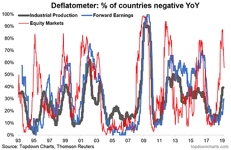
1. Deflation Risk: What's changed in this chart is that more countries have gone into "deflation" in terms of industrial production and forward earnings, but the equity market deflatometer has made a sharp turn down, indicating perhaps the deflationary wave might be over as quick as it began.
"Deflation Risk: as I write, over 80% of world equity markets are in “deflation” (price negative YoY%), the risk here is that we see the black and blue lines turn up (proportion of countries seeing forward earnings and industrial production contracting on an annual basis), and if they do it will probably leave us all feeling a little black and blue, because when it comes to economic deflation, what we’re really talking about is the risk of a global economic recession. Keep this chart front of mind and top of your radar this year."
2. Manufacturing PMIs - EM vs DM: What makes this chart so interesting, and even more so with the Q1 data, is that we could be about to see a repeat of the type of pattern we saw in 2015/16... EM was the first to peak, and apparently seems to be the first to have bottomed. This will get even more interesting if EM is able to outperform DM and lead DM back to recovery. A lot to ask, but with EM central banks having more ammo in the monetary clip, it's an interesting thesis.
"Manufacturing PMIs: down with DM, up with EM? It’s early days, but we’ve been seeing some stabilization in EM economic data (and softening across DM). Given the growing size and influence of EM economies, this could be a key chart in determining how the previous chart plays out."

3. EM vs DM Equities Relative Performance: After an initial rally in EM relative performance, it's looking like a false start. But these are very early days and it's normal to see volatility/minor counter-trend reversals in this series, so I would not be counting it out yet. A big driver of what happens next here is going to be as much down to the chart above as the path of the US dollar (I know what I think's going to happen there!).
"EM vs DM – Equities: this one also ties in closely with the previous chart, because this emergent economic divergence is among the many factors (including valuation) which I think will help EM equities comfortably outperform vs DM in coming years."

4. Global Cyclicals vs Defensives: This one is a favorite of mine, and it echoes the PMI chart - we saw Emerging Markets cyclicals vs defensives rollover first, and then recover first too. Aside from the US, the rest of DM has been lagging behind, and I would say watch those closely as they will be a swing factor and a key driver for DM ex-US equities.
"Global cyclicals vs defensives – a key theme in 2018 with rotation well underway. But the key one here (EM again!) is the red line and the nascent rebound: watch closely for follow-through. Since initially publishing this chart in the end of year report we've actually started to see the other regions begin to turn up too (...just like how EM rolled over first)."

5. Global Monetary Policy Trends: It's slightly less obvious in this chart than some of the other global monetary policy monitors I run, but there has been a distinct noticeable global policy pivot (certainly at least a pause). As I noted back at the start of the year the transition from central banks as suppressors to sources of volatility seems to be short-lived, and if true we may well be in for another couple of years of extend-and-pretend for the market cycle.
"More and more global central banks are shifting into tightening mode. My guess is we’ll see more of the same here and more of monetary policy being a source (vs suppressor) of volatility."

6. Cash Allocations: With cash rates still globally close to record lows, it's perhaps unsurprising to see cash allocations continuing to bounce along the bottom. One thing to note with this chart is the extreme low in cash allocations (Dec 2017) has come and gone and around the turn of the year, we saw investors rapidly raising cash into (and out of) the December correction. This will be one to monitor and specifically to watch out for another lurch toward the lows.
"One impact of monetary policy tightening is that cash becomes incrementally more attractive (as an income generating asset) beyond its core role of capital preservation. Look for cash allocations to rise from record lows (as indeed, they have already started to do so)."

7. US High Yield Credit: I still see US HY credit spreads in the later innings, I had noted to clients a few "red lights" flashing late last year, but these have since moderated to orange/yellow lights. The Fed is on hold for now, but could still end up having the last word on credit.
"Higher cash rates may cause issues for those who opted to push risk for income: US high yield credit is in the final innings; anticipate wider spreads ahead."

8. Global Equity Valuations: So far the rebound in global equities has not brought the median country valuation back to expensive; implying that there could yet still be plenty of room to move in terms of valuation re-rating. It's not the same bargain it was back at the start of the year, but it's also far from expensive. Again, I feel this is an important chart to keep track of.
"In the wake of the global equity market correction, it’s becoming easier and easier to find a bargain. Valuations have already reset to some of the previous major market lows. While global equities could get cheaper yet, the probability is increasingly in favor of long term investors at these levels."

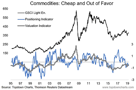
9. Commodities: Speaking here on commodities in aggregate (i.e. as an asset class), we're starting to see things stir here, and I think this is a really interesting setup. As for the chart below, it still shows commodities on the "cheap" side and positioning still fairly light. Catalysts include China macro, US dollar, and DM ex-US turning the economic tides. The battle lines are drawn in commodities, so pick your side.
"Beset by numerous headwinds and cross-currents last year, commodities ended 2018 looking un-loved and undervalued. As with the previous chart, there’s always room to go lower, but as long as the global economy avoids recession and if China/EM do ultimately stabilize and improve the case for commodities starts to look very good. And it’s often that you see commodities tend to do well later in the cycle. As the window starts to close for US dollar strength, that could be the final element to fall into place for commodities (and EM)."
10. China A-shares: Probably what I love most about this last chart is how much push-back I got when I first started talking about it... and the subsequent 30%+ rally we saw. To be fair, I am a little more wary on China A-shares now after this massive valuation re-rating. There's a few specific things I'm watching for in terms of macro/fundamental follow-through, but one thing we can say now is that valuations are now much closer to fair-value, so it's no longer a value play as such.
"Last but not least is China again (our China stimulus chart was number 10 last year, and it remains very important), this time China A-shares in particular. A lot went wrong for China last year, and in my mind that simply sets the stage for things to go at least less wrong, if not right for China this year. Trump has helped make China A-share valuations great again (cheap again). All that’s required now is a catalyst and I can see multiple candidates."

For more and deeper insights on the global markets, good charts, and actionable investment ideas you may want to more


