
A Short Look At Charts

Image Source: Unsplash
My friends are now trying to get me to go to Las Vegas to see Phish at the Sphere. I don’t really have that sort of time. But I did see that No Doubt will be at the Sphere, and Gwen Stefani is my favorite front-woman of all time, so it is still tempting.
Two years ago, I gave my wife and daughter two tickets to see Taylor Swift at the Hard Rock in Miami. It was a small fortune. In exchange, I have designated a one-week trip that I get to take - anywhere I want - with no complaints. I’d love to fly to Nepal, look at Mount Everest, and then get back on a plane and fly home. I did the math, and I’d be there for about 14 hours.
I looked at flying to Milan to go to the Olympics and watch the USA hockey team. But then I remembered, I can just go to the new All-Star format whenever I want. Milan is my second-favorite city in the world after Chicago, so I should just go to Chicago and be cold.
But I did make a decision. I decided that I’ll go to the World Baseball Classic this year. I’m going to fly to Houston to see the USA team on a Saturday night, then fly to Miami to watch the Final Four. That’s a clean trip, and it’ll be warm.
Gwen Stefani in Vegas would have been entertaining, but we’re 29 days from pitchers and catchers reporting. Plus, the off-season has been very good to my two teams - the Orioles and the Cubs. Alex Bregman is now a Cub. Let’s make Framber Valdez an Oriole.
Wait, what were we talking about? Oh, that's right. Here's a quick look at some financial charts.
Chart No. 1: Volatility
This is the CBOE Volatility Index, dating back to 2010, mixed with the U.S. policy uncertainty index. I’d say that this latter element matters, but it’s kind of an overstatement that policy uncertainty shifts the focus not on trade, but on liquidity.
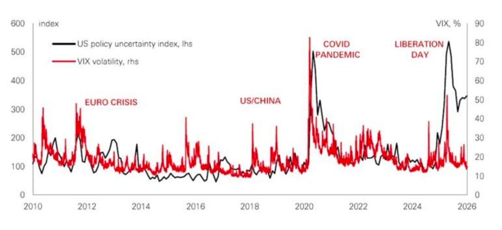
(Click on image to enlarge)
Every single one of these events could have fueled a deflationary Depression if the central banks hadn’t pumped more dollars into the system. That’s the world we live in, and the sooner you understand that we’re just a refinancing system, the better off you’ll be.
Anyway, I showed you that chart first to present the following one next.
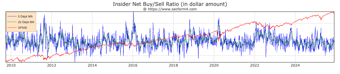
(Click on image to enlarge)
The chart illustrates insider buying to selling in real dollars on aggregate. Look how insider buying calls the bottom of every single spike. Why? The easing of economic conditions.
This isn’t hard, guys. They want to print money. It’s the only tool that suppresses volatility, which is, at its core, a reflection of liquidity expectations.
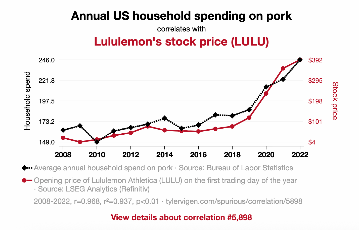
Chart No. 2: Just a Reminder
I love spurious correlations. There’s a whole website dedicated to them, and this chart is a reminder that one thing does not necessarily drive another's performance.
(Click on image to enlarge)
Pork consumption and Lululemon’s stock price? Sure, the correlation is gorgeous. But unless bacon sales are secretly driving yoga-pant valuations, we’re staring at the financial equivalent of seeing religion in a grilled cheese. Correlation isn’t causation.
It’s just two lines shifting together on a spreadsheet. If markets actually moved like this, every economist in America would be trading sausage futures in stretchy pants.
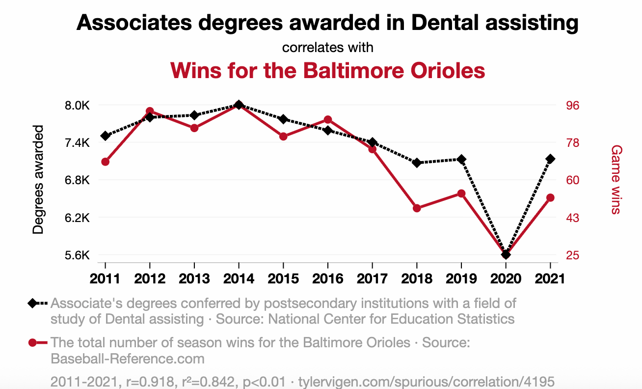
Chart 3: Wait, Hold On
I take back everything I just said. Take a look at this next chart.
(Click on image to enlarge)
I’m enrolling my daughter in dental school. This seems legit.
Now, I have to cut this look at charts short. Right when I was hitting my groove, my laptop went mad. The screen is acting up, and it seems to be a GPU issue. So I now have to go spend my day at Best Buy in a Bills jersey. I’m sorry that we have to cut this party short, but I'll make it up to you in the next update.
More By This Author:
Why I'm Going Long The Stock That Nearly Destroyed The Financial SystemWhy 2026 Will Break Every Strategy You Used In The Last 4 Years
$80 Silver... Achievement Unlocked


