


While the current cycle may have dispelled the notion that “housing is the economic cycle,” it is nevertheless an important component of the long leading indicators. And while new home construction is far more important economically, existing home sales - roughly 90% of the market - are an important determinant of pricing equilibrium in housing, and the repeat home sales indexes, by S&P Case-Shiller and the FHFA, are the best indicator of the same. And in the last few months, their prices have seemed to be slightly firming.
That emerging trend continued in this morning’s data. After several months of decline, the seasonally adjusted Case-Shiller National index (blue in the graphs below) rose 0.1% for the three-month period ending in June, while the FHFA index (red) was unchanged [Note: FRED has not yet updated the Case Shiller data]:
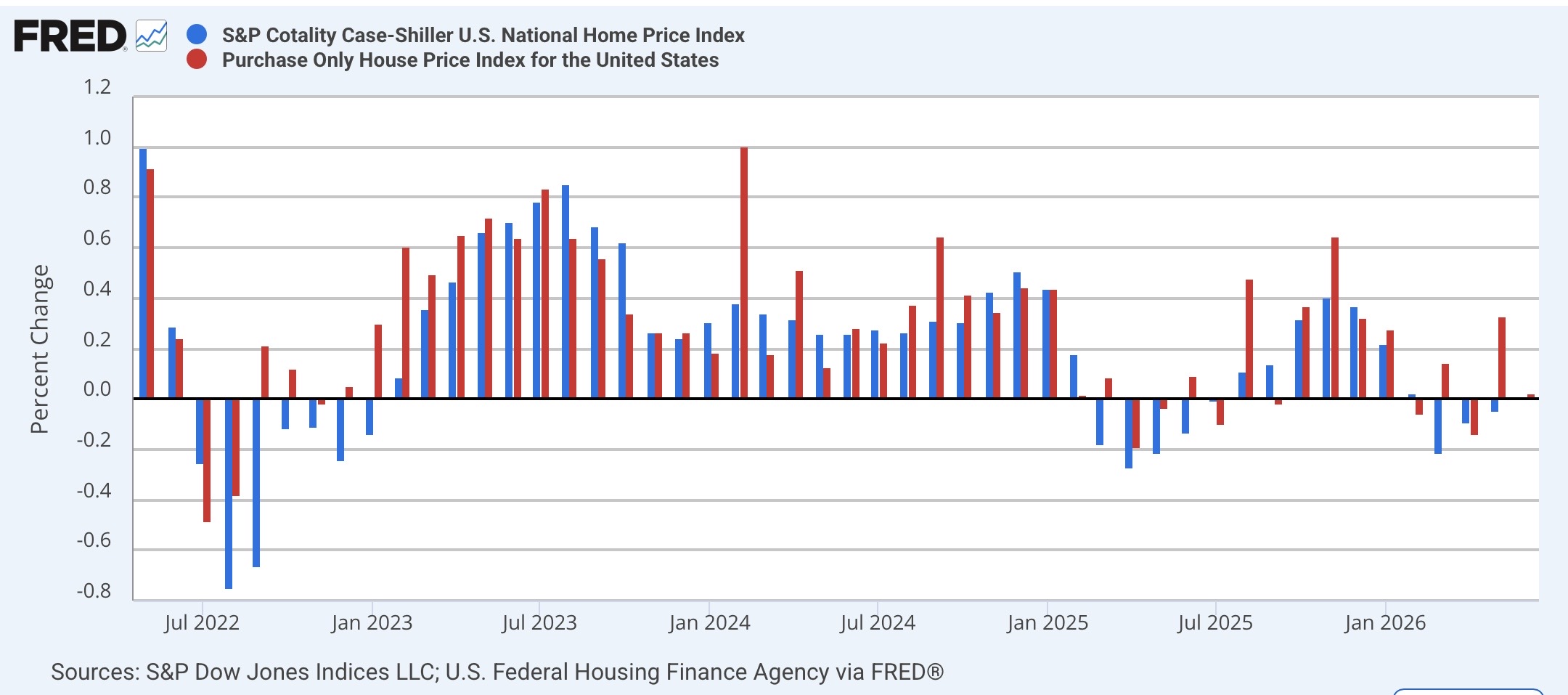
Often the FHFA Index slightly leads the Case Shiller one, and that appears to have been the case this year as well. In the past several months I have noted that “there is something of a divergence showing in the YoY comparisons of the two national indexes,” as the Case Shiller national index had increased less than 1% YoY, while the FHFA Index had accelerated to a 2.0% increase. With this month’s data, on a YoY% basis, the Case Shiller national index increased to 1.5%, and the FHFA declined very slightly to 2.3%:
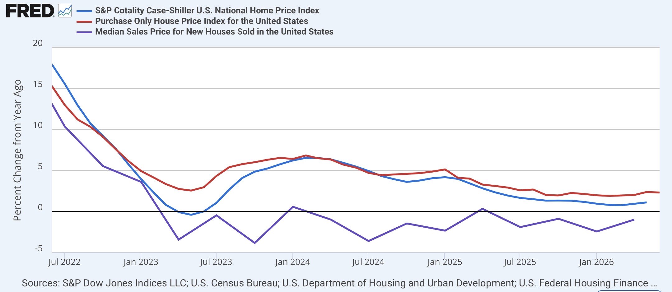
As of this month, both series appear to have ended their YoY declines, although neither one shows any sign of significant YoY acceleration. In the above graph, I have also shown the YoY% change in the median price for new homes (purple, averaged quarterly to cut down on noise). These are still in a slow decline, although the moving average of the last three months has been only -1% YoY.
Next, let’s take a look at how new (purple) and repeat home prices compare with households’ buying power, by adjusting for average hourly nonsupervisory earnings in the graphs below (median household income would be better, but is updated only once a year, and average wages are reasonably close for these purposes).
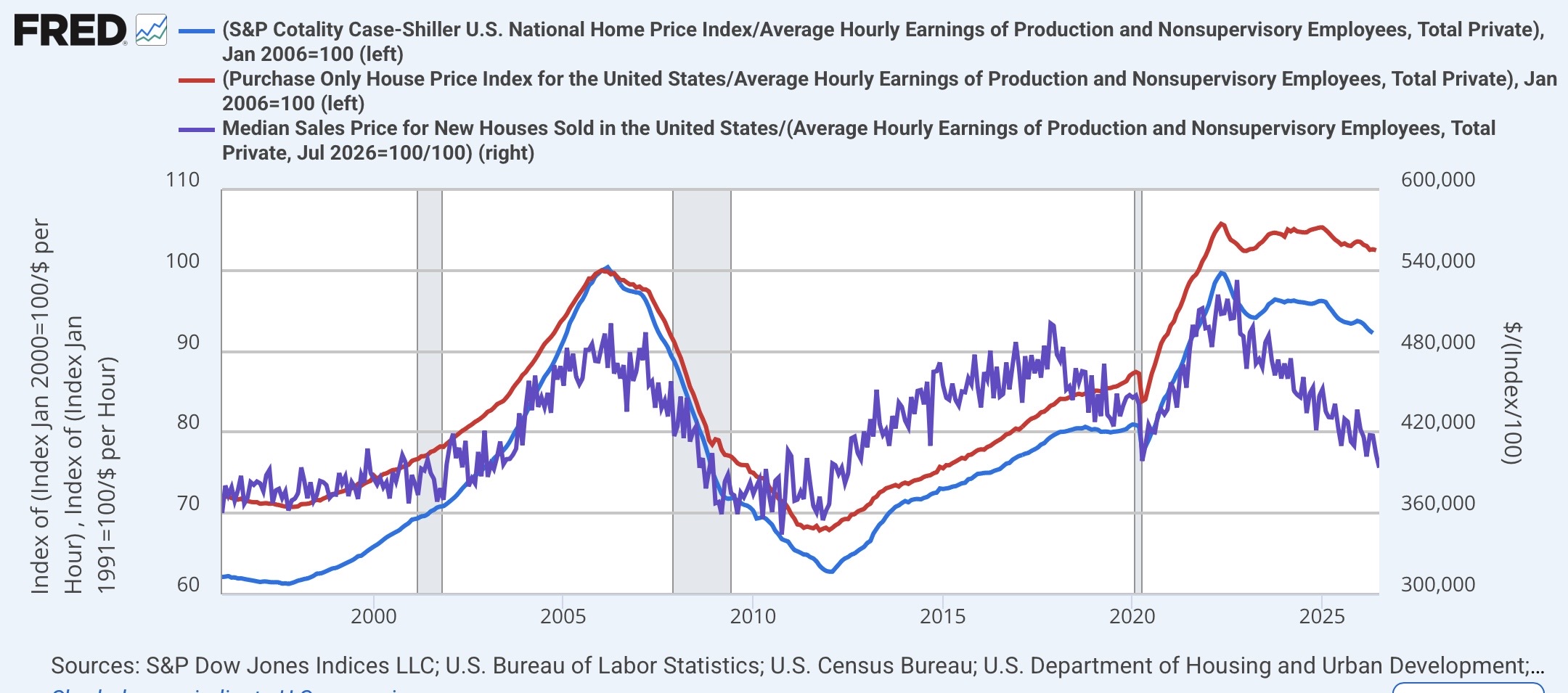
The bad news continues to be that existing houses remain unaffordable compared with most times in the past 30 years. But there is some “less bad” news in that, measured by both the Case Shiller and FHFA indexes, existing houses have gradually become “less unaffordable” over the past 24 months. Nevertheless, it will take considerably more inventory on the market to bring existing homes down to just their average affordability compared with the past 30 years.
Finally, let me look at something I haven’t updated in quite some time. Way back in 2021, it became apparent that the Fed was way behind the curve, since house prices lead the official shelter measure in the CPI, “owners’ equivalent rent,” by 12 to 18 months. What if any message are house prices sending the Fed now? Below is the YoY% change in the CPI using the FHFA index (dark blue) instead of OER to measure shelter compared with “core” inflation (light blue) and the Fed funds rate (red):
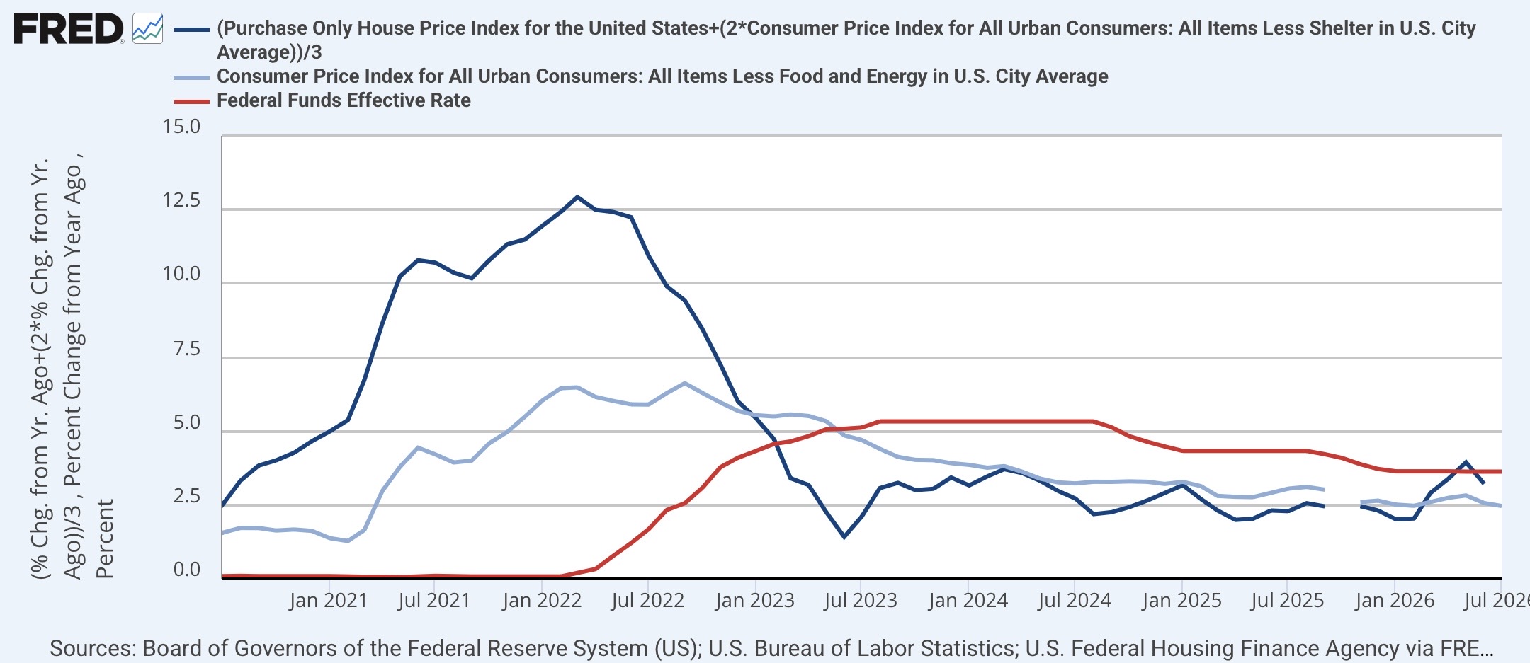
So measured, the Fed remained slightly behind the curve throughout 2023-25, as both core inflation and house-price measured CPI were close to the Fed’s 2% target during that time. But this year, as both house prices firmed and energy prices took off due to the Iran war, the house-price-measured CPI increased above 3%. In other words, at very least, the likely pass-through from house prices into inflation counsels against any lowering of interest rates.


Comments
Log in or sign up to join the conversation.