

So far this week, we’ve been talking about various market models and indicators. To be sure, the subject can get confusing as oftentimes the indicators can contradict one another. And then yesterday I went so far as to opine that negative readings from a couple longer-term, big-picture models might actually be positive this time around. So, feel free to insert an eye-roll here.
This morning, let’s forget about external factors, monetary conditions, the Fed, the economy, and/or valuations and turn our attention to the action of the market itself.
Long-time readers know that one of the reasons I like to look at price trends is that unlike so many other indicators/models, price cannot deviate from itself. While you may not always agree with what is happening in Ms. Market’s game, it is usually a very, very bad idea to believe that a market move is “wrong.” (Remember the old saw, markets are never wrong, but people often are!) In other words, the great thing about price is, it is what it is.
Of course, the interpretation of what is happening on the charts of the stock market indices tends to be more art than science. But since the models are presenting a cloudy picture at best these days, I decided it was time to take a look at some charts to see if there wasn’t a message to be gleaned.
Let’s start with a daily chart of the S&P 500…
S&P 500 – Daily
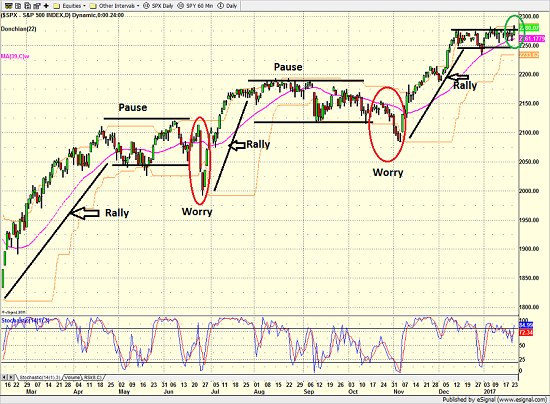
To reiterate, what is “seen” on a chart is indeed based on the eyes of the beholder. But here’s my take.
Cutting to the chase, I see a familiar pattern that has been unfolding since the latest cyclical bull market began on February 11, 2016. First, stocks rally. Then they pause as the rally is “digested” for a while. Then some “worry” comes out of the woodwork to give the bears the edge for a few days/weeks. But then traders remember the original reason for the move and the rally resumes. Rinse and repeat.
Since February 11, 2016, this pattern has definitely played out twice. And frankly, it looks like a variation on the theme is occurring right now.
For confirmation of this type of stuff, I like to look at other indices. The idea is to see if the theme appears anywhere else besides the S&P 500. So, I checked on the Russell 2000, the Midcap index, as well as the NASDAQ and NASDAQ 100.
The first point is that for the most part, my rally-pause-worry-rally-resumption pattern can definitely be seen across the rest of the major indices. For example, below is a chart of the IWM – the iShares Russell 2000 ETF.
iShares Russell 2000 ETF (IWM) – Daily
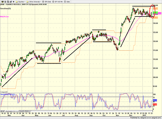
The major difference between the Russell small-caps and the S&P is what is happening right now. While the “generals” of the S&P appear to be attempting a jail break from the recent trading range, the “troops” are not following along. Well, not yet, anyway.
The bears are quick to point out that this is a technical divergence – and not a good one.
So, I checked in with the Midcap index to see if the same thing was happening there. As might be expected from a “mid” index, the recent chart action for the MDY is somewhere in between the S&P and the Russell. So, that’s no help.
Then I pulled up a charts of the NASDAQ and the NASDAQ 100 and found something completely different.
NASDAQ 100 – Daily
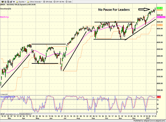
What is interesting here is that there hasn’t really been a “pause” on the NDX, which arguably has been the market’s leading index for some time now. No, the NDX as it is called, appears to have skipped the “pause” stage and is marching steadily higher.
Which Chart Should We Follow?
The question here is which chart is telling us the real story? The NDX seems to be moving merrily higher. The S&P 500 and Midcap 400 both look to be trying to break out of their ranges. While the Smallcaps are lagging behind.
What I did next was to take a step back from the blinking screens and the daily hysterics and looked at a weekly chart. I find that by looking at several years of data at a time, it is often much easier to see what is going on.
The chart below is the weekly version of the S&P 500 since mid-2011 – about the time the “debt downgrade bear” was in full swing.
S&P 500 – Weekly
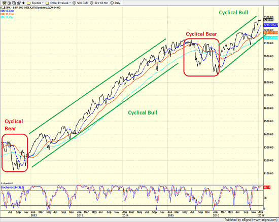
What I see on this chart is the end of the 2011 cyclical bear, the entirety of the QE-induced cyclical bull, the brief cyclical bear that occurred from August 2015 until February 2016, and the current cyclical bull move.
Here’s my take. Unless you believe that the current cyclical bull is about to end, it is probably a good idea to bet that our heroes in horns will ultimately prevail here. As such, I’m going to use the chart of the NDX as my “leader” and assume that the rest of the indices will follow along and get in line – in due time. After all, based on historical measures (and the computers at Ned Davis Research), the average cyclical bull lasts longer than a year and gains a lot more than the 22.3% seen since February 11 of last year. So for me, this remains a bet on the bulls and buy the dips environment.



Comments
Log in or sign up to join the conversation.