
In this time of great economic uncertainty, I am amazed at the indicators people look to for guidance on the future. When miners would take caged canaries down into the mine with them, these birds were a monitor of lethal gases building in the mines. The bird would die before any harm to the miners. They were "leading indicators" as we investors would say. In the coal mine we find ourselves in now, you hear little about leading indicators, however, and a constant babble about either coincident or lagging indicators. For instance, the mantra in market TV and press now is "wages are up" and "employment is OK." But these are lagging indicators. It's like taking a canary and an elephant down into the mine, carefully ignoring the canary and watching only the elephant as you are overcome with deadly gases. The miners (investors) will be dead by the time the elephant (everybody else) is overcome.
There is also a third type of indicator - Fed guidance. In 2007, Ben Bernanke told us we are not entering a recession and the housing market was just fine. The Fed is persistently a badly lagging indicator (to put it politely). Yet, all we hear and see is a steady drumbeat of wages, employment, consumer confidence, and Fed speak. We are all staring at the elephant in the coal mine - unless you search out the leading stuff.
What should we be looking at? Well, there are a slew of leading economic indicators tabulated by the ECRI, and they are showing a downturn as they always do before recessions:
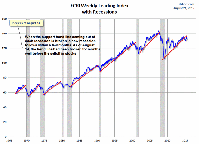
Here we see that this canary has been dead for quite a while. I've added the continued downturn of the data since this August 14 chart with blue dots. All you heard on CNBC on August 14 was wages, employment, and when the Fed was going to rein in the booming economy with rate hikes. I don't think I saw this chart on CNBC back in mid-August, or ever for that matter.
As good as this ECRI chart is, I actually like keeping an eye on certain lead groups in the stock market as my canaries. There has been a train of lead and follow groups with a caboose, cars, and, and an engine pulling us into the mess we are approaching. Let's first take a look at the caboose, the RLX index of large retailers, a reflection of the American consumer:
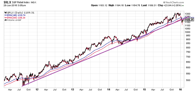
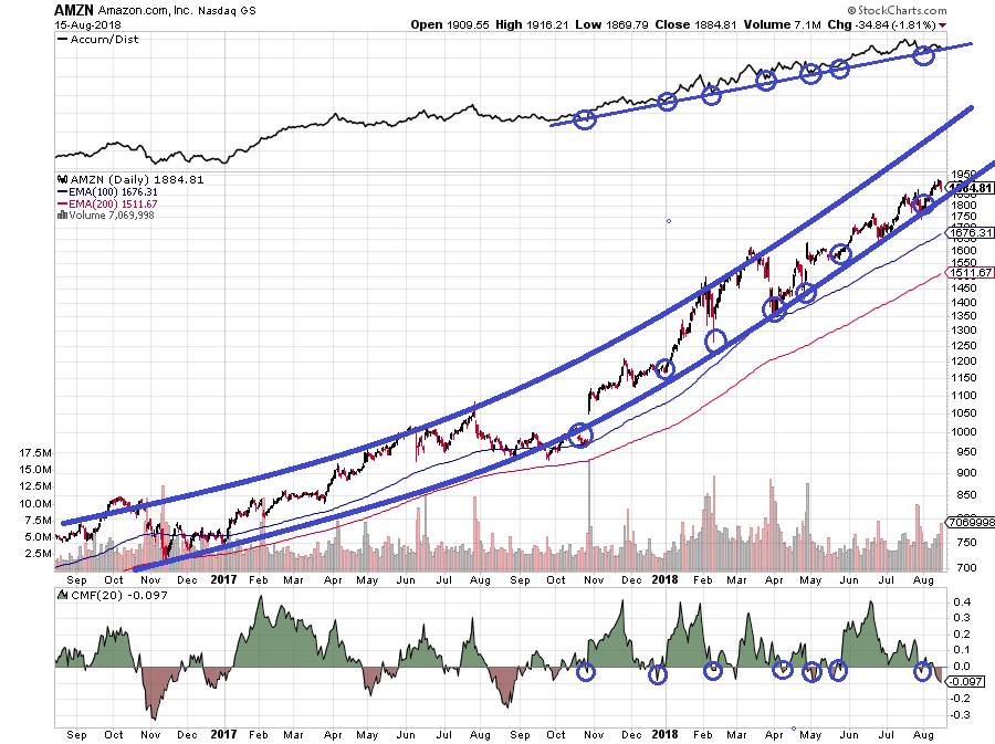
This has been the engine in the bull market holding up far better than about any other index, and it has been the caboose so far in the bearish turn of late. The 5-year support trend has been taken out with the January carnage. All the other lead groups have led the bearish turn of the SPX including the usual leading small cap Russell 2000:
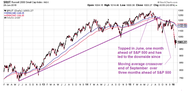
Since the early turn, the Russell has led very strongly down being over twice as much off its high as the SPX. Then there is the Dow Theory leader, the transports. I like to look at the Nasdaq Transportation Index because it has far fewer rails in it. Nowadays, rails are maybe more of a proxy for commodities, especially energy, than they are for the economy in general. So this index will be more isolated from the commodities mess and more accurately gives us classic Dow Theory results:
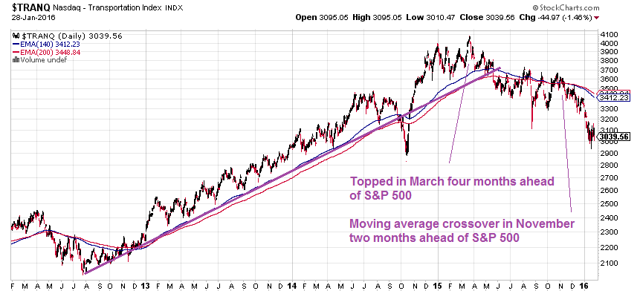
Note that it peaked even earlier than the Russell. When the Dow and SPX were on the verge of new highs after the August event, the transports were nowhere near confirming that action. Note that there was a serious breakdown in TRANQ back in 2012 also, but this was not confirmed in the Russell and other lead groups.
I purposely skirted the whole commodities thing in the above charts, but that is actually the thing that gets us closer to the heart of all our problems. And as I discussed in the article "The Debt Cycle And Rhymes Of Lehman Brothers" Glencore is about the biggest nerve center in commodities with tentacles made of loans, derivatives, and trading infrastructure wound throughout the financial world - a lot like Lehman was with mortgages. Looking at Glencore (OTCPK:GLNCY) as a leader in the turn:
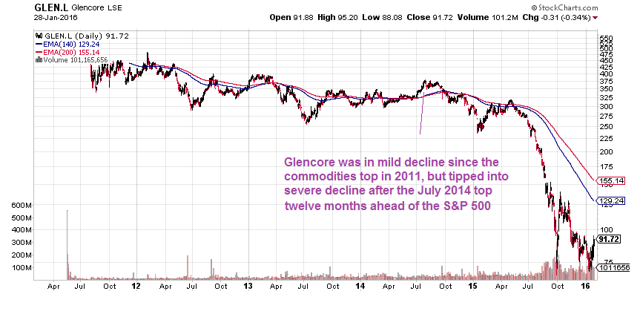
Glencore was wilting slowly along with commodities up until the early turn down ahead of the following car in the train, the above transports. The nice one year uptrend peaked even earlier than the transports.
If we want something as an engine pulling the train into a possible train wreck, Deutsche Bank (NYSE:DB) would be it. They have become the leading holder of derivatives in the world, they are the biggest bank in Germany, which is by far the lead economy of all of Europe, and they are heavily exposed to Glencore and many other huge commodities companies:
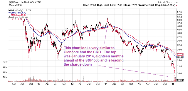
If this is the engine pulling the train, maybe we should all jump! DB's peak was way earlier than the rest. You do not want the world's leading derivatives player, with at least $60 trillion worth of this stuff, to have a chart that looks like this. There is a lot of debate on derivatives with some saying they offset each other safely and are not a systemic threat. Everybody uses them. I am not an expert on them, but I respect the opinion of Warren Buffett. His opinion has been widely known since a Berkshire meeting in 2002, when he said they are "financial weapons of mass destruction." In a recent interview, he still holds that view:
Continue reading on Seeking Alpha.
Comments
Log in or sign up to join the conversation.