

Here is the opening statement from the Department of Labor:
During the week ending March 14, the increase in initial claims are clearly attributable to impacts from the COVID-19 virus. A number of states specifically cited COVID-19 related layoffs, while many states reported increased layoffs in service related industries broadly and in the accommodation and food services industries specifically, as well as in the transportation and warehousing industry, whether COVID-19 was identified directly or not.
Note: This week's release reflects the annual revision to the weekly unemployment claims seasonal adjustment factors. The seasonal adjustment factors used for the UI Weekly Claims data from 2015 forward, along with the resulting seasonally adjusted values for initial claims and continuing claims, have been revised.
In the week ending March 14, the advance figure for seasonally adjusted initial claims was 281,000, an increase of 70,000 from the previous week's unrevised level of 211,000. This is the highest level for initial claims since September 2, 2017 when it was 299,000. The 4-week moving average was 232,250, an increase of 16,500 from the previous week's revised average. This is the highest level for this average since January 27, 2018 when it was 234,500. The previous week's average was revised up by 1,750 from 214,000 to 215,750. [See full report]
This morning's seasonally adjusted 281K new claims, up 70K from the previous week's figure, was worse than the Investing.com forecast of 220K.
Here is a close look at the data over the decade (with a callout for the past year), which gives a clearer sense of the overall trend in relation to the last recession.
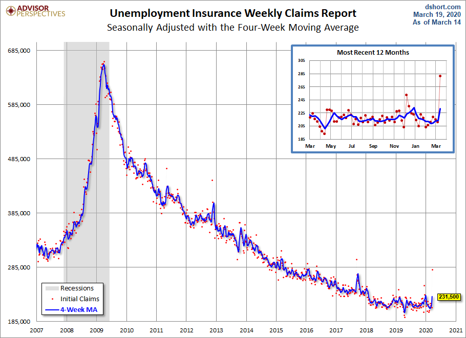
As we can see, there's a good bit of volatility in this indicator, which is why the 4-week moving average (the highlighted number) is a more useful number than the weekly data. Here is the complete data series.
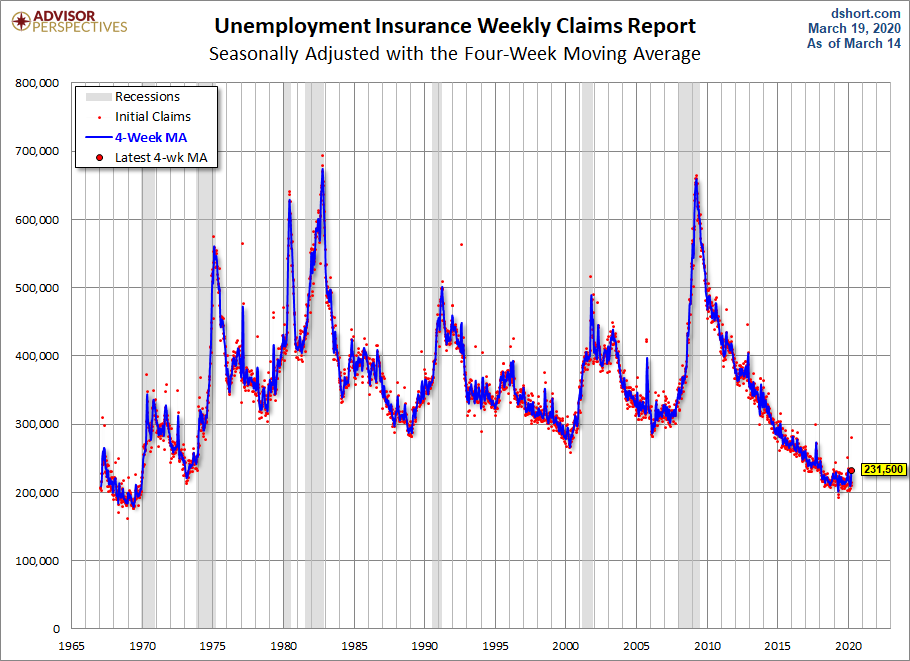
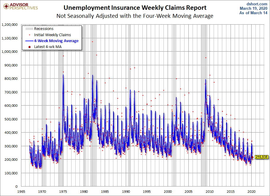
The headline Unemployment Insurance data is seasonally adjusted. What does the non-seasonally adjusted data look like? See the chart below, which clearly shows the extreme volatility of the non-adjusted data (the red dots). The 4-week MA gives an indication of the recurring pattern of seasonal change (note, for example, those regular January spikes).
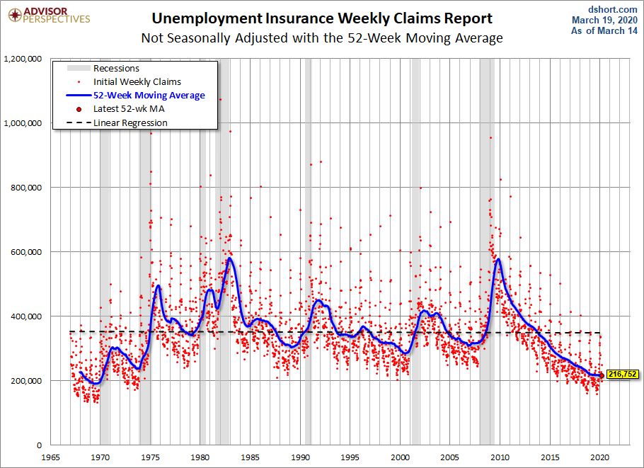
Because of the extreme volatility of the non-adjusted weekly data, we can add a 52-week moving average to give a better sense of the secular trends. The chart below also has a linear regression through the data. We can see that this metric continues to fall below the long-term trend stretching back to 1968.
Annual Comparisons
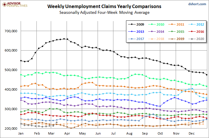
Here is a calendar-year overlay since 2009 using the 4-week moving average. The purpose is to compare the annual slopes since the peak in the spring of 2009, near the end of the Great Recession.
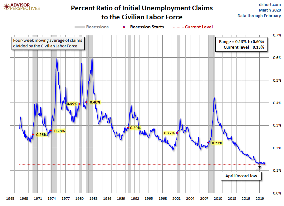
For an analysis of unemployment claims as a percent of the labor force, see regularly updated piece The Civilian Labor Force, Unemployment Claims and the Business Cycle. Here is a snapshot from that analysis.

Comments
Log in or sign up to join the conversation.