

Here is the opening statement from the Department of Labor:
In the week ending April 23, the advance figure for seasonally adjusted week moving ave initial claims was 180,000, a decrease of 5,000 from the previous week's revised level. The previous week's level was revised up by 1,000 from 184,000 to 185,000. The 4 rage was 179,750, an increase of 2,250 from the previous week's revised average. The previous week's average was revised up by 250 from 177,250 to 177,500. The advance seasonally adjusted insured unemployment rate was 1.0 percent for the week ending April from the previous week's unrevised rate.
The advance number for seasonally adjusted 16, unchanged insured unemployment during the week ending April 16 was 1,408,000, a decrease of 1,000 from the previous week's revised level. This is the lowest level for insured unemployment since February 7, 1970 when it was 1,397,000. The previous week's level was revised down by 8,000 from 1,417,000 to 1,409,000. The 4week moving average was 1,455,000, a decrease of 24,500 from the previous week's revised average. This is the lowest level for this average since March 14, 1970 when it was 1,435,250. The previous week's average was revised down by 2,250 from 1,481,750 to 1,479,500. [See full report]
This morning's seasonally adjusted 180K new claims, down 5K from the previous week's revised figure, was at the Investing.com forecast.
Here is a close look at the data over the decade (with a callout for the past year), which gives a clearer sense of the overall trend.
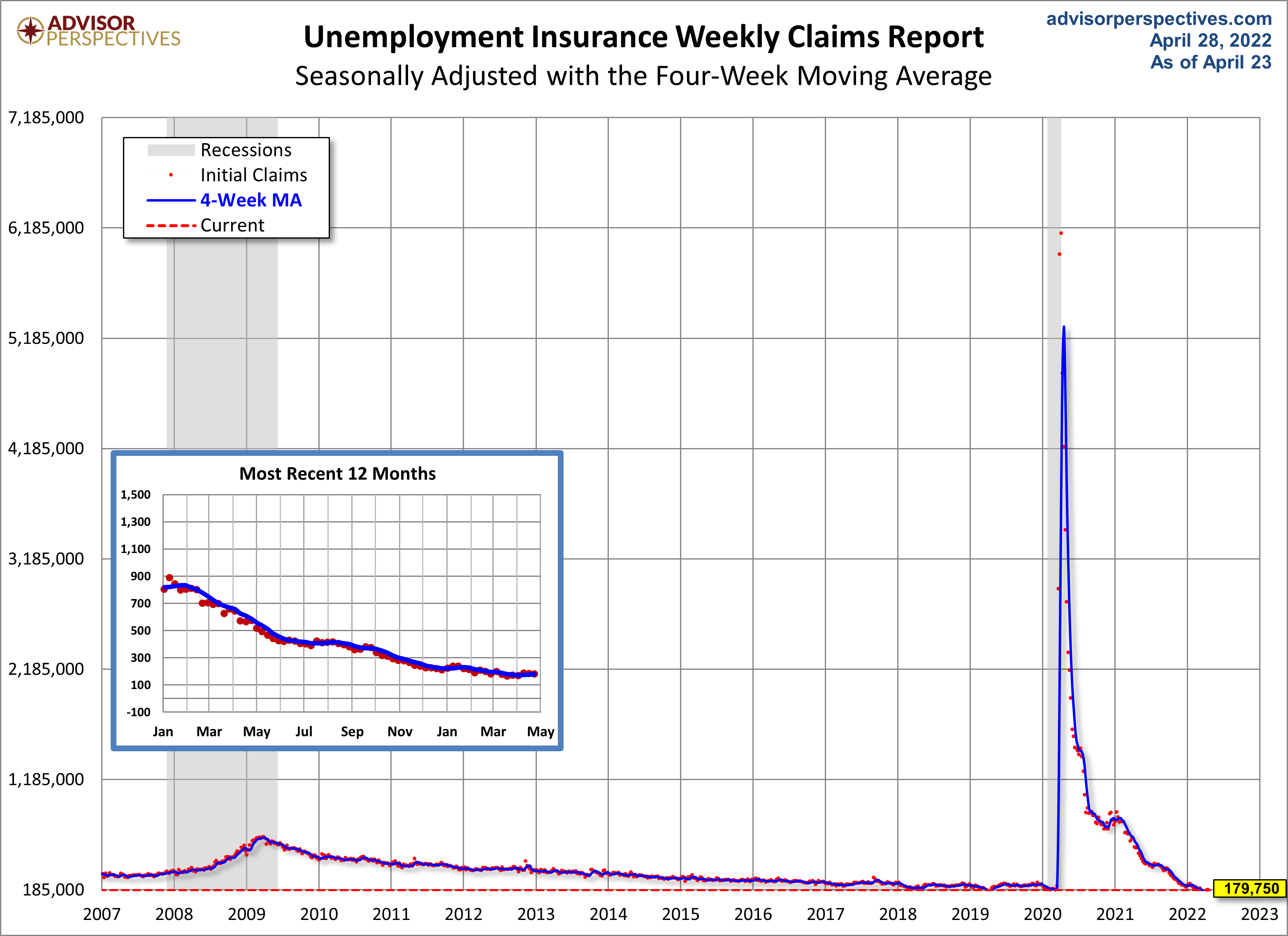
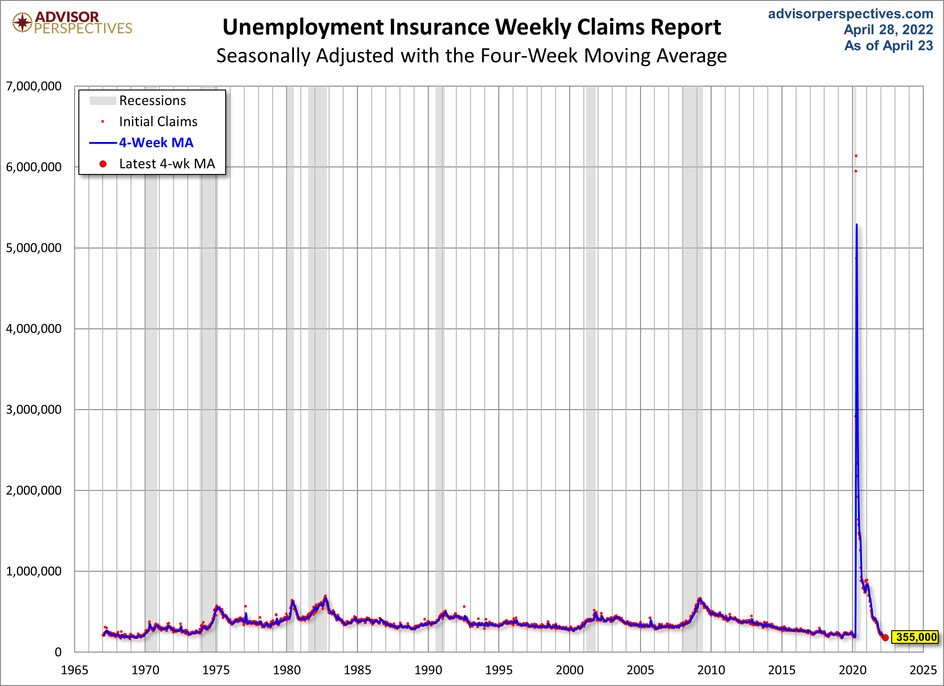
As we can see, there's a good bit of volatility in this indicator, which is why the 4-week moving average (the highlighted number) is a more useful number than the weekly data. Here is the complete data series.
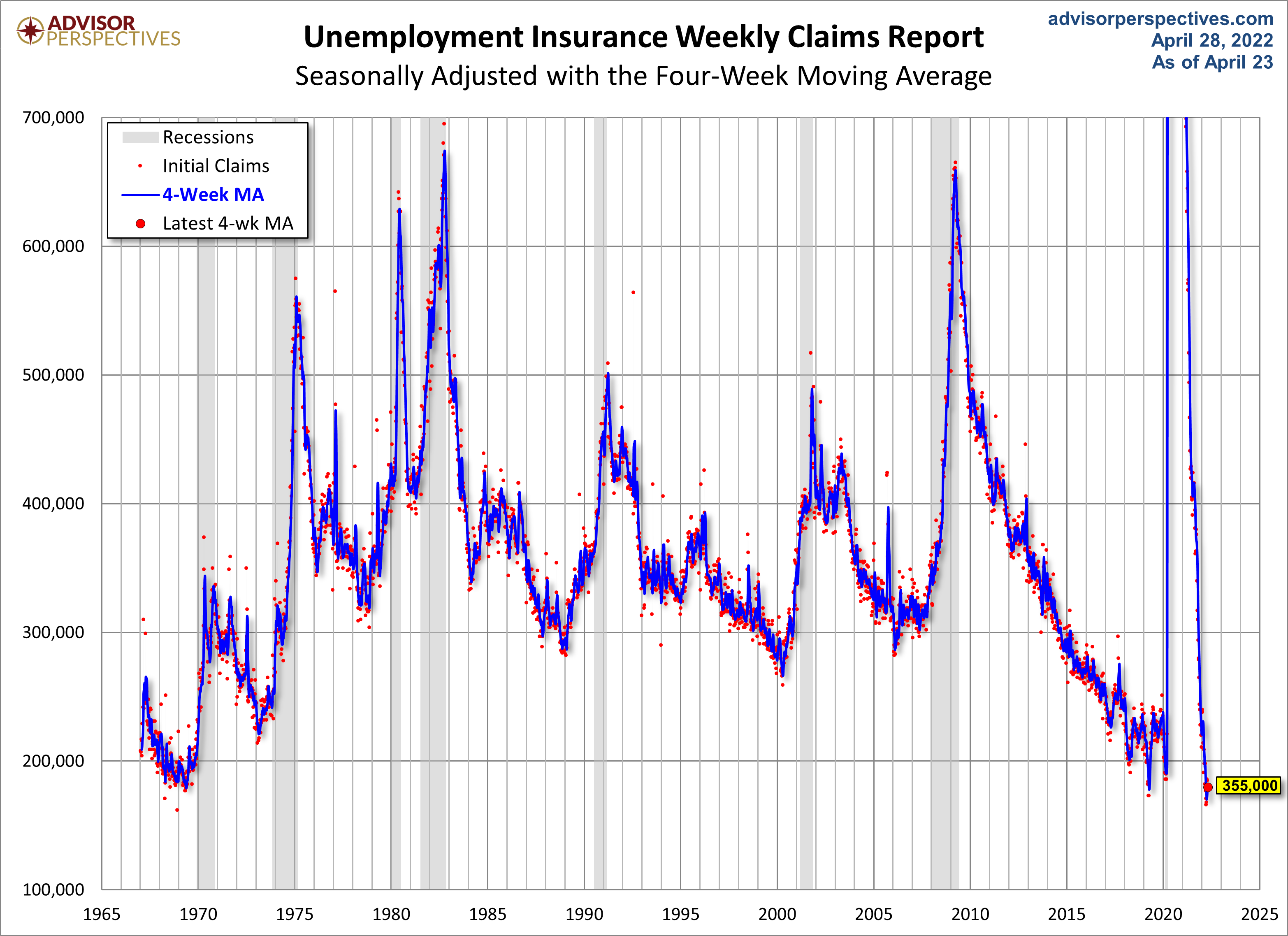
Here's a copy of the above chart, but zoomed in, so the COVID spike isn't as prominent. We'll be adding a few more of these "zoomed in" looks in the coming weeks.
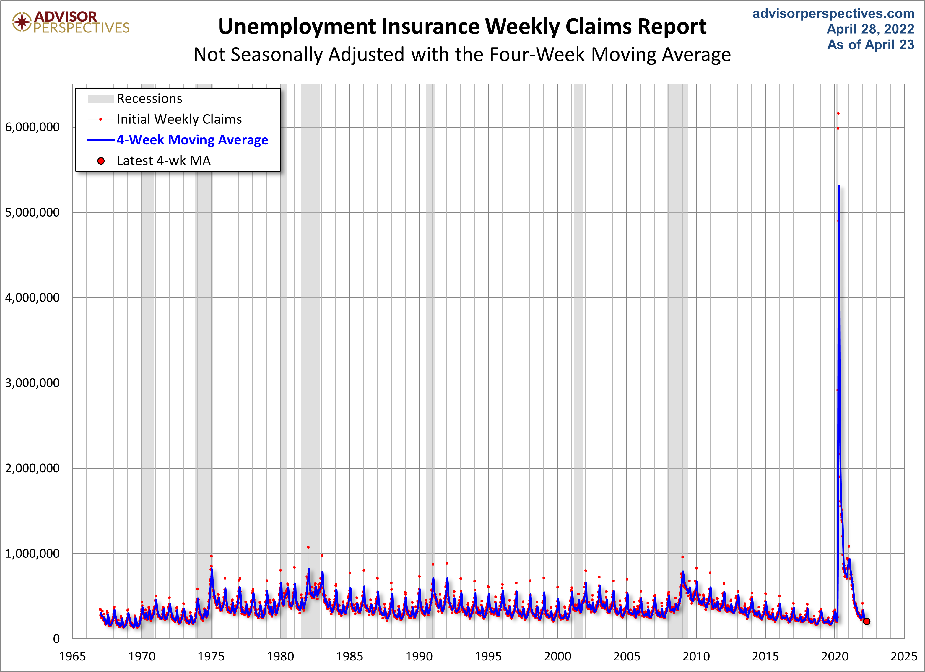
The headline Unemployment Insurance data is seasonally adjusted. What does the non-seasonally adjusted data look like? See the chart below, which clearly shows the extreme volatility of the non-adjusted data (the red dots). The 4-week MA gives an indication of the recurring pattern of seasonal change (note, for example, those regular January spikes).
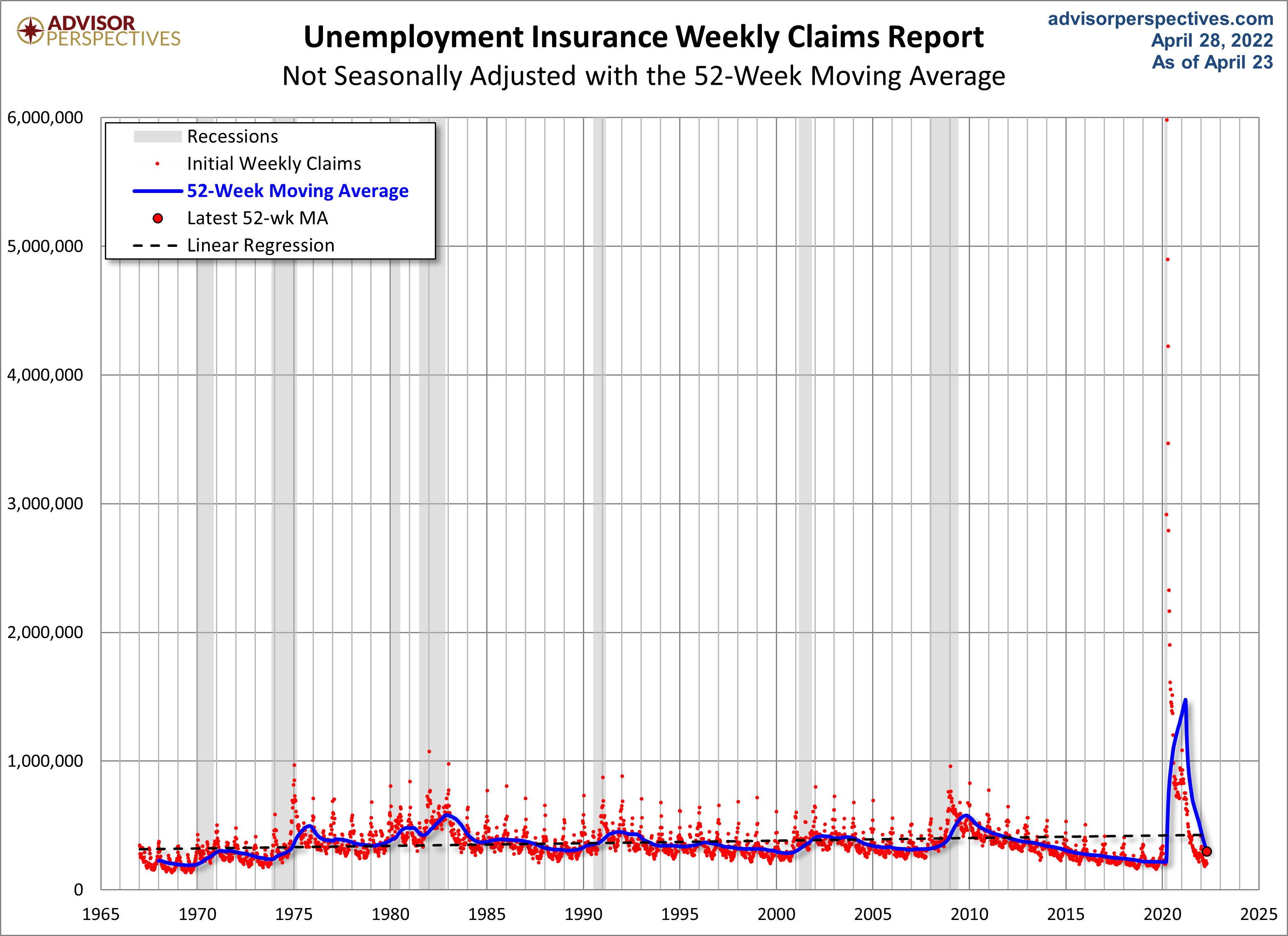
Because of the extreme volatility of the non-adjusted weekly data, we can add a 52-week moving average to give a better sense of the secular trends. The chart below also has a linear regression through the data.
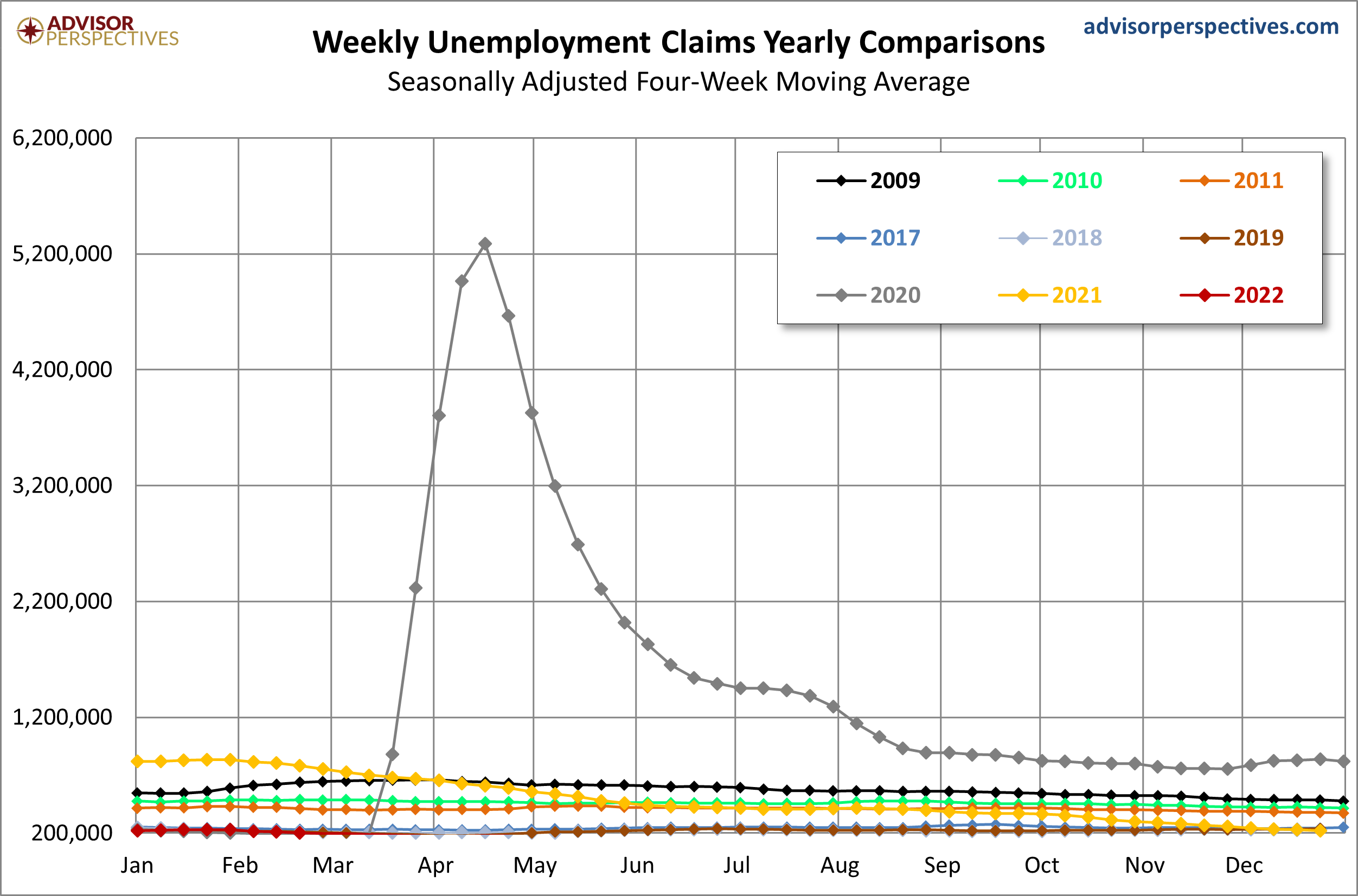
Here's a look at a sample of year's claims going back to 2009.
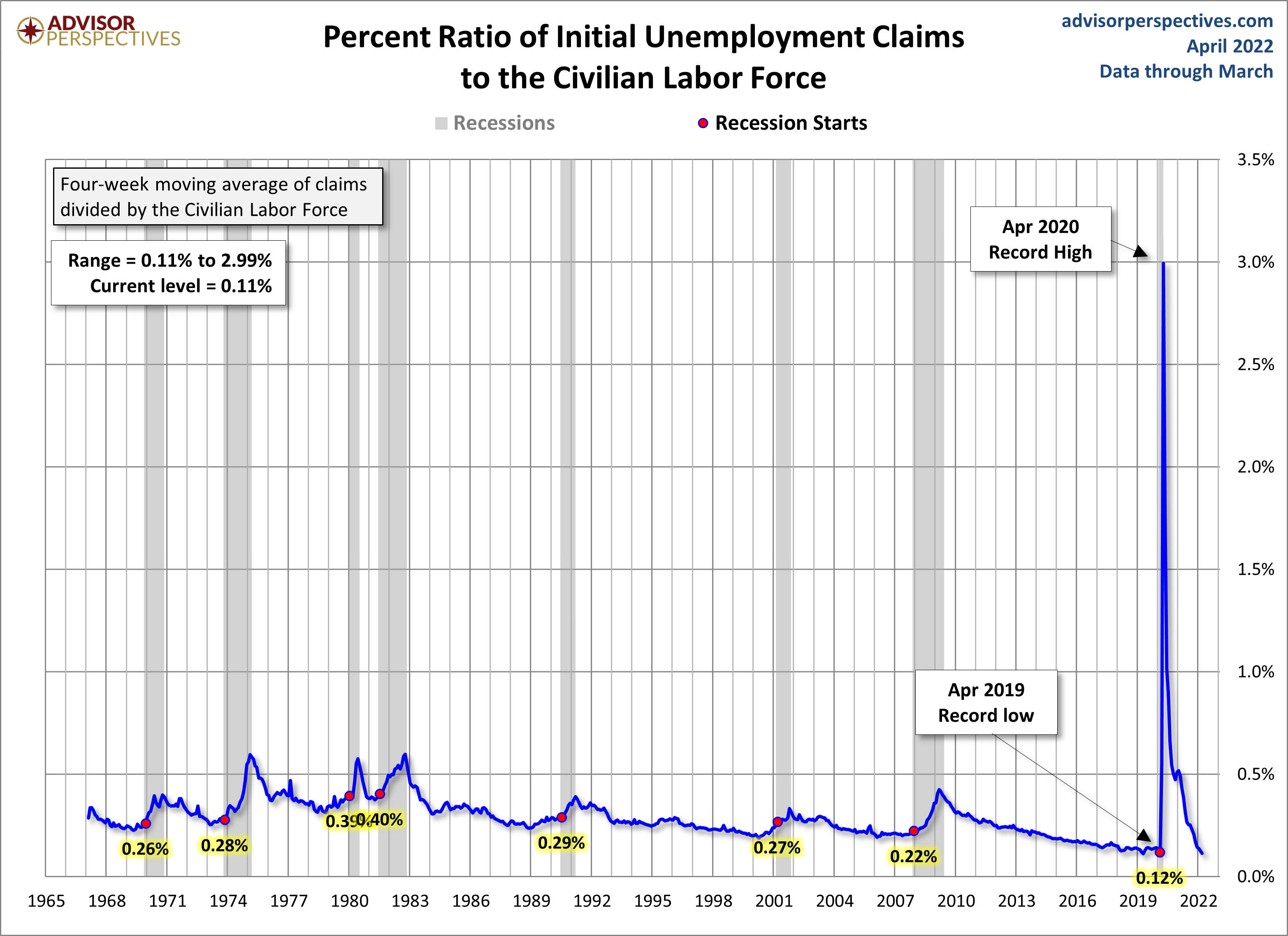
For an analysis of unemployment claims as a percent of the labor force, see this regularly updated piece The Civilian Labor Force, Unemployment Claims and the Business Cycle. Here is a snapshot from that analysis.

Comments
Log in or sign up to join the conversation.