
Here is the opening statement from the Department of Labor:
In the week ending October 1, the advance figure for seasonally adjusted initial claims was 249,000, a decrease of 5,000 from the previous week's unrevised level of 254,000. The 4-week moving average was 253,500, a decrease of 2,500 from the previous week's unrevised average of 256,000. This is the lowest level for this average since December 8, 1973 when it was 252,250.
There were no special factors impacting this week's initial claims. This marks 83 consecutive weeks of initial claims below 300,000, the longest streak since 1970. [See full report]
Today's seasonally adjusted 249K new claims, down 5K from last week, was below the Investing.com forecast of 257K. The latest weekly number is only 1,000 above its interim low set 24 weeks ago on April 16th.
Here is a close look at the data over the past few years (with a callout for the past year), which gives a clearer sense of the overall trend in relation to the last recession and the volatility in recent months.
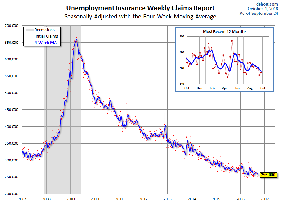
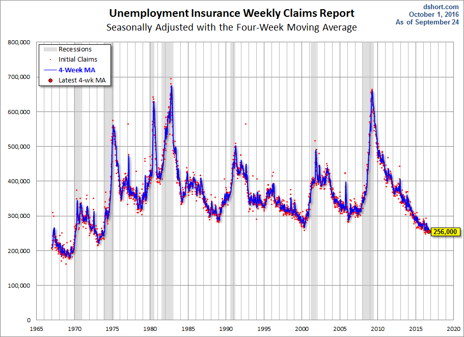
As we can see, there's a good bit of volatility in this indicator, which is why the 4-week moving average (the highlighted number) is a more useful number than the weekly data. Here is the complete data series.
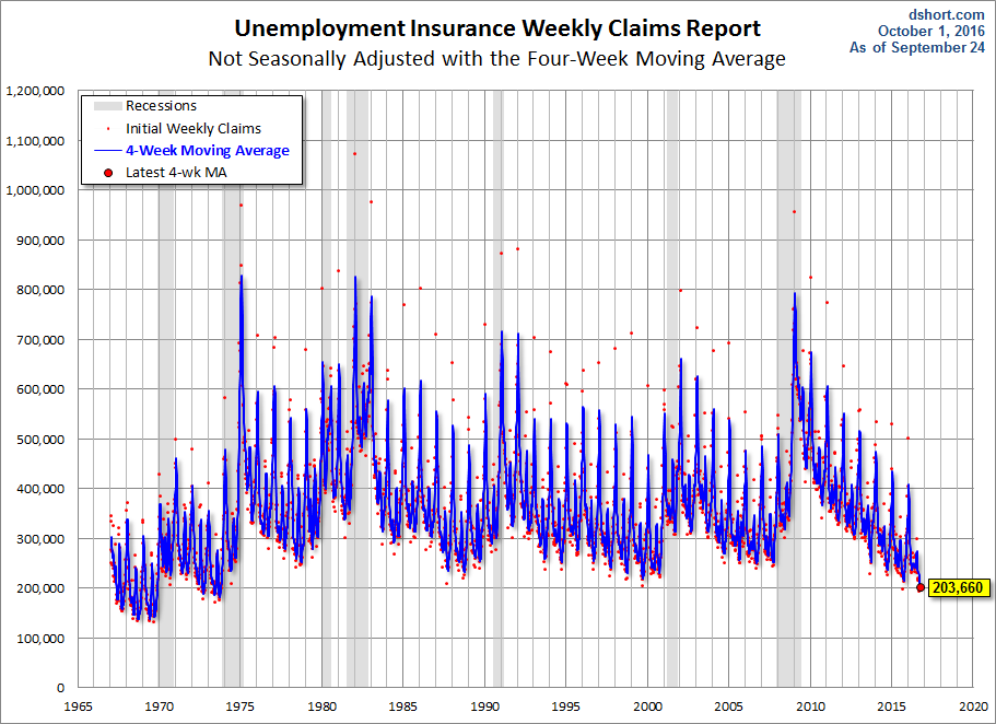
The headline Unemployment Insurance data is seasonally adjusted. What does the non-seasonally adjusted data look like? See the chart below, which clearly shows extreme volatility of the non-adjusted data (the red dots). The 4-week MA gives an indication of the recurring pattern of seasonal change (note, for example, those regular January spikes).
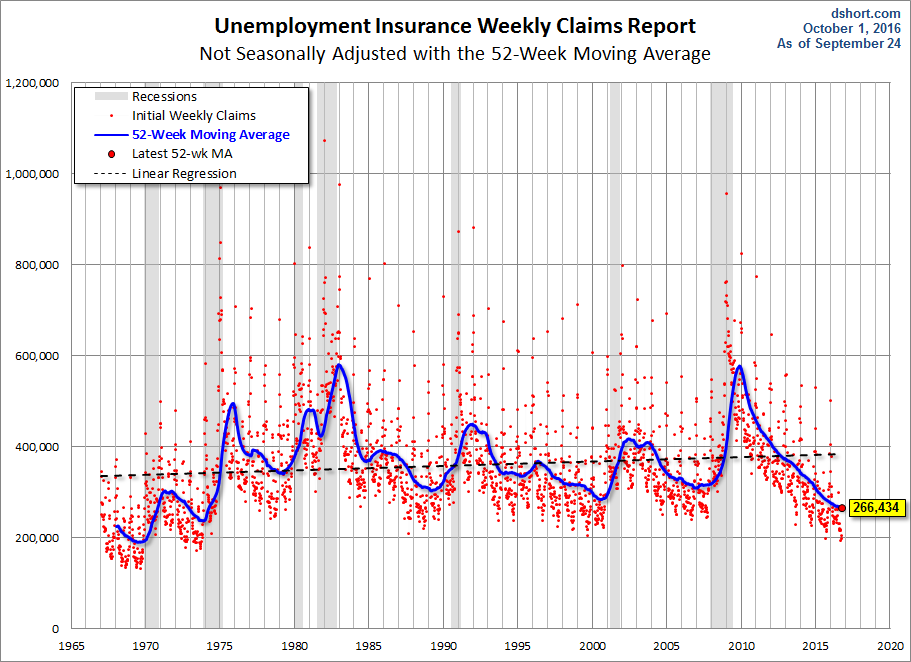
Because of the extreme volatility of the non-adjusted weekly data, we can add a 52-week moving average to give a better sense of the secular trends. The chart below also has a linear regression through the data. We can see that this metric continues to fall below the long-term trend stretching back to 1968.
Annual Comparisons
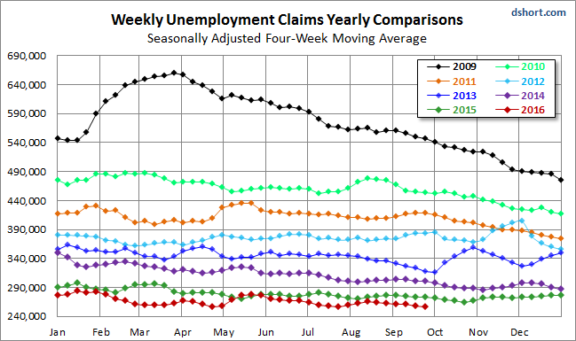
Here is a calendar-year overlay since 2009 using the 4-week moving average. The purpose is to compare the annual slopes since the peak in the spring of 2009, near the end of the Great Recession. The latest data point is a record low over this timeframe.
For an analysis of unemployment claims as a percent of the labor force, see our recent commentary What Do Weekly Unemployment Claims Tell us About Recession Risk? Here is a snapshot from that analysis.

Comments
Log in or sign up to join the conversation.