
Here is the opening statement from the Department of Labor:
In the week ending October 28, the advance figure for seasonally adjusted initial claims was 229,000, a decrease of 5,000 from the previous week's revised level. The previous week's level was revised up by 1,000 from 233,000 to 234,000. The 4-week moving average was 232,500, a decrease of 7,250 from the previous week's revised average. This is the lowest level for this average since April 7, 1973 when it was 232,250. The previous week's average was revised up by 250 from 239,500 to 239,750.
Claims taking procedures continue to be severely disrupted in the Virgin Islands. The ability to take claims has improved in Puerto Rico and they are now processing backlogged claims. [See full report]
Today's seasonally adjusted 229K new claims, down 5K from last week's revised 234K, was better than the Investing.com forecast of 235K.
Here is a close look at the data over the past few years (with a callout for the past year), which gives a clearer sense of the overall trend in relation to the last recession.
(Click on image to enlarge)
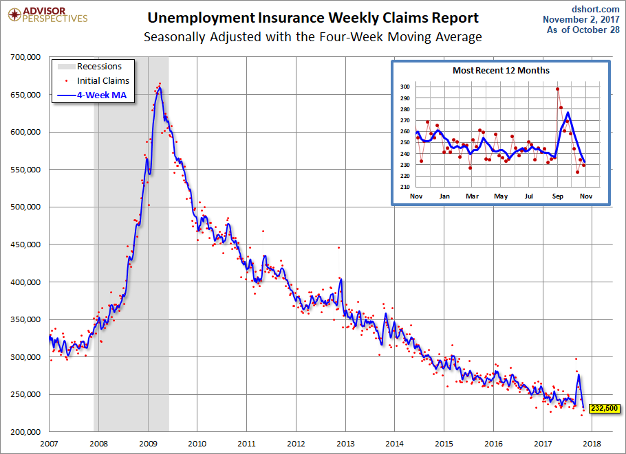
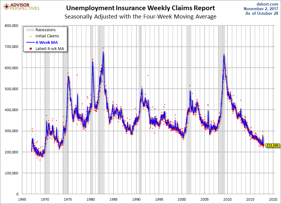
As we can see, there's a good bit of volatility in this indicator, which is why the 4-week moving average (the highlighted number) is a more useful number than the weekly data. Here is the complete data series.
(Click on image to enlarge)
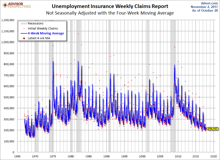
The headline Unemployment Insurance data is seasonally adjusted. What does the non-seasonally adjusted data look like? See the chart below, which clearly shows the extreme volatility of the non-adjusted data (the red dots). The 4-week MA gives an indication of the recurring pattern of seasonal change (note, for example, those regular January spikes).
(Click on image to enlarge)
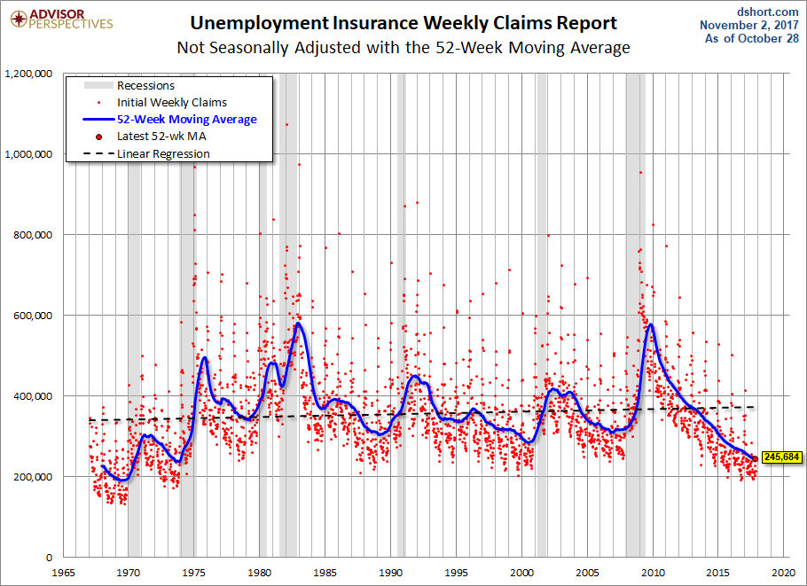
Because of the extreme volatility of the non-adjusted weekly data, we can add a 52-week moving average to give a better sense of the secular trends. The chart below also has a linear regression through the data. We can see that this metric continues to fall below the long-term trend stretching back to 1968.
(Click on image to enlarge)
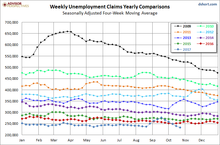
Annual Comparisons
Here is a calendar-year overlay since 2009 using the 4-week moving average. The purpose is to compare the annual slopes since the peak in the spring of 2009, near the end of the Great Recession.
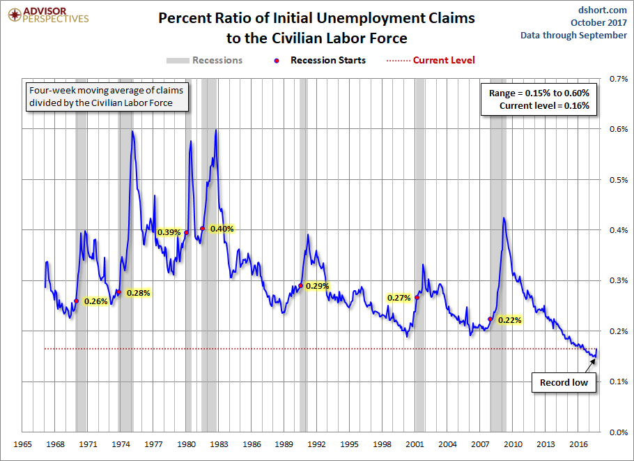
For an analysis of unemployment claims as a percent of the labor force, see regularly updated piece The Civilian Labor Force, Unemployment Claims and the Business Cycle Here is a snapshot from that analysis.
(Click on image to enlarge)

Comments
Log in or sign up to join the conversation.