

Over the past two years, we have seen inflation soar. And with that has come rising interest rates.
This week’s CPI and PPI data have only confirmed consumers' fears. But how much of the latest inflation data is baked into current interest rates?
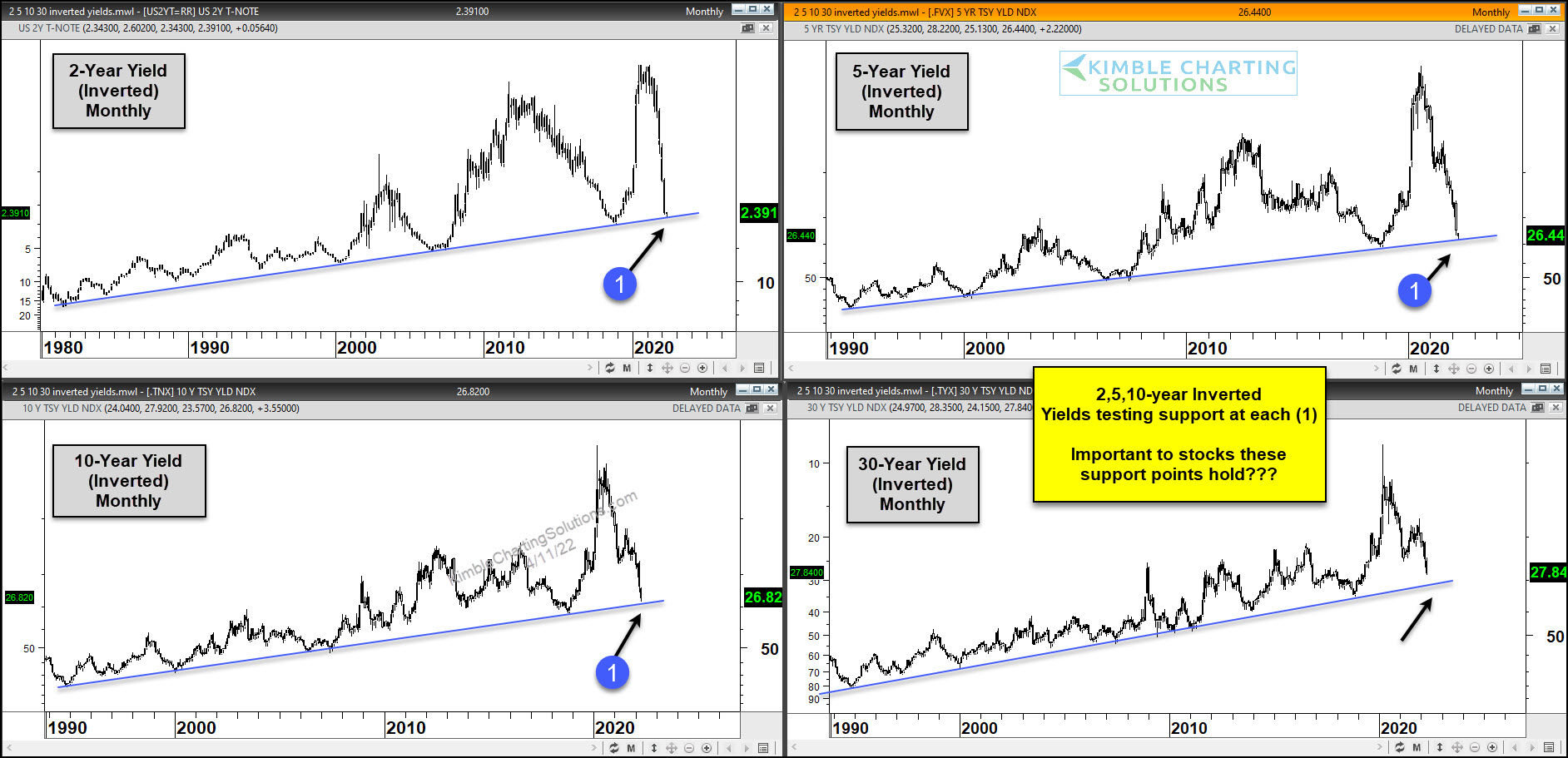
Today we take a look at a chart 4-pack of the 2-year, 5-year, 10-year, and 30-year US treasury bond yields. And as we have done in the past we invert the charts. This flips the script and takes away some or our current bias.
So line (1), which is overhead resistance, is shown here on the “inverted” chart as support. Note that line (1) is a long-term trend line with major implications.
On the “inverted” chart, it is important for stocks, bonds, and consumers that these support lines hold. Or else rates could surge higher and signal a trend change.
(Click on image to enlarge)



Comments
Log in or sign up to join the conversation.