

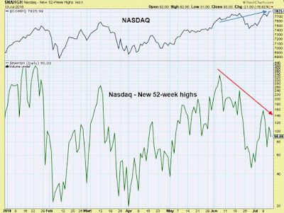
Although the Nasdaq is making new historical highs, the market internals do not support these tops. Look at the chart below:
source: Stockcharts.com
The lower panel of the chart shows the amount of stocks establishing new 52-week highs. Note that despite the index making new all-time highs (the blue arrow on the upper panel of the chart), the amount of stocks doing the same is rapidly going down (the red arrow).
This is not a typical pattern printed by a healthy bull market.
Comments
Log in or sign up to join the conversation.