

During the past year, or so, U.S. 2-Year Treasury Yields have shot up sharply, in comparison with 10-Year Yields, as shown on the following weekly price comparison chart and percentage comparison chart.


(Click on image to enlarge)
The next (longer-term) percentage comparison chart shows the weakness that ensued in the SPX when the 2-YT crossed below the 10-YT.

(Click on image to enlarge)
The following (short-term) percentage comparison chart shows that the 10-YT gained more this past week than the 2-YT.

(Click on image to enlarge)
Keep an eye on whether last week's outperformance of the 10-YT was just an anomaly, or whether it may be a signal of a potential tightening of the spread between it and the 2-YR. If we see a continued narrowing of this spread, it may signal bad news for U.S. bank stocks, and, potentially, the SPX.
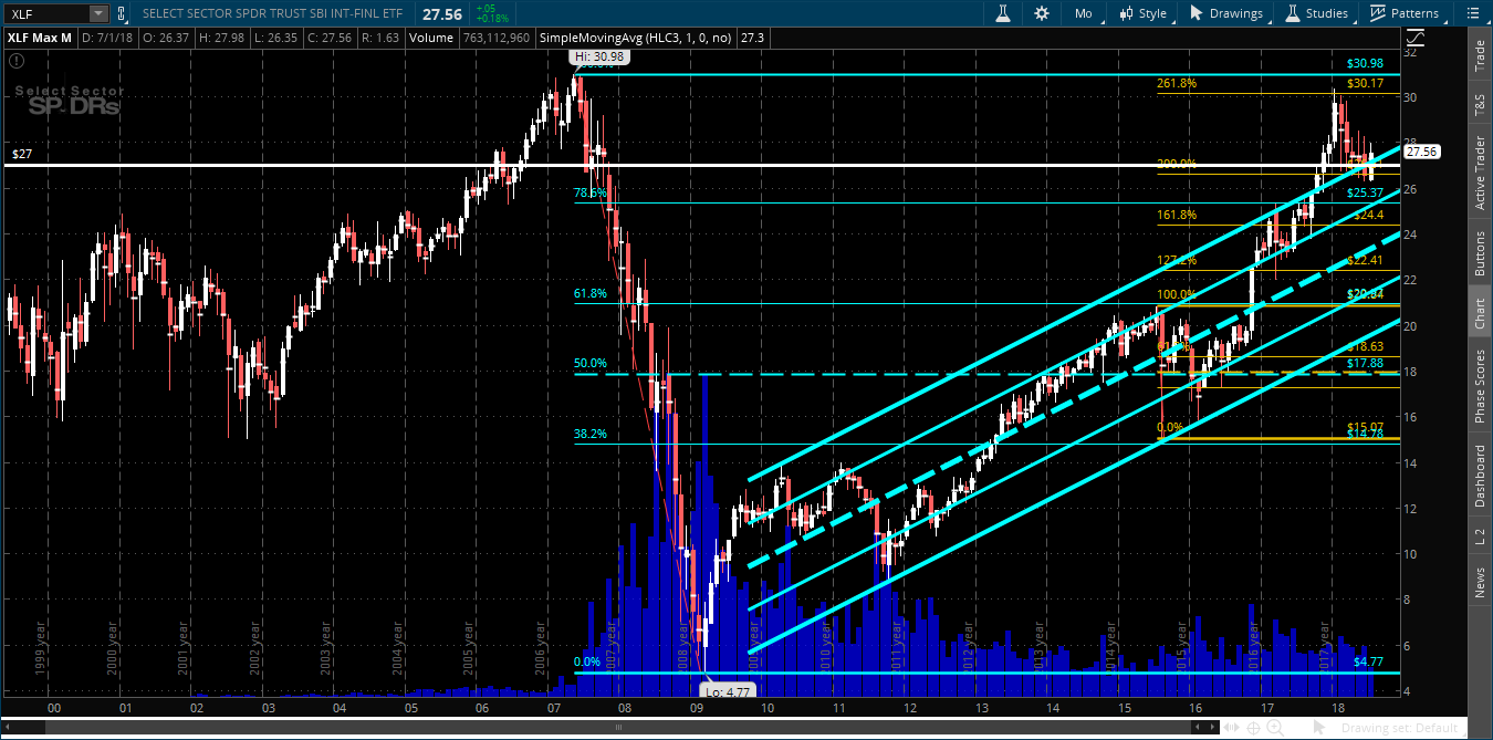
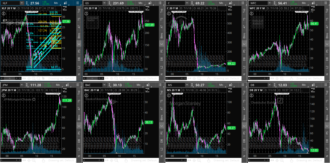
At the moment, the Financials ETF (XLF) is hovering just above major support at 27.00, as shown on the following monthly chart, and the banks stocks are stuck in their respective consolidation zones, as shown on the last monthly chartgrid.
Watch for signs of weakness if:
- XLF drops and holds below 27.00,
- bank stocks break and hold below their congestion zones, and
- the spread narrows between the above-mentioned 2 and 10-YR yields.
On a more ominous note, if, longer term, we see a crossover of the 2-YR below the 10-YR on accelerating momentum, we'll likely get quite an equity market downturn.
(Click on image to enlarge)
(Click on image to enlarge)



Comments
Log in or sign up to join the conversation.