

With the third round of Quantitative Easing behind us and the first FOMC meeting of 2015 a month away, let's take a quick look at US Treasuries. The yields on the 10-, 20- and 30 year Treasuries have generally trended downward since the end of 2013. They hit their 2014 lows on December 16th, the day before the latest FOMC statement was released. The 10-year Note is up 18 bps since its low that day. The 20- and 30-year Bonds are up 14 and 12 bps, respectively.
Will rates trend higher in 2015? The prospect of Fed tightening next year would logically reinforce expectations of higher yields. On the other hand, a global disinflationary trend for the general price of goods could thwart expectations of a Fed hike and lead yields lower. The price of Crude Oil could be a significant factor in the months ahead.
A log-scale snapshot of the 10-year yield offers a more accurate view of the relative change over time. Here is a long look since 1965, starting well before the 1973 Oil Embargo that triggered the era of "stagflation" (economic stagnation with inflation). I've drawn a trendline (the red one) connecting the interim highs following those stagflationary years. The red line starts with the 1987 closing high on the Friday before the notorious Black Monday market crash. The S&P 500 fell 5.16% that Friday and 20.47% on Black Monday.

The dashed lines on the chart above were provided by my friend and mentor Bob Bronson of Bronson Capital Markets Research. Bob comments:
| "The blue dashed lines are much more closely parallel to the all-data, log-linear best fit line – very similar to the high-low mid-channel line - since 1980. Then there is the even more currently relevant downtrend (black dashed line) since the 2007 high." |
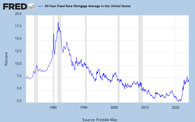
The 30-Year Fixed Rate Mortgage
Here is a long look back, courtesy of a FRED graph, of the Freddie Mac weekly survey on the 30-year fixed mortgage, which began in May of 1976.
A Perspective on Yields Since 2007
The first chart shows the daily performance of several Treasuries and the Fed Funds Rate (FFR) since 2007. The source for the yields is the Daily Treasury Yield Curve Rates from the US Department of the Treasury and the New York Fed's website for the FFR.

Now let's see the 10-year against the S&P 500 with some notes on Federal Reserve intervention. Fed policy has been a major influence on market behavior.

For a long-term view of weekly Treasury yields, also focusing on the 10-year, see my Treasury Yields in Perspective, which I update on weekends.
Comments
Log in or sign up to join the conversation.