


Image Source: Unsplash
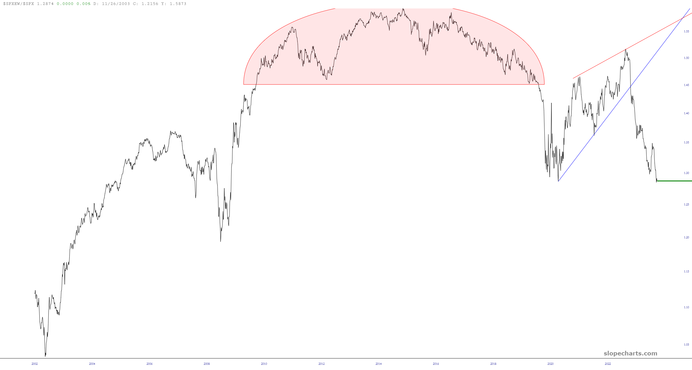
It’s been a while since we looked at the ratio chart of the equal-weighted S&P 500 as compared to the normal S&P value, but here it is. As you can see, it’s a complete train wreck, which illustrates, once again, how a tiny handful of mega-caps are providing ALL the nominal strength to the headline numbers. People who read USA Today aren’t going to tell the difference between one S&P or the other, so it makes everyone chipper to see lifetime highs every day, even with all the rot beneath the surface.
More By This Author:
Tech InsaniaSecondary Shorts
Supports, Lyfts, And Separates



Comments
Log in or sign up to join the conversation.