
The Hidden Step Behind Crisp Embroidered Hat Logos: Vector Tracing
When you send a log o over for a hat design, you expect the final cap to look just as sharp as it did on your screens. Then the stitched sample comes back, and the edges look rough, the small text is mushy, and something just feels off compared to the mockup. Nine times out of ten, that gap traces back to one thing: nobody did a proper png to vector file conversion before the digitizing even started. A flat png can’t hold its shape once it hits a curved, textured surface like a cap front.
Basically, there is a hidden step most customers never hear about, and it happens long before a machine touches thread. Before a digitizer can create clean stitch paths for something like 3D puff embroidery digitizing or even a small structured logo, someone has to vectorize png artwork into precise, scalable lines first. Skip that part, and no machine work can fix what the file was missing from day one. I have watched this exact mistake ruin more cap orders than I can count, and it always comes back to the same missing step.
Why Hat Logos Behave Differently From Flat Garment Embroidery?
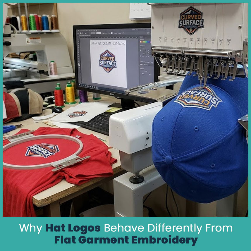
A logo that looks fine on a t shirt chest can fall apart on a hat, and there is a real reason for that. Caps don't give a digitizer a flat, easy surface to work with. They give a small, curved, structured space that leaves no room for sloppy artwork.
The Curved Panel and Crown Challenge
Hat panels are not flat. They curve around the head, meet at seams, and often have foam or buckram backing underneath the fabric. That curve changes how stitches sit once the needle starts moving.
The front panel usually gives you two to two and a half inches of usable height, so there is no room for wasted detail.
Seams between panels can distort a design if the digitizing file was not built with that curve in mind.
Structured caps push the fabric outward, which stretches thin lines and small gaps in ways a flat shirt never would.
Structured Caps Demand Cleaner Digitizing Data
Because the surface fights back a little, the underlying file needs to be nearly perfect before digitizing starts. Any blur or jagged edge in the source artwork gets amplified once it is scaled down and stitched.
Buckram-backed caps hold shape well, but they also expose rough underlay if the paths are not clean.
Foam front caps, the kind used for 3D puff work, need even sharper edges since the raised foam magnifies every imperfection.
Small caps leave almost no margin for error, so clean vector data becomes non negotiable rather than a nice extra.
What Vector Tracing Actually Means Before Digitizing?
People throw around the word vector without always knowing what it changes about a file. It is worth slowing down here, because this step decides how the whole project turns out.
Turning a Raster Logo Into Clean, Scalable Paths
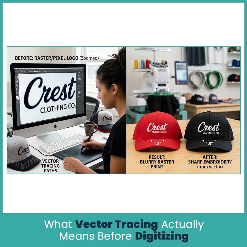
A png, jpg, or screenshot is made of pixels. Zoom in far enough and you will see blocky squares instead of a clean edge. Vector tracing rebuilds that same logo using mathematical paths instead of pixels, so the shape stays sharp no matter how small or large you scale it.
Pixel based files lose quality the moment you shrink them down for a two inch cap logo.
Vector paths keep their edges sharp at any size, from a small sleeve patch to a full jacket back.
This matters even more on hats, where logos often run smaller than one and a half inches wide.
Why This Step Comes Before the Digitizing File, Not After
I still get asked why this cannot just happen during digitizing itself. Well, digitizing software reads paths, angles, and closed shapes to figure out stitch direction and density. If the artwork handed over is still fuzzy or made of scattered pixels, the software has nothing clean to build stitches from.
Digitizers work from vector paths, not raw pixels, to set accurate stitch boundaries.
Tracing first means fewer manual corrections during the actual digitizing stage.
Doing it out of order usually means redoing the whole file later, which slows everything down.
The Hidden Step: How Vector Tracing Creates a Crisp Hat Logo
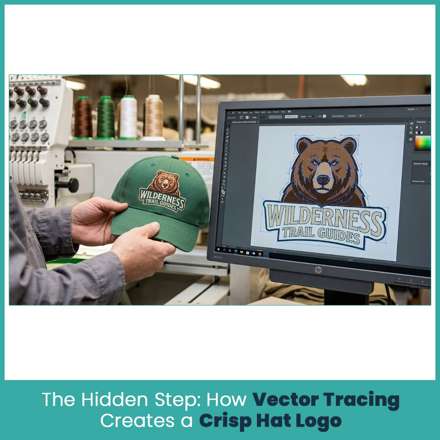
This is the part that rarely gets mentioned in beginner guides, and it is exactly why so many hat logos come out looking soft or uneven. I have redone plenty of caps for clients who skipped this stage the first time around, and the difference once it gets fixed is obvious within seconds of seeing the sample.
Fixing Blurry Edges and Pixelation at Small Sizes
Once a logo is traced properly, blur and pixelation basically disappear from the equation. The digitizer is now working from a shape with defined edges instead of guessing where a fuzzy pixel cluster is supposed to end.
Clean edges convert directly into cleaner satin stitch borders.
Small logos hold their shape instead of turning into a blob once stitched.
Curved letters and rounded shapes stay smooth instead of looking jagged at the edges.
Preserving Fine Text and Details on a Curved Surface
Small text is where most rushed projects fall apart. A traced vector file keeps letterforms consistent, which matters a lot once you are working on a curved crown with almost no room to spare.
Thin letter strokes stay readable instead of collapsing into a smudge.
Serif fonts and script logos keep their detail instead of merging together.
Fine gaps between letters or shapes stay open rather than filling in with stray stitches.
Setting Accurate Stitch Boundaries From Clean Vector Paths
Stitch density and direction come straight from the shape of the vector paths. Clean paths mean the digitizer can set boundaries accurately on the first attempt, rather than eyeballing where one section ends and another begins.
Accurate boundaries reduce overlapping stitches that cause thread buildup.
Clean paths help avoid gaps where the underlying fabric peeks through.
This step alone often saves an entire round of sample corrections.
What Happens When Vector Tracing Gets Skipped?
Skipping this step does not save time, even though it might look that way at first. It usually just pushes the problem further down the line, and by then it costs more to fix.
Jagged Edges and Puckering Around the Crown
Without clean paths, the machine follows whatever rough shape it was given. On a curved crown, that rough shape turns into visible puckering and uneven tension around the stitched area.
Fabric can bunch slightly where stitch density was miscalculated.
Edges come out ragged instead of smooth, especially on rounded letters.
Puckering tends to get worse after the first few washes.
Text That Turns Illegible Once Stitched
Small text suffers the most when it is digitized from a raw, un-traced file. What reads fine on a screen can turn into an unreadable blur once it is compressed down to cap size.
Letters as small as a quarter inch tend to merge together without clean paths.
Script fonts lose their flow and start looking choppy.
Customers usually notice this issue immediately, which means a reorder request.
Extra Revision Rounds and Wasted Thread Costs
This is the part that actually costs money and time. A file that was not traced properly almost always needs rework, and that means pulling out thread, resetting the hoop, and running the sample again.
Each revision round adds days to turnaround time.
Wasted thread and backing material add up fast on bulk orders.
Rushed fixes at this stage rarely match the quality of doing it right from the start.
Manual Tracing vs Auto-Tracing for Cap Logos
Not all vector tracing happens the same way, and the method matters more on hats than on almost any other product.
Factor | Manual Tracing | Auto-Tracing |
Edge accuracy on curves | Very high, adjusted manually | Often rounds off sharp corners |
Small text handling | Cleaned letter by letter | Frequently merges thin strokes |
Time needed | Slower, more hands-on | Fast, near instant |
Best use case | Small cap logos, fine detail work | Simple shapes, large flat designs |
Consistency across sizes | Reliable at any scale | Can distort at very small sizes |
Where Auto Tracing Falls Short on Curved Layouts?
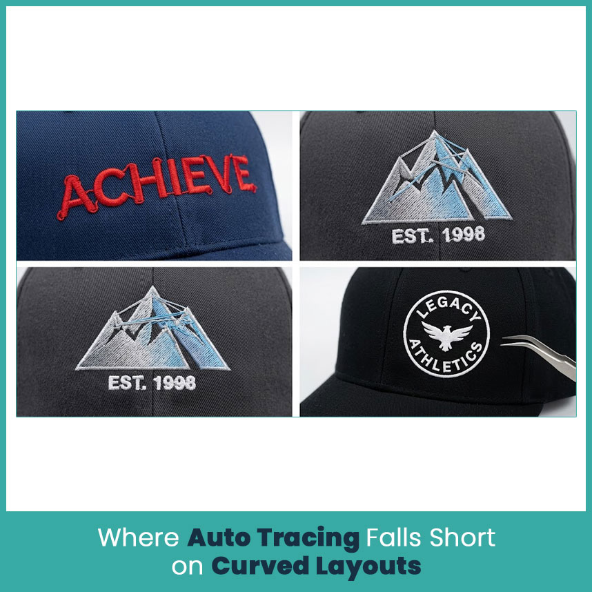
Software tracing tools are genuinely useful, but they work off contrast and edge detection, not judgment. On a curved cap layout, that gap shows up quickly.
Auto-tracing tends to smooth out corners that were meant to stay sharp.
Gradients and shadows in the original file can confuse the software into adding extra paths.
Small gaps between letters sometimes get filled in by mistake.
Why Manual Cleanup Still Matters for Small Caps?
Every file I hand off for a cap logo still gets a manual pass, even after auto-tracing. That extra look catches the small stuff software tends to miss.
A trained eye can tell the difference between a stray anchor point and an intentional curve.
Manual cleanup keeps proportions accurate once the design gets scaled down for a two-inch panel.
This step is quick compared to redoing a bad digitizing file later on.
How to Prepare Your Logo File Before Sending It for Tracing?
A little prep work on your end makes the whole process faster and keeps the final result closer to what you actually pictured.
File Formats That Actually Work Well
Not every file format gives a tracer much to work with. Higher resolution and cleaner source files make a real difference here.
High resolution png files, at least 300 dpi, trace far better than low-res screenshots.
Original ai or eps files, if you have them, skip the tracing step altogether.
Avoid sending a logo pulled straight off a website, since those are usually compressed and low quality.
What to Tell Your Digitizer About Cap Placement and Size
The file matters, but so does the context around it. A digitizer works faster and gets closer to your expectations when you make sure they know how the logo will actually sit on the hat.
Mention the exact placement, whether that is front panel, side, or back.
Give the target size in inches, not just a general description like small or medium.
Point out any small text or fine detail that absolutely needs to stay readable.
Choosing a Vector Tracing and Digitizing Partner for Hats
Not every provider treats this step the same way, and that difference shows up in the final product every single time.
What to Check in Their Sample Work?
Before committing to anyone, look closely at past cap samples rather than flat garment work, since the two are not really comparable.
Zoom in on small text within their sample photos to check for clean, readable edges.
Look specifically for curved crown work, not just flat panel examples.
Ask if they can show before and after files from the tracing stage itself.
FAQs
1. What is vector tracing in embroidery digitizing?
It is the process of turning a pixel based logo, like a png or jpg, into clean scalable paths before digitizing begins, which keeps edges sharp at any size.
2. Why do hat logos need vector tracing more than flat garment designs?
Hats have curved, structured surfaces and much smaller usable space, so any blur or rough edge in the original file gets magnified once it is stitched.
3. Can I skip vector tracing if my logo file is already high resolution?
High resolution helps, but a raster file still needs to be converted into vector paths for accurate stitch boundaries, so this step should not be skipped entirely.
4. How much extra time does vector tracing add to digitizing turnaround?
It usually adds a small amount of time upfront, often less than a day, but it saves far more time later by avoiding revision rounds and reprints.
Author Bio
Matthew Davis
Senior Embroidery Digitizer
I'm Matthew Davis, a skilled embroidery digitizer with more than 15 years of practical experience. I specialize in logo digitizing, 3D puff embroidery designs, applique digitizing, custom embroidery digitizing, and working with difficult fabrics. Over the years, I have worked with different fashion brands and production teams worldwide. I always share simple tips and useful techniques to help both beginners and businesses improve their embroidery work.
Comments
Log in or sign up to join the conversation.