
When I was a kid, I loved Edgar Alan Poe’s story “The Gold Bug,” and I was tickled at the beginning of this century when the expression “gold bug” became a name for people, like me, who were putting our money into both bullion and stocks. You will remember that between 2000 and 2012 bullion prices rose from US$300 to $1,900 per ounce. Spectacular! They have since slid (briefly dropping below $1,100), and now stand at about $1,300.
But gold isn’t what I want to talk about today. During that same period gold’s lacklustre sister, silver, rose from a couple of dollars an ounce to $50 in 2011. It dropped to $14 at the beginning of this year, and then began to rise.
I’ve played this recovery two ways. One was to buy the Global X ETF (SIL) that tracks a basket of silver miners. You can read all about it here. I sold it a few months ago, when silver prices briefly weakened.
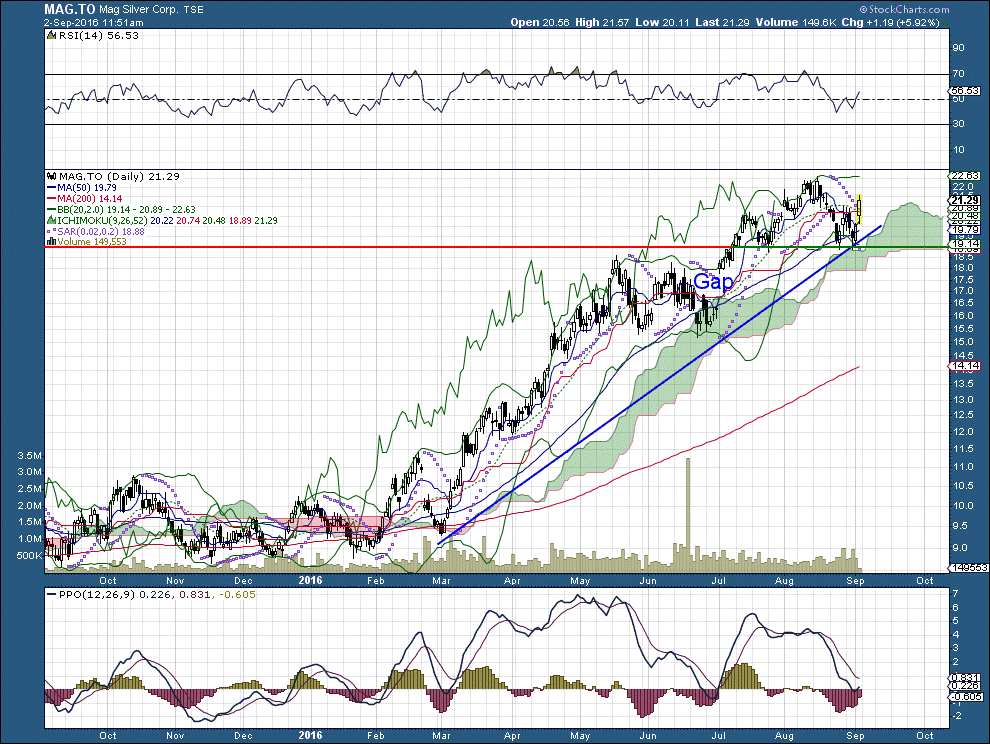
In July I bought MAG Silver Corp. – MAG.TO – after reading this article in the Globe and Mail, and doing a bit of fundamental and technical analysis. For a peek at the company’s summary of its operations, click here.
As the blue trend line shows, a five-month upward ascendancy is intact. Of particular importance in recent days is the red-and-green line, which indicates support and resistance. Support is now sitting at about $19 – a level the share price has confirmed four times in the last two months.
Of course, I never make buy or sell recommendations, and MAG is no different.
On the matter of island reversals….
In the chart above I earmarked a gap in June. That can be preparatory to an island reversal, and if I had been following the stock at that time I would have been cautious, since those reversals can be a bit scary. The last time I played an island reversal was with MSFT in 2015, and it’s pretty uncommon in a longstanding bull market like the one we’re now enjoying – but which is getting a bit long in the tooth.
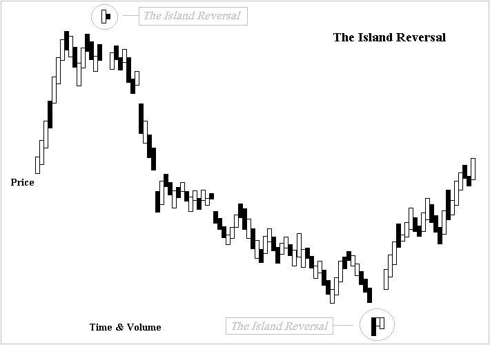
As a reminder of how significant island reversals can be, I copied the chart below from Wikipedia. There are places on the web that explain this pattern better, but this chart is pretty good – except in the sense that island reversals often take place over a week or more – not two or three days..

Comments
Log in or sign up to join the conversation.