

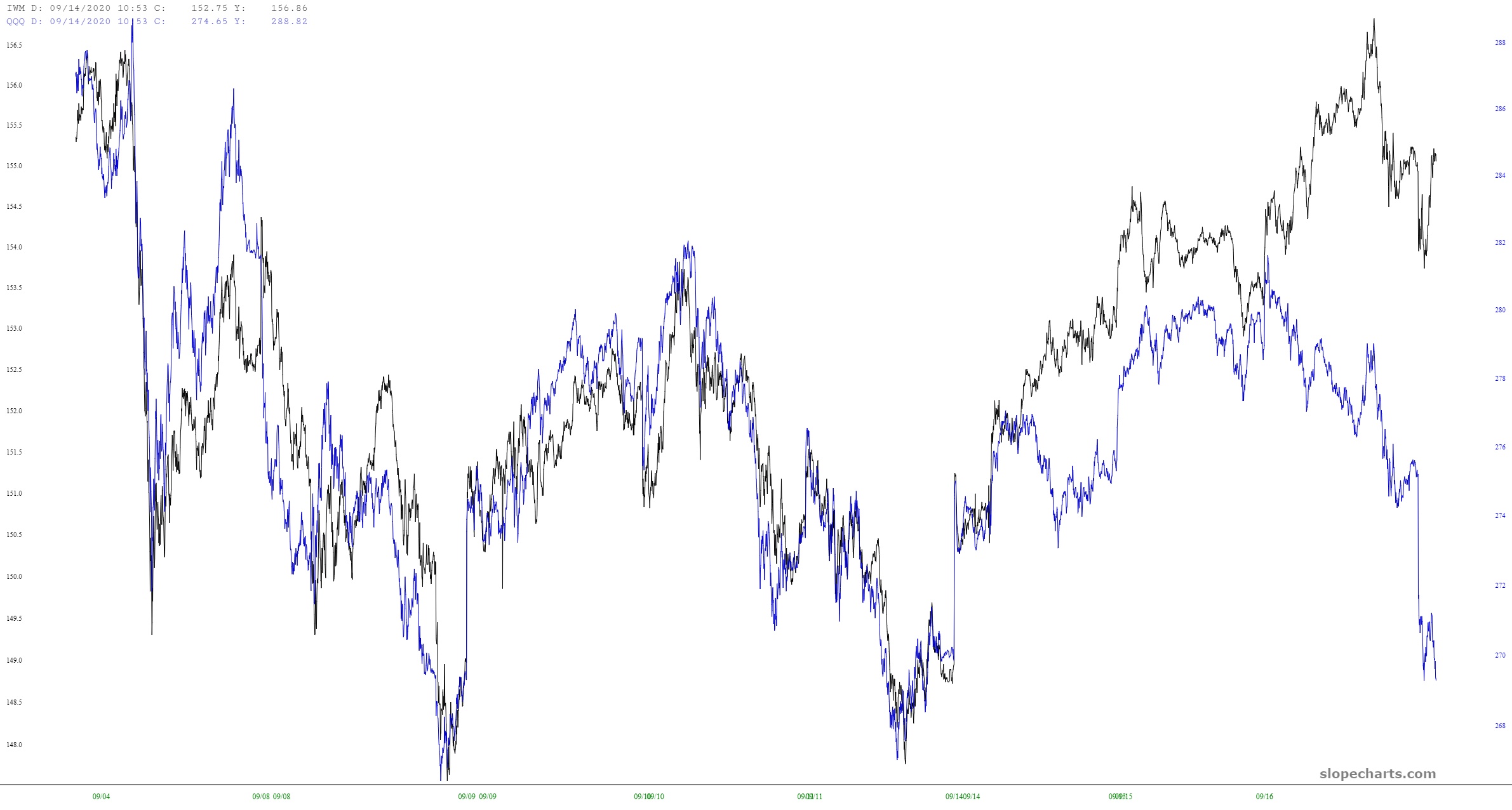
Here’s one chart worth a thousand words: it’s a ten-day minute bar chart with the QQQ in blue and the IWM in black. For the first half, they are joined at the hip; lately, however, tech has absolutely been falling to pieces. It’s annoying as hell to me, since I’m so focused on small caps.
Will the rest of the market follow tech lower? We’ll find out soon.
(Click on image to enlarge)



Comments
Log in or sign up to join the conversation.