

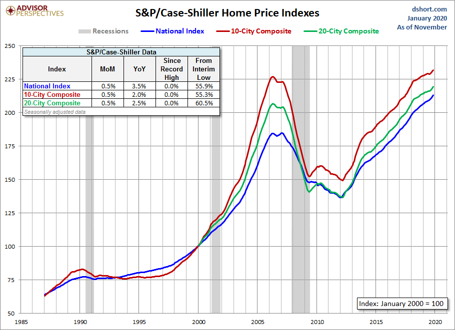
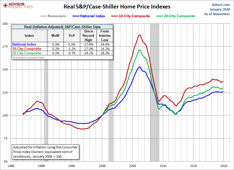
With today's release of the November S&P/Case-Shiller Home Price Index, we learned that seasonally adjusted home prices for the benchmark 20-city index were up 0.5% month over month which is cut to 0.2% with inflation adjustment.
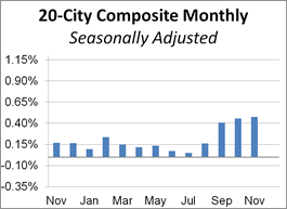
The adjacent column chart illustrates the month-over-month change in the seasonally adjusted 20-city index, which tends to be the most closely watched of the Case-Shiller series. It was up 0.48% from the previous month. The nonseasonally adjusted index was up 2.6% year-over-year.
Investing.com had forecast a 0.4% MoM seasonally adjusted increase and 2.4% YoY nonseasonally adjusted for the 20-city series.
Here is an excerpt from the analysis in today's Standard & Poor's press release.
"The U.S. housing market was stable in November,” says Craig J. Lazzara, Managing Director and Global Head of Index Investment Strategy at S&P Dow Jones Indices. “With the month’s 3.5% increase in the national composite index, home prices are currently 59% above the trough reached in February 2012, and 15% above their pre-financial crisis peak. November’s results were broad-based, with gains in every city in our 20-city composite.
“At a regional level, Phoenix retains the top spot for the sixth consecutive month, with a gain of 5.9% for November. Charlotte and Tampa rose by 5.2% and 5.0% respectively, leading the Southeast region. The Southeast has led all regions since January 2019.”
“As was the case last month, after a long period of decelerating price increases, the National, 10-city, and 20-city Composites all rose at a modestly faster rate in November than they had done in October. This increase was broad-based, reflecting data in 15 of 20 cities. It is, of course, still too soon to say whether this marks an end to the deceleration or is merely a pause in the longer-term trend. [Link to download]
The chart below is an overlay of the Case-Shiller 10- and 20-City Composite Indexes along with the national index since 1987, the first year that the 10-City Composite was tracked. Note that the 20-City, which is probably the most closely watched of the three, dates from 2000. We've used the seasonally adjusted data for this illustration.
(Click on image to enlarge)
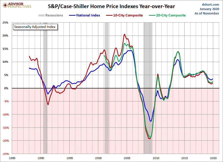
The next chart shows the year-over-year Case-Shiller series, again using the seasonally adjusted data.
(Click on image to enlarge)
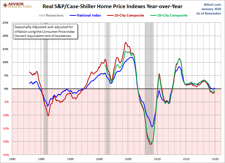
Here is the same year-over-year overlay adjusted for inflation with the Consumer Price Index owners' equivalent rent of residences.
(Click on image to enlarge)
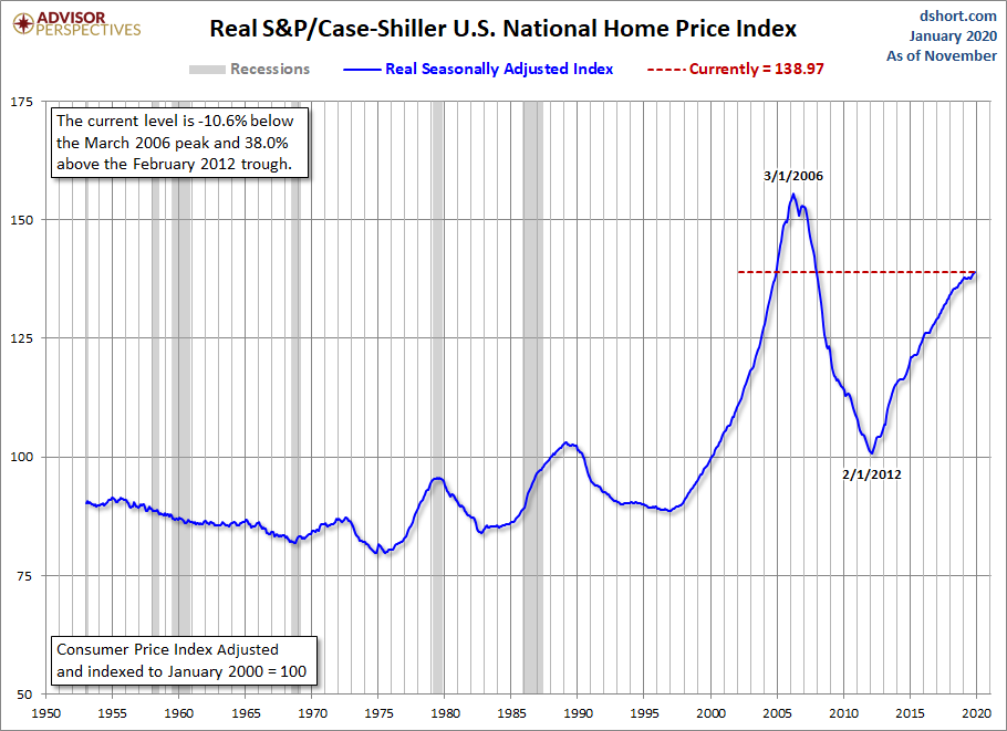
For a long-term perspective on home prices, here is a look at the seasonally and inflation-adjusted Case-Shiller price index from 1953, the first year that monthly data is available. Because the CPI owners' equivalent rent of residences didn't start until 1983, we've used the broader seasonally adjusted Consumer Price Index.
(Click on image to enlarge)
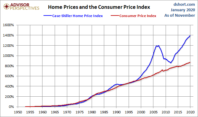
To get an even better idea of the trend in housing prices over long time periods, we compare the change in the seasonally-adjusted Case-Shiller Home Price Index and the Consumer Price Index since 1953.

Comments
Log in or sign up to join the conversation.