

With today's release of the July S&P/Case-Shiller Home Price Index, we learned that seasonally adjusted home prices for the benchmark 20-city index saw a 0.55% increase month over month which is cut to 0.34% with inflation adjustment.
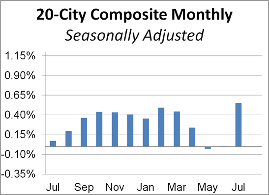
Investing.com had forecast a 0.3% MoM seasonally adjusted increase and 3.8% YoY nonseasonally adjusted for the 20-city series.
Here is the analysis from today's Standard & Poor's press release:
“Housing prices rose in July,” says Craig J. Lazzara, Managing Director and Global Head of Index Investment Strategy at S&P Dow Jones Indices. “The National Composite Index gained 4.8% relative to its level a year ago, slightly ahead of June’s 4.3% increase. The 10- and 20-City Composites (up 3.3% and 3.9%, respectively) also rose at an accelerating pace in July compared to June. The strength of the housing market was consistent nationally – all 19 cities for which we have July data rose, with 16 of them outpacing their June gains.
“In previous months, we’ve noted that a trend of accelerating increases in the National Composite Index began in August 2019. That trend was interrupted in May and June, as price gains decelerated modestly, but now may have resumed. Obviously more data will be required before we can say with confidence that any COVID-related deceleration is behind us.
“Phoenix’s 9.2% increase topped the league table for July; this is the 14th consecutive month in which Phoenix home prices rose more than those of any other city. Seattle (7.0%), Charlotte (6.0%) and Tampa (5.9%) continue to occupy the next three places, but there was some growth even in the worst performing cities, Chicago (0.8%) and New York (1.3%). Prices were particularly strong in the Southeast and West regions, and comparatively weak in the Midwest and Northeast.” [Read more]
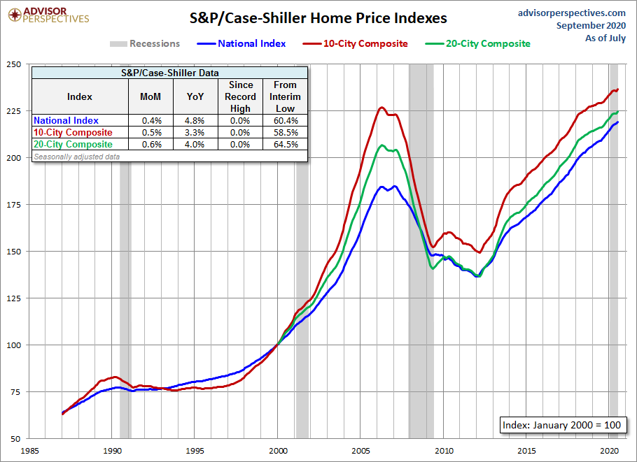
The chart below is an overlay of the Case-Shiller 10- and 20-City Composite Indexes along with the national index since 1987, the first year that the 10-City Composite was tracked. Note that the 20-City, which is probably the most closely watched of the three, dates from 2000. We've used the seasonally adjusted data for this illustration.
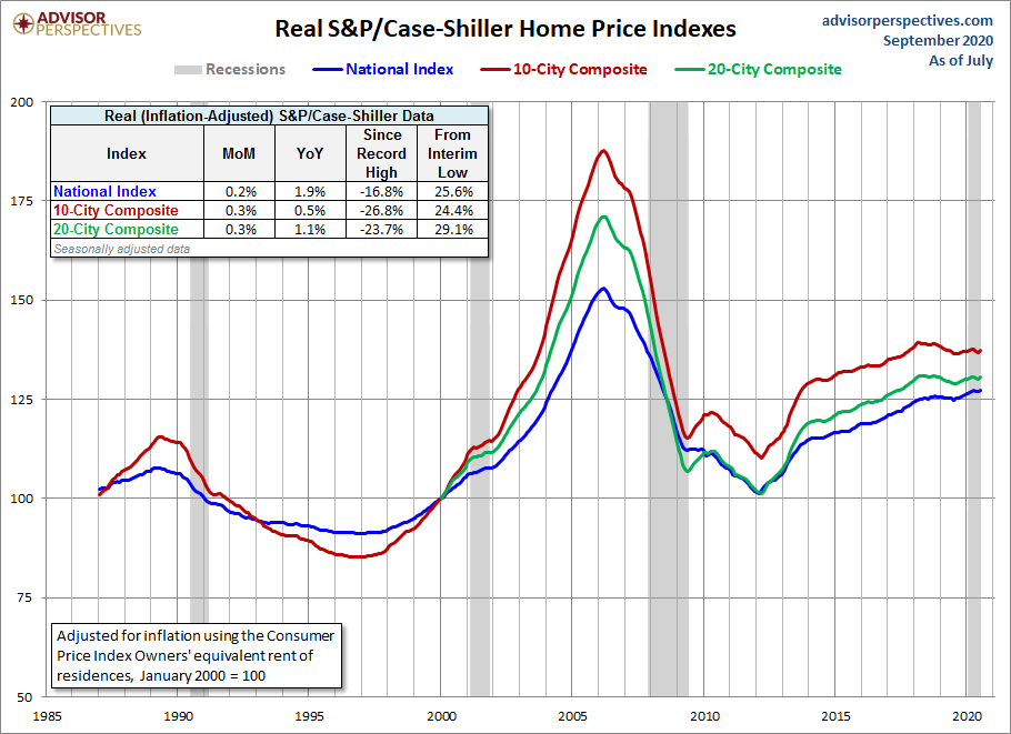
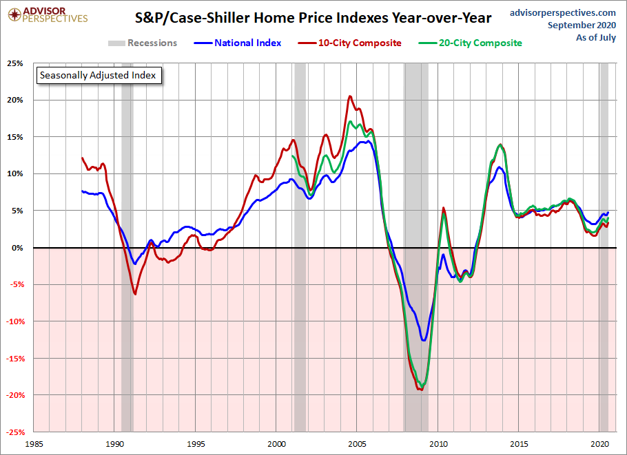
The next chart shows the year-over-year Case-Shiller series, again using the seasonally adjusted data.
Here is the same year-over-year overlay adjusted for inflation with the Consumer Price Index owners' equivalent rent of residences.

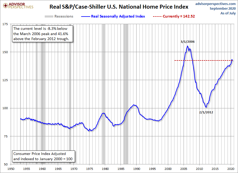
For a long-term perspective on home prices, here is a look at the seasonally and inflation-adjusted Case-Shiller price index from 1953, the first year that monthly data is available. Because the CPI owners' equivalent rent of residences didn't start until 1983, we've used the broader seasonally adjusted Consumer Price Index.
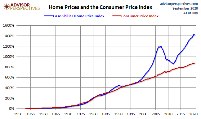
To get an even better idea of the trend in housing prices over long time periods, we compare the change in the seasonally-adjusted Case-Shiller Home Price Index and the Consumer Price Index since 1953.

Comments
Log in or sign up to join the conversation.