

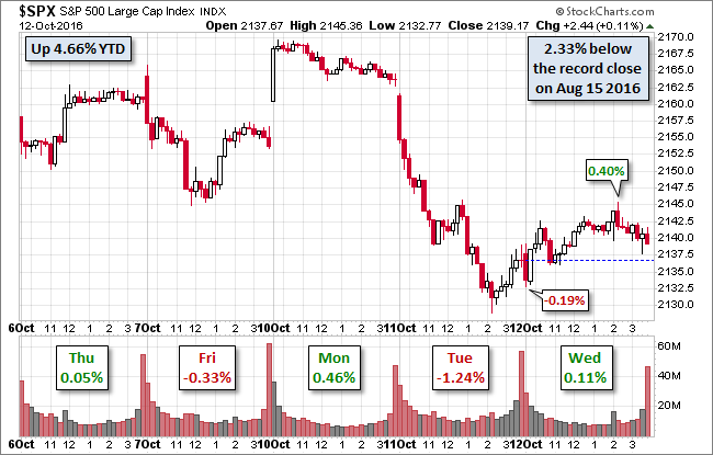
Today was a light day for economic news, aside from the JOLTs report, so the popular financial press was focused (with bated breath) on monetary policy, namely possible clues in the 2 PM release of the Minutes for the September FOMC meeting. The S&P 500 showed a bit of indecision at the open, which included its -0.19% intraday low. The index then zigzagged to a narrow trading range for about 90 minutes in advance of the potential FOMC drama. Check out the market's subdued response to the Fed minutes — a brief gyration to the 0.40% intraday high. The index then trailed off to its fractional closing gain of 0.11%. As for Fed drama ... today's high-low range was at the 28th percentile of the 197 market days thus far in 2016.
The yield on the 10-year note closed at 1.79%, up two BPs from yesterday's close. This is the highest closing yield since 1.81% June 2nd and well off the 1.37% closing low on July 5th and 8th.
Here is a snapshot of past five sessions in the S&P 500.
(Click on image to enlarge)
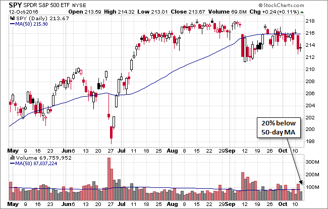
Here's a daily chart of the SPY ETF, which gives a better sense of investor participation in today's trade. Volume was 20% below its 50-day moving average.
(Click on image to enlarge)
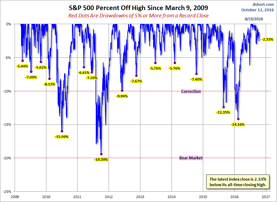
A Perspective on Drawdowns
Here's a snapshot of selloffs since the 2009 trough.
(Click on image to enlarge)
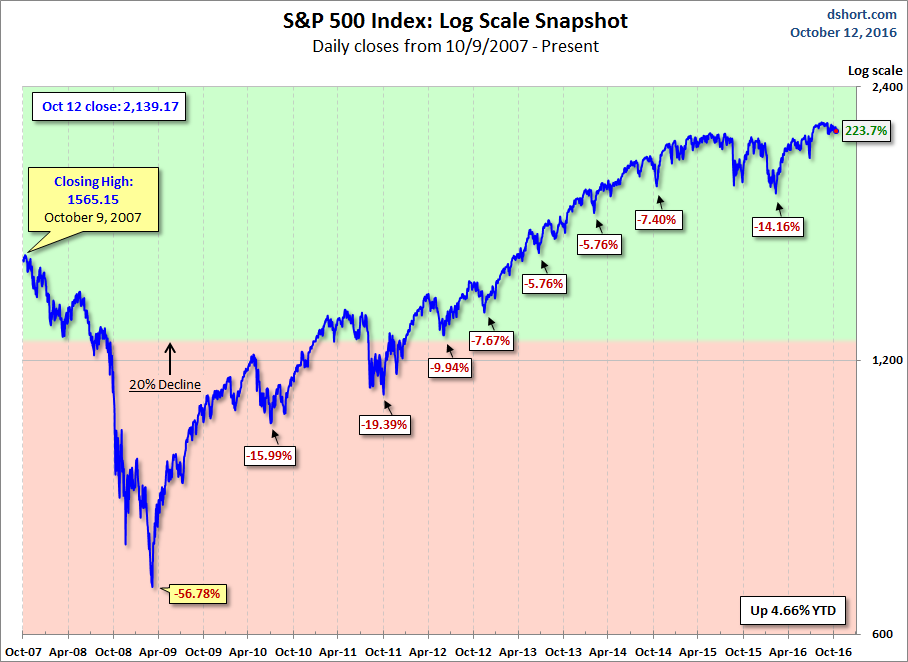
Here is a more conventional log-scale chart with drawdowns highlighted.
(Click on image to enlarge)
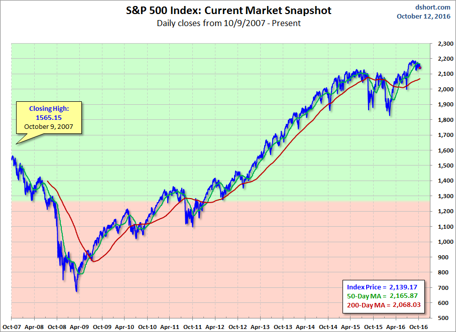
Here is a linear scale version of the same chart with the 50- and 200-day moving averages.
(Click on image to enlarge)
A Perspective on Volatility
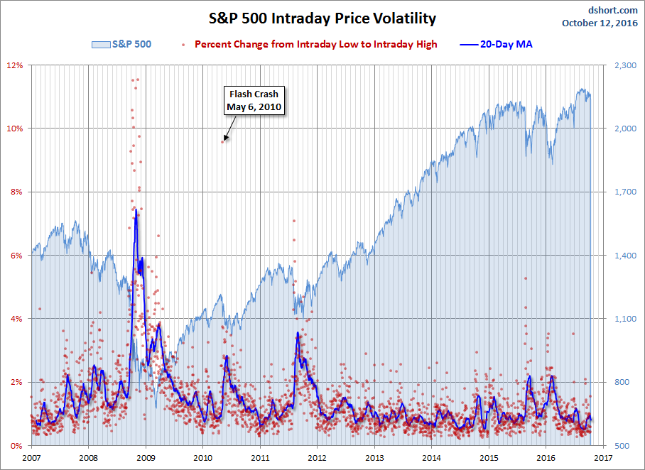
For a sense of the correlation between the closing price and intraday volatility, the chart below overlays the S&P 500 since 2007 with the intraday price range. We've also included a 20-day moving average to help identify trends in volatility.
(Click on image to enlarge)
Comments
Log in or sign up to join the conversation.