

Apropos of nothing except current (financial system) events (Fall teaching), some pictures to elicit thoughts.
Debt rising fast even at full employment
Stock market near peak?
Fed funds rate above Taylor rule implied levels.
Fed credibility lower under Trump 2.0.
Stablecoins after GENIUS.
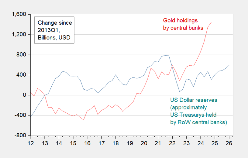
And (not on the syllabus), dollar reserve currency domination eroded (see Eichengreen in NYT yesterday).
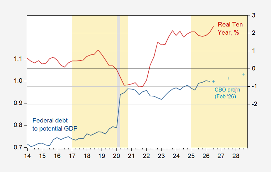
Figure 1: Federal debt held by public to GDP ratio (blue, left scale), CBO February projection (+, let scale), real ten year interest rates (TIPS), % (red, right scale).
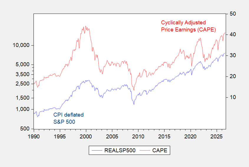
Figure 2: CPI deflated S&P500 (blue, left log scale), CAPE, % (red, right scale). Source: Shiller.
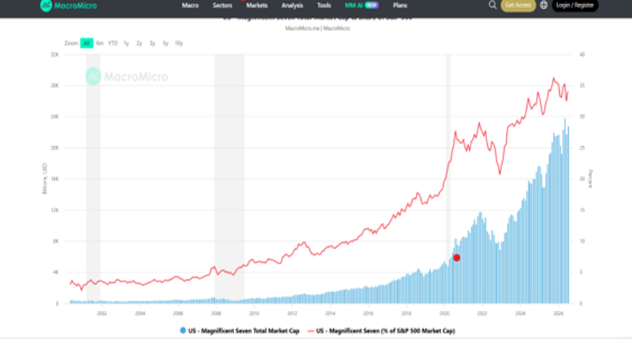
Figure 3: S&P500 capitalization (blue bar), share accounted for by Magnificent 7 (red, right scale). Source: MacroMicro.
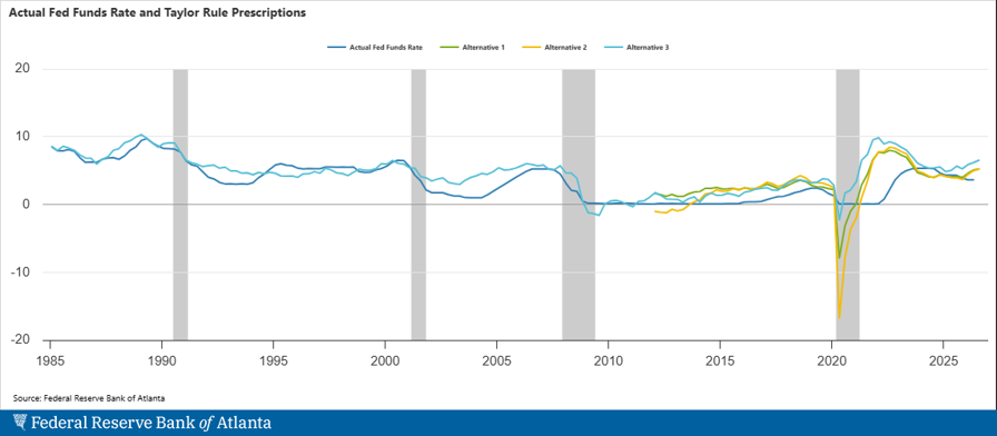
Figure 4: Various Taylor rule implied target Fed funds vs. actual (black). Source: Atlanta Fed.
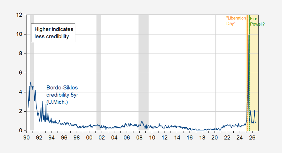
Figure 5: Bordo-Siklos central bank credibility measure for Fed, 5 year (blue). Calculated as |i-i*| for -1 < i-i* < +1, and (i-i*)2 otherwise. Higher means less credibility.
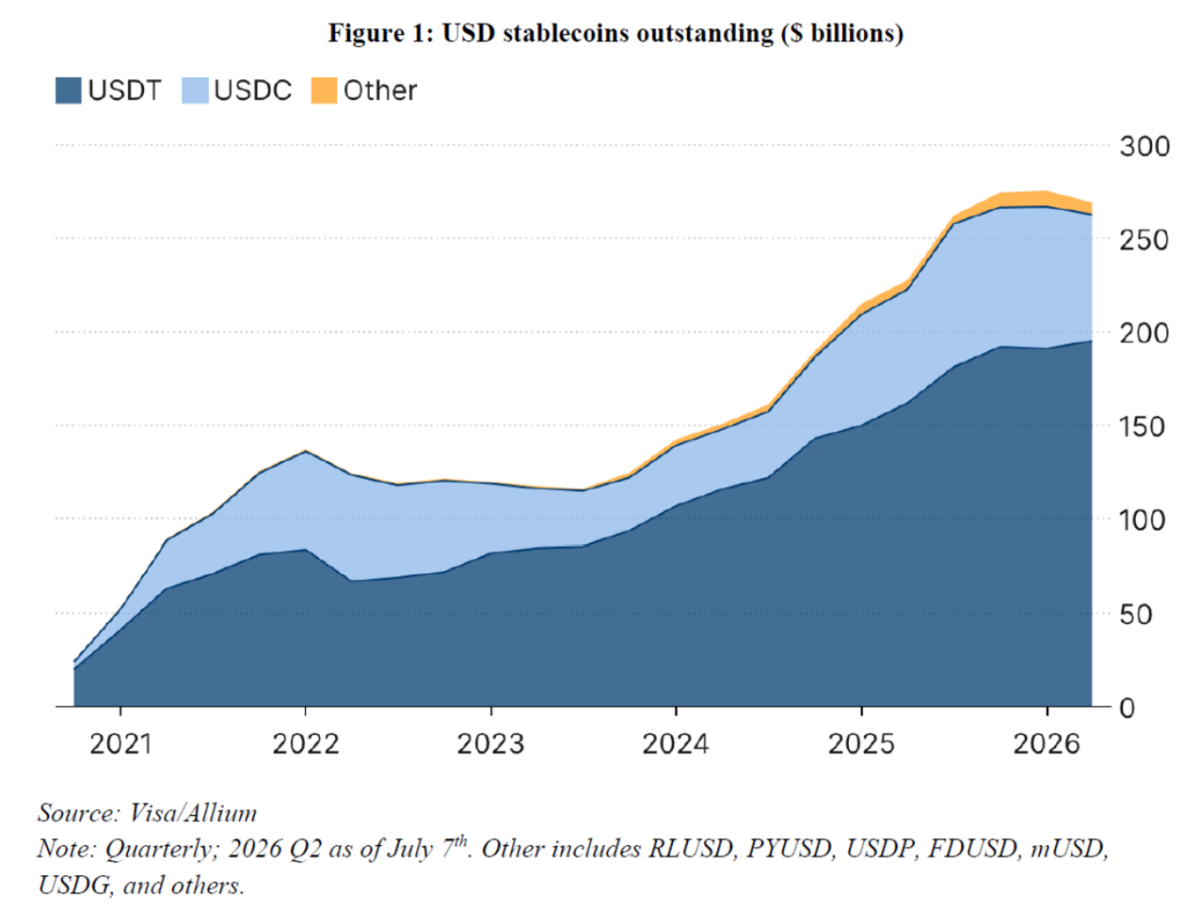
Figure 6: Stablecoins. Source: Liang and Nieman, “Stablecoins after GENIUS” (2026).



Comments
Log in or sign up to join the conversation.