

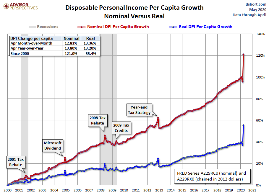
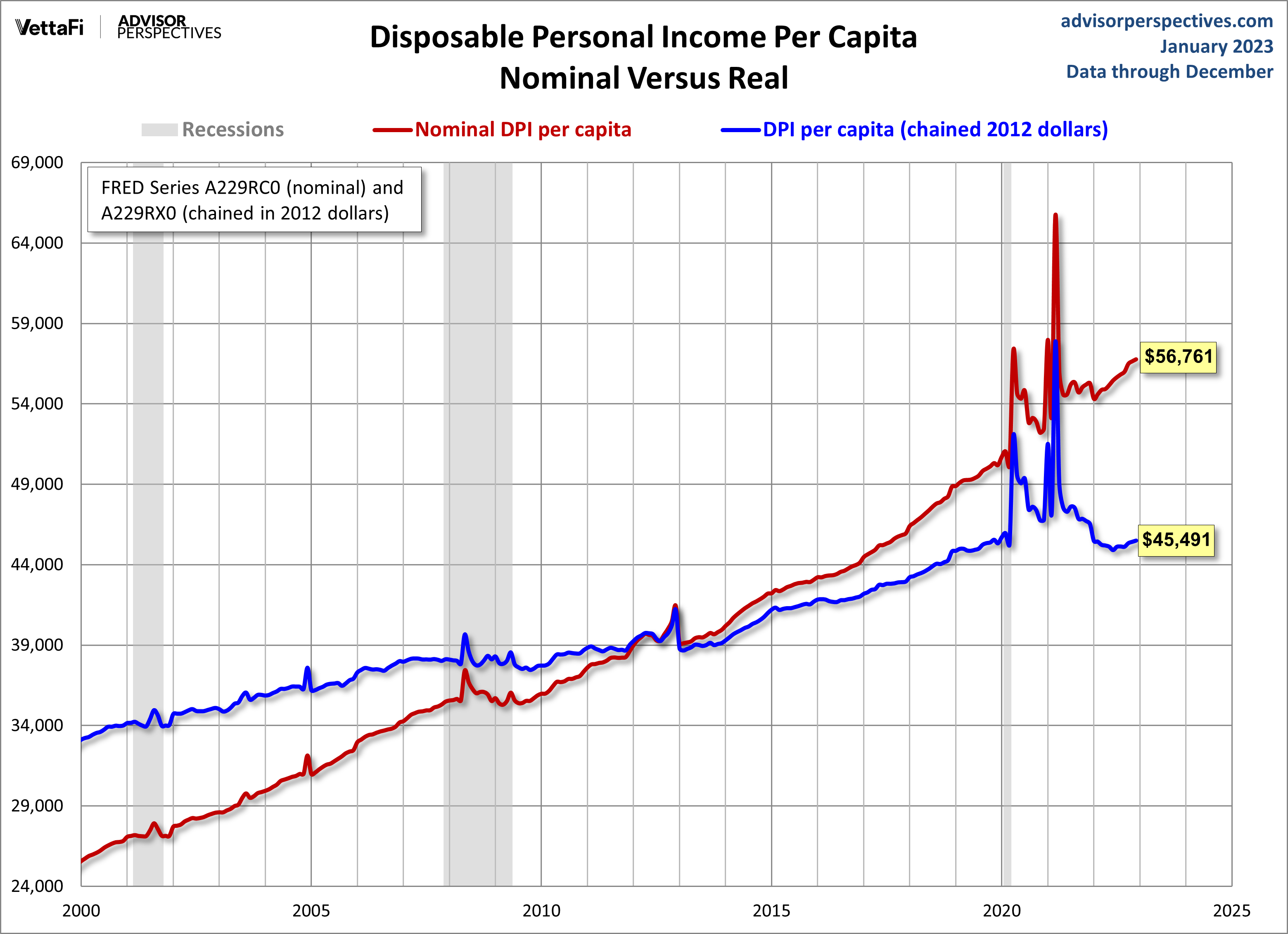
With the release of Friday's report on April Personal Incomes and Outlays, we can now take a closer look at "Real" Disposable Personal Income Per Capita. At two decimal places, the nominal 12.83% month-over-month change in disposable income was at 13.36% when we adjust for inflation. This is an increase from last month's 2.1% nominal and 1.9% real decreases last month. The year-over-year metrics are 13.8% nominal and 13.2% real.
Post-recession, the trend was one of steady growth, but generally flattened out in late 2015. Disposable income began a faster increase in 2012 and 2013.
The first chart shows both the nominal per capita disposable income and the real (inflation-adjusted) equivalent since 2000. This indicator was significantly disrupted by the bizarre but predictable oscillation caused by 2012 year-end tax strategies in expectation of tax hikes in 2013.

The BEA uses the average dollar value in 2012 for inflation adjustment. But the 2012 peg is arbitrary and unintuitive. For a more natural comparison, let's compare the nominal and real growth in per-capita disposable income since 2000. Do you recall what you were doing on New Year's Eve at the turn of the millennium? Nominal disposable income is up 121% since then. But the real purchasing power of those dollars is up only 55%.
DPI Per Capita
Let's take one more look at real DPI per capita, this time focusing on the year-over-year percent change since the beginning of this monthly series in 1959. The chart below highlights the value for the months when recessions start to help us evaluate the recession risk for the current level.
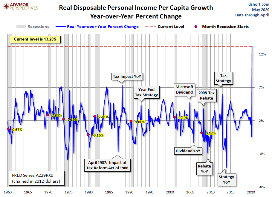
The current real YoY of 13.2% is well above the 1.72% average YoY at the start of all eight recessions since 1959. Check out the conspicuous tax planning blips as well as Microsoft's big dividend payout in 2004.
Consumption versus Savings
The US is a consumer-driven economy, as is evident from the percent share of GDP held by Personal Consumption Expenditures.
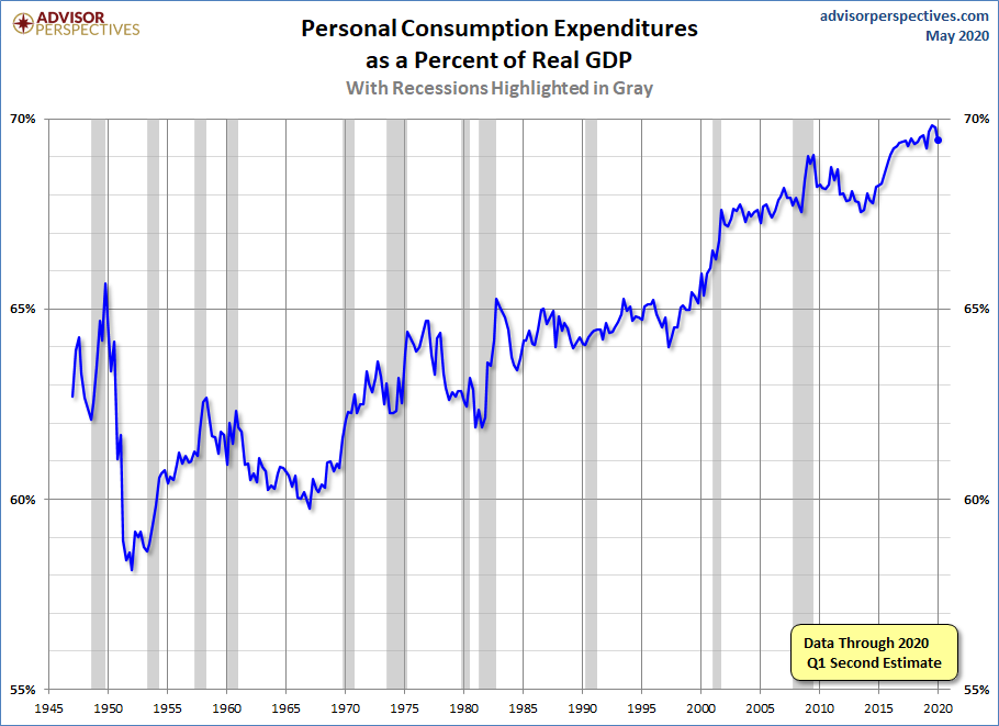
But the money to support consumption has to come from somewhere, and growth in real disposable income would be the best source. An alternative is to spend more by reducing savings. Given the long timeframe, this chart features a log scale vertical axis to give a better view of the relative savings rate.
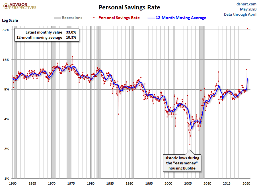
As the chart above illustrates, the US savings rate had generally declined since the early 1980s, a trend no doubt supported by the psychology of the secular bull market from 1982 to 2000. After stabilizing for a couple of years following the Tech Crash, a new surge in asset-growth confidence in residential real estate was probably a factor in that trough in 2005 — along with the "easy money" financing of those years. But in 2008 the Financial Crisis reversed the trend … for a while. The red dots are the actual monthly data points. The blue line is a 12-month moving average, which helps us understand the underlying trend of this rather volatile indicator.
As of March 2020, we are at the highest personal savings rates since the 1980s, which makes sense given consumers aren't spending during the pandemic.
Here is a close-up of the 21st century using the more familiar linear vertical axis. The addition of the callouts helps to explain the outlier months when a one-off surge in income momentarily showed up as savings. These are typically followed by a sharp drop-off in the savings rate in the following months as the one-off dollars are spent. Note that this chart uses a 3-month moving average unlike the 12-month MA in the chart above, hence the greater volatility in the trend.
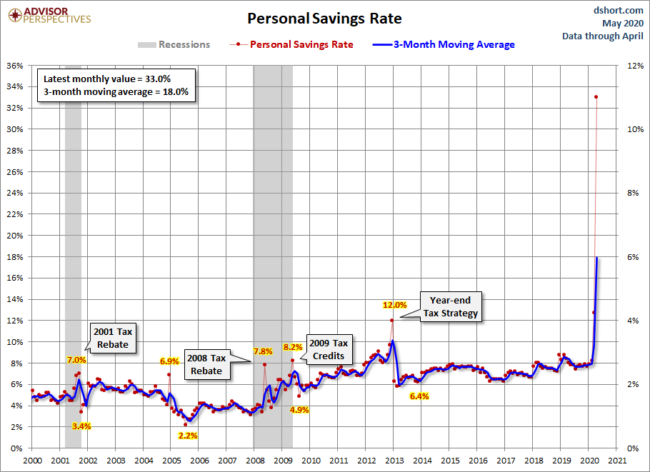
The trend zigzagged upward after the recession, dropping again in 2013. Personal savings have bounced up and down since then, but have not made any real progress. In any case, the probability of reductions in retirement entitlements in the years ahead may eventually lead the savings rate back to the levels in the 1970's and 80's. The COVID-19 pandemic has brought about a new round of savings harkening back to 1980s levels, but time will tell if this is only temporary.
For some additional commentaries on income and wages, see the following:

Comments
Log in or sign up to join the conversation.