

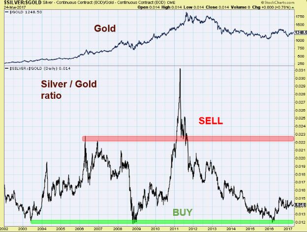
From time to time it is very helpful to look at the market in the long-term. Let me show a popular ratio of Silver/Gold:
Source: stockcharts.com
The lower panel of the chart shows the ratio of Silver/Gold prices and the upper panel shows gold prices, starting from 2002 when the current long-term bull market in precious metals had started.
The green area on the lower panel indicates long-term buying opportunities for gold, silver and precious metals stocks. On the other hand, the red area depicts selling opportunities.
Now, it looks like we are at a very early stage in the current bull run.
Comments
Log in or sign up to join the conversation.