

The Philly Fed's Manufacturing Business Outlook Survey is a monthly report for the Third Federal Reserve District, covers eastern Pennsylvania, southern New Jersey, and Delaware. While it focuses exclusively on business in this district, this regional survey gives a generally reliable clue as to the direction of the broader Chicago Fed's National Activity Index.

Photo by Katie Moum on Unsplash
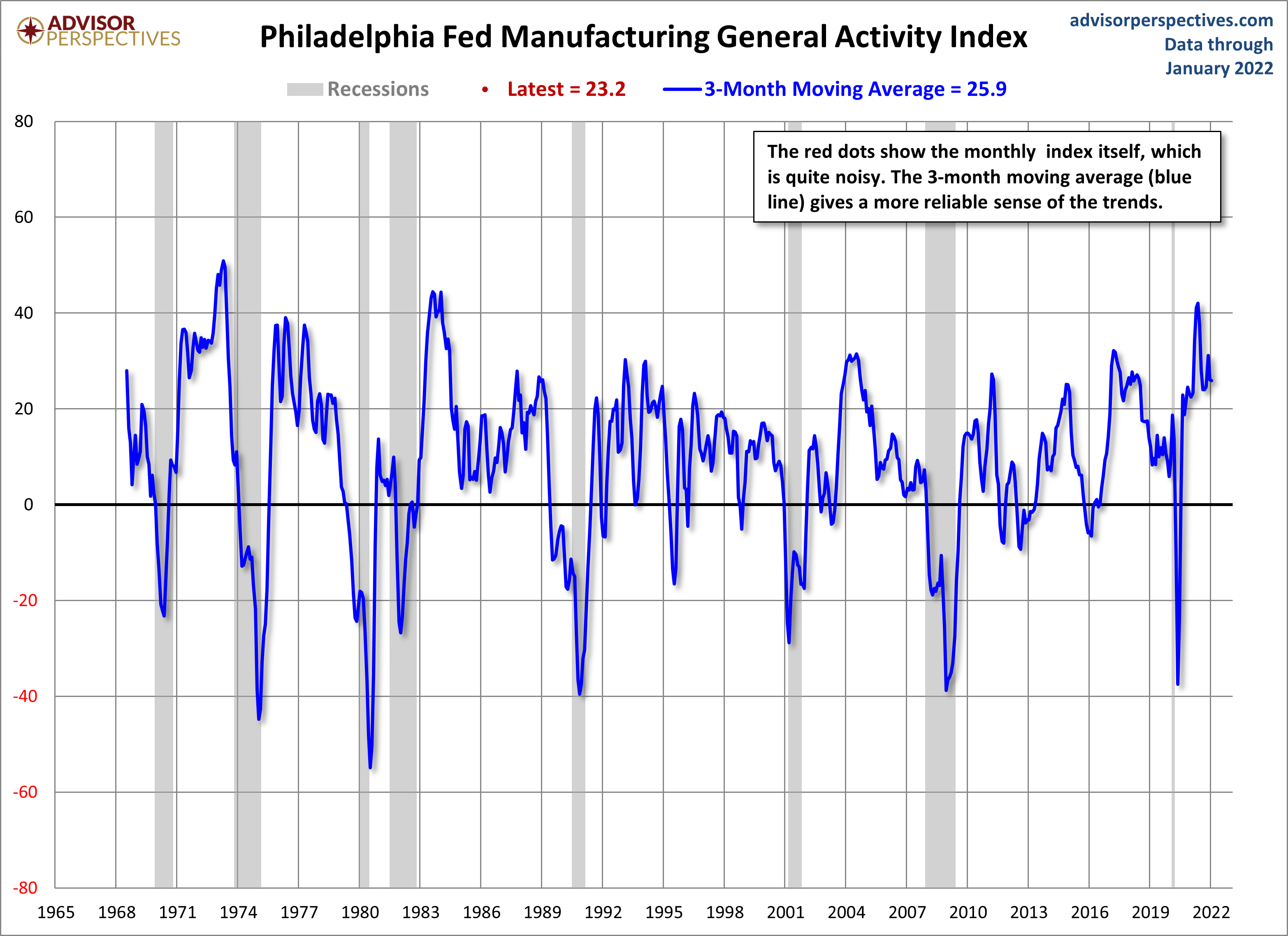
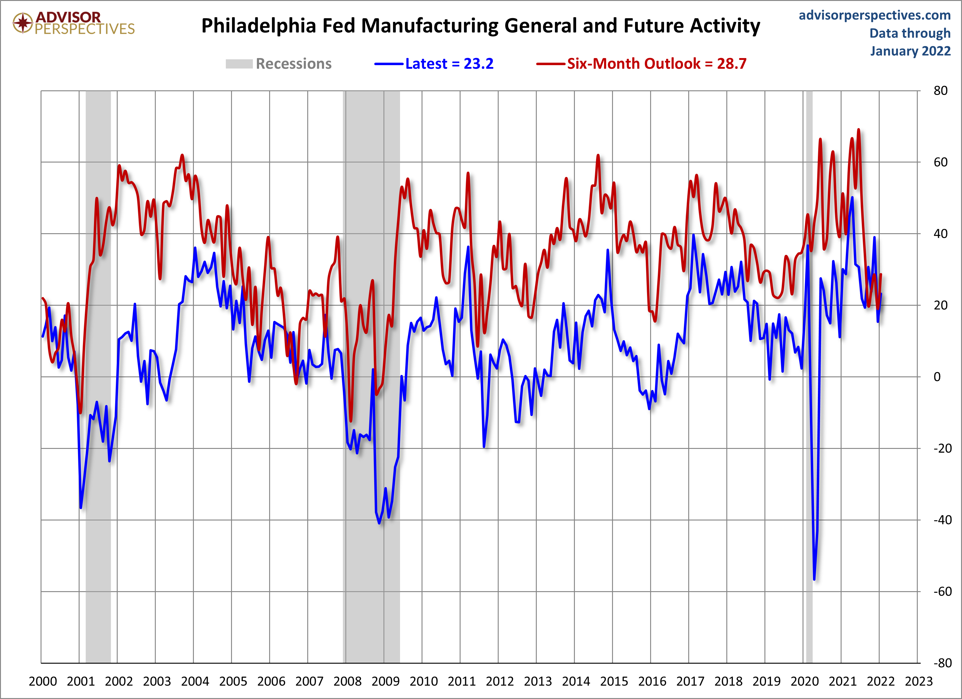
The latest Manufacturing Index came in at 23.2, up 7.8 from last month's 15.4. The 3-month moving average came in at 25.9, down from last month. Since this is a diffusion index, negative readings indicate contraction, positive ones indicate expansion. The Six-Month Outlook came in at 28.7, up 9.7 from the previous month's 19.
The 23.2 headline number came in above the 20 forecast at Investing.com.
Here is the introduction from the survey:
Manufacturing activity in the region continued to grow, according to the firms responding to the January Manufacturing Business Outlook Survey. The survey’s indicators for general activity, shipments, and new orders posted modest increases after falling sharply last month. The employment index remained positive but decreased. The price indexes remained elevated. Responding firms remained generally optimistic about growth over the next six months. (Full Report)
The first chart below gives us a look at this diffusion index since 2000, which shows us how it has behaved in proximity to the two 21st century recessions. The red dots show the indicator itself, which is quite noisy, and the 3-month moving average, which is more useful as an indicator of coincident economic activity. We can see periods of contraction in 2011, 2012, and 2015, and a shallower contraction in 2013. The contraction due to COVID-19 is clear in 2020.
(Click on image to enlarge)

In the next chart, we see the complete series, which dates from May 1960. For proof of the high volatility of the headline indicator, note that the average absolute monthly change across this data series is 8.0.
(Click on image to enlarge)
The next chart is an overlay of the General Activity Index and the Future General Activity Index — the outlook six months ahead.
(Click on image to enlarge)
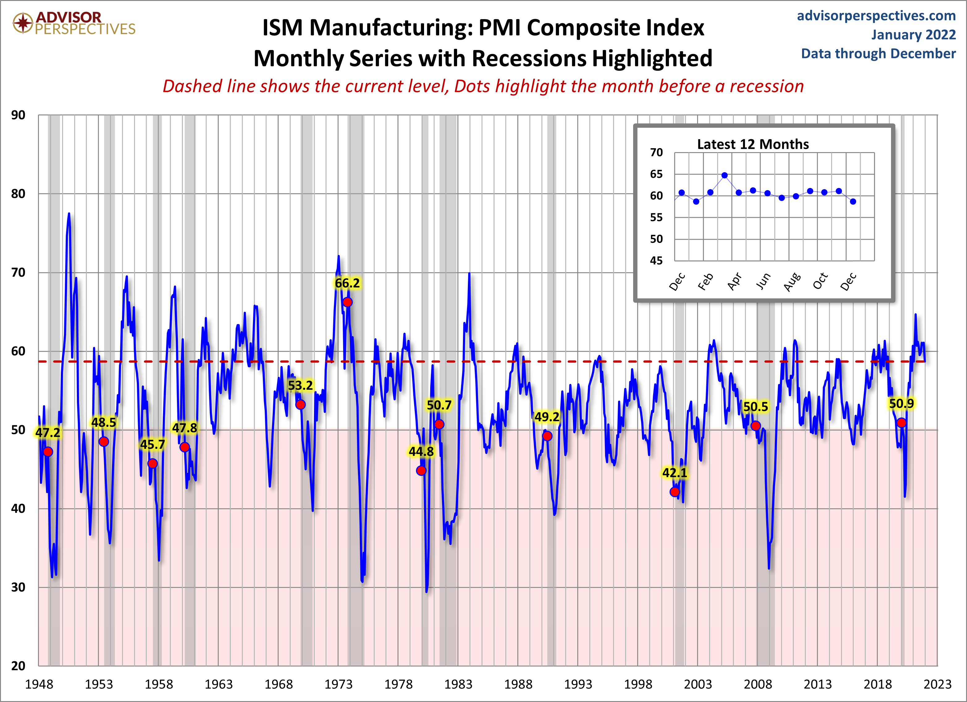
For comparison, here is the latest ISM Manufacturing survey.
(Click on image to enlarge)
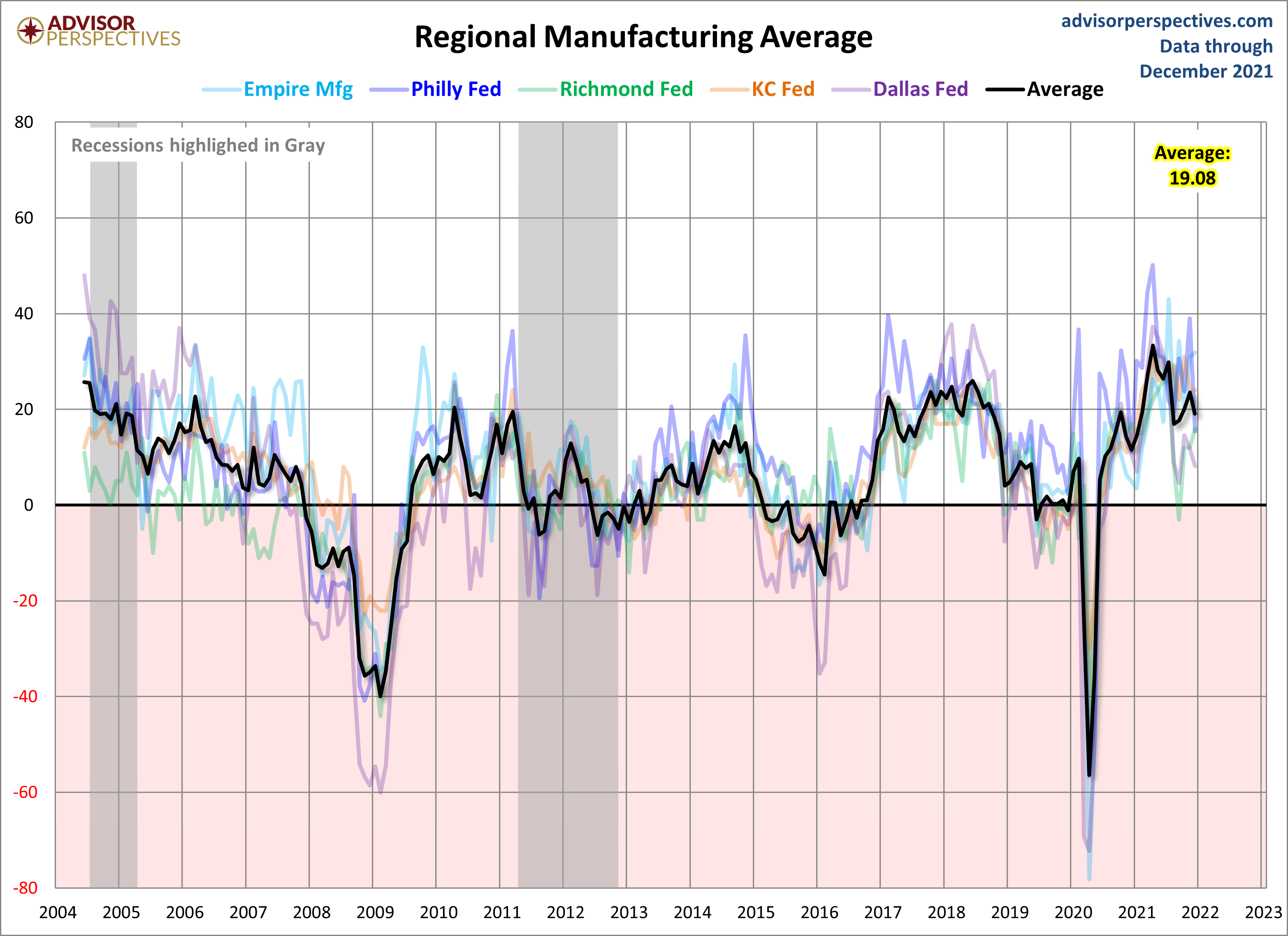
Let's compare all five Regional Manufacturing indicators. Here is a three-month moving average overlay of each since 2001 (for those with data).
(Click on image to enlarge)
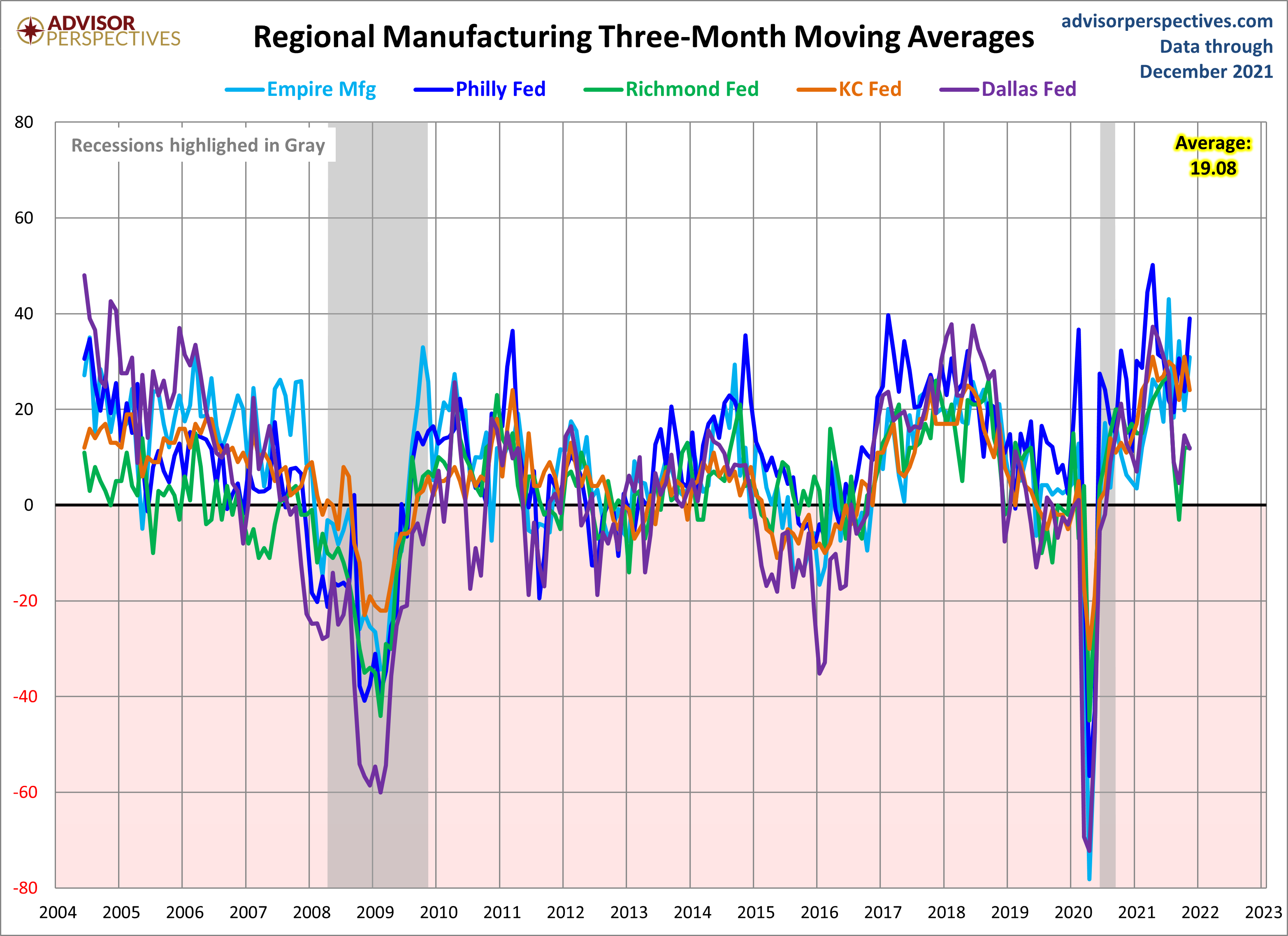
Here is the same chart including the average of the five. Readers will notice the range in expansion and contraction between all regions.
(Click on image to enlarge)

Comments
Log in or sign up to join the conversation.