

On Sunday night, I happened to stumble across some really old index data (yes, my friends, this is the kind of thing I do FOR FUN on a weekend). It was from the late 1700s up until 1900, and it was representative of the US stock market. This was before the days of even the Dow Industrials, of course, so I’m not sure what they cobbled together, but it was interesting data nonetheless. I made a simple line chart out of it:
(Click on image to enlarge)
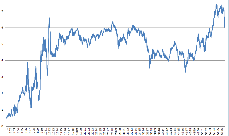
There you see history before you…….the explosive growth of the early 1800s (with crazy swings), the lead-up to Civil War, the drop, the struggle during the post-war years, and then the “gilded age” of the late 1800s, culminating in a substantial drop at the end of the 19th century.
Maybe I find this kind of thing more interesting than most, but I thought I’d share it anyway.



Comments
Log in or sign up to join the conversation.